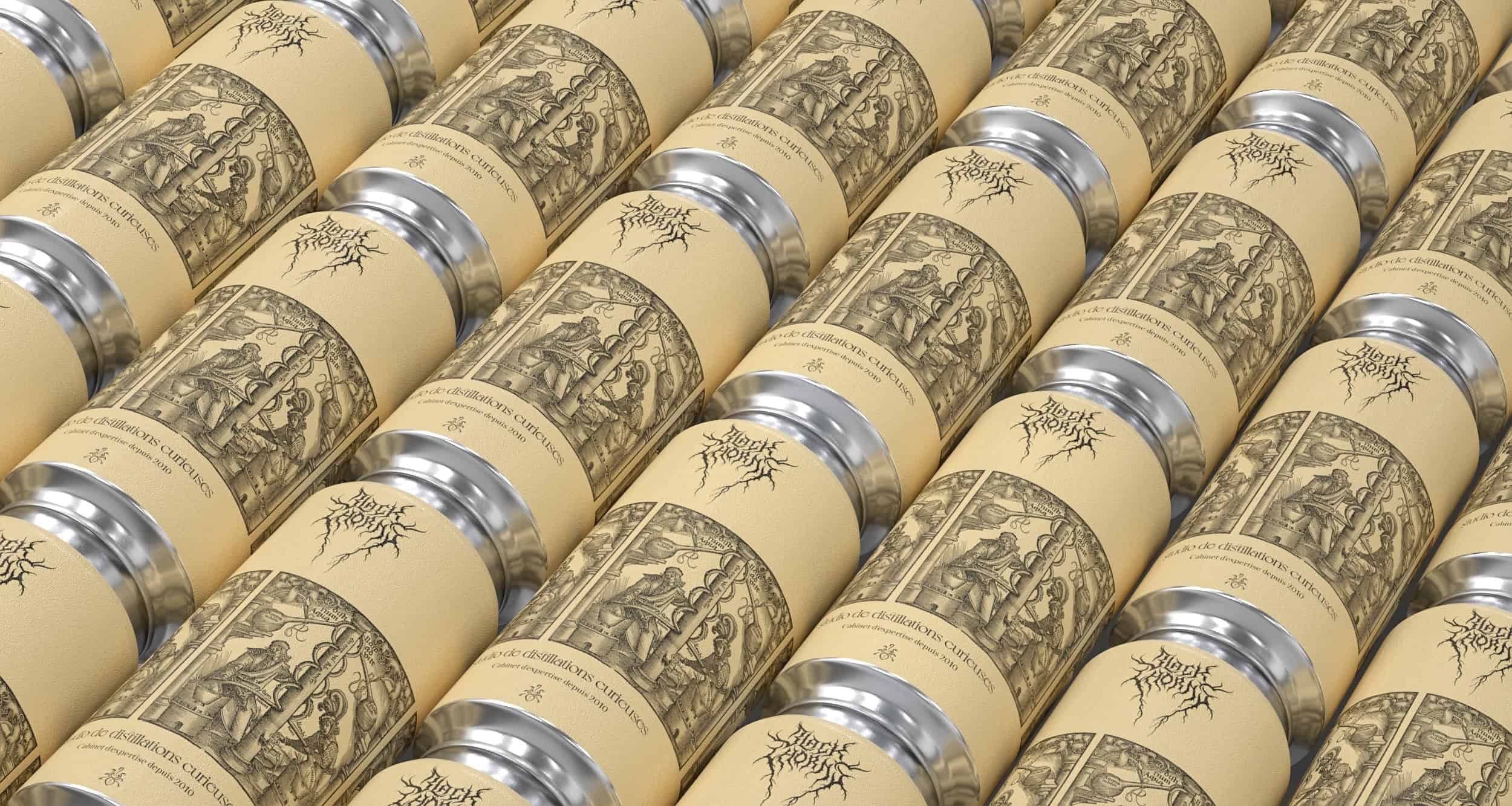
Studio Blackthorns worships difference with new logo
PRESS RELEASE
January 2022
How on earth are you going to stand out in 2022? The communications agency specializing in spirits and well-drinking is revamping its identity with a unique, differentiating concept: a logo with black metal iconography.
70 % of consumers prefer to discover a brand through original, creative content.
Axonn Media
The rise of extravagant typography (also known as display typography) is injecting a breath of fresh air into the world of modern design. Despite the purists of legibility, Gen Z brands are innovating and overturning our habits.
Some striking examples reinforce this trend, particularly among celebrities: Kanye West wears Cradle Of Filth t-shirts, Willow Smith prefers Anthrax, and Rihanna sports rock and metal patches on her stage outfits. On the style front, we noticed the British band Bring Me The Horizon's clothing line at H&M. Occultism fascinates and irreverence piques our curiosity. According to Axonn Media, «70 % of consumers prefer to discover a brand through original, creative content».
For most people, marketing is the part of a company that aims to fool the consumer. We aim to turn this thinking on its head. Our new logo embodies this allergy to marketing bullshit.
Ludovic Mornand, founder of Studio Blackthorns
«Designing a font that's too clean, timid and ticks all the boxes of so-called perfect design? What a bore! That's not my bias,» says Ludovic Mornand, founder and Brand Strategist at Studio Blackthorns.
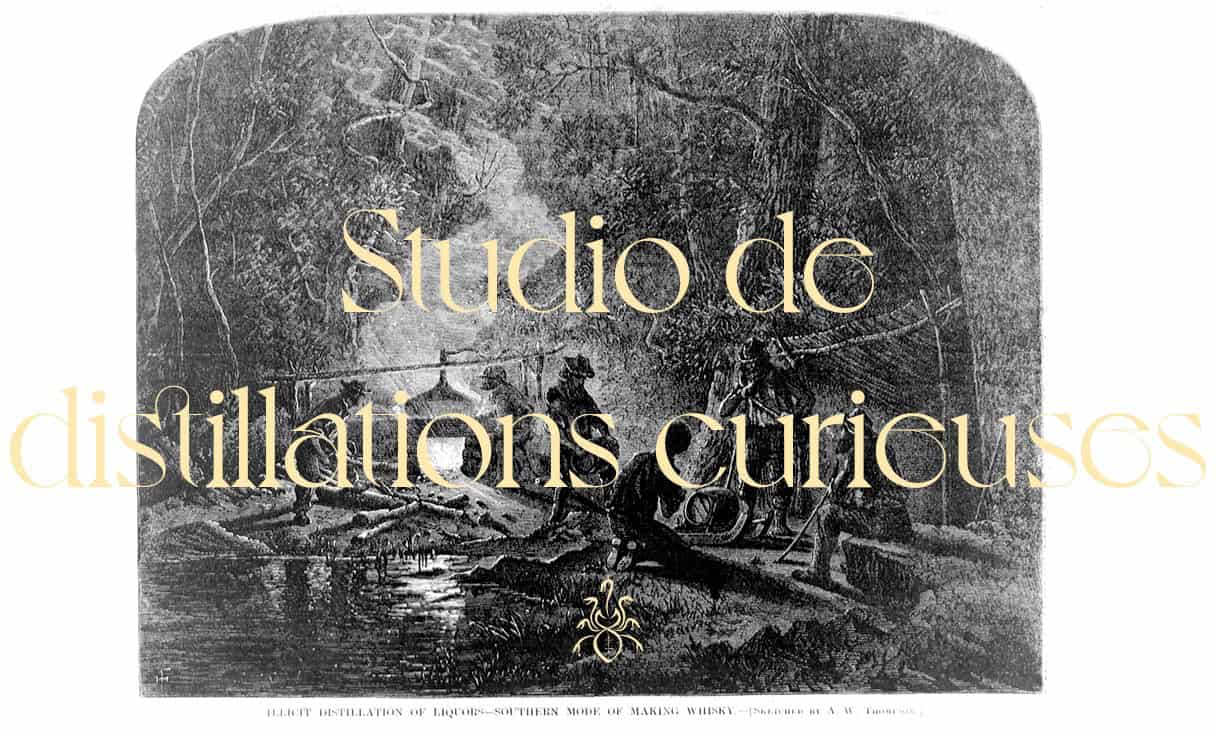
The studio, experts in «brand exorcism», opted for an organic logotype stained with peat, thorns and compost. The visual symbolizes the hard work of brewers, distillers and winemakers, but also connotes nature and mother earth.
«For most people, marketing represents the branch of a company that aims to fool the consumer. We aim to reverse this thinking. Our new logo embodies this allergy to marketing bullshit.» This rebranding is a return to our roots, a statement of assertive singularity and an ode to the strategic design studio's convictions.
Blackthorns has collaborated with Christophe Szpajdel, a true figurehead in the field. The calligrapher has created emblems for the most famous international bands in the genre (Emperor, Old Man's Child, Enthroned, Borknagar, Moonspell and even Rihanna).
The studio's original rebranding is a contrasting account of this fascination with difference, the taste for disturbing beauty and the genesis of millennia-old alchemists. The logo evokes the roots of a «blackthorn» tree, the source of fabulous sloe gins. As for their new emblem, it materializes fractional distillation in a hydra.
«We wanted to instill that authentic, tumultuous and sometimes difficult side of entrepreneurship and product creation,» Ludovic continues.
The firm's bold approach to «strategic incantations and decantations» is sure to delight devotees wishing to conjure up their projects towards a conscious and responsible rebranding.
We wanted to bring out the authentic, tumultuous and sometimes difficult side of entrepreneurship and product creation.
Ludovic Mornand, founder of Studio Blackthorns
—
Press contact: contact [AT] blackthornsdesign [.] com
More info : https://blackthornsdesign.com/promo-2022/
About Studio Blackthorns
Blackthorns is an independent strategic design studio founded in 2010 by Ludovic Mornand. Based in Lyon, the communications agency specializes in redesigning well-established companies in the beverage sector. We have recognized expertise in the world of wines and spirits, and act as expert strategists and designers. Our mission is to find the creative devices and solutions needed to make your rebranding or brand refreshment a success. We work collaboratively and consciously to bring clarity to your transformation.