hardseltzer.eth
The
concept
In order to warn against the unbridled speculation and the ecological impact linked to the emergence of alcohol-branded NFTs, Studio Blackthorns had fun inventing a brand of alcoholic sparkling water called “hardseltzer.eth”.
Services provided
- Brand Identity system
- Packaging Design
- 3D Rendering
The challenge
According to Studio Blackthorns, the NFT market reinforces the idea of the “high-class gallery” that has always been linked to investment, speculation and resale. For them, this is a first ethical brake. On the other hand, we have a digital market intrinsically associated with astronomical energy consumption. This is a second obstacle of an ecological nature.
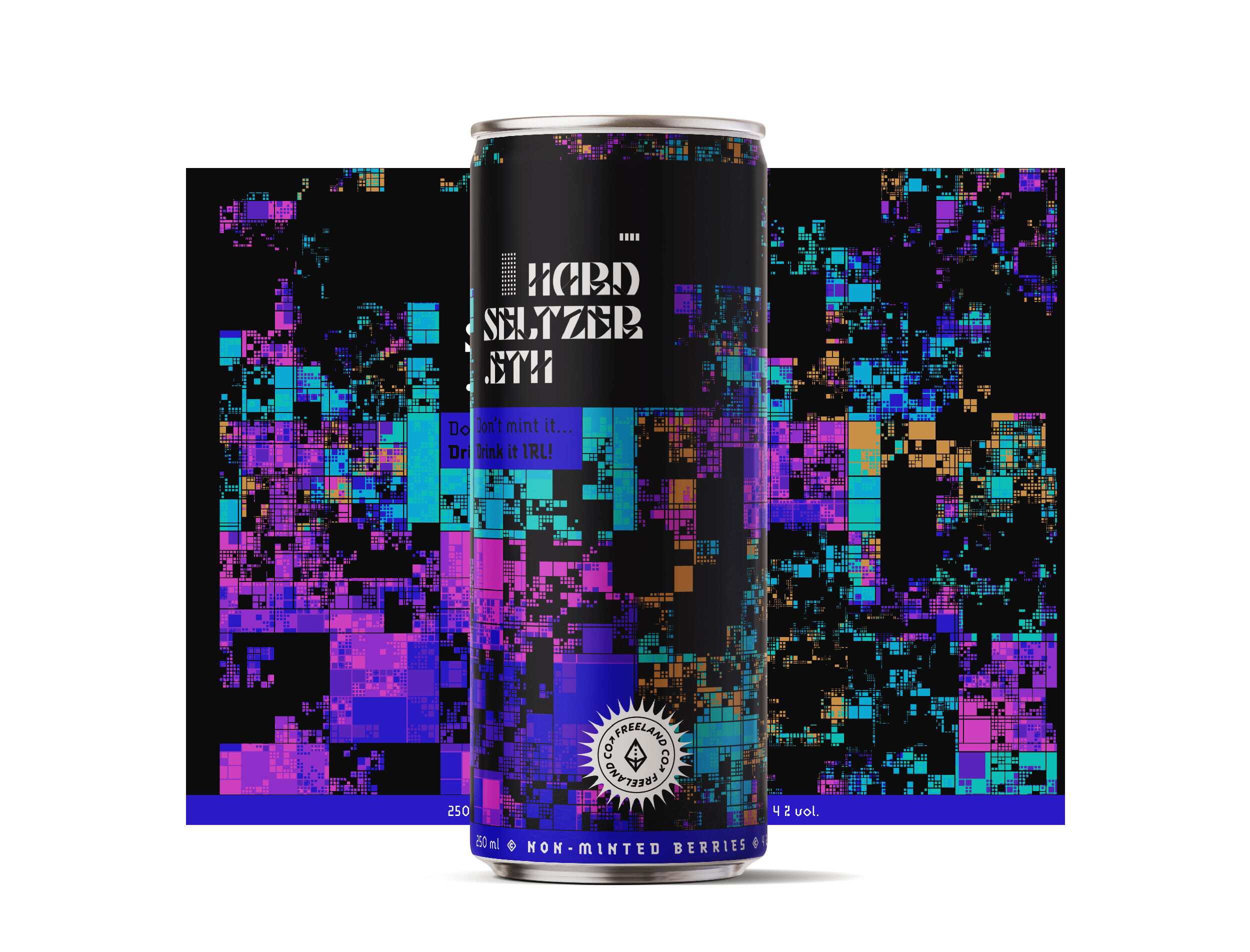
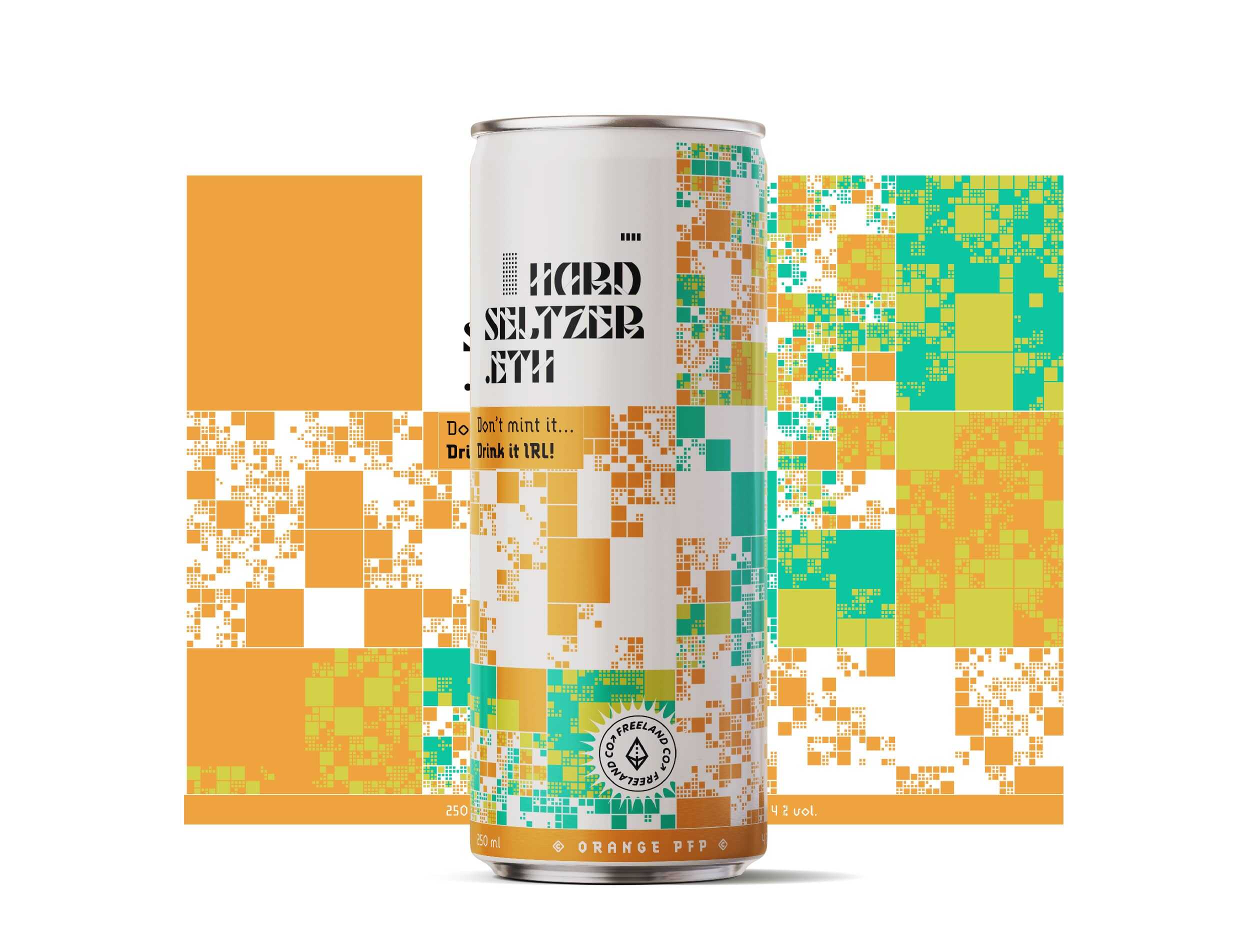
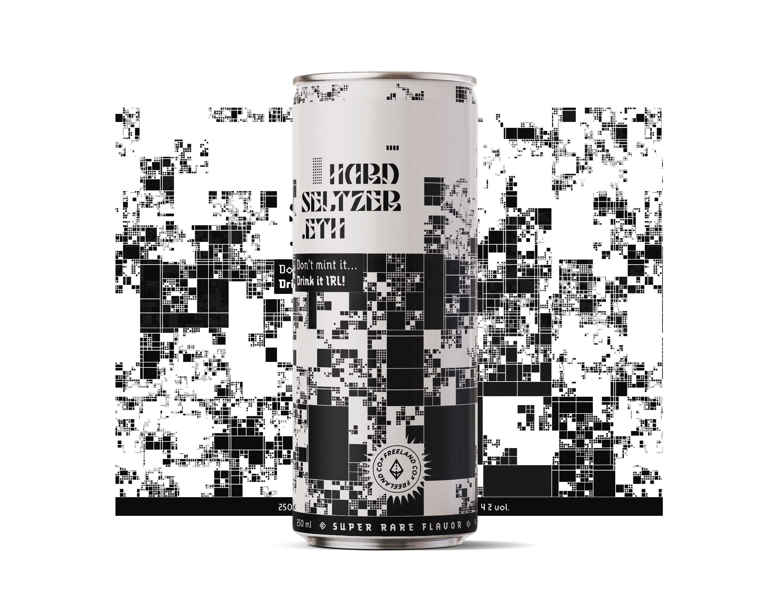
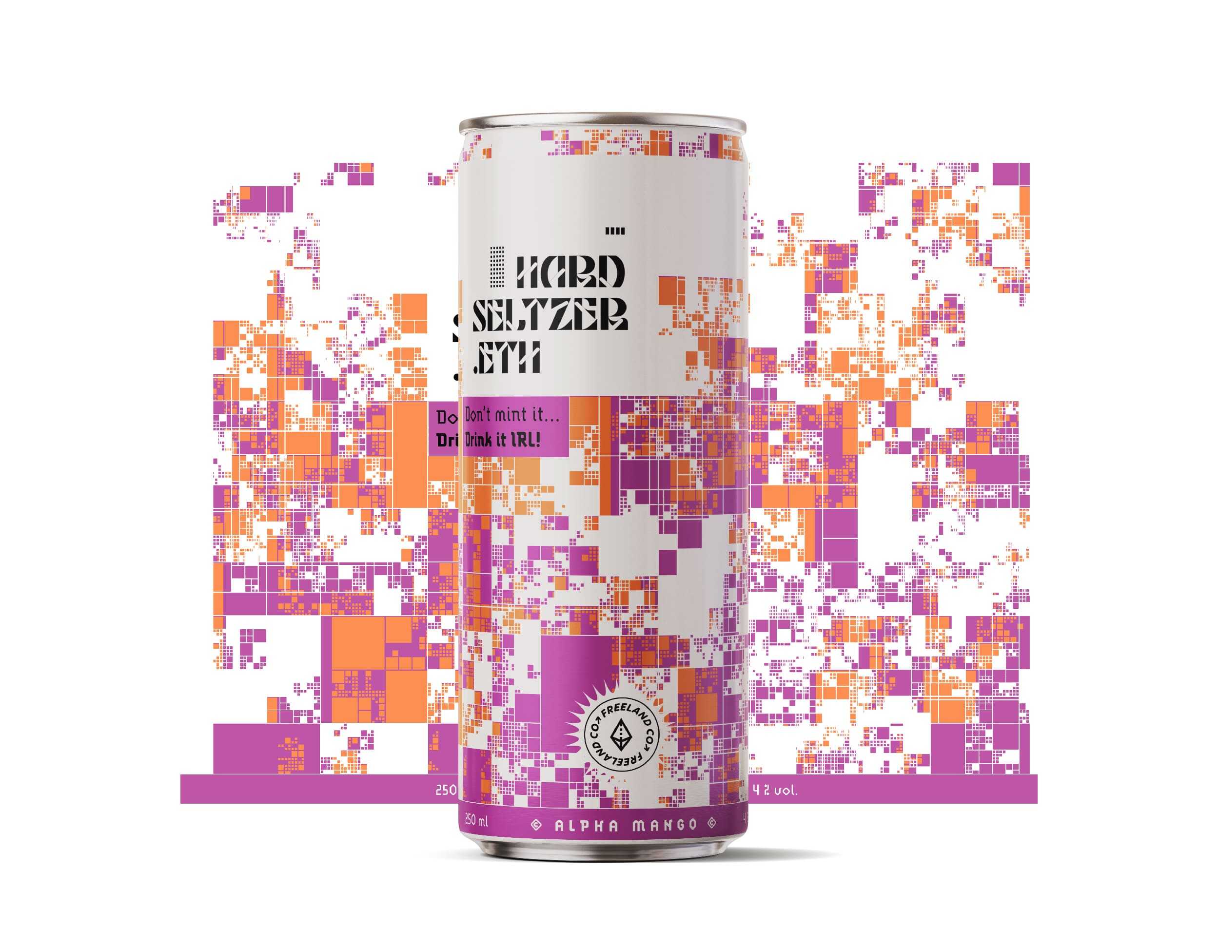
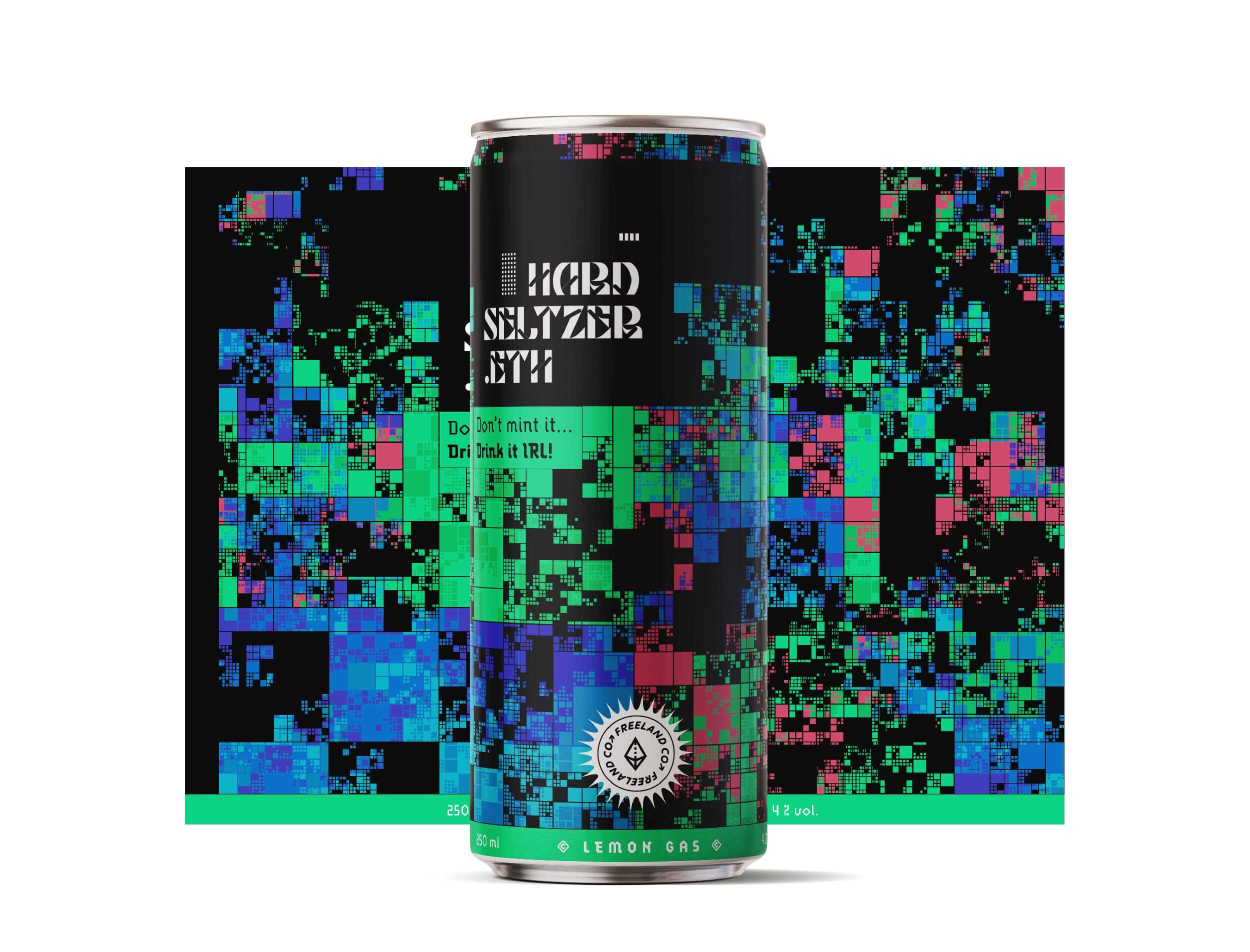
In an increasingly complex, digitalized and now “metaversed” world, Studio Blackthorns wanted to thumb its nose at the cryptofriendly world based on blockchain, NFT and Web3. Like Heineken who opens its virtual brewery on Decentraland or Budweiser who promotes its domain name beer.eth on some cans, they wanted to mix this decentralized trend with a totally conceptual project around a range of seltzers entitled “hardseltzer.eth”.
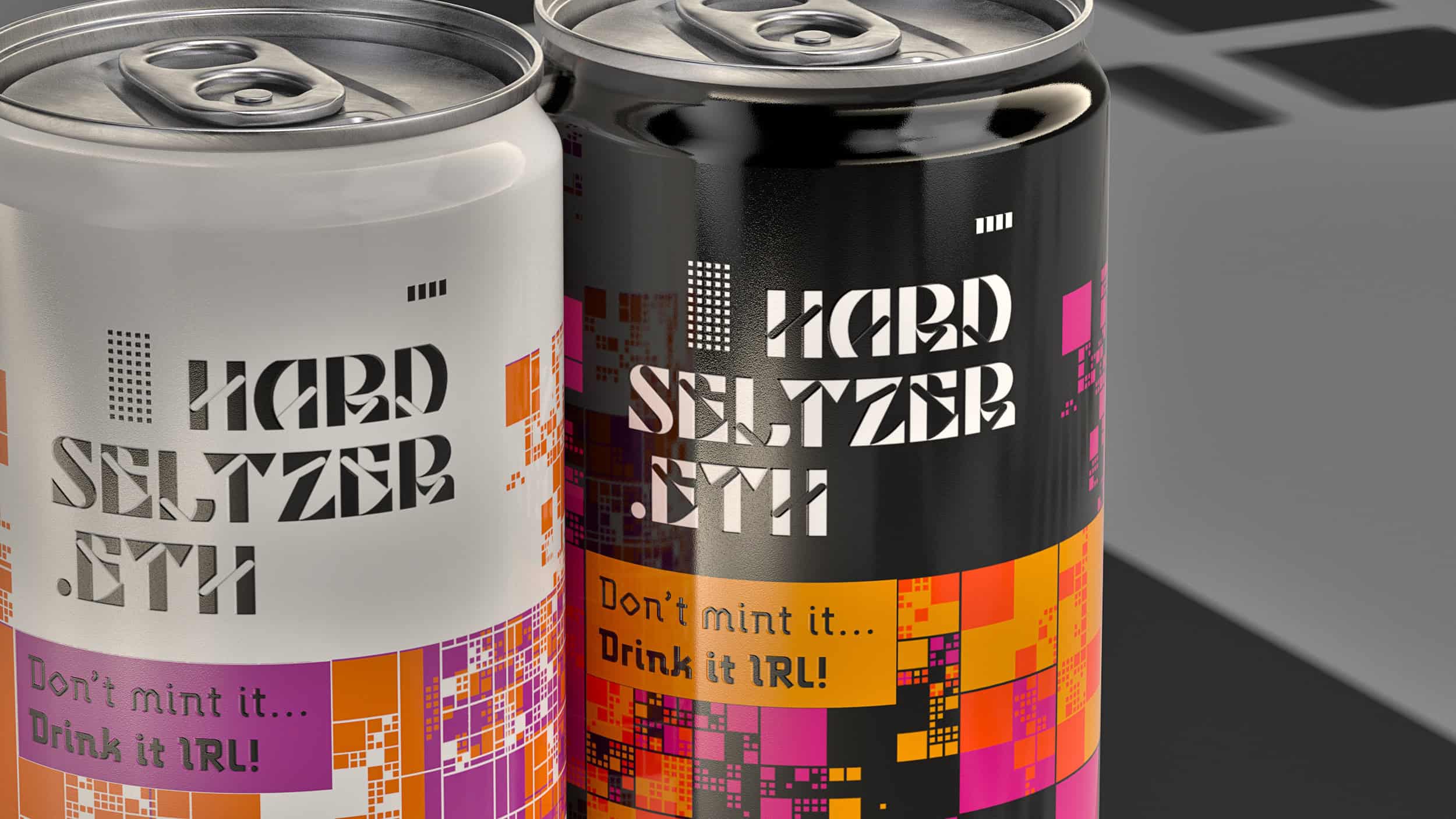
The studio’s idea was to tease “virtual drink tastings” with a slogan “Don’t mint it, drink it IRL!”.
Publications
- → Published on Packaging Of The World
Back to the future
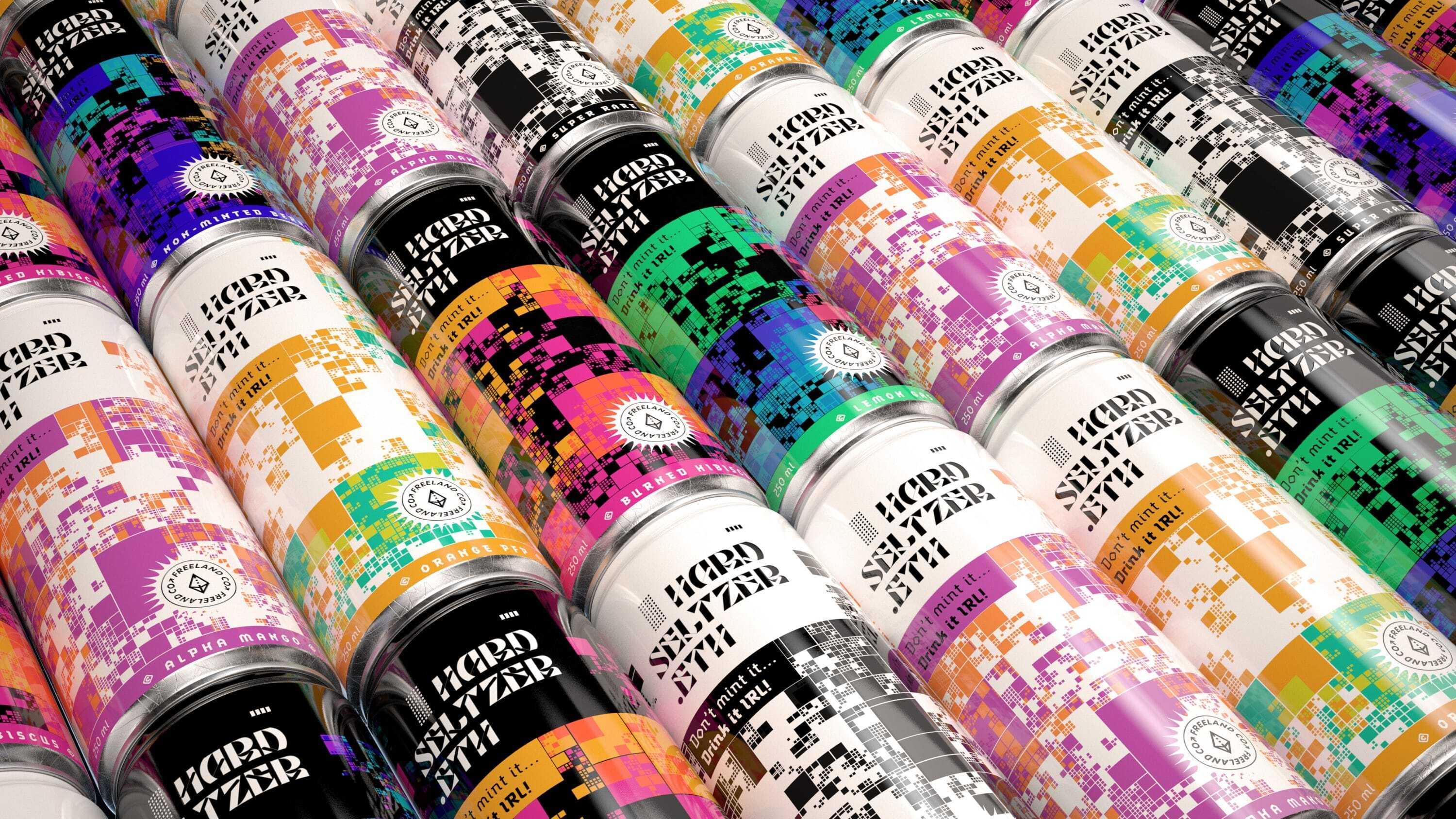
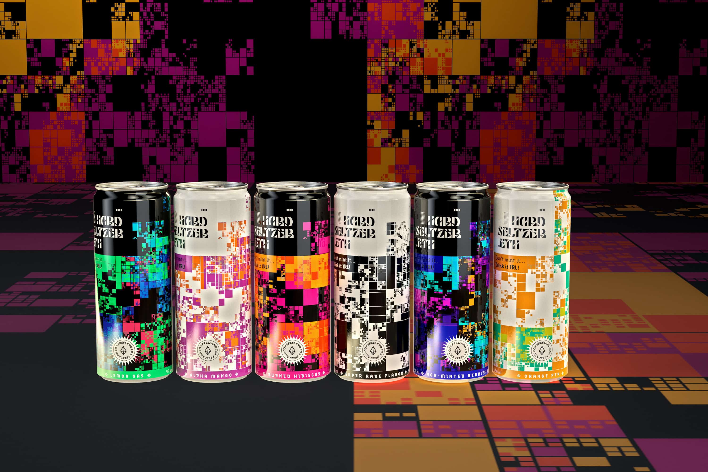
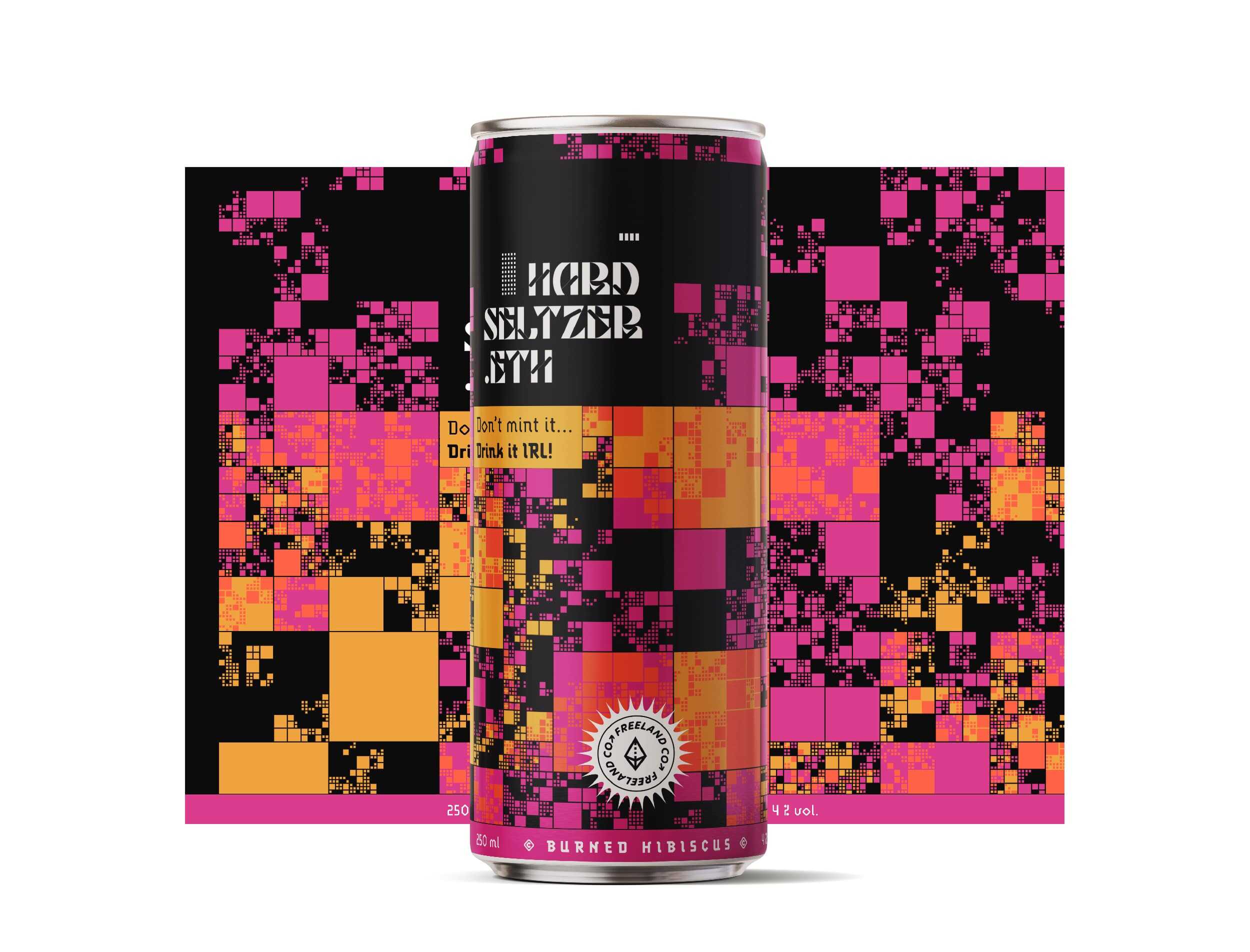
On the graphic design side, Blackthorns played with code art and generative design in order to create random visuals with an ultra-digital trend. For that, the studio used the different algorithms of Kjetil Golid’s website generated.space. We can note that the fractal square effect used reminds us of the (pretty damn) expensive “virtual lands” of Decentraland, The Sandbox and MatrixWorld. Moreover, they chose the name “Freeland Co.” as a company name to highlight the hypocrisy of the prices of a piece of virtual land on the metaverse.
From a typographic point of view, Studio Blackthorns wanted to start with something futuristic and opted for the beautiful Barrett Reid-Maroney font called Wren.
Finally, in order to stay in the neo-future-geek semantics, the agency had fun naming its different flavors like this: Lemon Gas, Alpha Mango, Burned Hibiscus, Non-Minted Berries, Orange PFP.
HARDSELTZER.ETH - Don't mint it, drink it IRL!
Scope of work
Brand Expression
- Naming
- Visual Identity
- Product Design
- Packaging Design
- 3D Rendering