The global coffee and tea market is constantly evolving to meet changing consumer demands. À...
In recent years, whether in Lyon, Paris or (above all) Melbourne, I've witnessed the meteoric rise of the craft beer market. No more going to a department store and buying a pack of 1664, Heineken, Pelforth or Carlsberg. Now, you can buy your beers in bottle shops or liquor stores. What I've observed here is that Australians are very good at setting up walls of beer cans, each more beautiful than the last, in specialist stores. It's simple, I feel like a child in front of multicolored candies! I was also surprised by the can packaging, as if glass bottles had become a thing of the past.
Many new craft breweries have chosen to package their beers in opaque cans. However, this is still a minority choice, with only a quarter of the French market concerned. According to a study by The Drink Box, 27 % of beer consumed in France comes from cans. In the collective unconscious, the can is still the symbol of low-end beer or «beer for the redneck». But is beer really better in the bottle? Despite what some may think, cans are the best packaging for storing beer.
Put an end to prejudices: here are the main benefits of the beer can 33 cl or 50 cl.
cans are made of aluminum or steel. The container is totally opaque and hermetically sealed. As a result, neither air nor light gets through! Glass bottles, on the other hand, can be tinted in a variety of colors to attenuate light, but are not opaque to 100 %. What's more, the screw cap is susceptible to gas leaks. These two aspects are very important not only for preservation, but also for taste. The sun's rays can sometimes oxidize beers, especially the hoppier ones. However, one thing remains impossible for canned beers: refermentation and aging in the bottle. Last but not least, whatever the packaging, Beer must be drunk from a glass to release its full flavour.
A can can refresh very quickly - 280 times faster than a glass bottle! Tip: to speed up the cooling process, try wrapping your cans in a damp cloth and placing them in the freezer.
Aluminum and steel cans require less energy and are 100 % recyclable. Cans are still the most recycled packaging in the world. It only takes 60 days to find a used can on the shelf! 76 % of consumers say they sort their cans.
Aluminium cans are stackable and 1,000 times lighter than glass bottles. This saves space and facilitates the transport of goods.
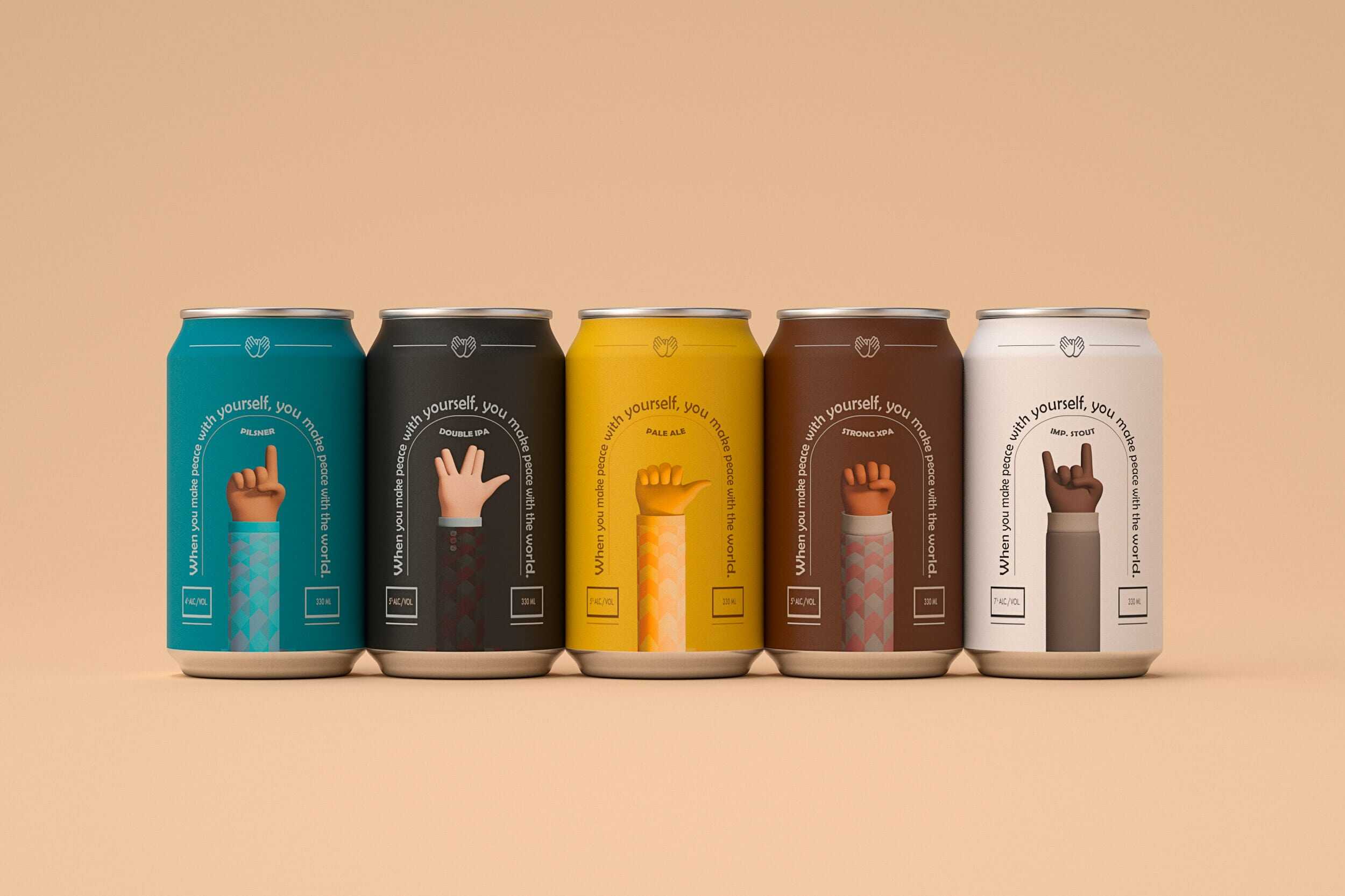
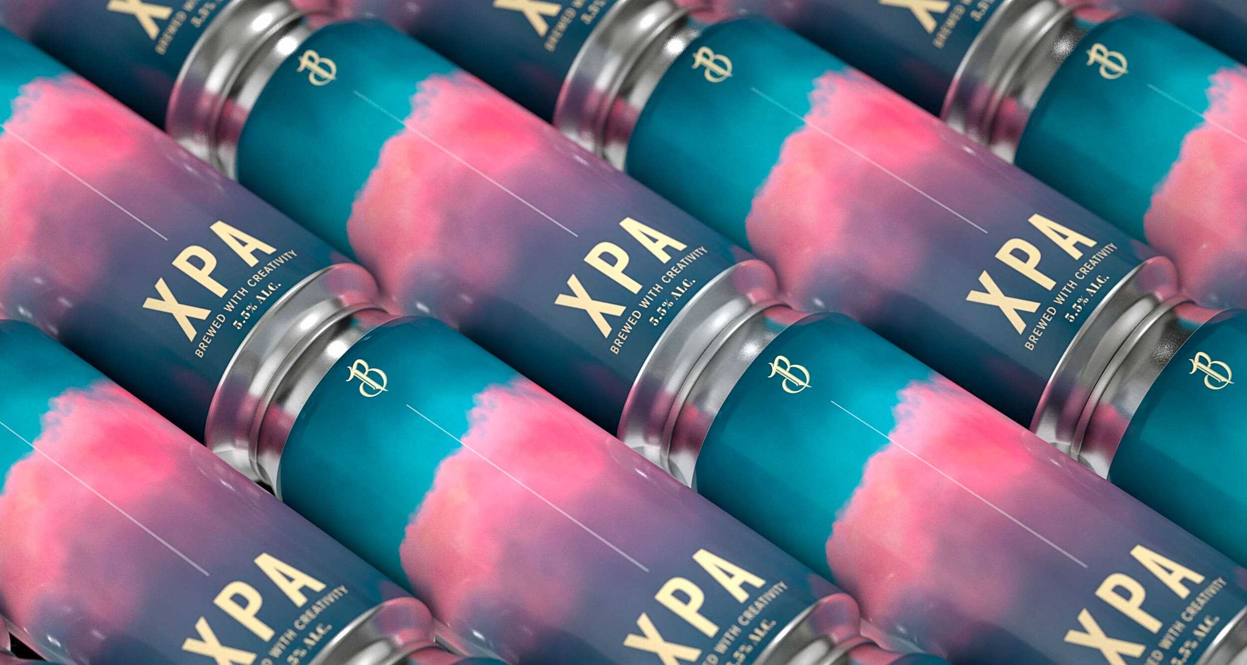
Let's get to it! The most important aspect of a company's blog Studio Blackthorns ;). Can design is in full swing these days. And this creativity tends to make the product much more friendly and qualitative than before. The entire surface of a can can be decorated, providing a genuine space for artistic expression. identify the brand. The plasticity of the material also allows for reliefs, velvety or shiny over-alls, and all kinds of originality.
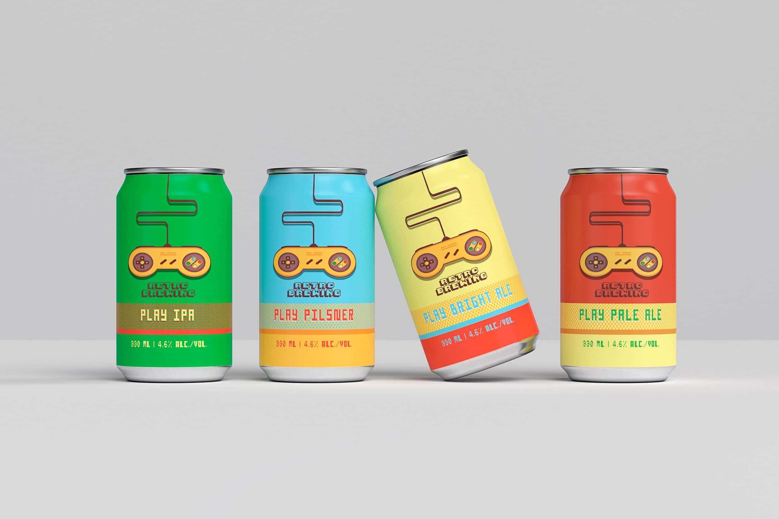
So, in the craft beer aisle, my eyes dart from can to can, wondering what differentiates an IPA with an abstract, colorful design from another IPA on which you can make out beautiful sans serif typography on the label. In the end, does it really matter? Whatever I choose, they'll all be beautiful, and I'll have something to invite home, with a touch of creativity as well as taste!
This phenomenon of hesitating when choosing a beer is still relatively new. Back then, choosing a beer was simpler. There were the classics described above, and possibly flavored beers such as Desperados. Nowadays, choosing a beer is almost like becoming an art critic at MoMA! That said, my wallet would rather buy a To Øl Beer than a Jackson Pollock dripping!
Independent microbreweries are booming, and the result is new life for beer labels and packaging. According to beer journalist Gilbert Delos, «a new brewery opens every other day in France, and by the end of 2016, the number had surpassed 1,000». In the U.S., there were 1,650 craft breweries 10 years ago; today, there are over 7,300, and the number keeps rising! This is good news for beer lovers, a little less so for indecisive consumers who make a decision based on what they think is cool. The problem now (if you can really call it a problem) is that all the new beers look cool!
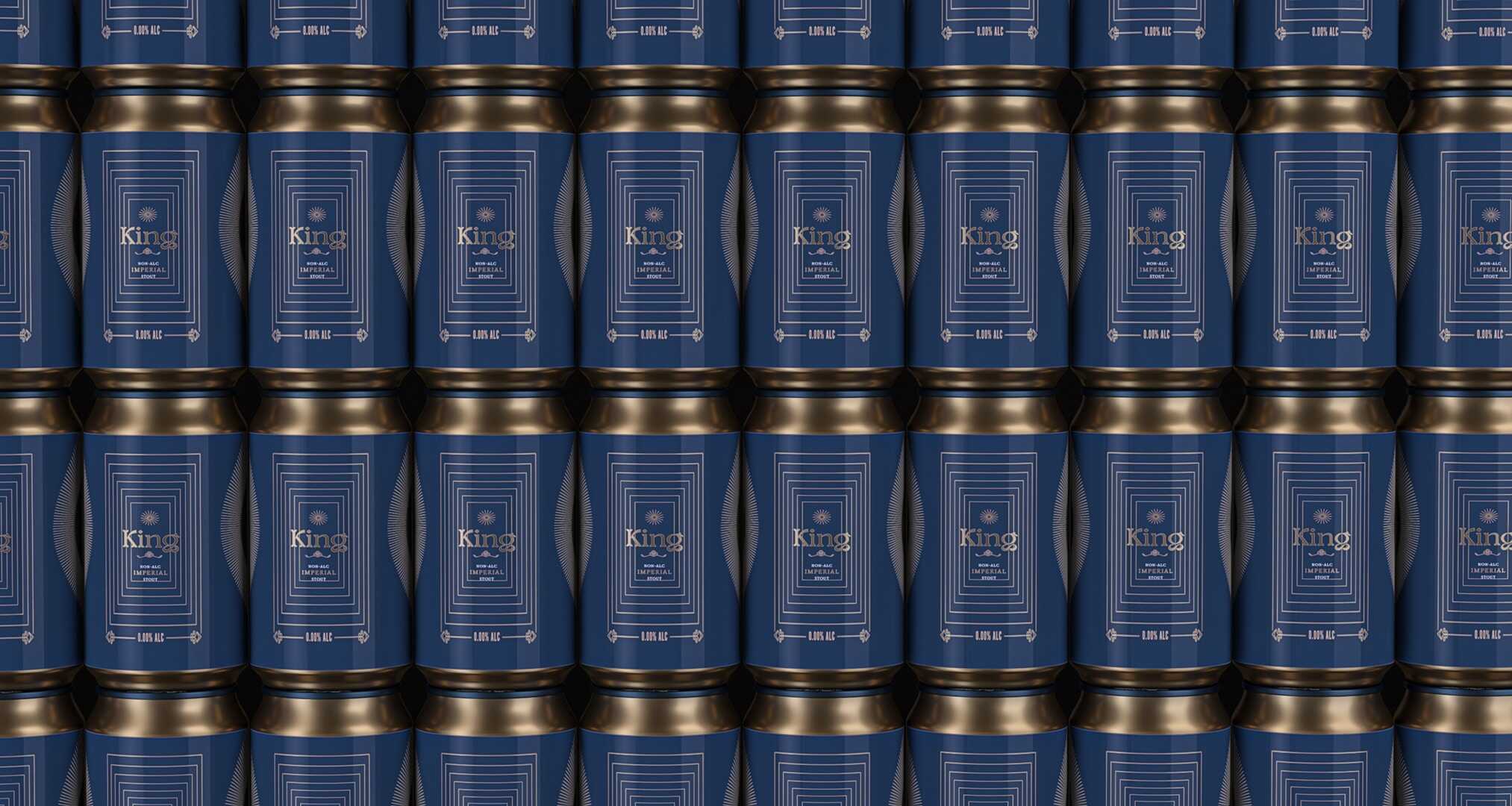
The trade magazine Caña recently wrote «beer cans are officially the new record sleeves», and it's true. While the big brands surf on their notoriety and durability, craft beers have adopted a more experimental approach. Indeed, they manage to distinguish themselves with their label design to capture your attention as you scan the refrigerator shelves.
Beer cans are officially the new record sleeves.
Caña Magazine
«A large number of shoppers arrive at the store with no idea of what they're going to buy,» says Julia Herz of The Brewers Association. «The main stress in retail is standing out. A beautiful label is a business card. It's a chance for breweries to convince you to choose their beer and not the one next door.» Herz adds, «Craft breweries generally don't have the same marketing budget as the big brands. Most rely on word-of-mouth and local marketing.»
Once upon a time, when craft beer was still in its infancy, breweries would make their own labels in-house, or ask a friend or local artist to lend a hand. «There was something authentic, even innocent about it,» says Oceania Eagan, founder of Blindtiger Design, a Seattle-based agency specializing in visual identities for breweries. «This innocence meant that people could design labels with a hodgepodge of non-hierarchical information. Today, that doesn't work anymore.» Over the past five years, this market has reached such a level of maturity that breweries have decided it's essential to engage graphic design studios to help them communicate visually.
Today, breweries, distilleries and wineries are recognizing the impact of attractive visuals on sales.
Ludovic Mornand, founder of Studio Blackthorns
Studio Blackthorns is one of these communication agencies specializing in branding and design packaging for alcoholic beverages. Ludovic Mornand, founder of the studio, says: «Today, breweries, distilleries and wineries recognize the impact of a beautiful visual on sales». On the other side of the Channel, another Glasgow-based agency called Thirst Craft, has also been nestled in the drink since its inception. Founder Matt Burns explains that he has not only witnessed this meteoric rise, but has also noticed that companies are becoming more discerning and fussy about their visual identity. Indeed, the strategic background is now inseparable from the visual identity. In other words, brand identity has taken root in the craft beer sector, and breweries now understand the business case for building a consistent visual identity.
Like most consumer products, a beer label must have its own nomenclature and legal information. According to Isaac Arthur, co-founder of CODO Design, When someone wanders into the aisle, the first thing they look for is the style of beer. Is it a thirst-quenching beer? An IPA? A pale ale? A stout? It has to be clear. «Then they'll focus on the brewing and the brewery. Then they'll be interested in the tasting notes or the authenticity of the story».
«Style helps,» he says, «but like all visual trends, what you see on the shelf is cyclical. What's more, the fact that many beer brands are moving towards the same trends means that aisle shelves quickly become uniform. Right now, we can see a return to illustration and bright colors.» (Editor's note: this is also the case in web design over the 2019/2020 period). Arthur adds, «I think next year we'll see more sober, minimalist packaging. That's the game.»
Isaac Arthur and his team have created brand identities for over 50 breweries. They have also written a book on the art of beer called « Craft Beer Branding Guide« a tutorial on how to set up your own brewery. For a certain type of consumer, beer is no longer seen as a product purchase. It has become a genuine leisure activity in which these people are willing to spend money. Branding must therefore reflect this phenomenon. «If you think about the core target for craft breweries, it's historically a younger audience with money to spend,» he says. «It's an expensive product. It's a luxury in itself even if it's not a Rolex.»
This realization has led many traditional breweries to rethink their strategic and visual approach. Boulevard Brewing, a Kansas City-based brewery since 1989, began rebranding in 2015. At that time, at least one brewery opened every day. Competition on the shelves was intense, and the American brewery had more than 25 different beers to its credit. Each beer was given its own individual branding design, with its own recognizable logo. «We had to standardize our identification system so that our products are recognizable from afar,» says Frank Norton, Art Director at Boulevard Brewing.
The story is the same for the country's other breweries, which are now facing increased competition in their niche markets. When KettleHouse, a Montana-based craft brewery, went into business in late 1990s, hiring a friend and local artist to create their logo and beer packaging. One of the cans featured an illustration of a fisherman by the river wearing a denim shirt. «Our younger staff called this image ‘Grandpa’,» says Suzy Rizza, co-founder of KettleHouse. «It didn't resonate at all with the post-boomer generation.»
KettleHouse decided it was time for a rebranding. When they started brewing beer, they were pioneers in their region. Today, there are more than 9 breweries in Missoula, with a dozen more in the pipeline. The owners saved up for a year to budget for their redesign by CODO Studio. «We decided it was time to refresh our communication,» says Rizza, «People are overwhelmed when they look at the shelves today, so it's imperative to make its image a little more attractive.»
I remain convinced that the taste of a beer must be fundamentally linked to its look.
Matt Burns , Thirst Craft
The influx of artisanal products and the design of craft beer packaging is a natural evolution in our modern, image-driven world. According to Matt Burns, «We drink with our eyes.» He adds: »I'm convinced that the taste of a beer is fundamentally linked to its look.. »For Ludovic Mornand, «the consumer trends are not limited to a single criterion. We find that beverage drinkers see design as intrinsically linked to the character of the brand, and also to their own lifestyle».
According to an article in Liz Stinson, published June 11, 2019 on AIGA Eye On Design.
Related articles
The global coffee and tea market is constantly evolving to meet changing consumer demands. À...
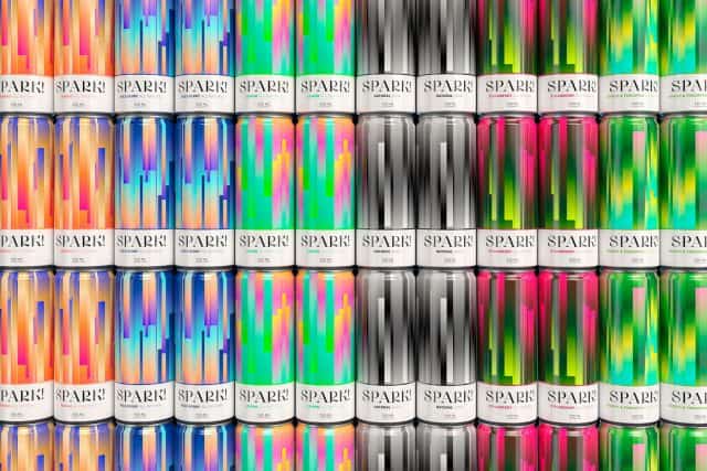
Spark! Soda by Studio Blackthorns The essentials in 30 seconds Market size: The soft drinks industry is expected to grow...