Brewlander
The story
Brewlander is one of Singapore's first craft breweries. Part of the brewing industry since 2016, the brewery previously produced in Thailand and called itself a «gypsy brewery». Now, it has equipped itself to brew its beers at home in a gigantic, newly renovated facility and a state-of-the-art brewing station.
Despite their growth and reputation in the local craft scene, the brewery wanted to redesign its brand identity. The main problem they were facing was the lack of consistency in their communication and the fact that their image did not reflect their core values and origin. Their desire: to expand beyond the craft scene by offering their beverages to a more diverse population while remaining independent and groundbreaking. That's how Studio Blackthorns started working on their strategic rebranding in 2020.
Services provided
- Strategic design
- Brand Identity system
- Marketing resources
The approach
In order to align their brand identity with their core values and give birth to a strong identity that is steeped in history, Studio Blackthorns has undertaken a scrupulous analysis of the competition in the beer market in Asia. We have also reviewed the marketing and communication trends in the global landscape in order to structure the strategic approach to their rebranding. We initially focused on the Perenakan culture, occupying a special place in the history of the region in relation to the immigration of the Chinese population from the 15th to the 17th century.
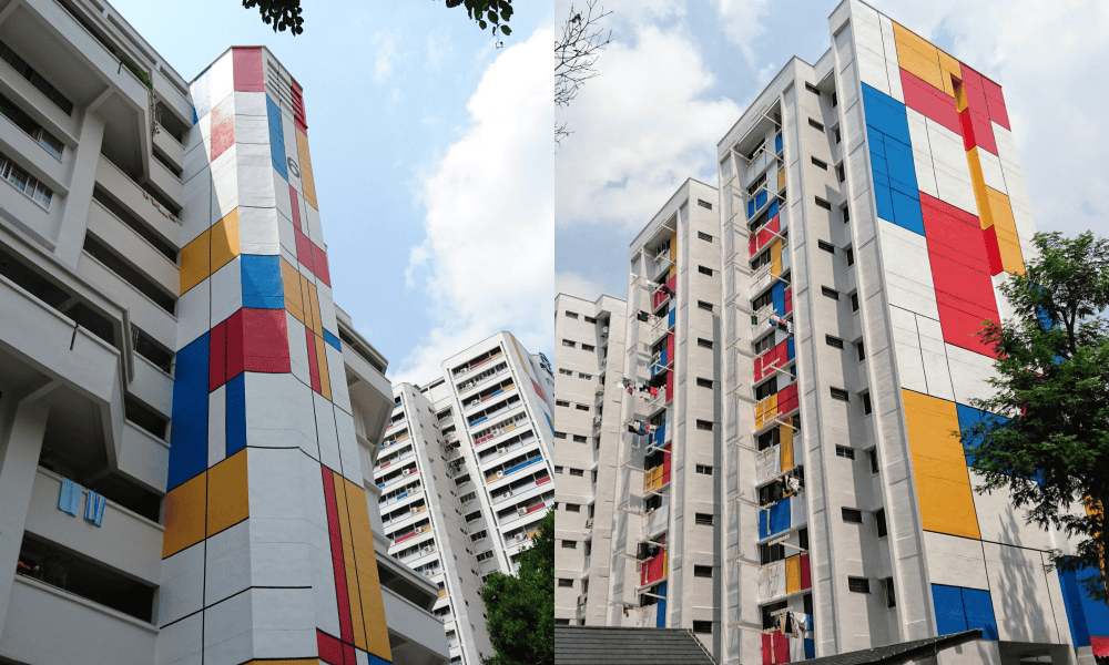
However, after consultation with the Brewlander team, this track seemed too traditional and perhaps less exportable internationally. So we focused on Brewlander's history and its DIY (do it yourself) beginnings, when John brewed his beer at home in a popular district of Singapore. We proposed various creative paths focused on Mondrian-inspired HDB flats. This way, Brewlander is growing without losing sight of its origins and inspires confidence among its consumers.
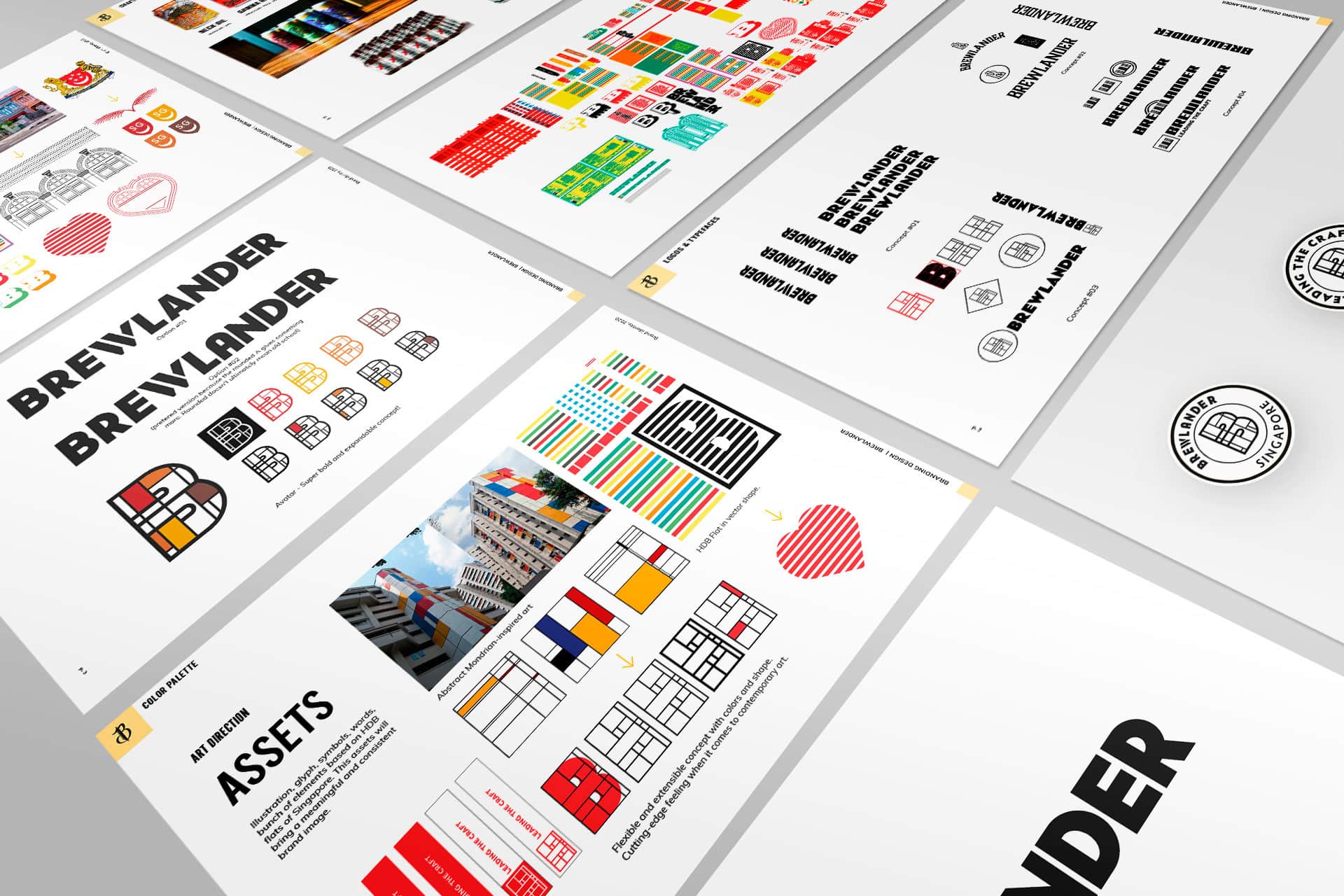
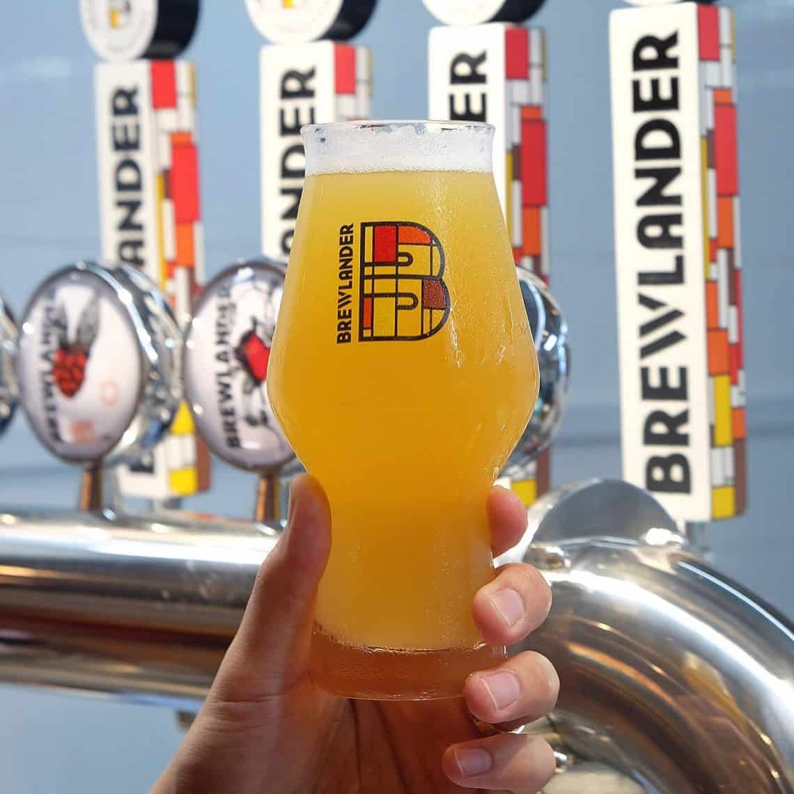
Our letter B perfectly encapsulates the backbone of our origins. From John's innocent brewing hobby in his little HDB flat, and our upward journey in the local craft beer scene, this emblem signifies determination, passion and pushing boundaries.
Brewlander
Visual Identity
The Brewlander font was selected and redesigned to incorporate elements of their values and vision. We have a modern sans serif typeface, with a slightly cut 'W' to bring back the cutting-edge feel of the brewery. The letter 'A' has been rounded off in order to keep the arch shape of the traditional architecture but also to make it more recognizable.
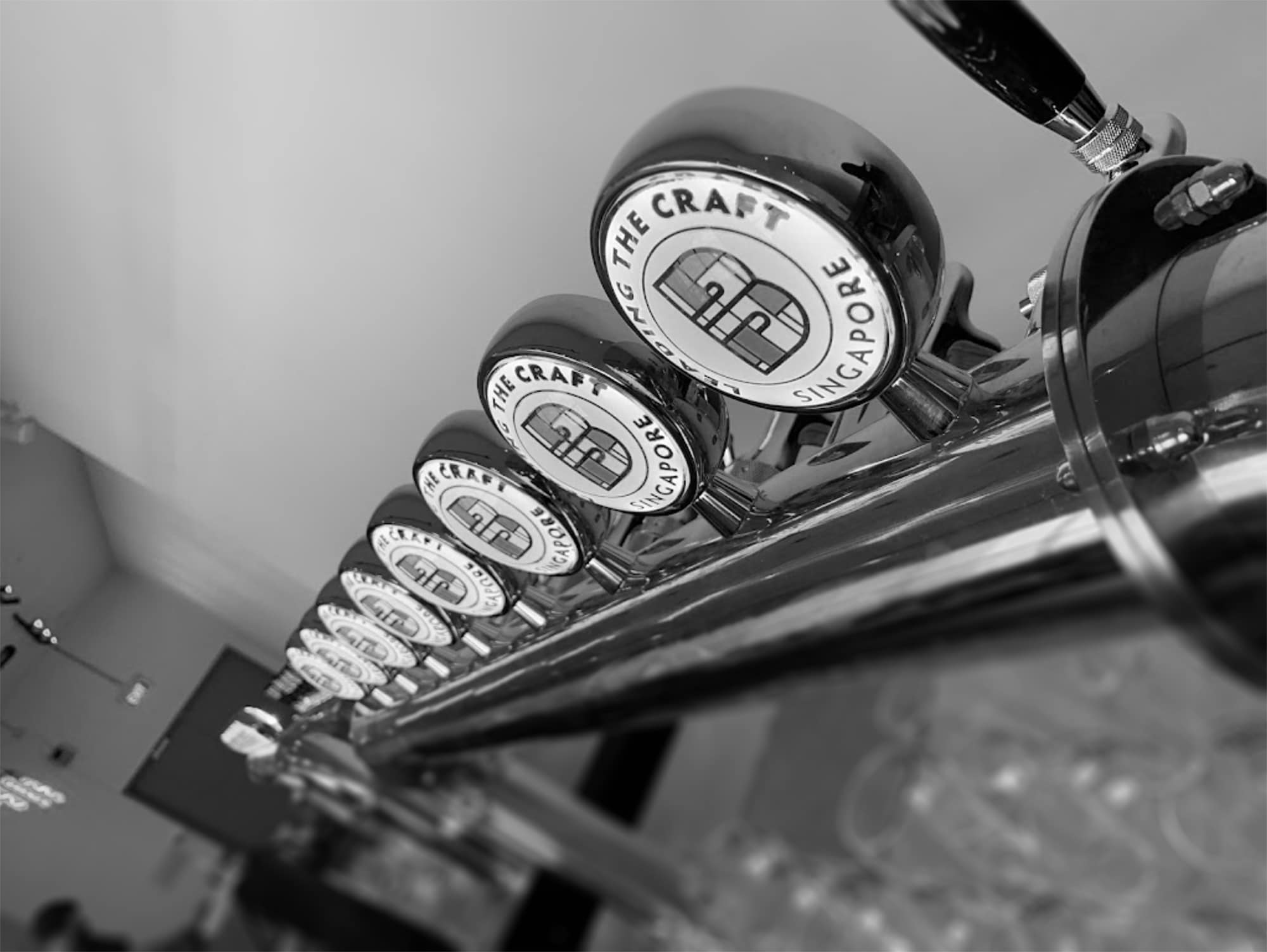
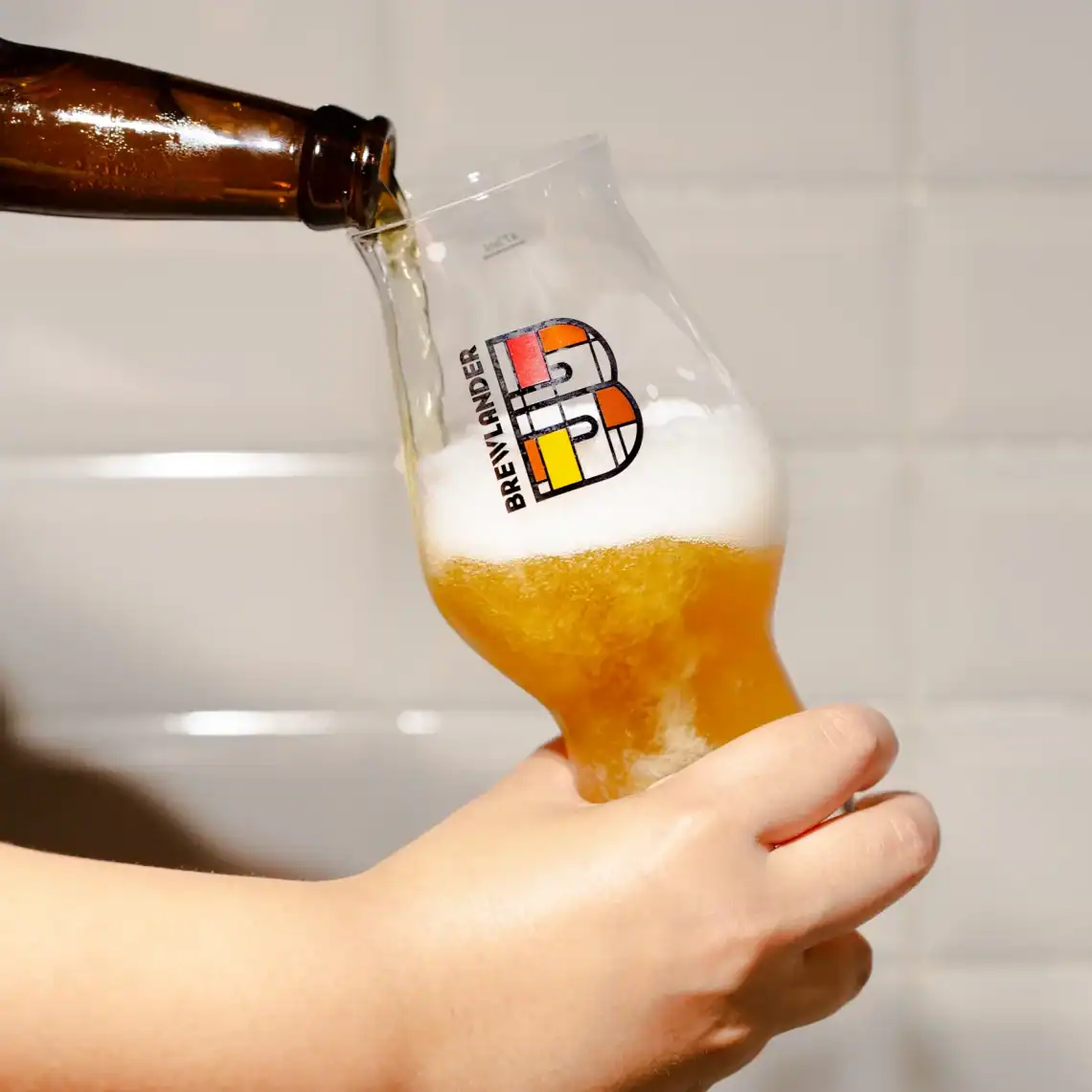
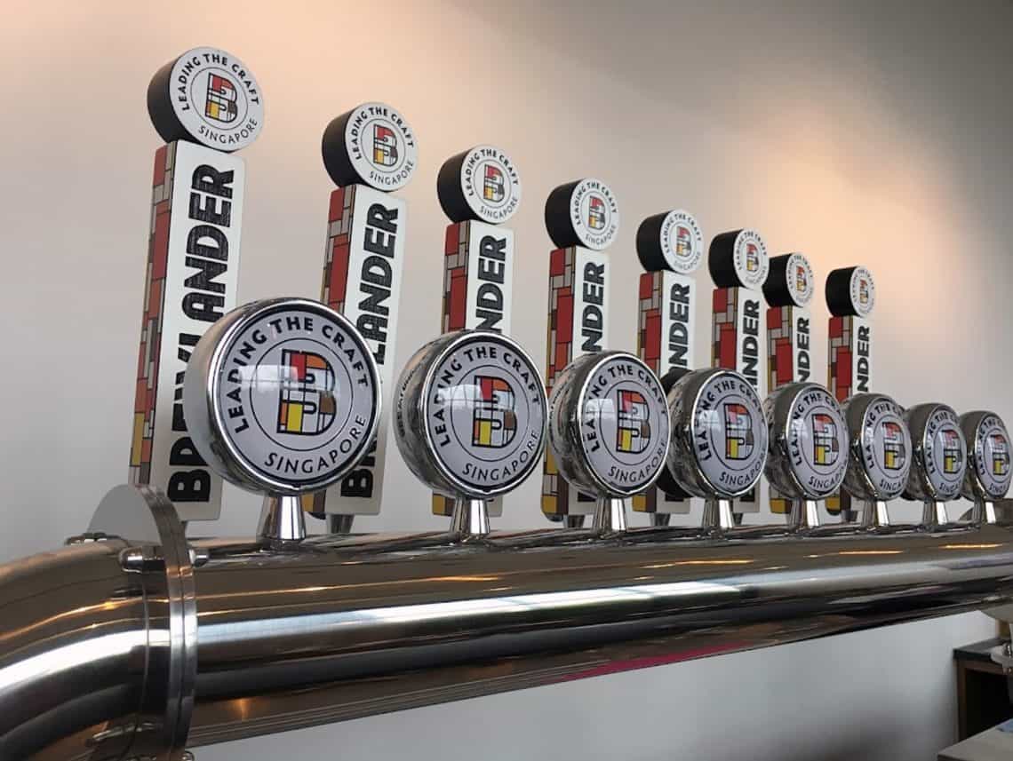
The avatar, a squared B, is inspired by the HDB Flats and Mondrian. We have thought about its use for social media platforms and the flexibility of possible animations. Thus, Brewlander is proud to have a disruptive MTV-like mark and can enjoy a wide range of designs and colours to develop its visual communication. We have created different badges in the colours of their core range (Love, Hope, Joy, Respect) and we have redefined a brighter colour scheme.
Alongside the launch of our new brewery, we are also proud to announce that we have a sexy, spanking new mark!
John Wei, founder of Brewlander
Scope of work
Brand essence
- Strategic design
Brand Expression
- Brand Identity system
- Branding design
- Label design