Creating and positioning a canned wine brand in France
Benjamin Furlan, President of Tastevin, approached Studio Blackthorns with a view to launching a range of wines in cans. Knowing the stigma attached to this type of packaging for wine in France, the task was not an easy one. But at Blackthorns, we like big challenges! And above all, we like the boldness that comes out of this type of Anglo-Saxon project.
Benjamin learned about Studio Blackthorns from 366 Cans Challenge of 2020 and the podcast SuperPotion™. The founder of’Uchronic Wines wanted our agency to support them in their brand creation process. Our expertise drink has propelled the brand of wine despite the delicate context of the Covid-19 pandemic.

What strategy for canned wine in France?
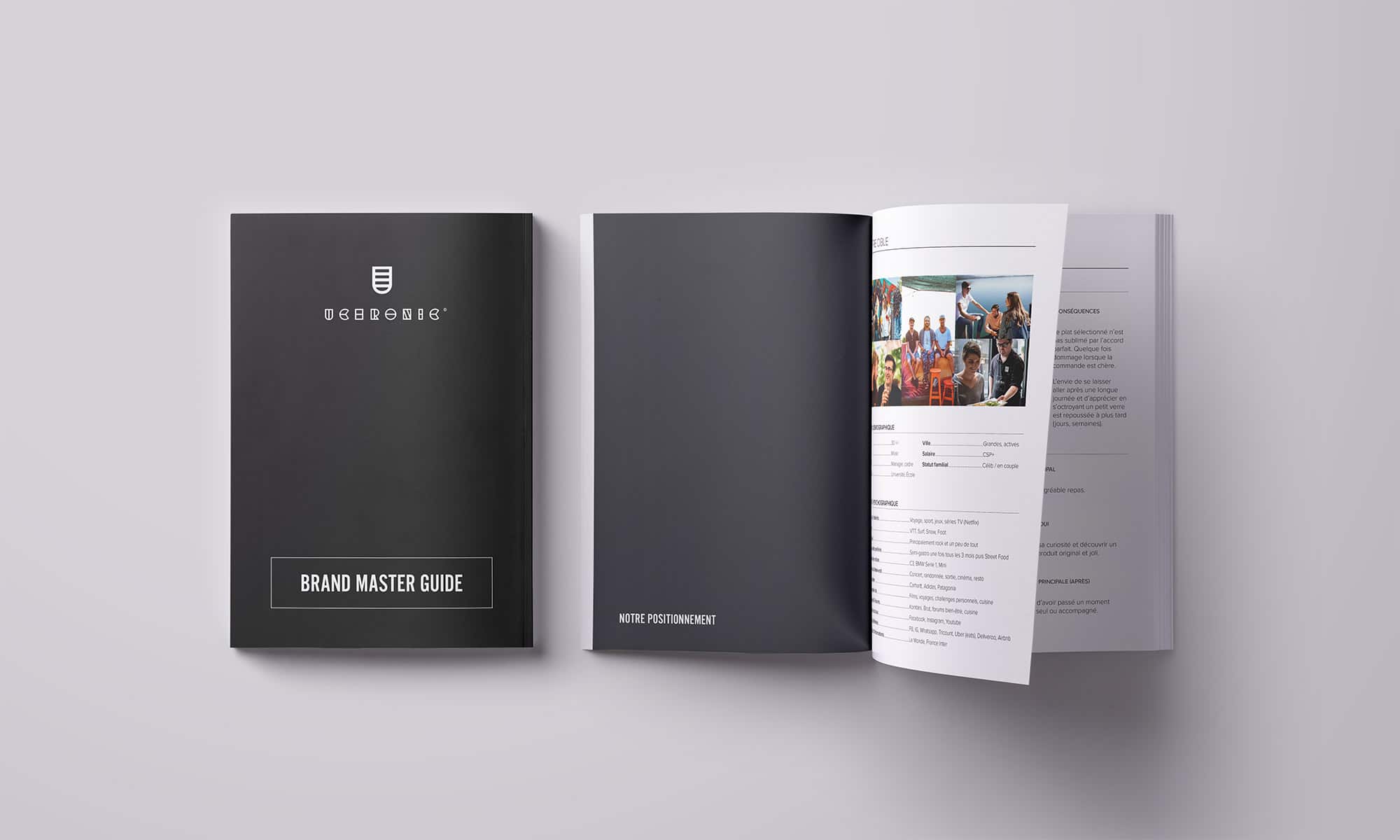
Based on a rigorous selection of the best wines and grape varieties of Southern France, Uchronic's aim is to bring a new choice to the street food community and to urban consumers: the choice to sublimate their dishes at all times by offering them a suitable, qualitative and sustainable drink. This way, their brand's mission is to be present in neo-restaurants offering Street Food on the spot or to take away. We've worked together to strategically define the essence and brand expression of Uchronic Wines.
From this association has grown a effective branding and positioning and beneficial to Uchronic's development. Through a succession of Zoom calls and intensive workshops, we helped the brand's decision-makers define its DNA and refine its positioning strategy in light of the health crisis. These methods, combined with strategic introspection and careful listening by the studio, enabled Uchronic to transform itself into a unique, recognizable brand ready to make its mark on the French canned wine landscape.
The brand we've created is not our own, it belongs to our customers. They are the ones who created this brand in their image and Ludovic has been able to develop its essence with brilliance and professionalism.
Benjamin, Founder of Uchronic
A retro-future brand identity
Developed during the period of a world in confinement, the Uchronic brand is itself a fiction. Inspired by historical periods revisited, it evolves between the contemporary punk deco worlds of 1920s Prohibition and near-future cyberpunk. Fundamentally traditional and deliberately futuristic, Uchronic wines are timeless and sometimes technological. They straddle two millennia. Multigenerational, they link two worlds: physical and digital, and propel gastronomic tradition into the future.
From this reflection was born a strong and recognizable visual identity. The logo reflects this "augmented tradition" with its digital coat of arms and futuristic typography. The logo is a reminder of the coat of arms of yesteryear, but also reminds us of a measuring glass. On the typographical side, the letters are split to connote the precision of the blending but also the idea of food/wine pairings being the positioning of the brand. The vivid colour chart between pop culture and futuristic clarity takes us back to this uchrony.
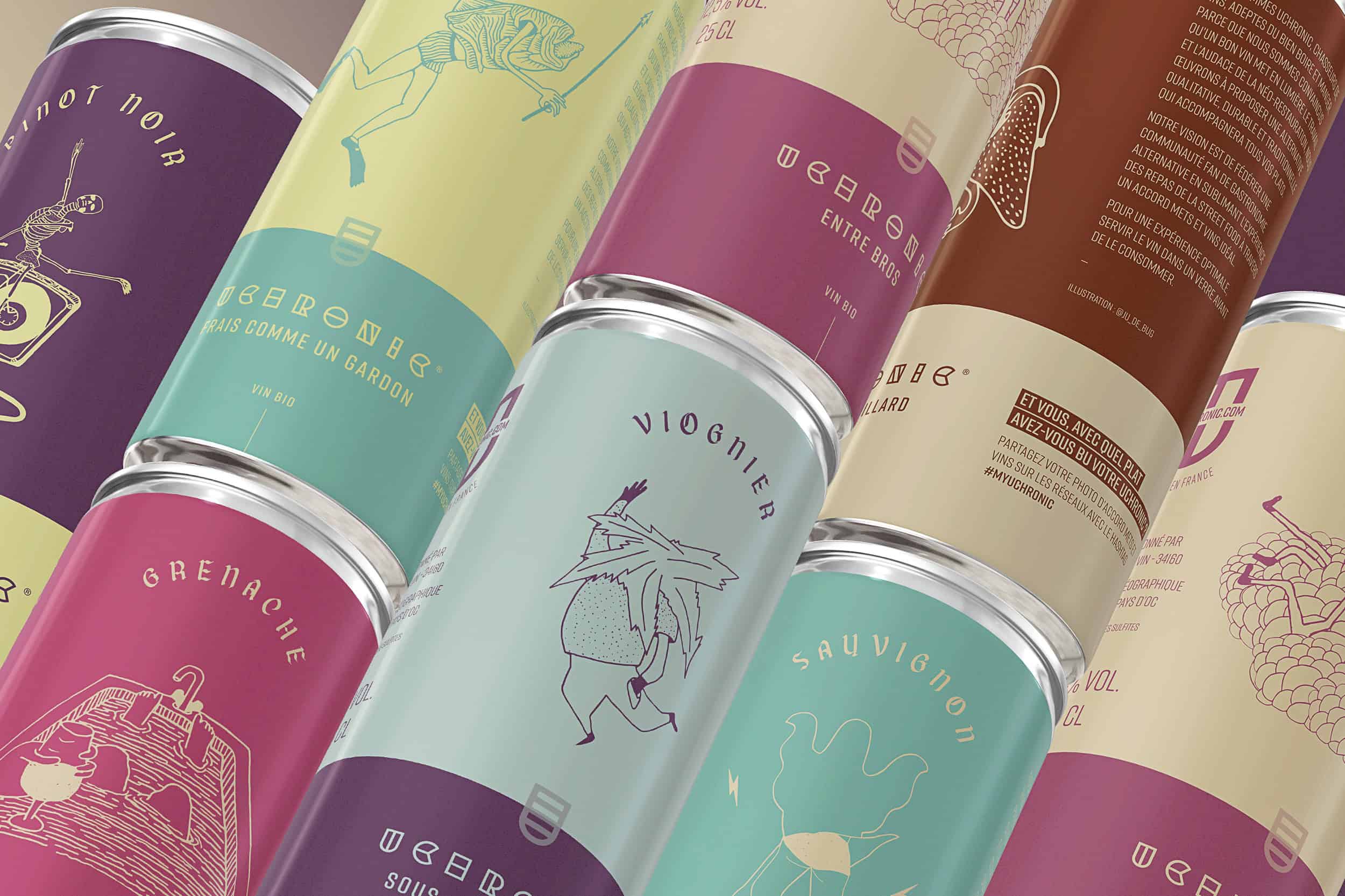
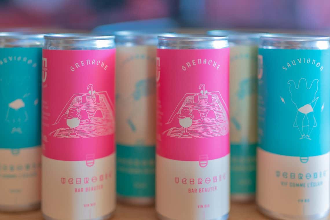
Illustrated wine labels in can format
Following the design of the brand identity, we created creative labels for the 7 wines in the Uchronic range. Throughout the strategy and creation process, we included around fifteen people representing the typical target audience. This method is crucial to building a brand around consumer feedback and not losing sight of the most important element: your brand is not what you say about it, but what they say about it. Benjamin understood this very well, and that's what made this collaboration so powerful. So, from start to finish, these millennials helped us build a new brand, and 90% of them felt that «wow» effect when they saw the finalized designs.
What type of paper for labels?
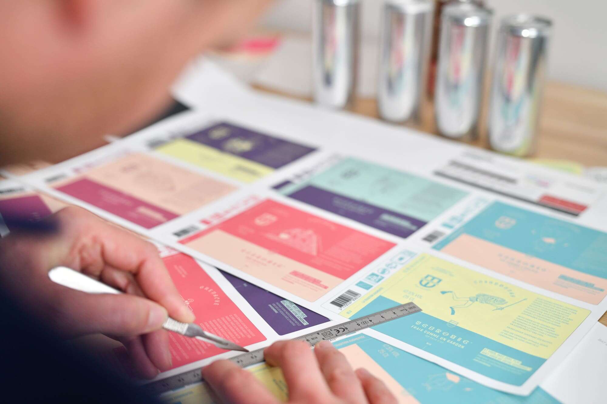
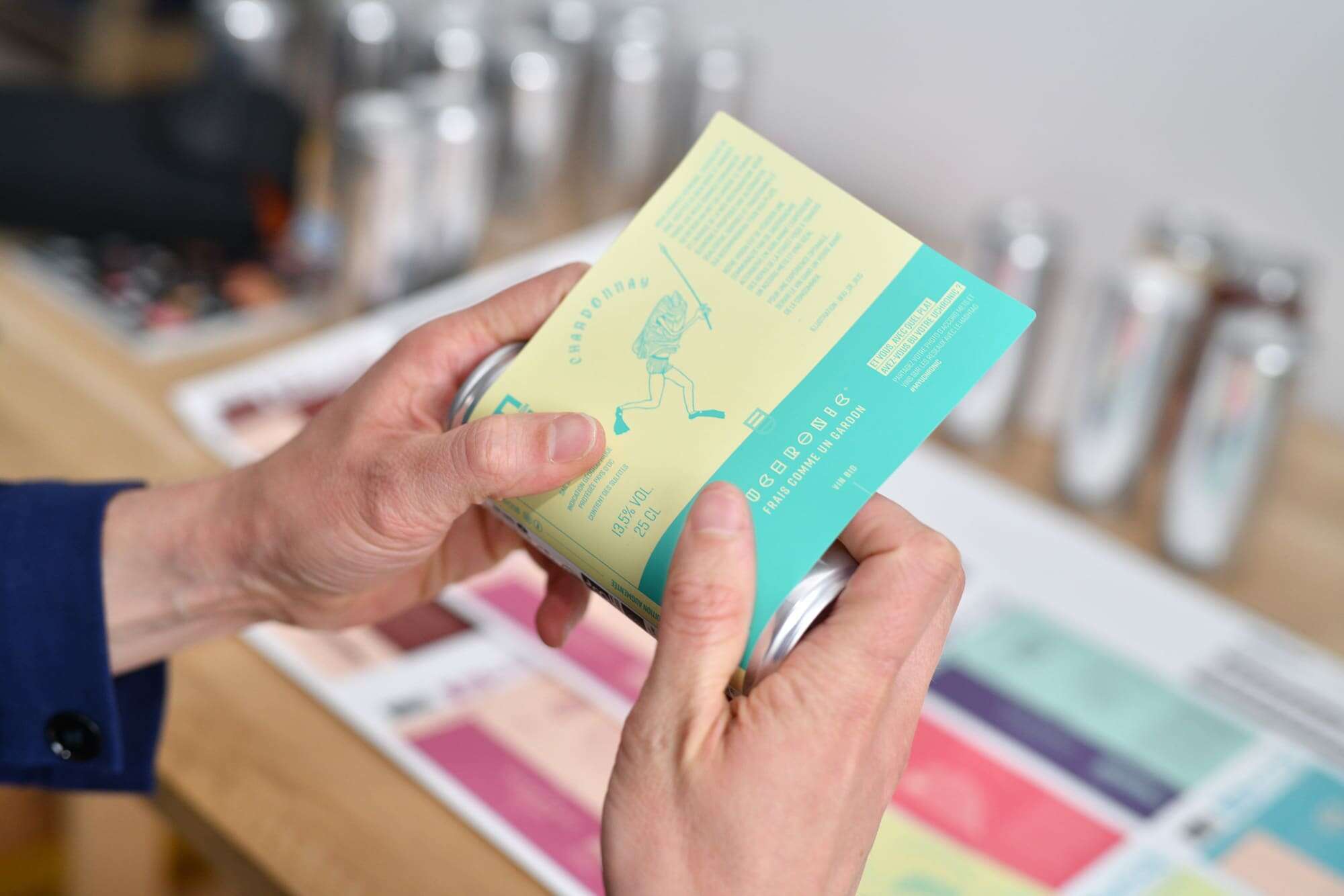
For the creation of the labels, we first looked at the type of printing and paper we wanted to use. Not being a large production at the moment, we could not afford to print directly on the can. We selected soft touch labels typically used for craft beer cans in the modern brewing industry. The look and feel of this type of label pointed us towards the craft aesthetic that the certified organic brand wanted to incorporate.
Illustrated wine cans
We then studied several creative paths before selecting the one that would meet with unanimous approval. After a careful study of the target, we called upon the illustrator Julie Buguet to design zany characters to match the personality and taste of each can. The result: sober, illustrated cans in vibrant colors, with a touch of underground concert flyer, perfect for the target audience.
All that was left to do was to name each can: Vif comme l’éclair, Frais comme un gardon, Sous les tropiques, Bar beauter, Entre bros, Bisquelette and Un doux gaillard.
Going further on the subject...
Project published on...