Repositioning a leading brand in the Kombucha market
In a sustainable approach, Lökki produces finely sparkling fermented beverages whose original and unexpected recipes combine deliciousness, length in the mouth, natural aromas and controlled acidity. Sebastian and Ludovic first met through an episode of the SuperPotion podcast entitled Drinking well in France, the alcohol-free market on the rise.
At the time, the Kombucha brand continued its ascent with the aim of quickly becoming a company with a mission to build another world and turn this humble beverage brand into a brand with a nobler cause. This has now been achieved since 2021! Indeed, Lökki has officially incorporated this mission-driven dimension into its articles of association. Their ambitions are therefore all the greater, and the stakes are high.
It was against this backdrop that Sebastian and Nina decided to call on Studio Blackthorns's expertise to support them in their strategic repositioning and brand refresh.
Repositioning a kombucha brand without changing everything
Standing out in the competitive world of beverages is no easy task, especially when new brands are appearing on the French scene every day. In order to consolidate Lökki Kombucha's reputation, we had to think strategically about how to differentiate ourselves while maintaining our position as the second leading fermented beverage in France. The aim of this re-branding was not, ultimately, to reinvent the wheel, but rather to focus on what Lökki did best. The brand has been around for 5 years now, and their customers are loyal, attentive and responsive. Their community already existed, and it was essential not to shake them up with overly disruptive communications.
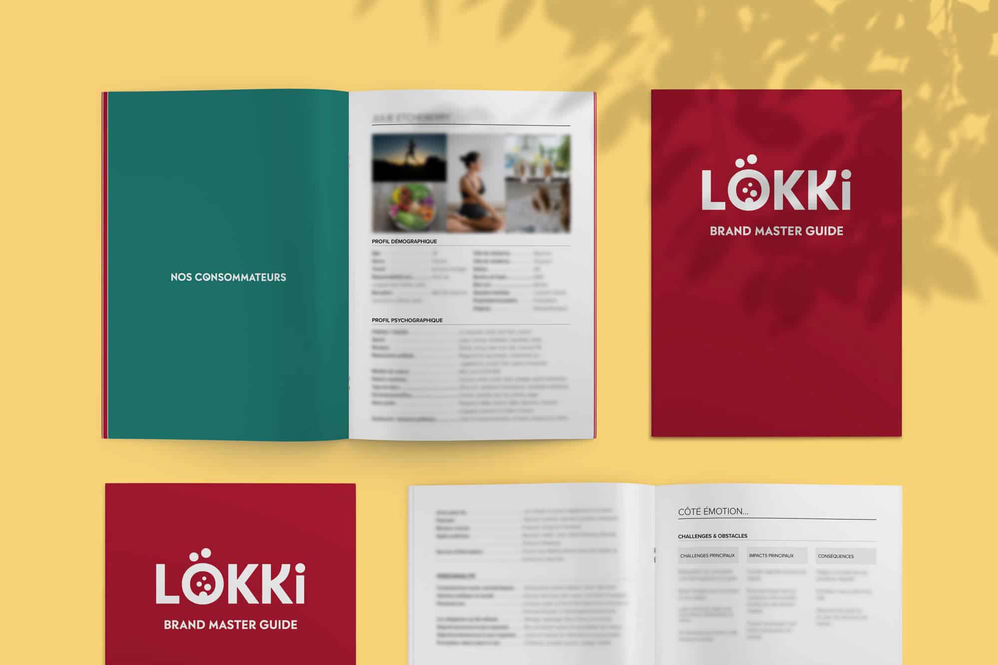
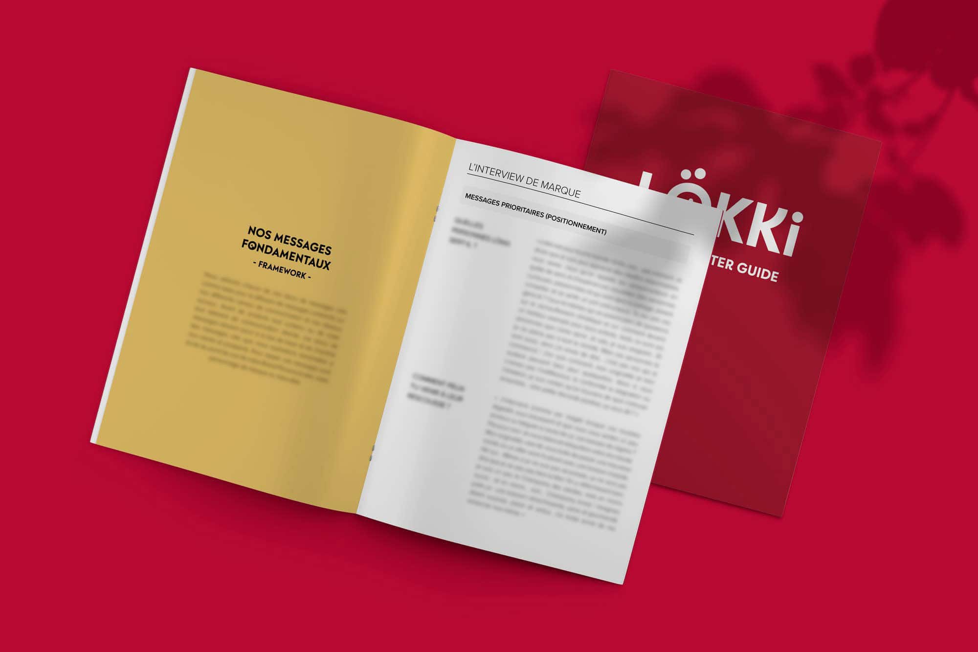
But how do you refurbish a brand's identity without changing everything? This is the true art of a rebranding strategy successful. In order to highlight all the strategic aspects and stakes involved in this tedious task, we accompanied the brand through an in-depth diagnosis of its brand essence, audience, competitors and positioning strategy. We worked collaboratively in the form of workshops to discuss the different layers that make up a modern brand. The customer journey, emotions, desires, fears - everything was scrupulously considered to further refine the beverage brand fermented. We also worked on the concept of personality archetypes to add a more psychological dimension and build a «super-conscious» brand.
Once the diagnosis had been established, Studio Blackthorns embarked on a long-term strategic project to better understand consumers of Kombuchas and other fermented beverages, market, the brand's current positioning and its real difference.
The workshop allows us to share this strategic work with others and to federate around common ideas! I think it's much easier later on to get a new brand positioning accepted by a team that has taken part in the workshop. I'd recommend it to any founder or marketing manager who feels the need to “psychoanalyze” their brand.
Sebastian, founder of Lökki Kombucha
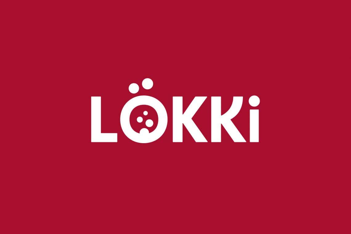
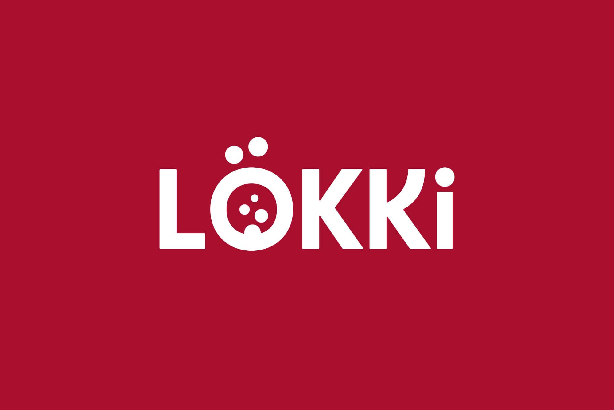
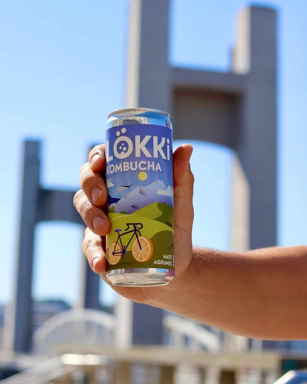
A new look for the Lökki Kombucha logo
The Lökki logo needed to be reworked in line with the strategic direction of the studio's diagnosis. We had to refine it, revise the kerning, make it more aesthetically pleasing and, if possible, fit it into a cartouche (frame) for easier use in any situation. The idea was to keep it identifiable enough not to confuse today's consumers, but to make it sharper, more sober.
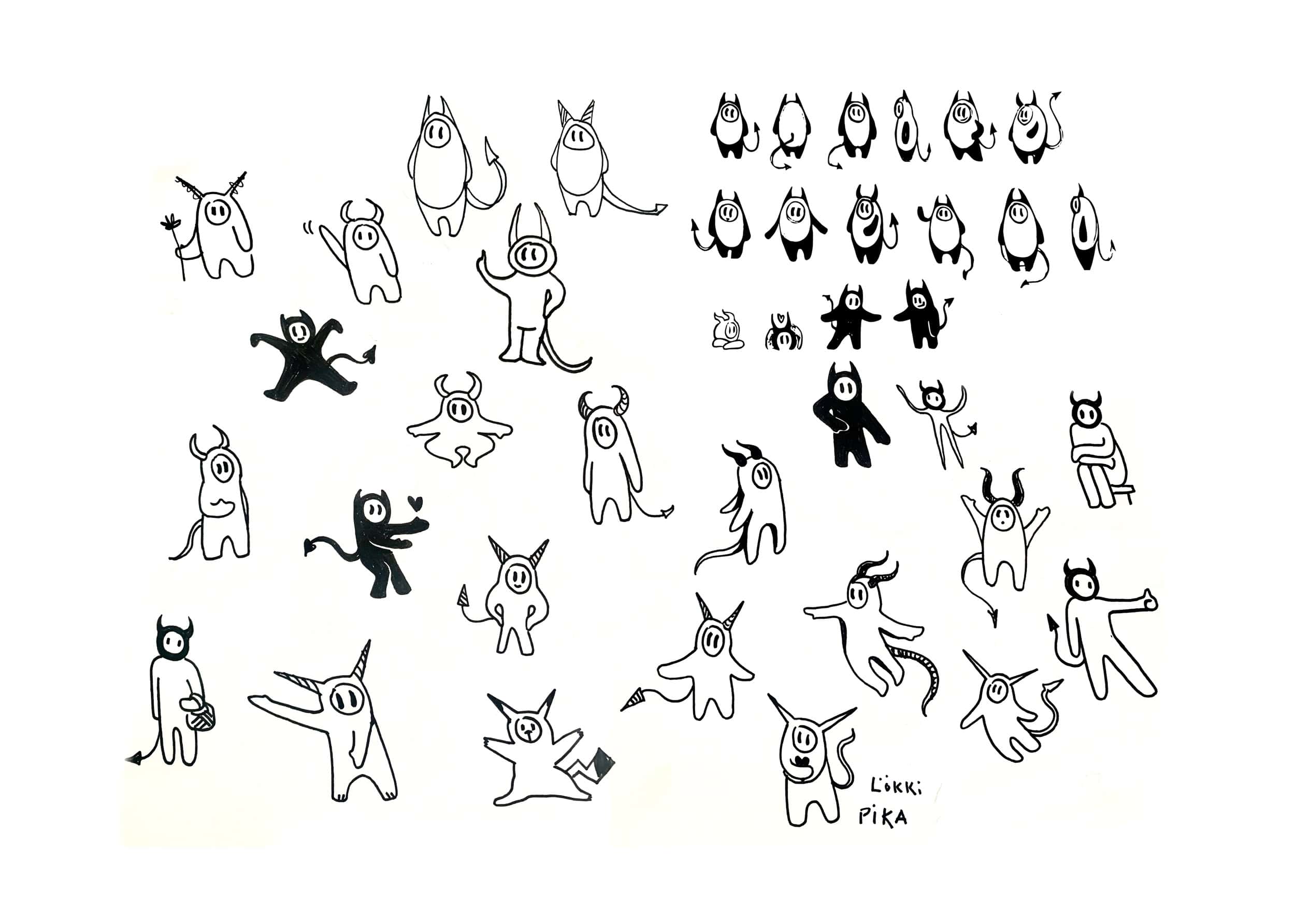
We therefore began a creative process to remove the imperfections of the old logo: the umlaut, the size of the logo, the number of bubbles and the kerning. The real purpose of a logotype is identification, not description. Therefore, too much information and detail makes the logo counter-productive and detracts from the brand image and its legibility (especially when it comes to packaging). We reworked the lettering, opting for a rounded refinement rather than a cursive or cut. The idea here was to play with the brand's «gently diabolical» side, making it more «horny», but without omitting the idea of roundness and deliciousness. The result is a seemingly gentle character that retains its stability.
So, by refining the current typeface and working on the proportions and fat ratios, we were able to maintain the logo as a coherent typographic typeface. The K was designed to recall the horns of the Scandinavian god Loki, but we kept a more serious K. This allows a typographic interplay between the K and its alternate, which can create dynamics and fun in its digital use. Finally, we decided to reinforce the pronunciation of the brand by transforming the capital i into a lower-case i. Behind this choice lay a more psychological reflection on the auditory memorization of name.
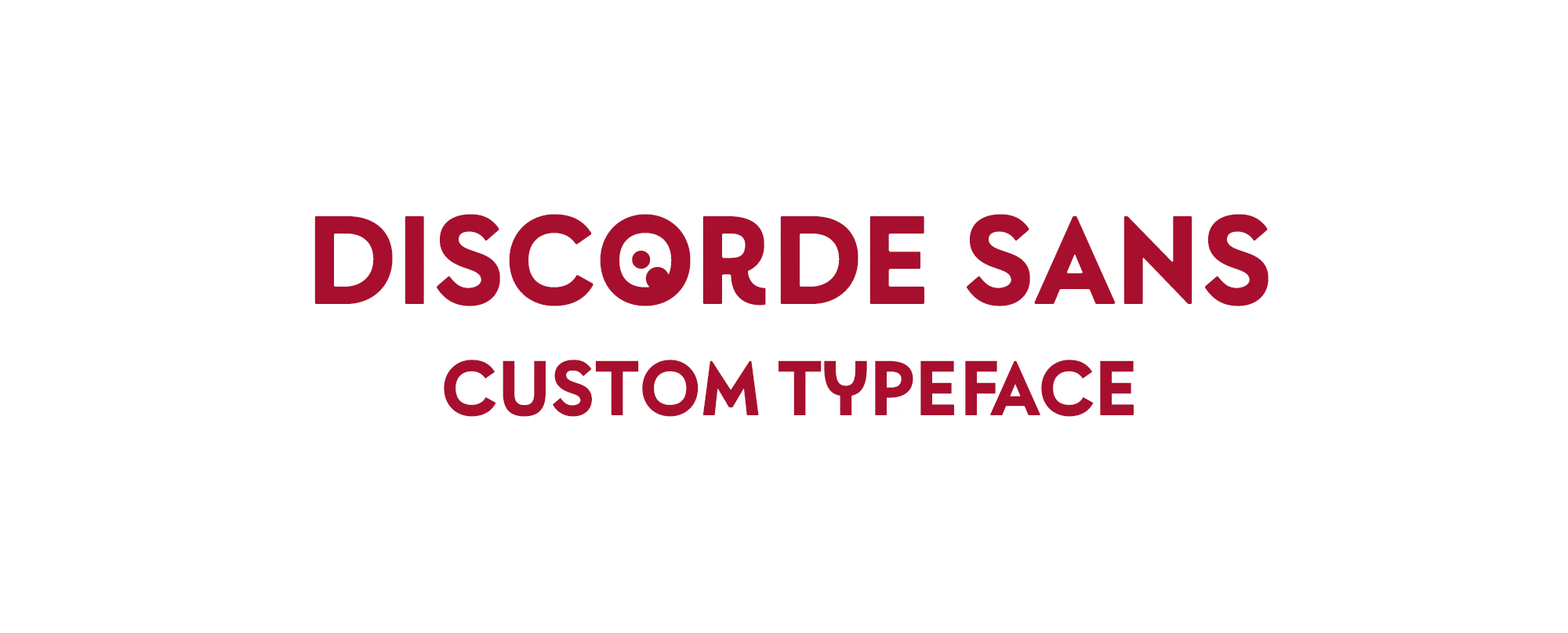
More character with the creation of custom typography for the beverage brand
Not every brand can afford to create a custom typeface in its own image (although... maybe it's enough to want to!). However, for Lökki, the creation of a custom typeface made sense in order to take greater ownership of its DNA, its brand expression, and to bring coherence to all the work carried out by Lökki. brand rebranding.
Studio Blackthorns has therefore designed this capital sans-serif called «Discorde Sans», in close collaboration with the Blazetype foundry. The name of the font is in keeping with the title «brewers of discord», proudly proclaimed by the Kombucha brand. This typography takes into account all the characters, glyphs and ligatures required for the French language. As a result, we produced the following lettering:
AÁÂÄÀÆBCÇDEÉÊËÈFGHïIIÎÌJKKLMNOoOÓÔÖŒPQRRSTUÚÛÜÙVWXYYŶŸỲZ
0123456789 .,:;...!?--*#//---_()‚„“”‘’«»» ‘'@&+-×÷=≠ % ‰
Considering the references present in the brand book (the brand's characteristics, assets and personality), and not forgetting the geometry of the new logo, we had to create a font that could be used with it. We therefore set up a typographic system that echoed the logo's shapes, with the fairly geometric rounding of the circled shapes (O/C/G/Q) and a sharper/pungent reminder on endings such as V/W/M/N/A, to bring stability back into the reading.
A few words from Lökki...