The very principle of design is to create a better world. We're still a long way from a perfect world, but...
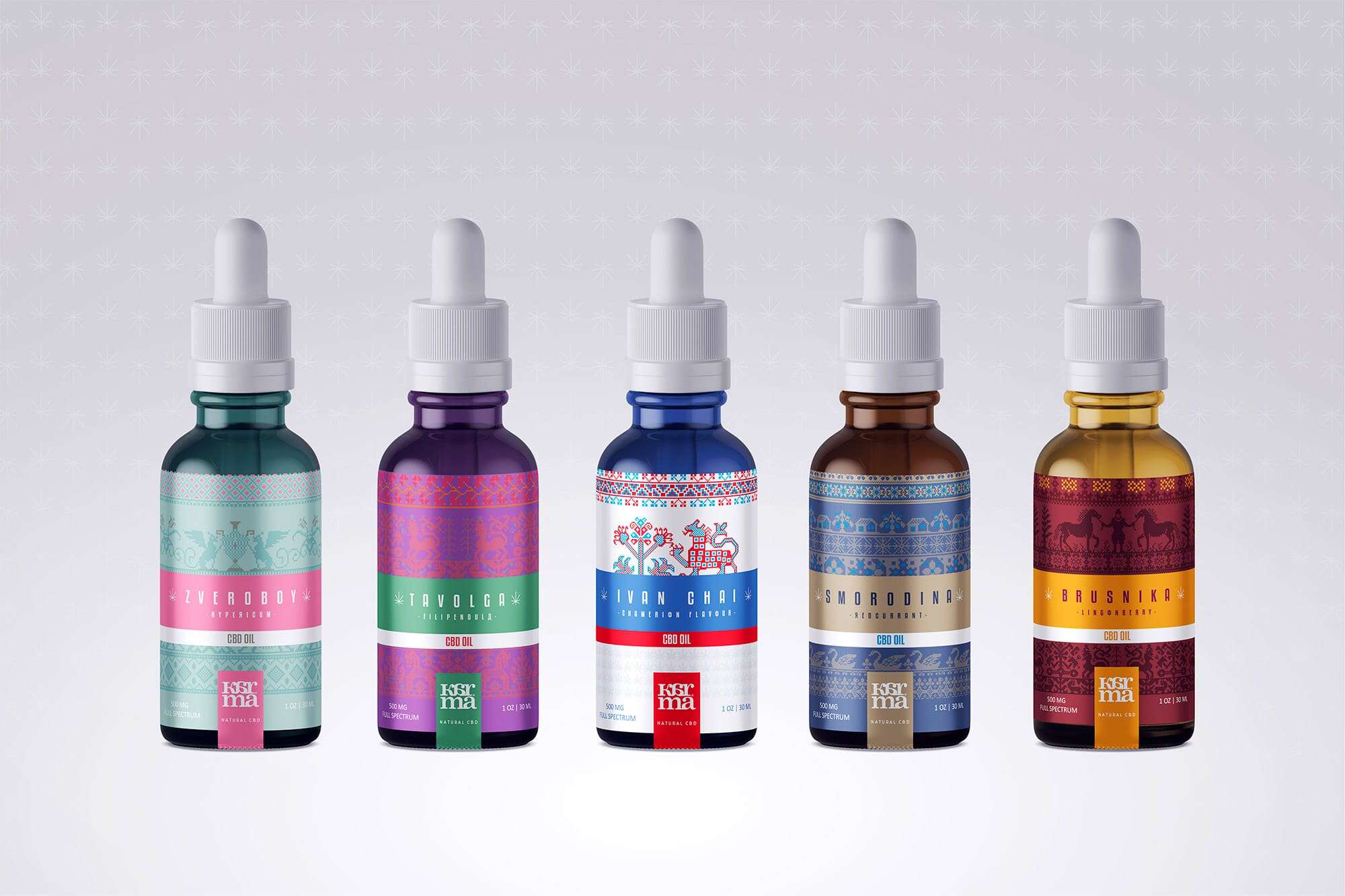
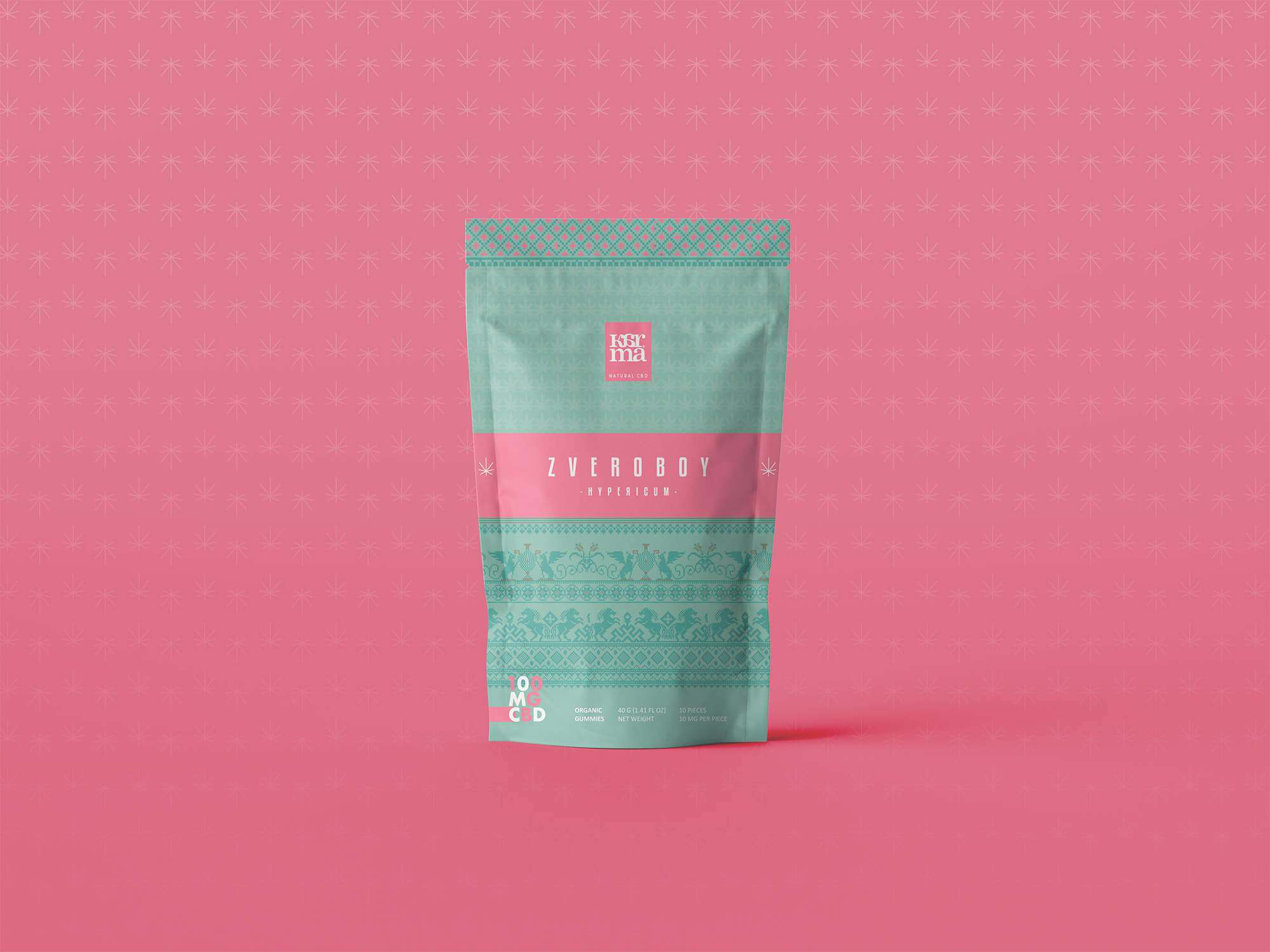
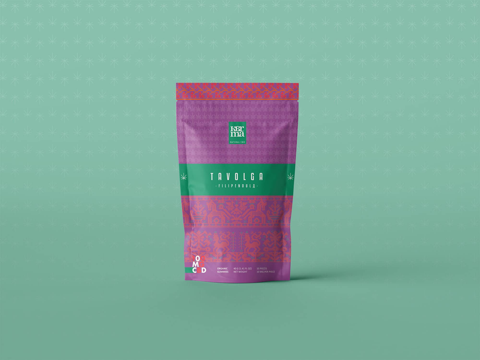
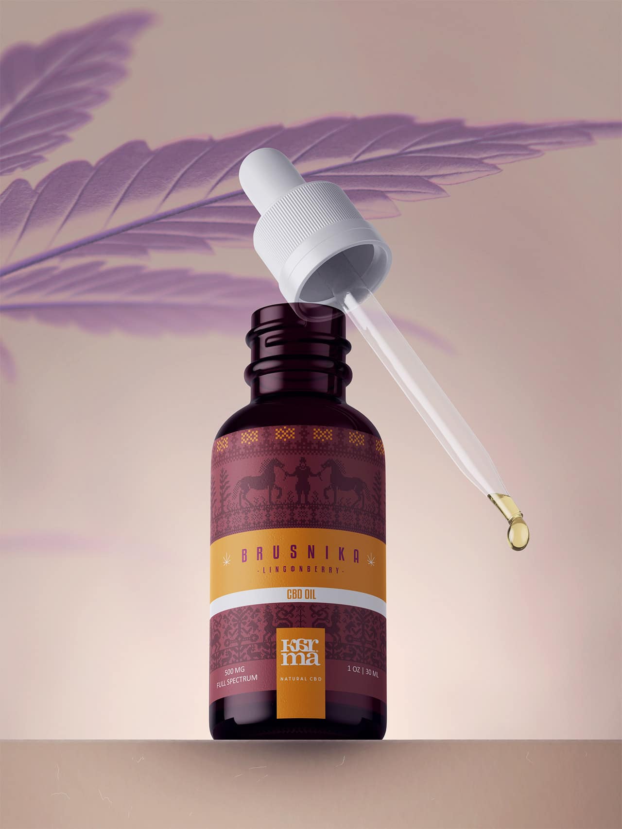
Karma CBD is a concept brand created by us. The challenge for Blackthorns was to design a line of premium CBD products by paying homage to Russian culture. The brand identity imagined by the studio combines the aesthetics of traditional Russian culture with an intense use of color reminiscent of Kusmi Tea communications. Studio Blackthorns tastefully blended these graphic elements to create a luxurious range rich in history. Different packaging was created: dropper bottles for CBD oils, paper bags for gummies, care creams...
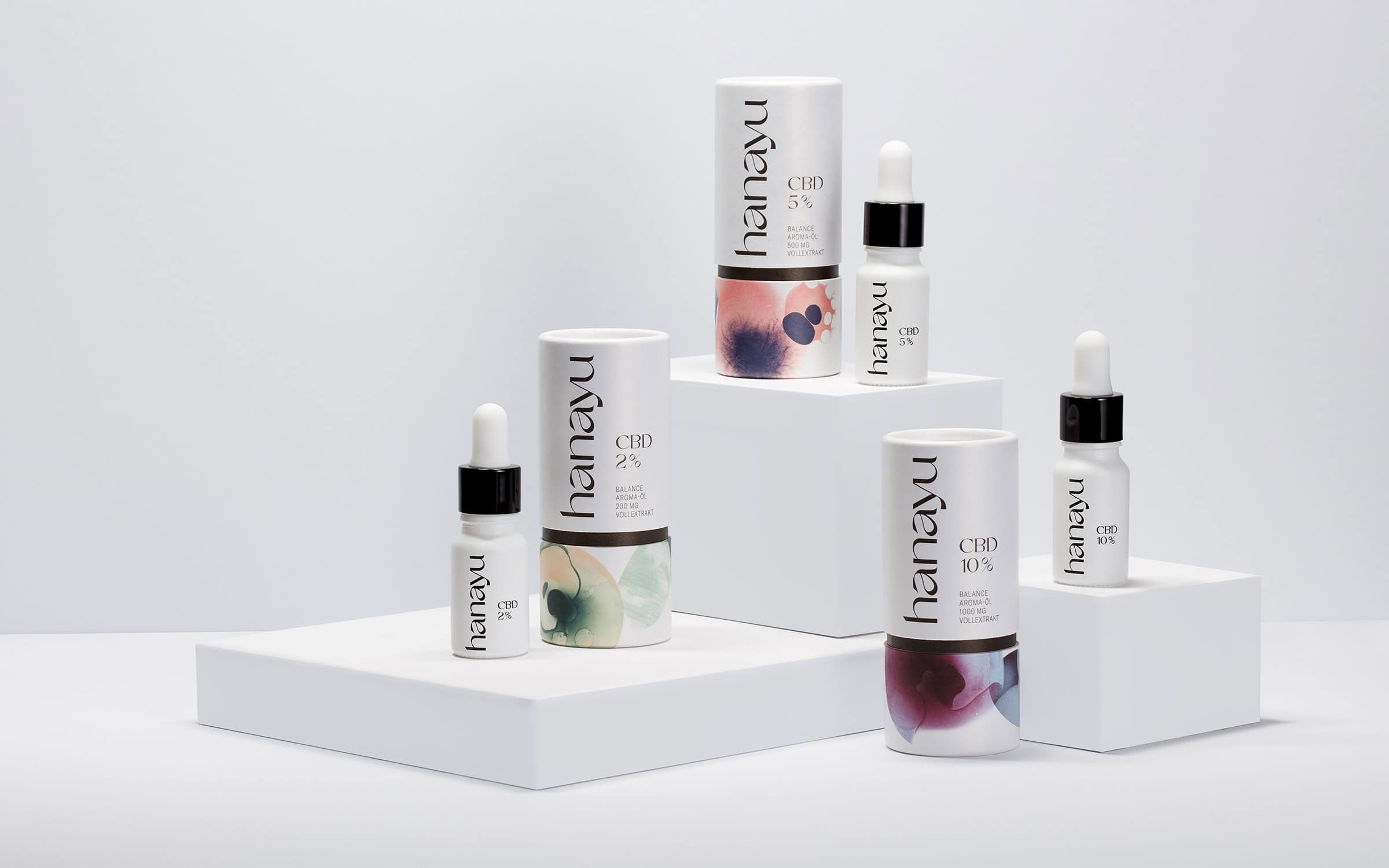
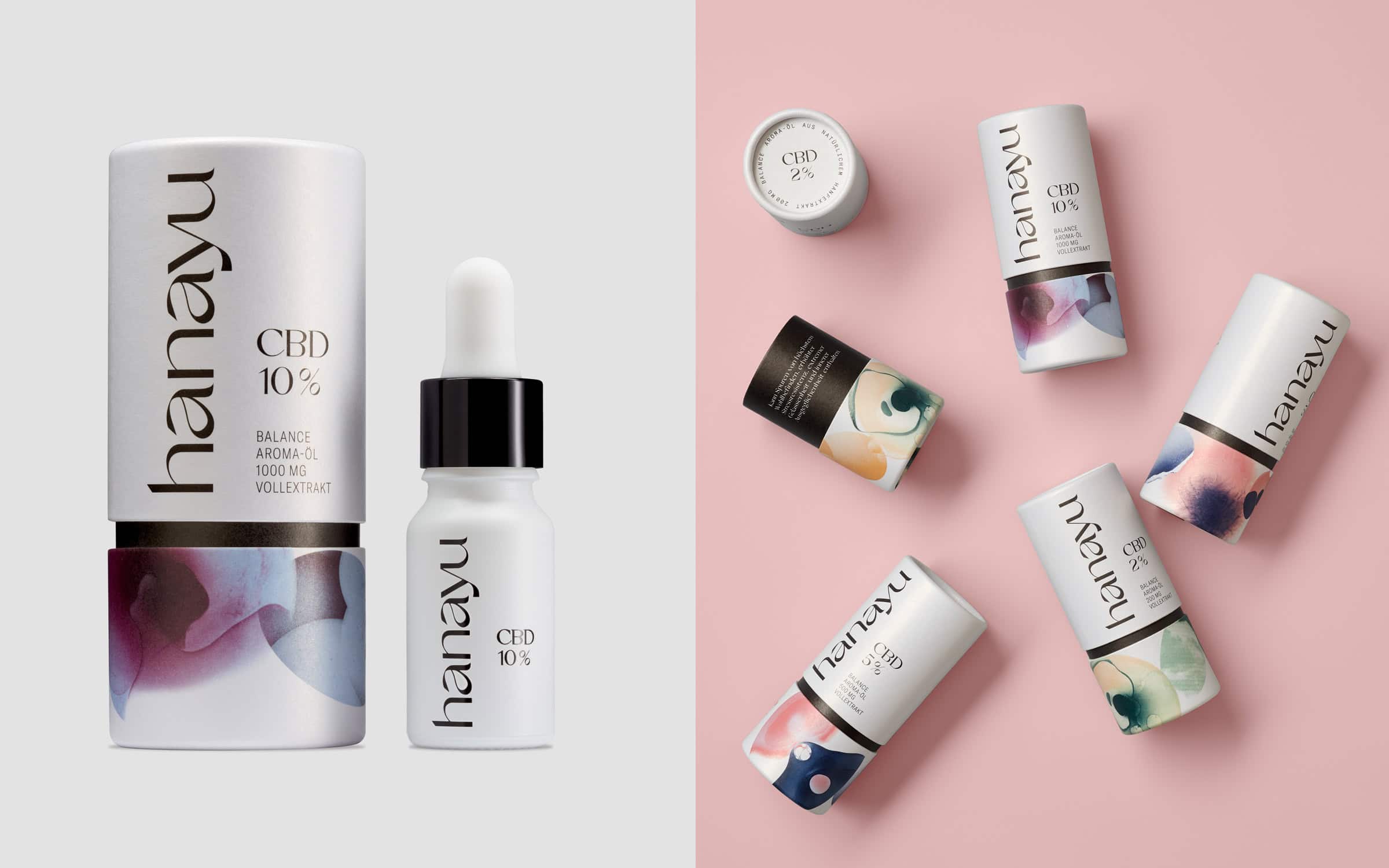
The young Hanayu company has developed a series of CBD products and is conquering market share with a brand that conveys serenity and concentration in a world filled with visual and aural stress. The Hanayu brand design by the German agency Eiga uses abstract and gradient elements to present brand messages consistently across all channels. The conceptual visuals illustrate the theme of «attention seeking» and offer the opportunity to create a series of flagship visuals for packaging and social media. The photographic style and choice of motifs create a concise visual identity and underline this concept of «serenity".
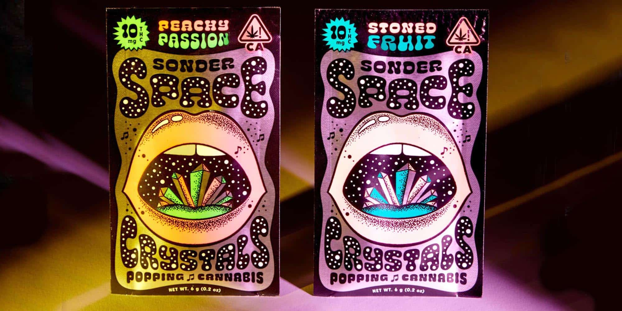
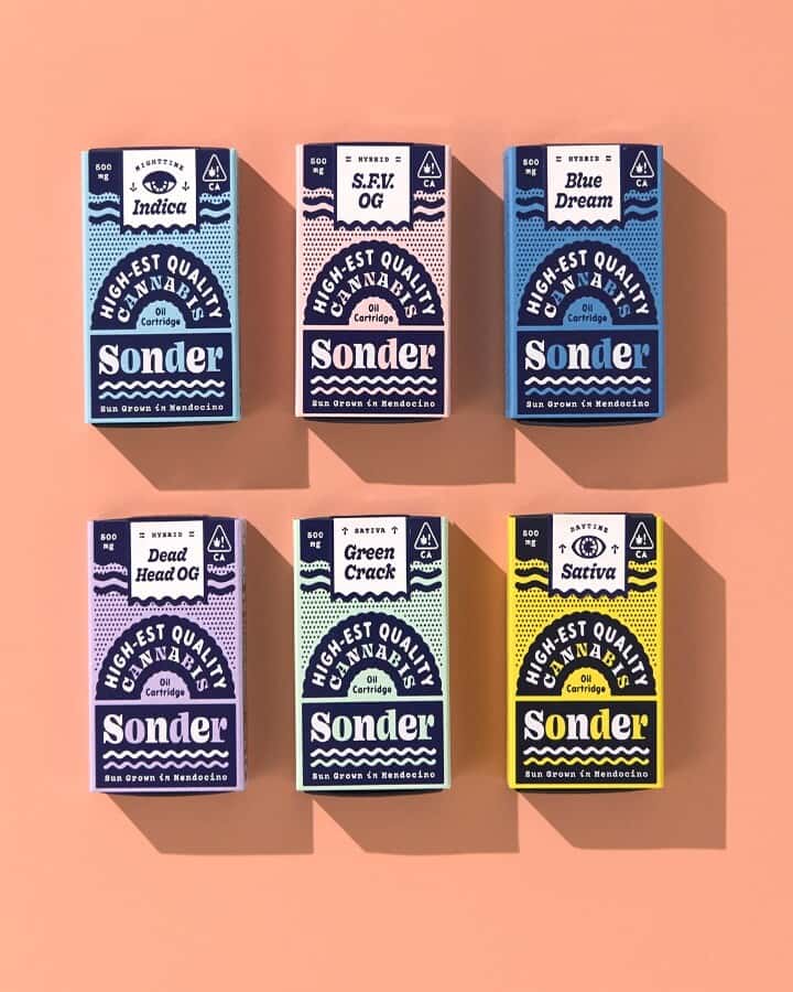
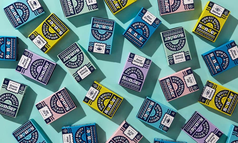
Before its recent rise to prominence on the American market, cannabis had tended to be equated with narcotics and illicit substances. The very substances that titillate the consumer's senses, detaching them somewhat from reality. For CBD and THC brand Sonder, cannabis has the opposite effect, and can open up new perspectives by exhilarating the senses.
The founders, who are both supporters of the LGBT movement, come from cannabis-growing families. They founded Sonder with the idea that this plant «connects» rather than «disconnects». It allows consumers to see nuances, inspire creativity and create links with the world and with others. They also run the Guts & Glory design studio, which explains the brand's strong personality.
Probe captures our attention through the use of display typefaces both heavy and fickle. The undulating graphics appeal to the concepts of quantum physics, where a particle can exist in a range of possibilities. The use of an eye recalls the Ajna, or third eye, which allows us to perceive more than we can see without activating it, according to Hindu tradition. Sonder's vision is illustrated by shimmering, country imagery, but also by clearly cosmic elements. Let yourself be abducted...
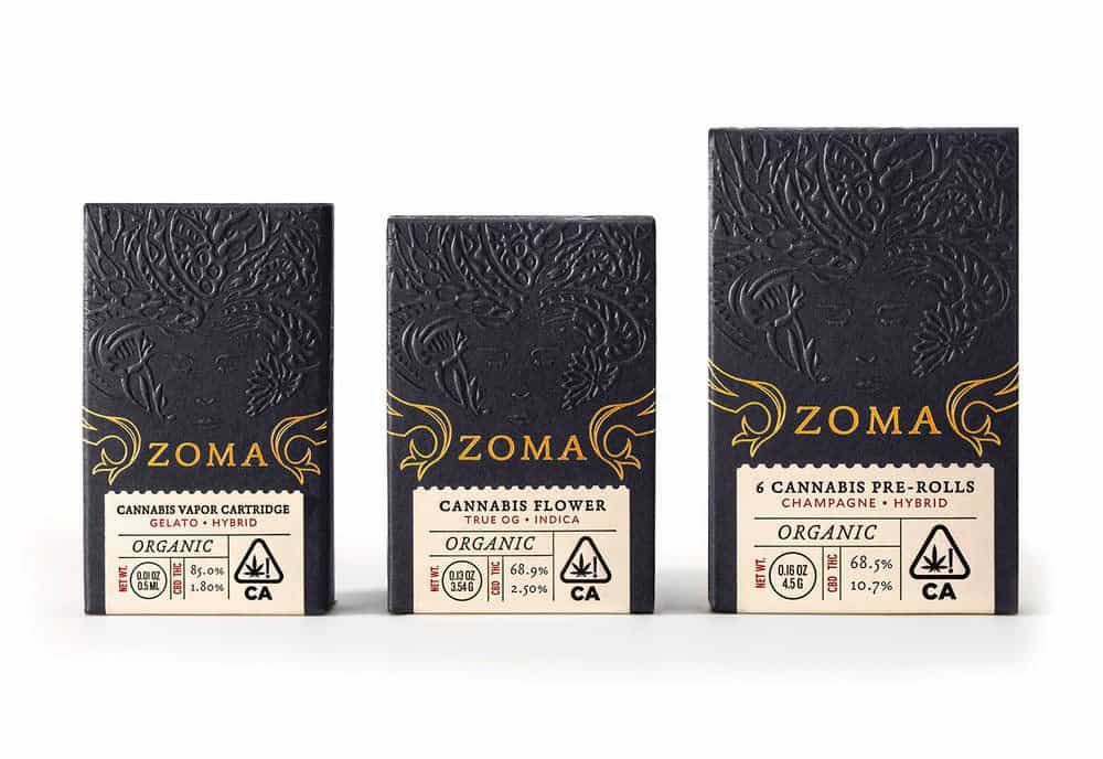
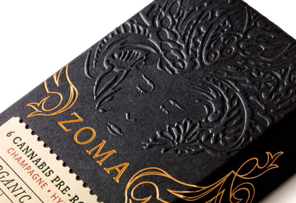
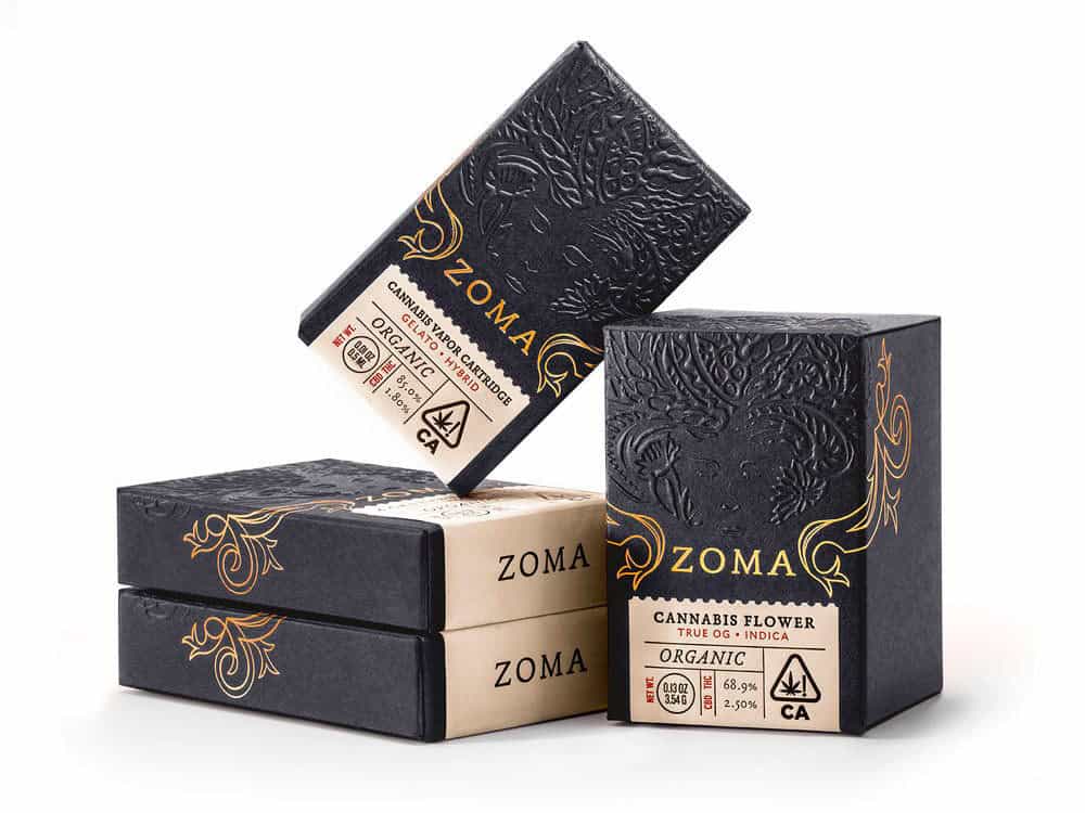
Zoma is a California-based luxury cannabis brand offering vaporizer cartridges, pre-rolled joints and flowers. As a certified organic cannabis line, the identity developed by the agency Pavement highlights the link between the cannabis plant and the earth Gaia. This concept of alchemy is marked by the use of somewhat mystical symbols. With an embossed illustration of Mother Earth and gilded flowers, the brand opts for opulence and indulgence, while remaining subtle and soothing. Zoma is positioned as a sophisticated brand with products at the cutting edge of refinement in the California leisure market.
À Please note: This brand's products contain THC, which is illegal in France. We do not encourage the consumption of this type of product. We only present original packaging linked to the CBD movement.
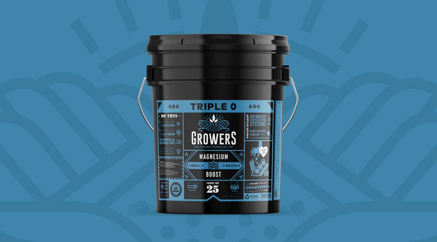
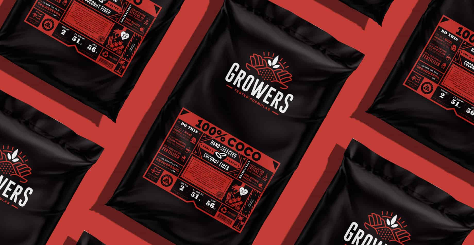
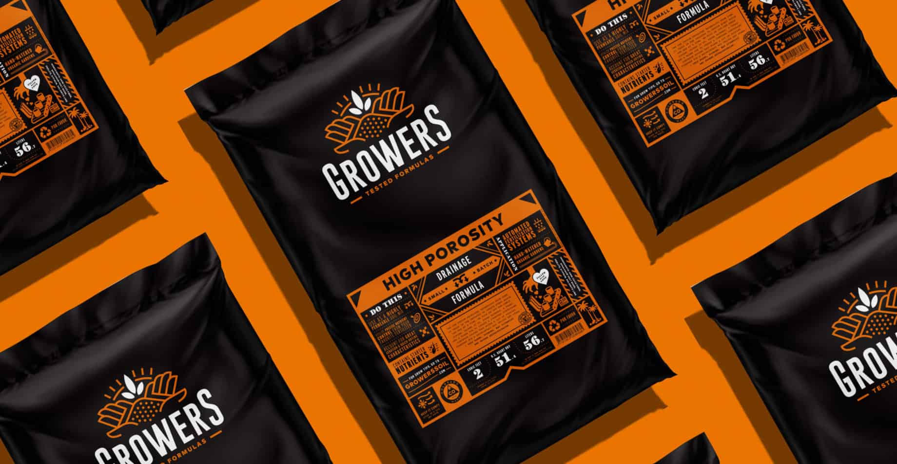
Growers' visual identity is a perfect blend of retro look and modern treatment. According to the brand, cannabis growers know what they want. So they decided to play on one of packaging trends of the moment: transparency. So when consumers pick up one of their products, they know everything. The agency created a bold design for the Growers range of soil and nutrients to ensure that their products stand out from the competition. The brand's deep roots in agriculture and vast knowledge are graphically reflected in their brand identity with a clever emphasis on the many benefits they offer consumers.
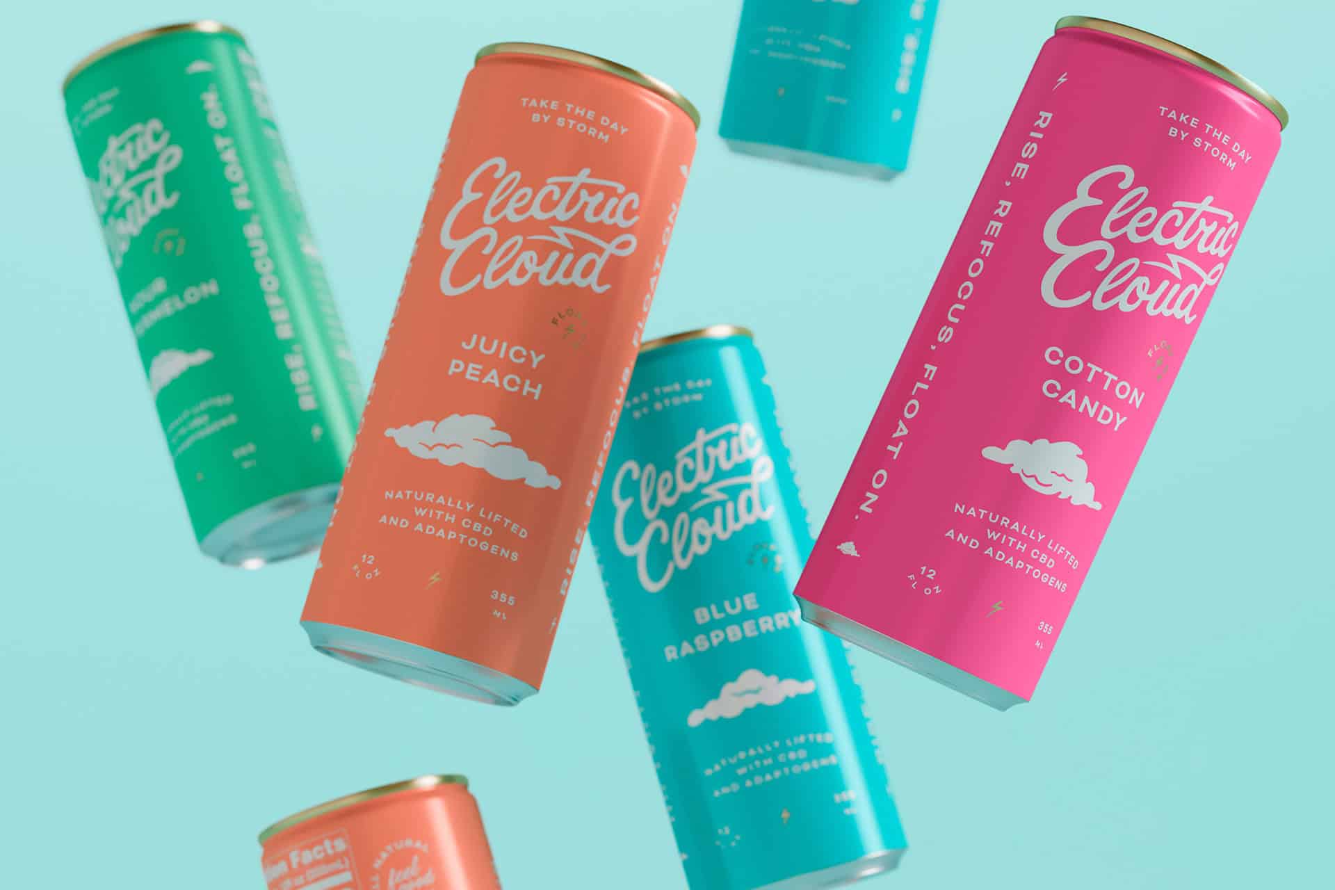
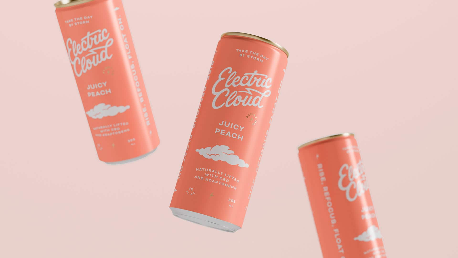
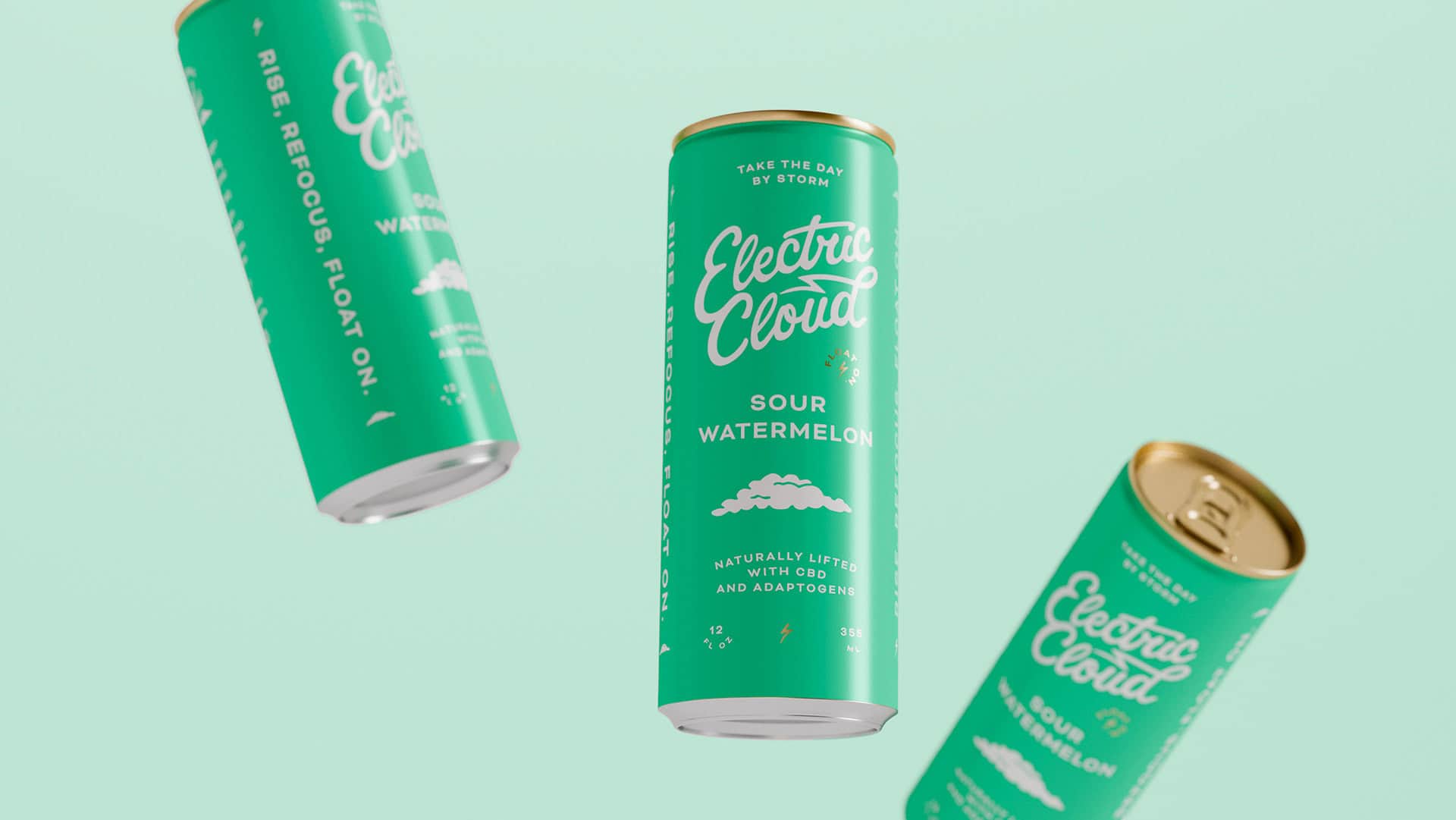
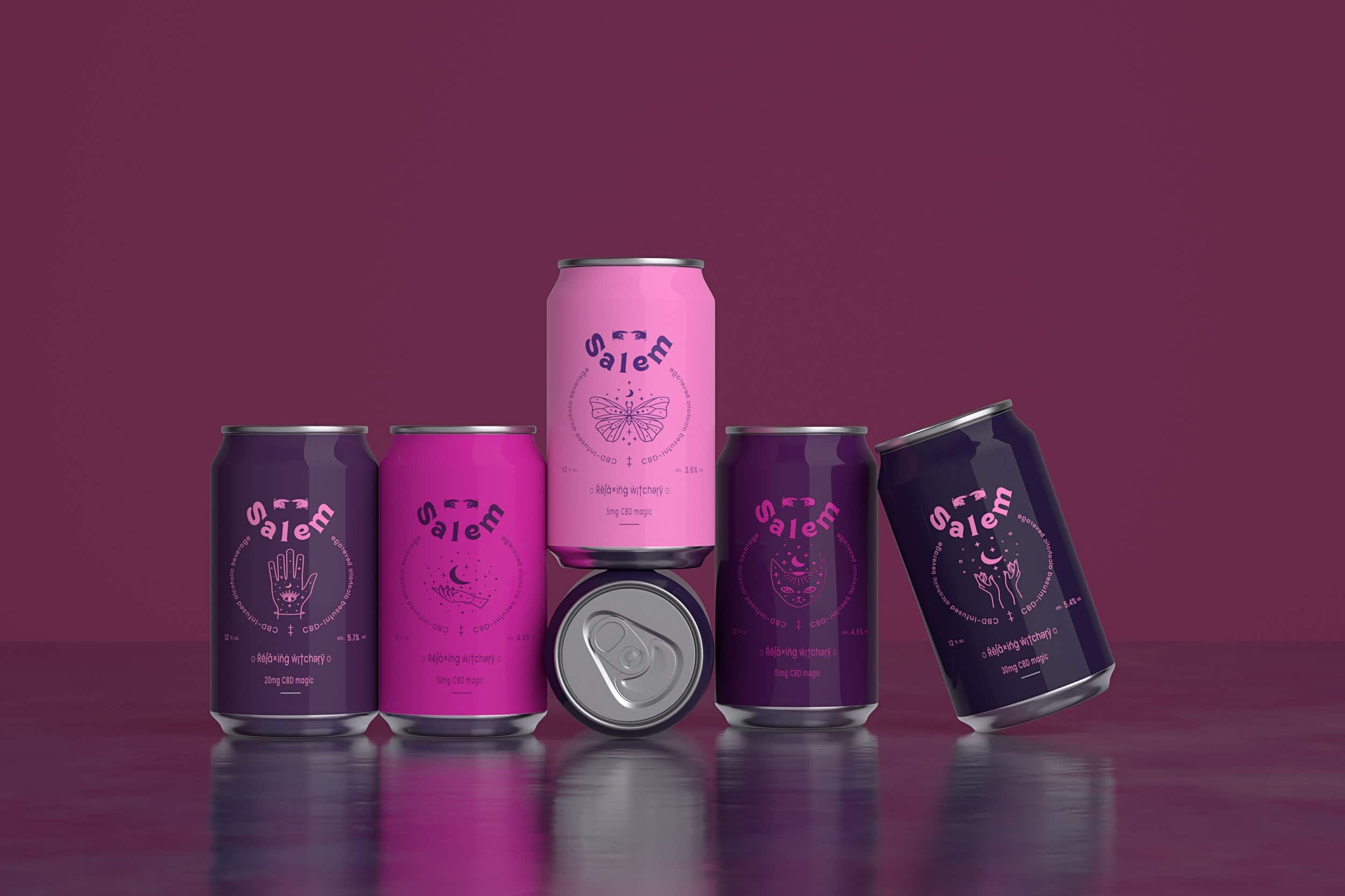
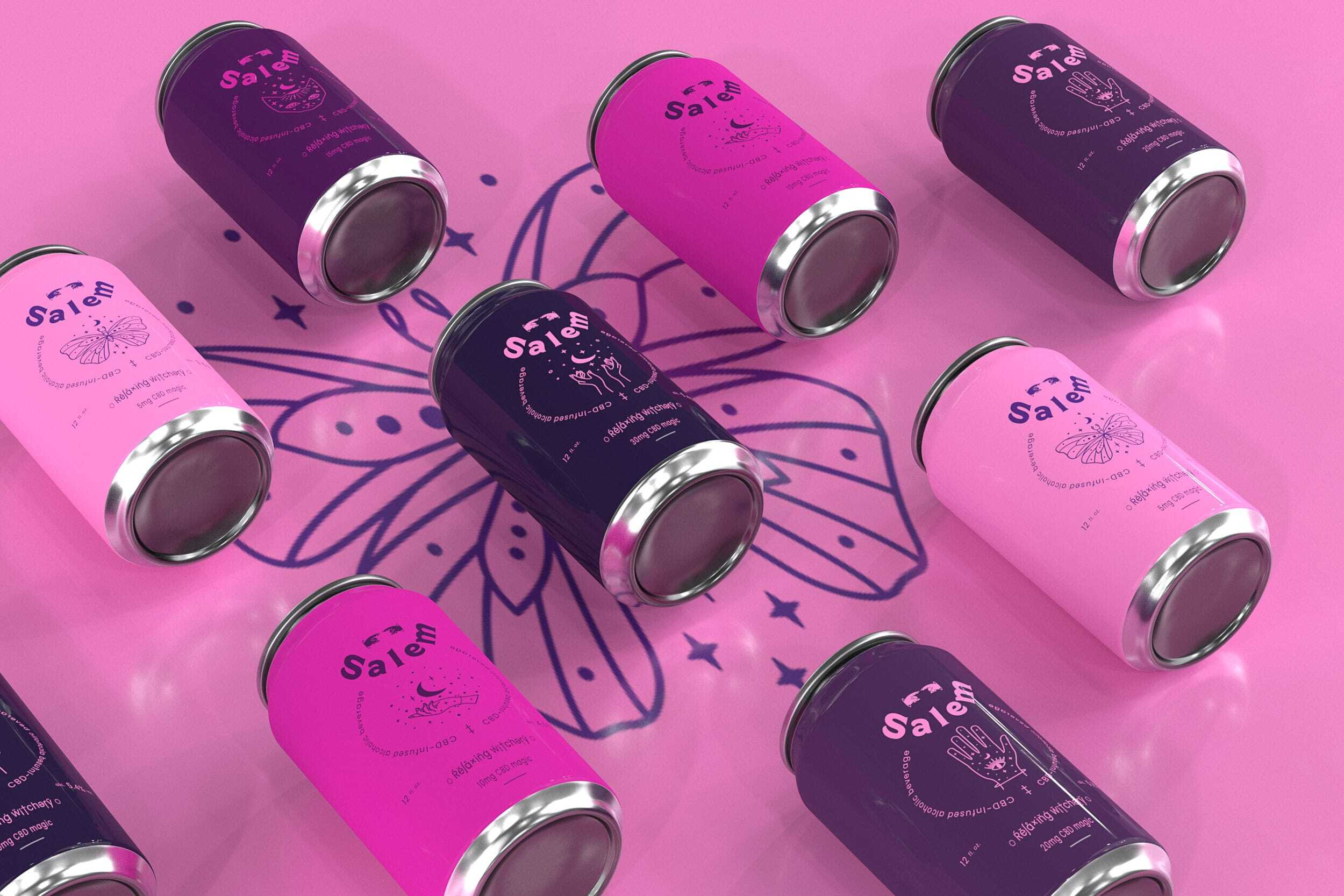
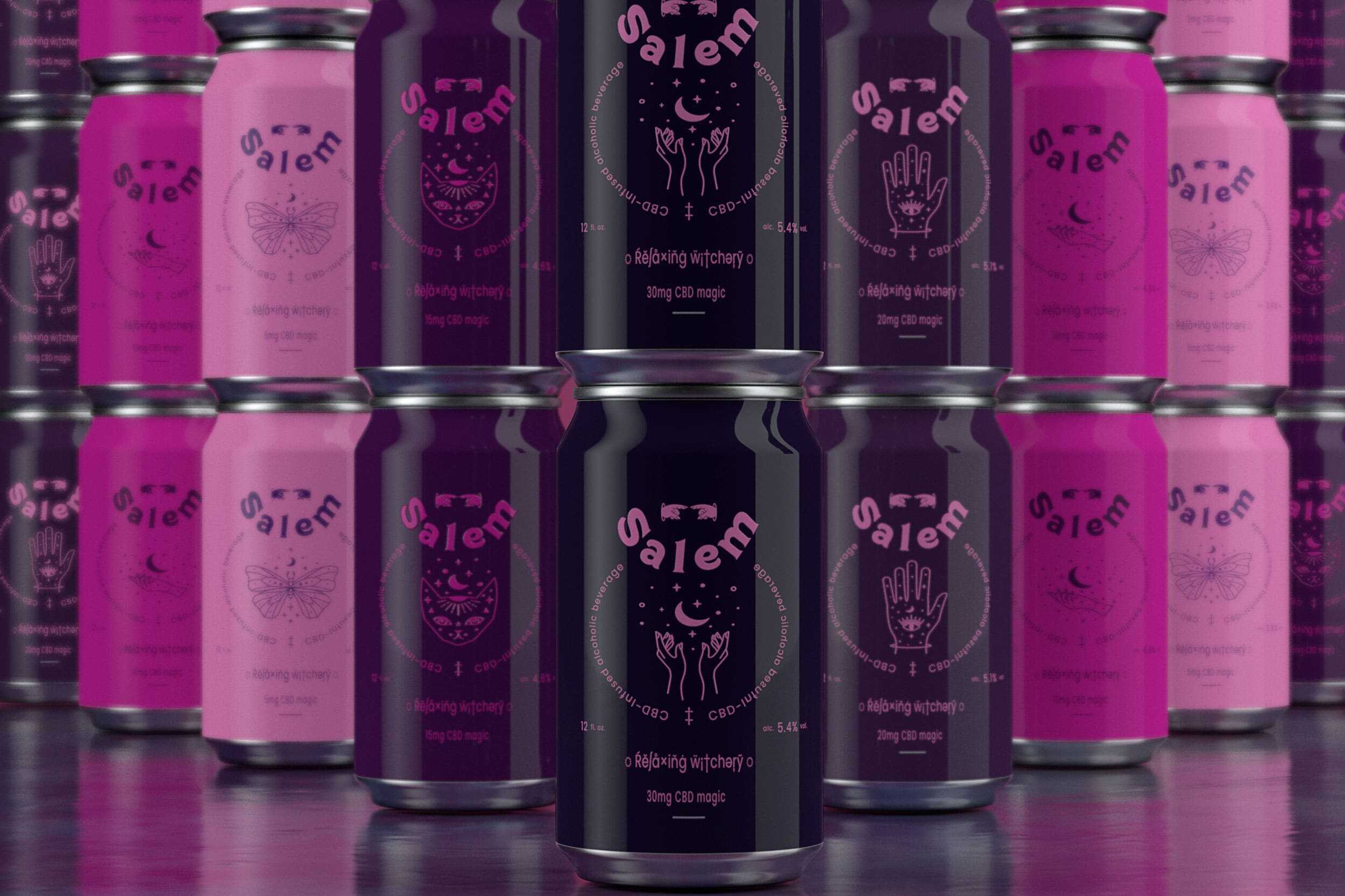
Electric Cloud is a CBD-infused drink designed to «lift the spirit». Produced by mixologists, it's naturally stimulating, helping you focus and feel your best all day long. The CBD drinks was booming in the United States, Electric Cloud needed a strong brand to stand out from the competition.
When the gravity of everyday life gets you down, take a moment to lift yourself up, refocus and float: this is the essence that communications agency Thirst Craft wanted to infuse into the brand. Minimalist graphics and dreamy colors lend calm and voluptuousness to the packaging. The verbal branding, meanwhile, combines the sensation of soft, fluffy clouds with a flash of concentration. The fonts chosen are easy to read without cluttering the design. Thirst has given Electric Cloud everything it needs to take the market by storm.
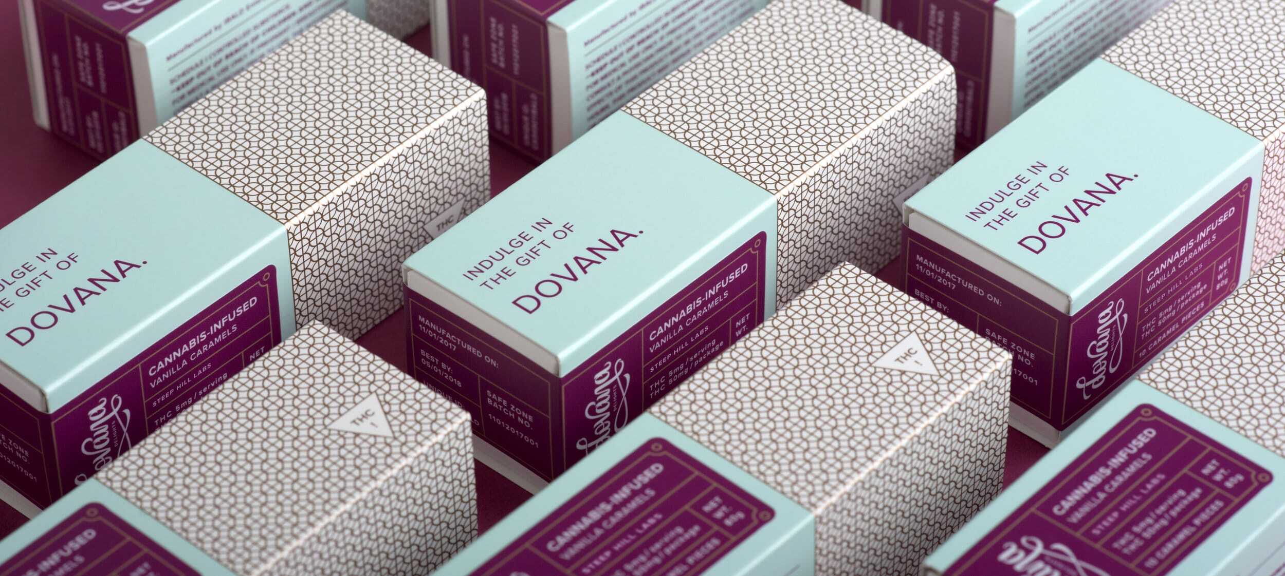
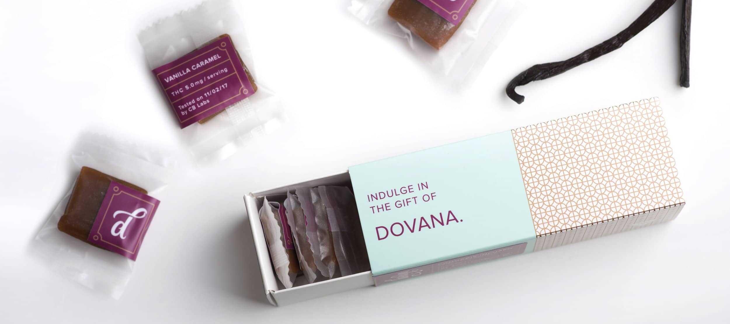
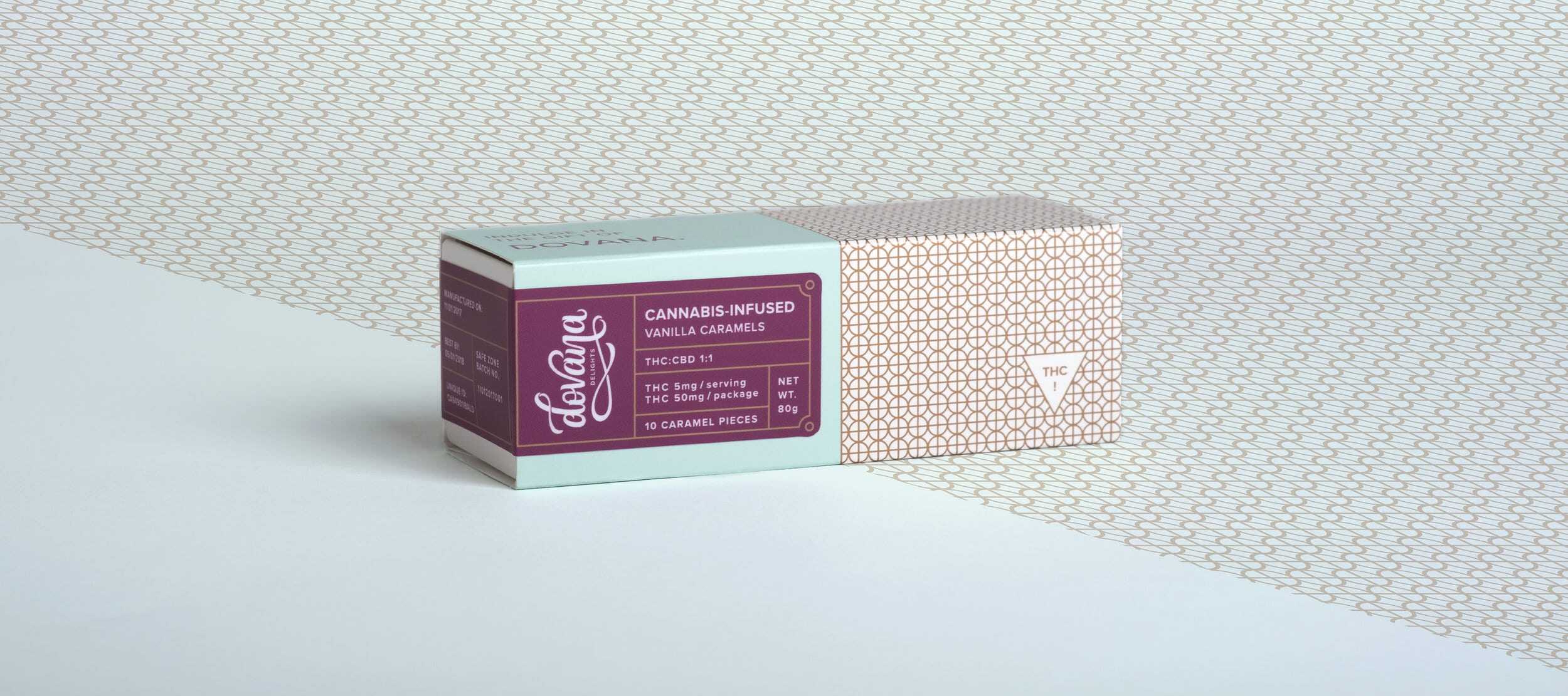
With the legalization of cannabis in the United States, an influx of beautiful packaging has blossomed. This beautiful packaging for Dovana (infused caramel) edibles is a perfect example.
The name «Dovana» means «gift» in Lithuanian. It's an allusion to family heritage, as well as a way of subtly acknowledging the restorative and relaxing effects of cannabis. The logo reflects this meaning with personalized letters that swirl and swirl, reminding us of the sweet, sumptuous caramels themselves. As for the packaging, the real challenge was to effectively communicate the complex levels of information associated with cannabis. Although Dovana is only launching with her vanilla caramels, she ultimately wants to explore confections infused with different types of cannabis, cannabinoids, flavors. Keeping in mind the brand's potential for expansion and the ever-changing cannabis compliance laws, agency Noise13 designed a visual identity system to make growth and expansion as simple and cost-effective as possible.
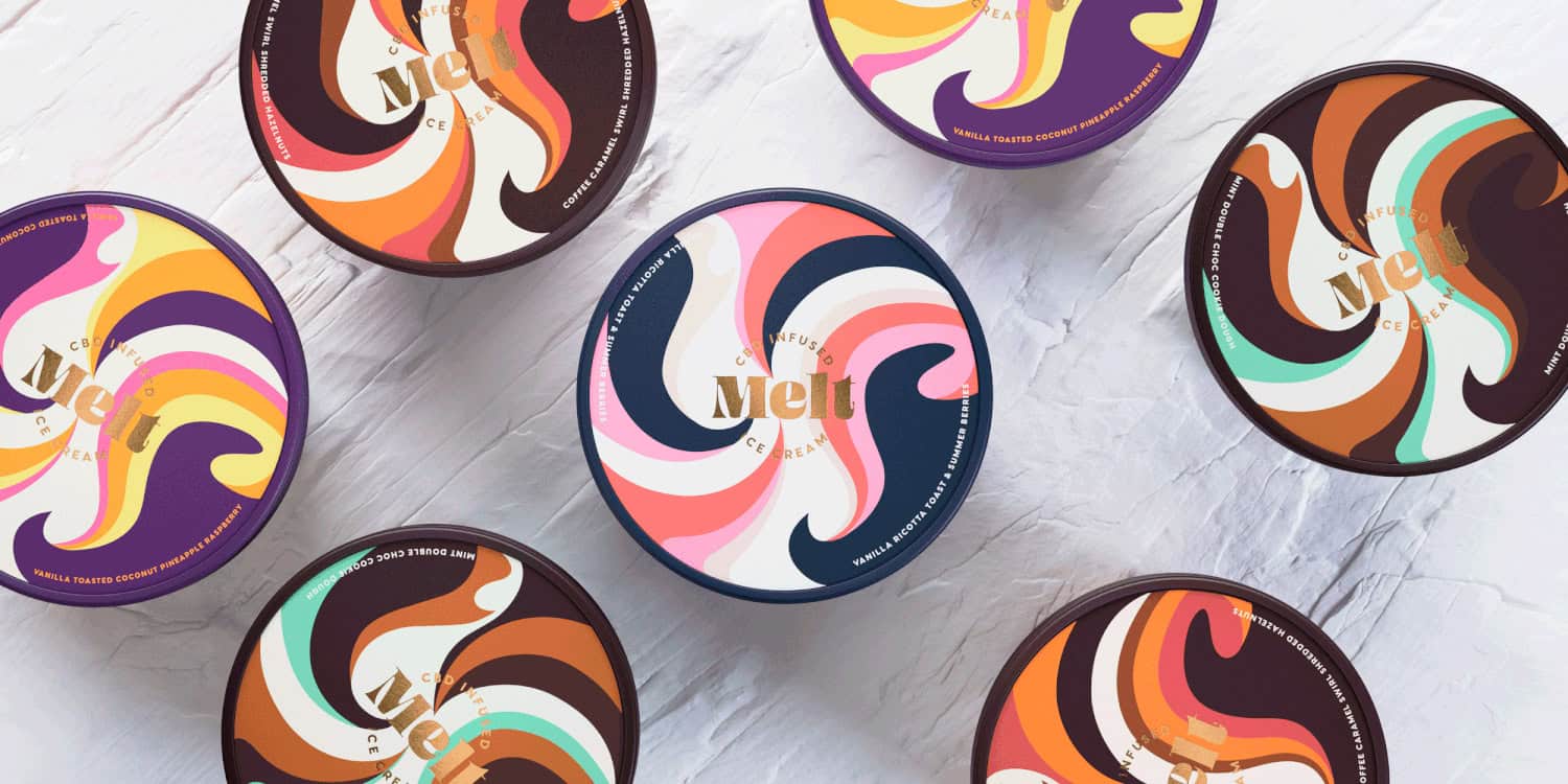
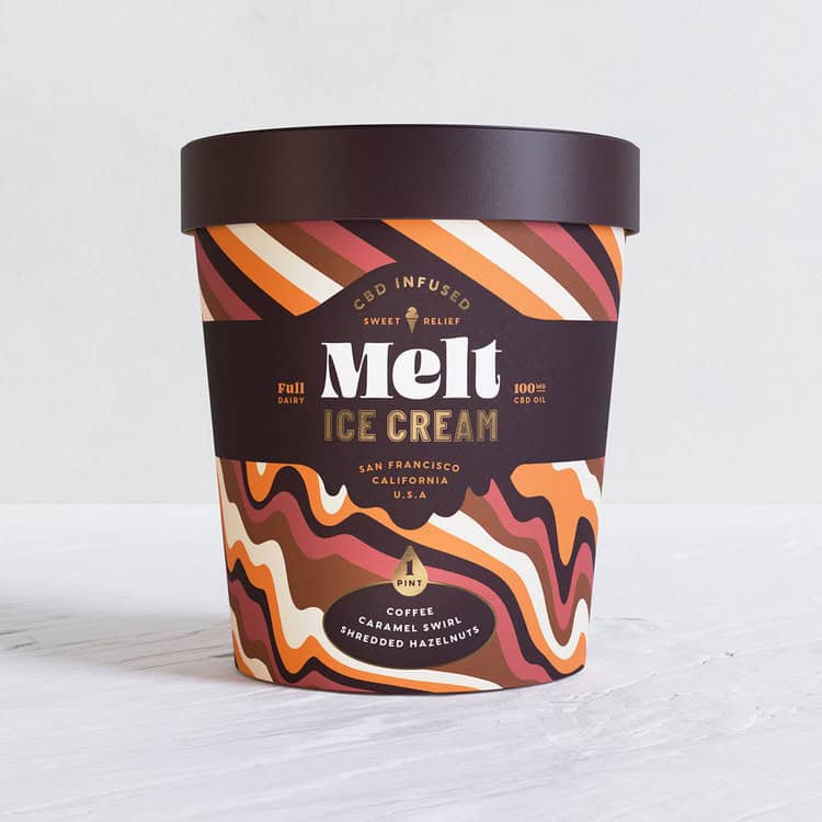
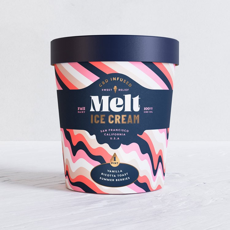
Melt is a CBD-infused ice cream brand aimed at a younger, open-minded audience with a holistic attitude to health. The visual identity was created by Hunger Craft, who wanted to create a casual ice cream brand with a Californian accent.
For the packaging, the agency played with the codes of the confectionery category, «melting» rigid, colored strips. With these deliciously distorting lines, each motif embodies the product's «chill / easy life» qualities. The flavors of the different ice creams range from toasted coconut and pineapple-raspberry to ricotta toast and summer berries. Layers of extravagant colors are used to embody the melting pot of ingredients inside. The whole identity has a retro-psychedelic vibe without compromising its high-end appeal. The lettering of the brand name is equally fluid, giving the indulgent sensation of a smooth, flavorful ice cream.
With a brand identity Melt's sophisticated yet psychedelic stripes can be easily applied to posters, vans and, of course, other ice cream tubs. Its sophisticated yet psychedelic stripes can easily be applied to posters, vans and, of course, other pots of ice cream.
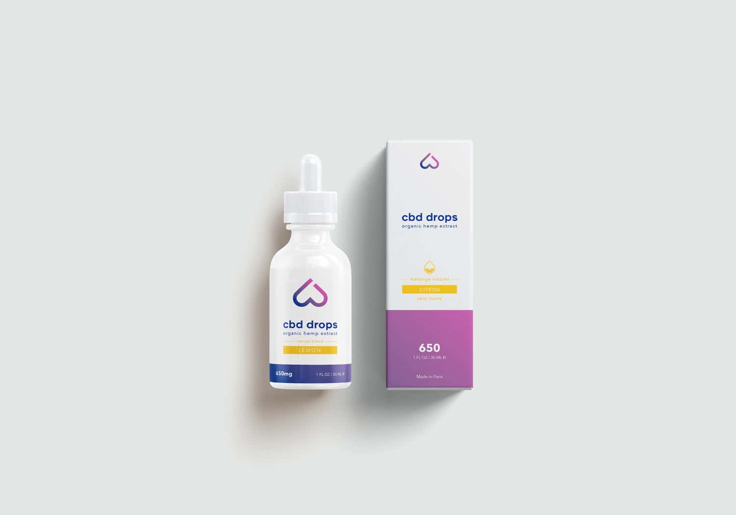
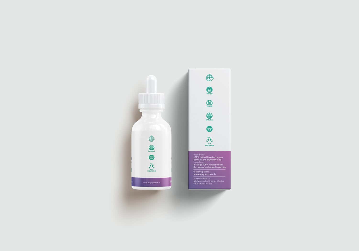
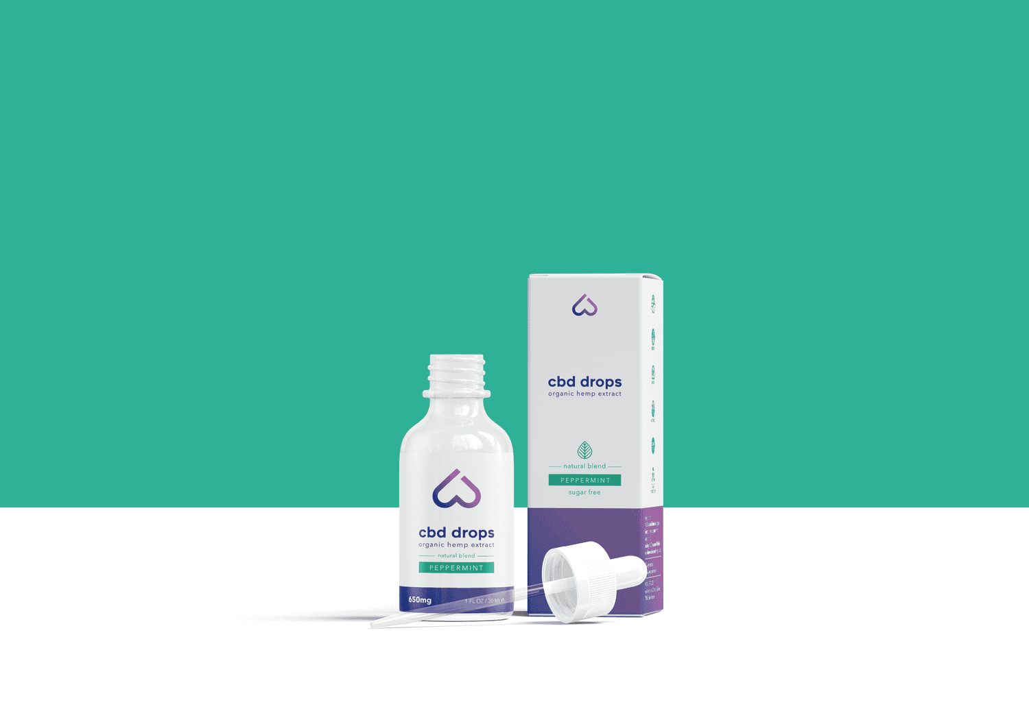
Wayup is a THC-free, French CBD oil designed for athletes to give them a safe, natural boost. This range of premium, full-spectrum hemp products is designed to help athletes feel their best before and after exercise. Their products are all sourced from the finest organic hemp and natural ingredients on the market, and are tested by independent laboratories for quality and purity. In terms of design, Wayup is the brand with the most «surgical» look in this article. Although less funky and colorful than the others, it stands out and speaks directly to the target. Packaging visual identity and the bottle reassure users of its medical and serious nature.
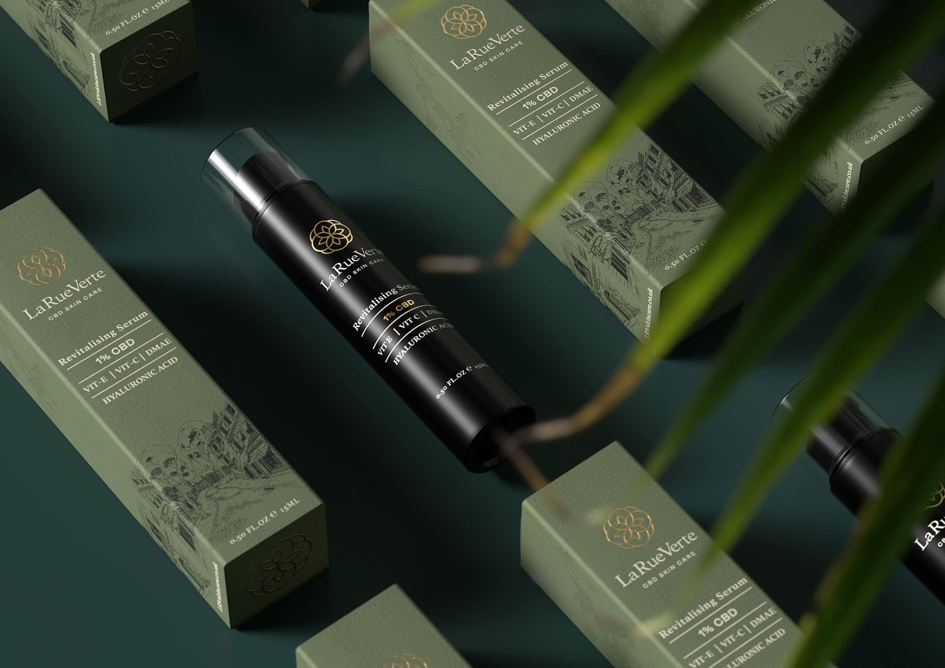
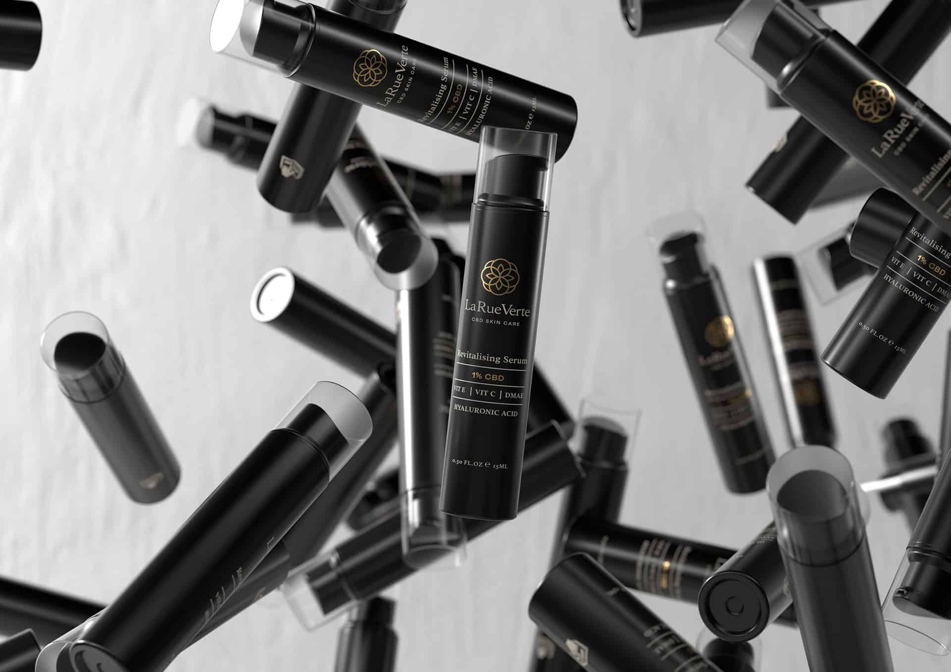
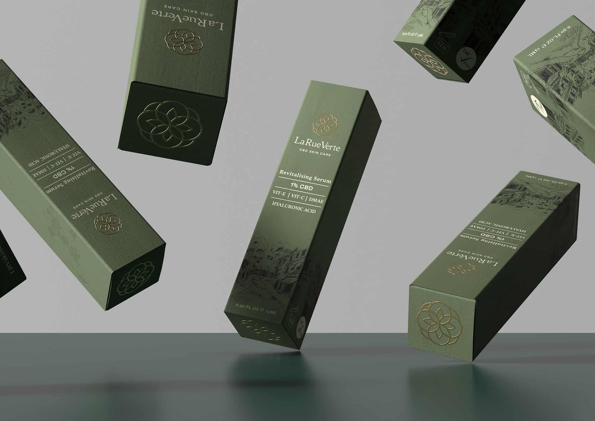
Too Gallus was hired by LaRueVerte to bring the vision of their new CBD luxury skincare product to life. With a strategic approach brand design, Too Gallus provided a complete package, from name and identity system to 3D renderings and copywriting. The visual identity is sleek and classy in shades of desaturated green. The spray is totally black, with some white text and a circular Celtic logo in gold. The whole is somewhat reminiscent of spirits packaging (whisky in this case).
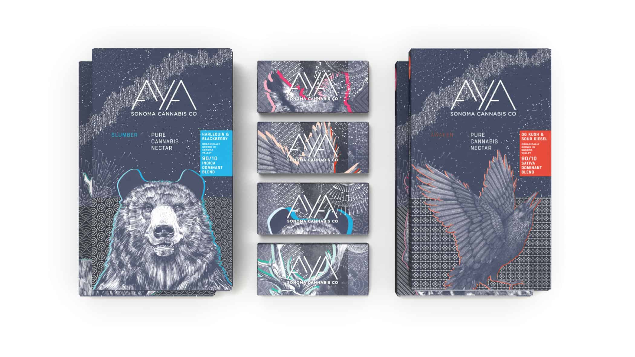
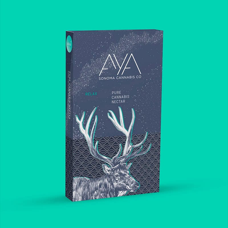
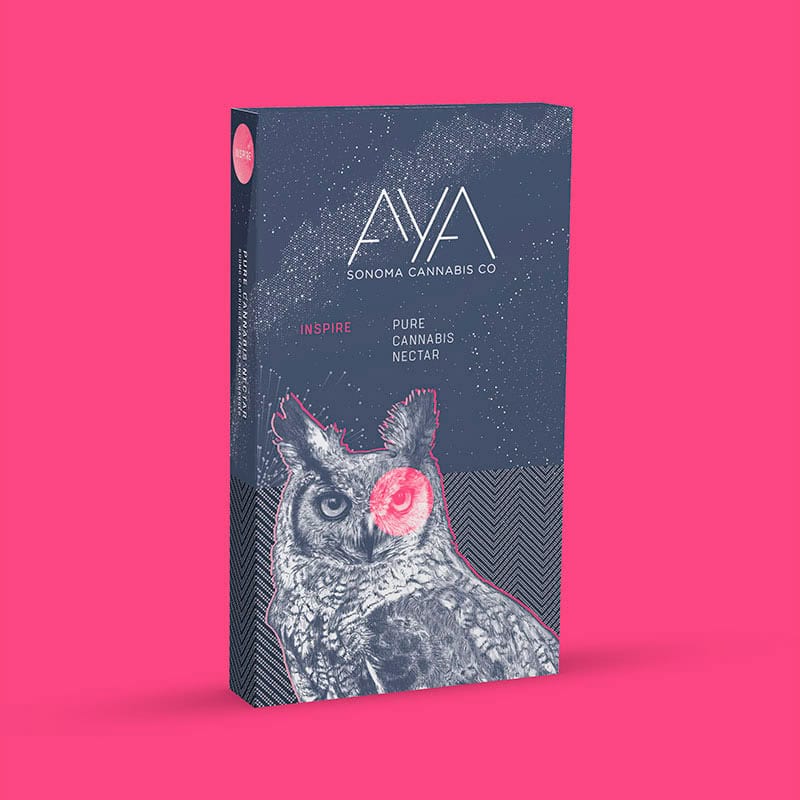
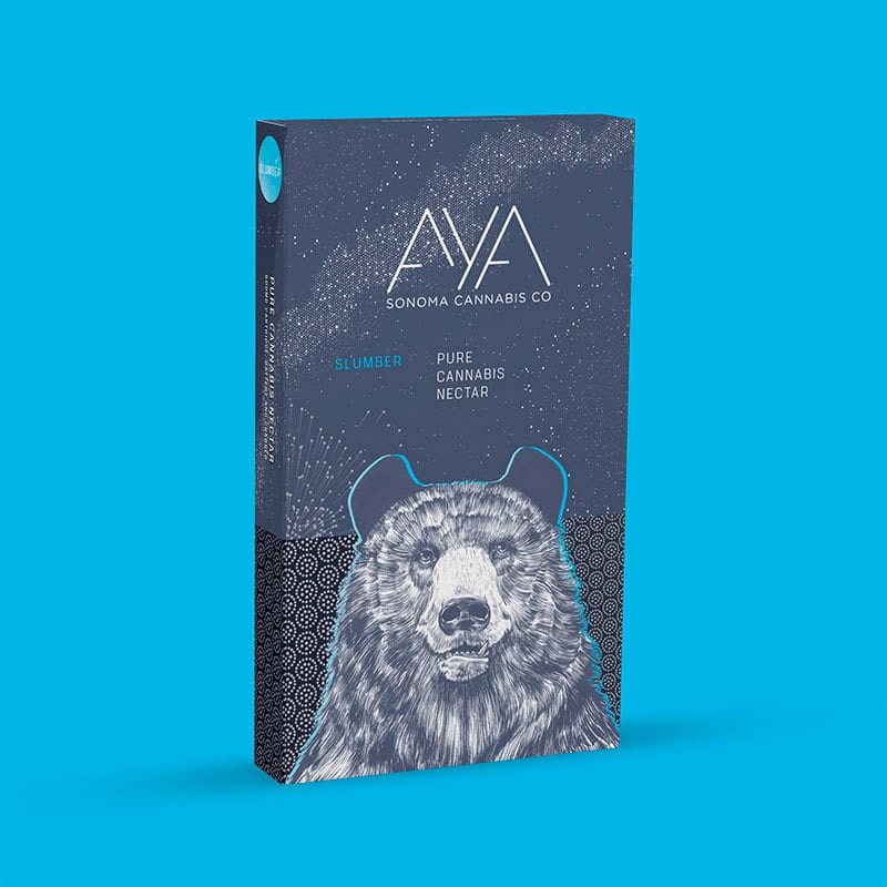
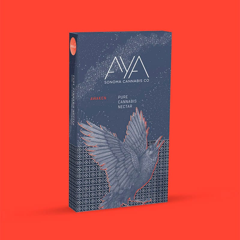
Aya is a brand of concentrated cannabis nectars sustainably hand-grown in California with respect for the land and its heritage. Aya is grown using only four ingredients: Earth, water, sun and sky, without pesticides or harmful chemicals. Products are carefully crafted using an exclusive low-temperature extraction process, then batch-tested to guarantee unrivalled quality. Each Aya packaging features a different animal (bear, raven, deer, owl) with mystical, celestial accents, giving the brand a dreamlike, soothing look. Work by John McNeil Studio.
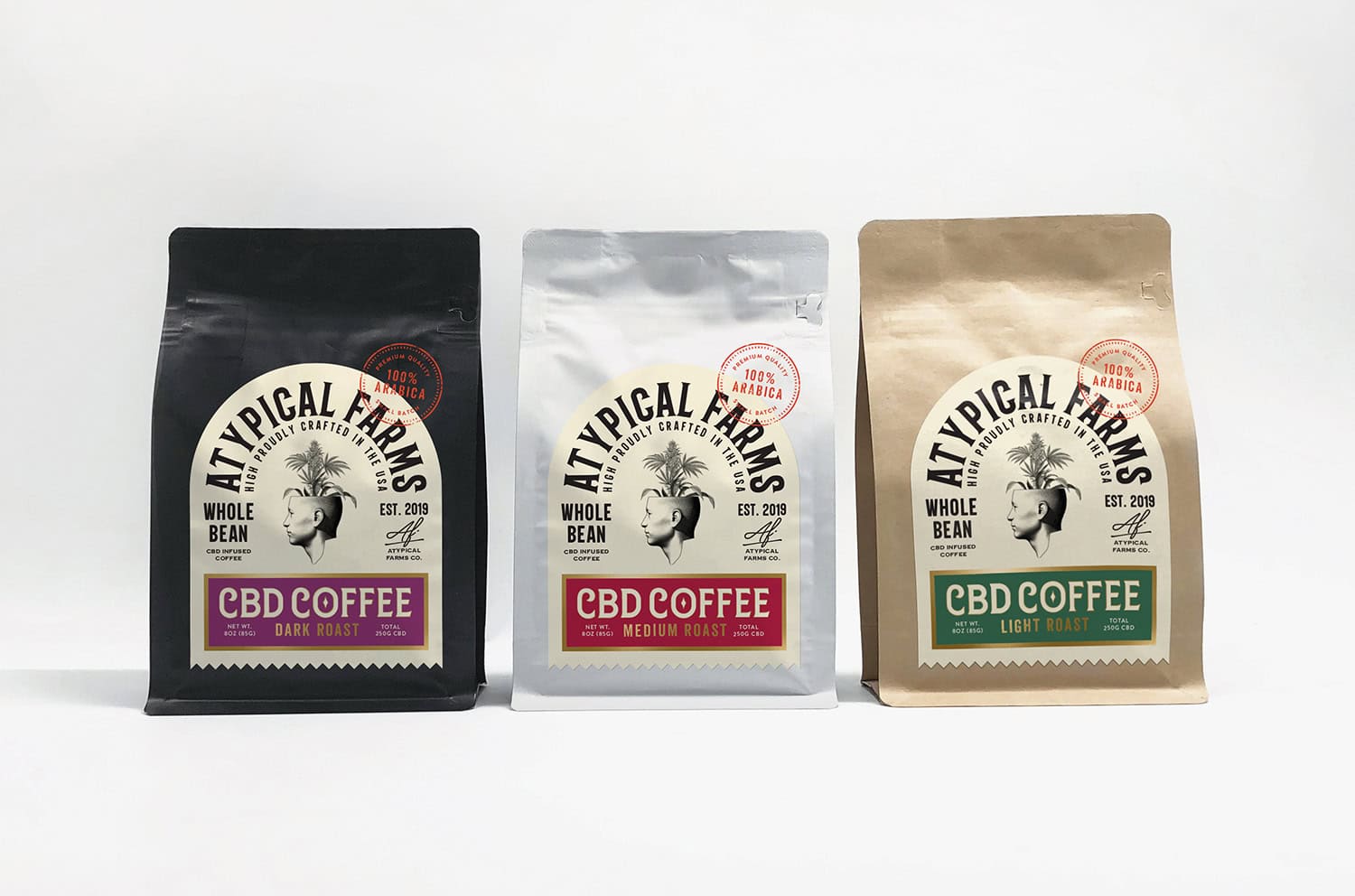
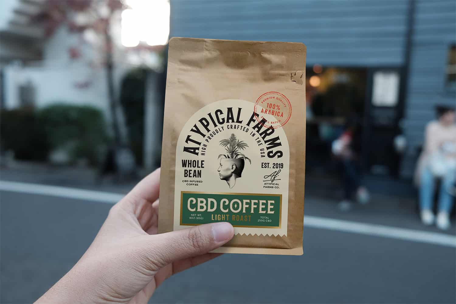
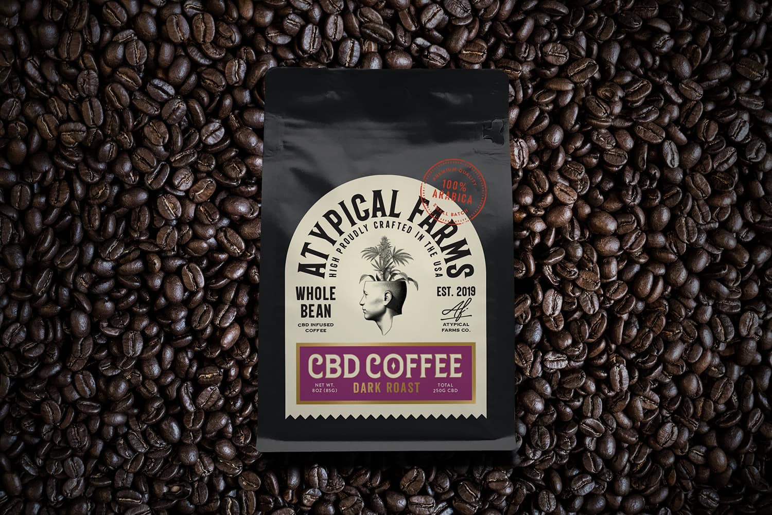
Atypical Farms' coffee is carefully selected and roasted, then infused with certified organic full-spectrum hemp oil, grown in California. The main challenge of this project was to create a bold brand for an artisanal product with a hip approach to linking the worlds of coffee and cannabis.
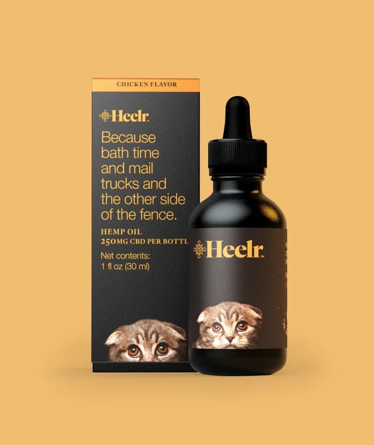
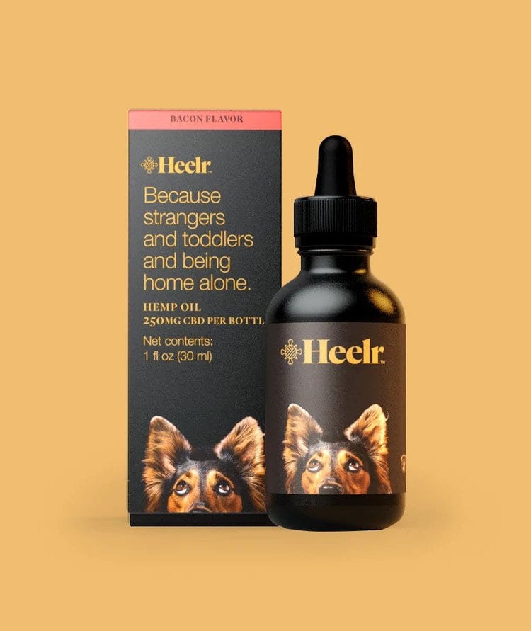
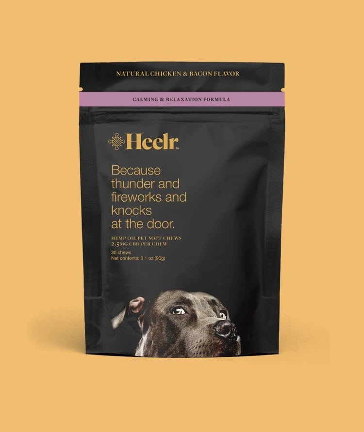
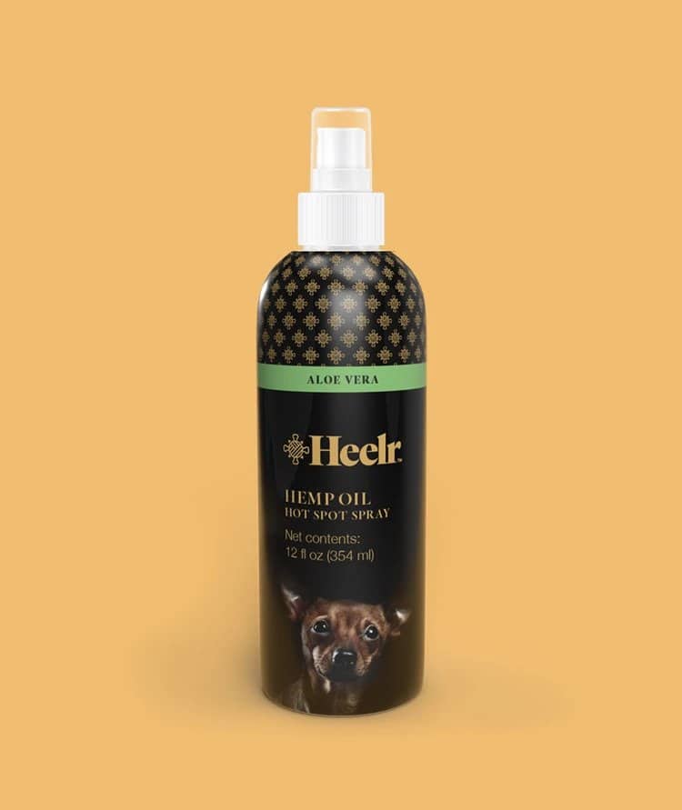
Heelr wishes your pet all the best. Indeed, the brand has had the good idea of «nesting» in CBD products for animals (mainly dogs and cats). Their carefully crafted oils and chews help promote a calming effect, improve bone and joint health, and maintain emotional balance. Heelr provides pet owners with CBD-infused products of consistent, natural quality. The design, meanwhile, is fun, high-contrast (yellow on black) and borrows from the usual pet food codes in that a photo of the pet is featured on each packaging. However, the difference lies in the placement of the photo. We see the dog or cat at the very bottom of the packaging, cut off at muzzle level, looking up as if asking its master to feed it this product. The concept is playful and works perfectly.
Related articles