Baie Bleue Liqueur
The story
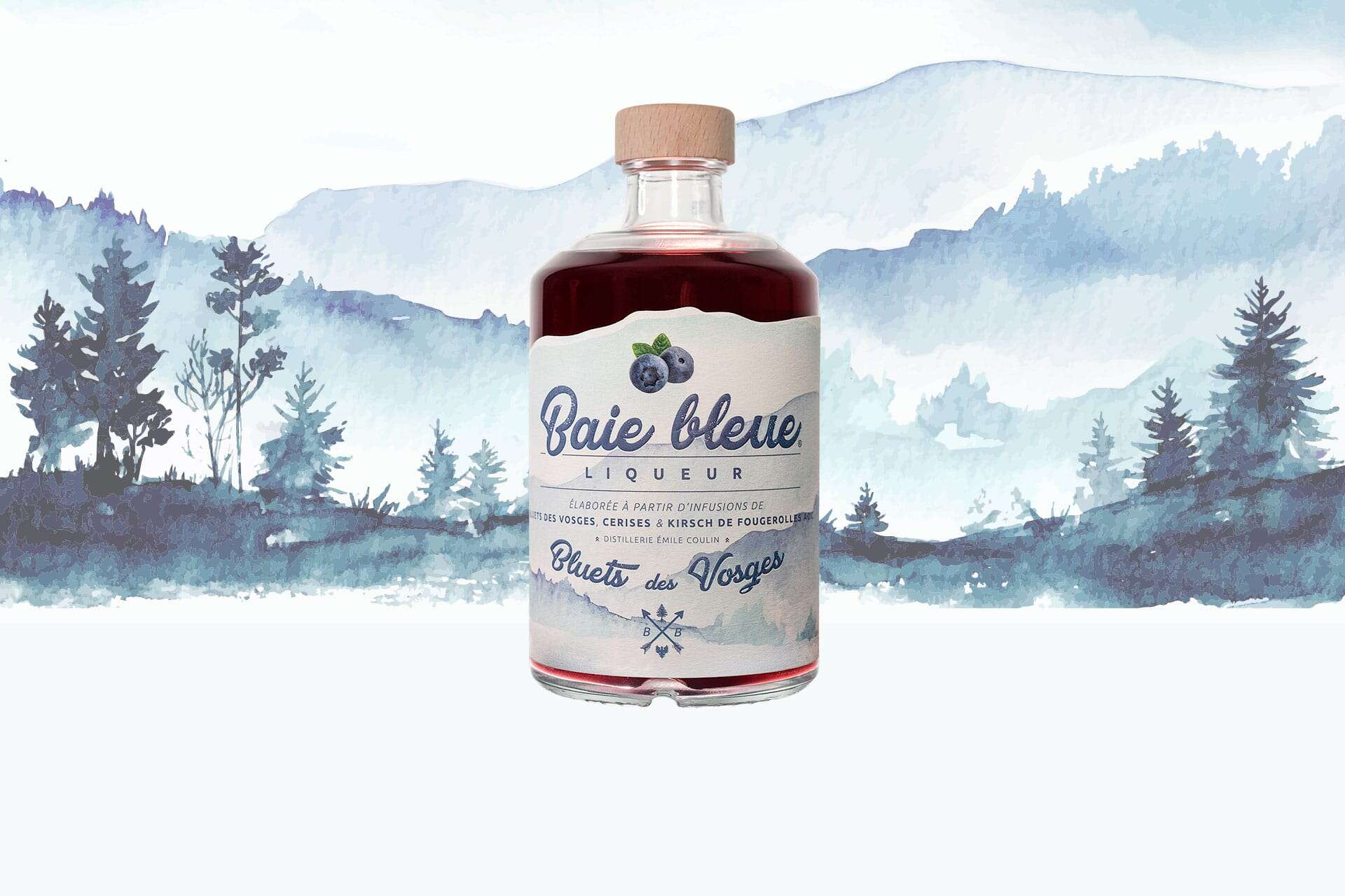
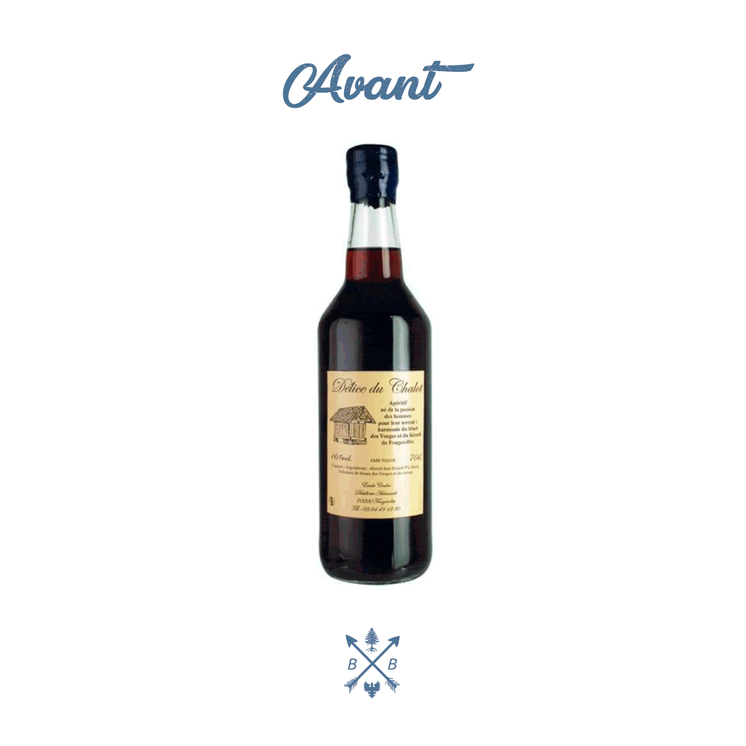
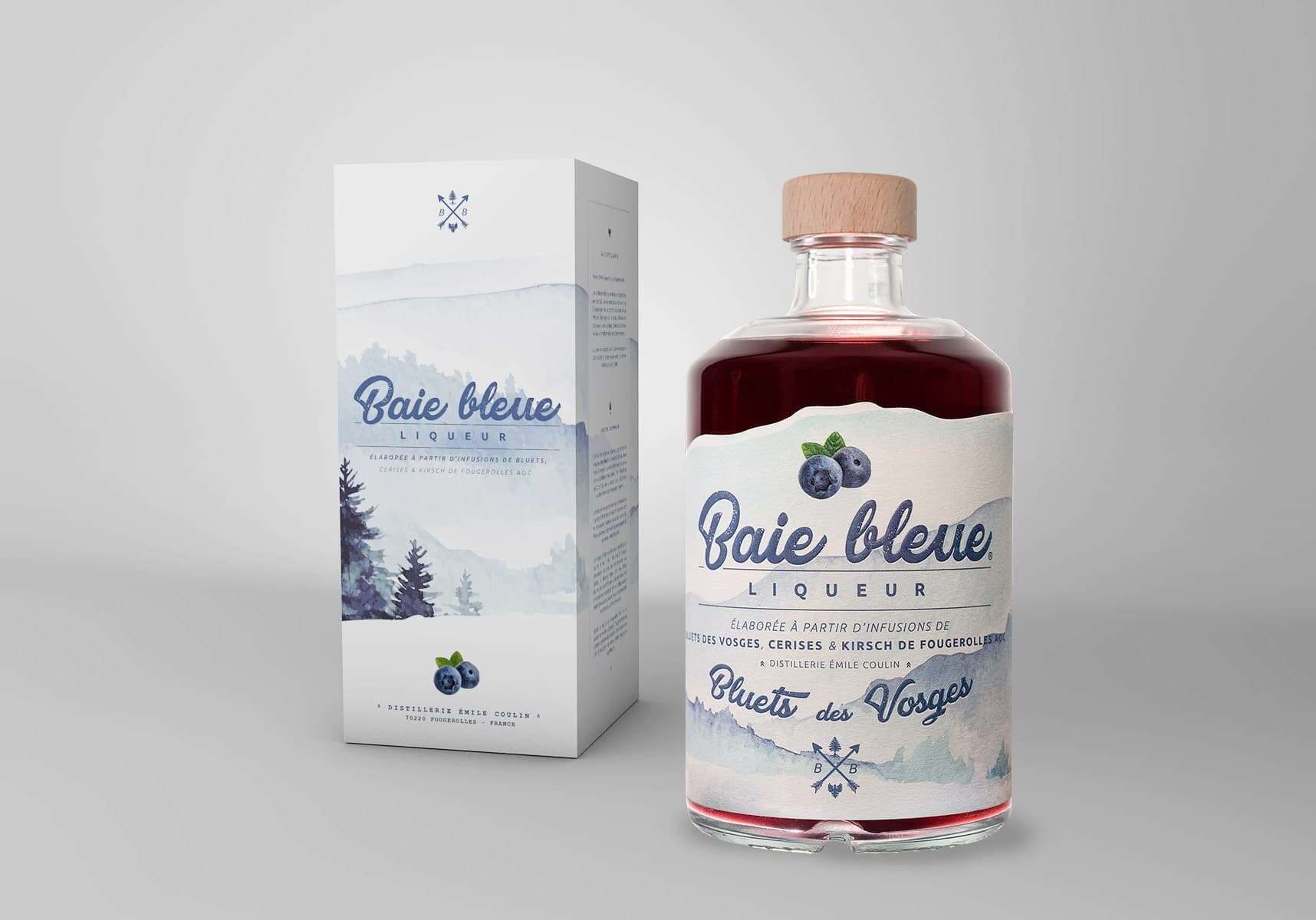
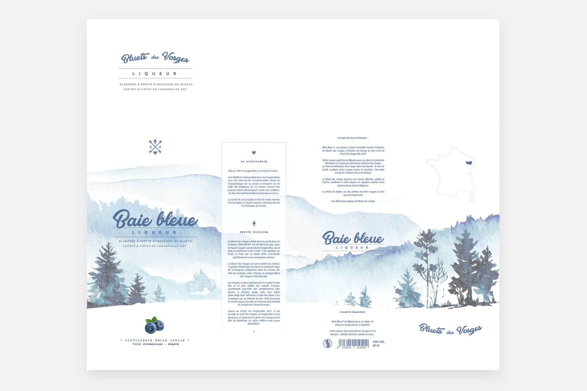
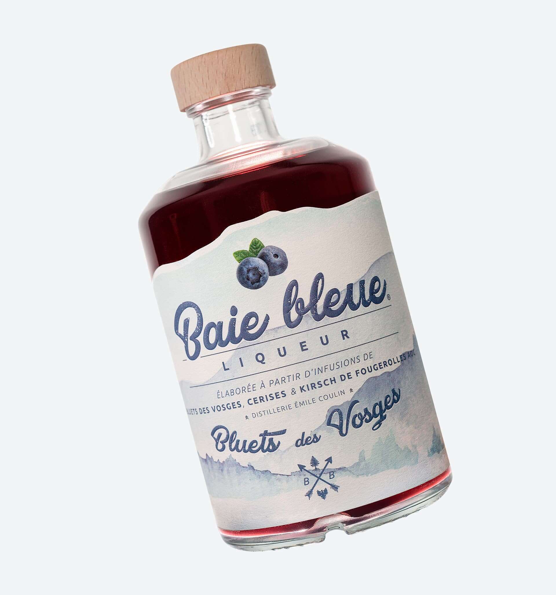
Baie Bleue is a unique liqueur made from an infusion of blueberries from Les Vosges, an infusion of cherries and a dash of Fougerolles AOC Kirsch. Formerly known as "Délice du Chalot", Distillerie Coulin wanted to rebrand this aperitif in order to broaden its target and honour the rich regional heritage of Les Vosges. The challenge was to redesign the brand identity and the bottle in order to make it a flagship product of the distillery.
→ Website : Baie Bleue Liqueur
Services provided
- Research & Strategy
- Rebranding
- Packaging Design
- Product photography
The approach
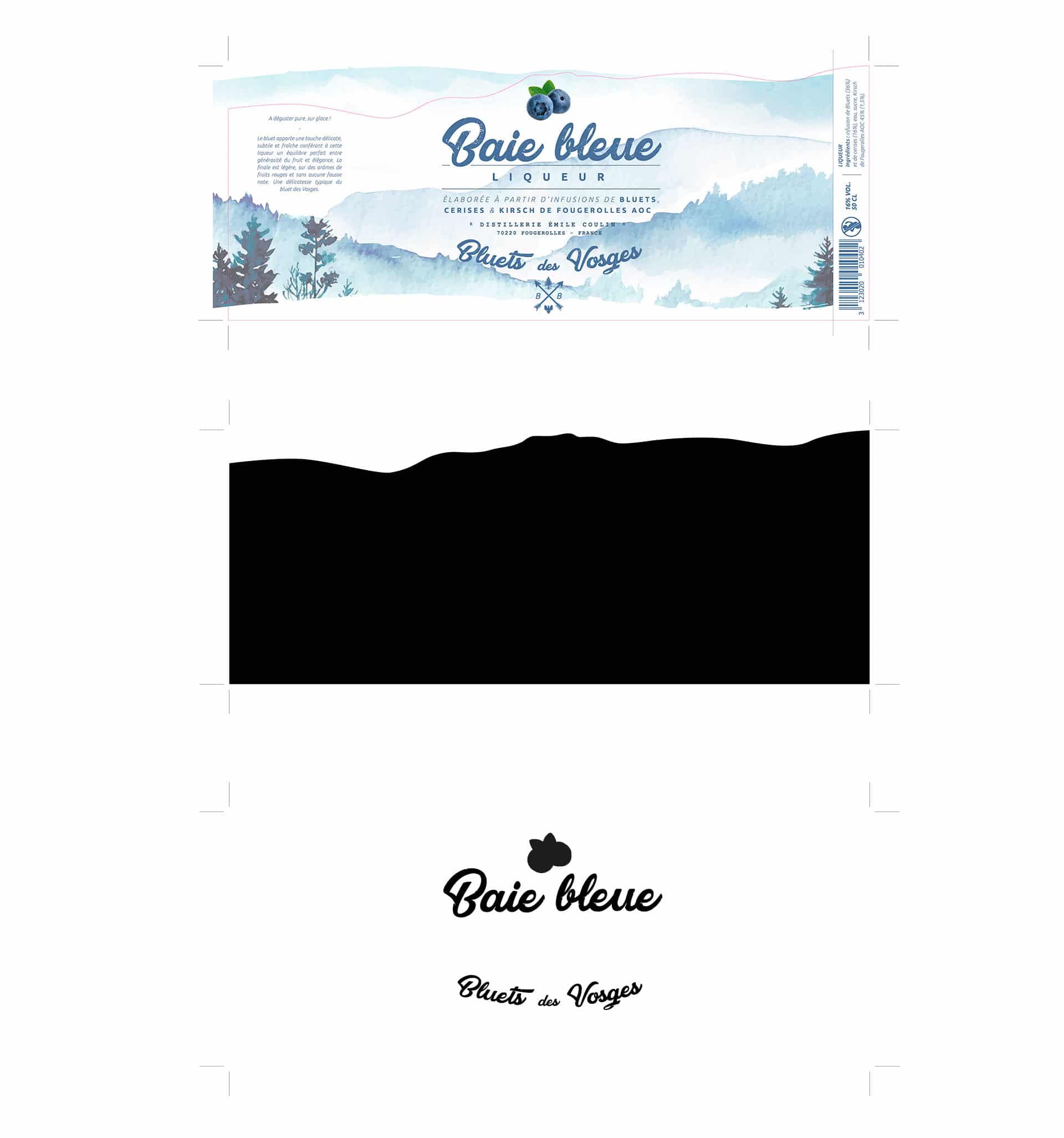
Although it is a fairly low mountain range, the wet and cold Vosges climate is often compared to the Scottish climate. The Baie Bleue liqueur is made from local products and harvested in the Val d'Ajol, at an altitude of over 600m. Therefore, the idea for the redesign of the label was to work on a visual evocation of this mountain freshness. So, in collaboration with the distillery, we have chosen to highlight the nature/purity side of the mountains and this beautiful region. So we used a cold tones colour chart to get closer not only to the colour of the bluet but also to connote this inherent freshness of the product.
A few printing effects have been implemented on this new label, namely the use of thick, soft-touch paper, the embossing of the name and the irregular cut-out of the label reminding us of the mountain landscape.
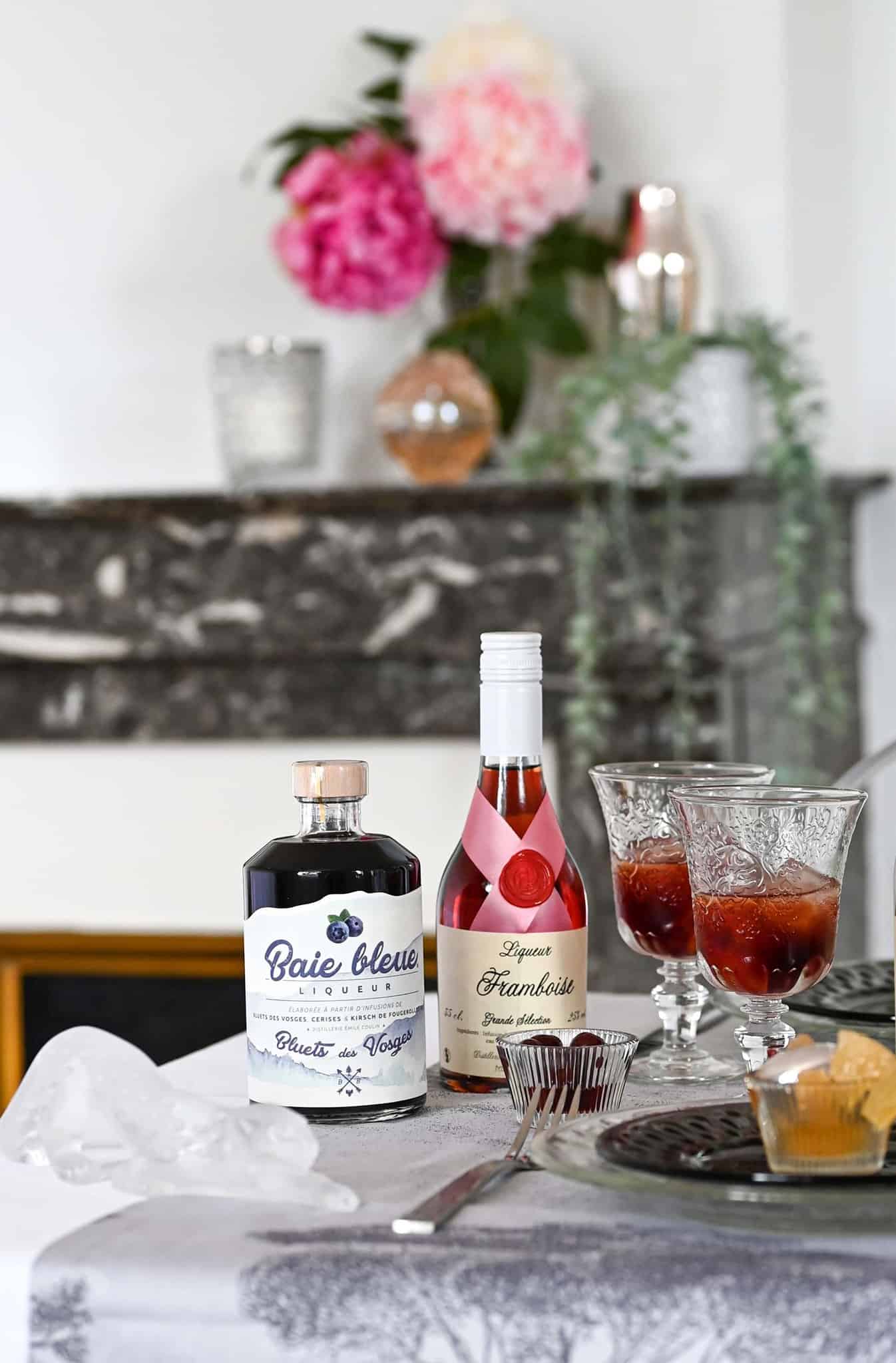
This aperitif liqueur can be enjoyed straight, over ice and is a proud symbol of the rich regional heritage of Les Vosges.
Packaging Design
A delicate aperitif
In order to be consistent with the new identity, we were asked to design the box of this liqueur. We extended the use of this blue watercolour on the whole packaging by adding a few text boxes, allowing you to learn more about the product.
Scope of work
Brand Identity
- Label Design
- Packaging Design
Creative production
- Product Photography