
Packaging design: bottles, cans, and packs designed for in-store impact
Studio Blackthorns designs and redesigns packaging for all kinds of beverages and related products: glass bottles, cans, pouches, gift sets, and coffee or tea bags. With over 15 years of experience, hundreds of packaging designs delivered, and one unwavering conviction: tastes and colors may differ, but impact is measurable.
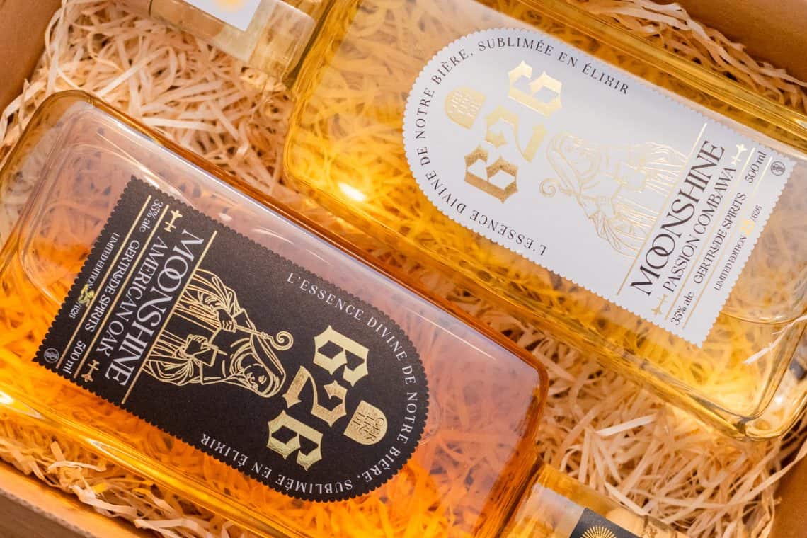
20 seconds in the radius, 2 centimeters in the drive
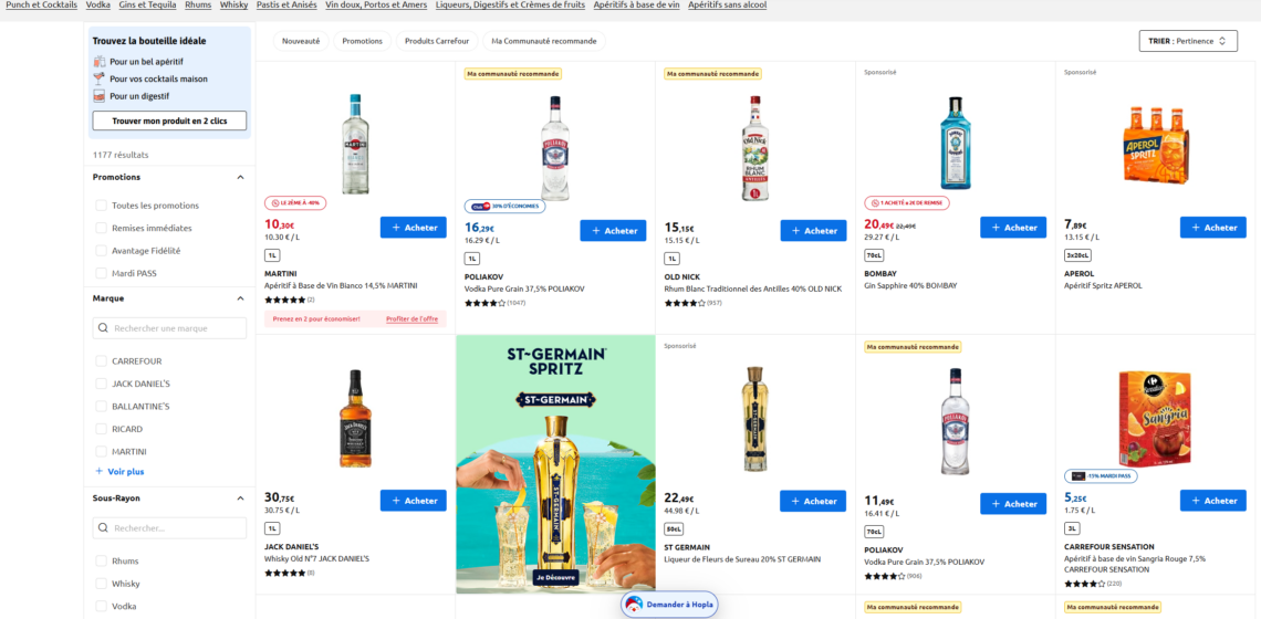
Your packaging lives in two ruthless worlds. On the physical shelf, the buyer scans about twenty products in 20 seconds and makes a decision from 3 meters away. For drive-through and delivery, your product becomes a 2-centimeter thumbnail on a smartphone screen. In both cases, the verdict is made before your product is even picked up.
This is the precise moment for which we design. Packaging can look magnificent in a 3D render on Behance and be invisible on the shelf; the opposite also happens, but hey... in the age of Instagram, that's unforgivable. Our job is to deliver both: packaging that can be identified in one second on its shelf, understood in three, AND attractive enough to make someone want to put it on the table. And it's precisely the order of priorities that makes all the difference.
Packaging design is a whole profession!
Packaging design starts well before Illustrator. A seriously conducted project involves diagnosis (your brand essence, your category, your competitors, your distribution channel, your target price), information hierarchy (what needs to be read from 3 meters away, 1 meter away, in hand), the design itself (silhouette, colors, typography, illustration, materials), range variations, and then industrial execution: choice of printing processes, finishes, quality constraints, production files, and follow-up until the "bon à tirer" (proof approval).
This last part is the least glamorous and the most decisive. A poorly anticipated sleeve distortion grid, impossible gilding on the chosen paper, an adhesive label that peels off in an ice bucket: these details can ruin months of creation. At Blackthorns, we incorporate them from the very first mock-ups, in direct liaison with your printers, and we stay in the loop until the product is in hand.
Upstream, when the brand itself deserves to be questioned, our signature method, the’Brand Exorcism, strategic diagnosis: DNA, positioning, Range architecture. Because we are convinced that brilliant packaging on a confusing brand is still just a vulgar band-aid!
The BLACKTHORNS Approach: Impact Before Aesthetics
Facing Agencies that sell beautiful things, We sell visibility and sellability, with beauty as a baseline standard rather than an end goal. Each creation undergoes our packaging that sells.
These tests have one virtue: they take debates out of the realm of opinion. When a management committee hesitates between two creative paths, the decision is no longer based on the sales director's preferences, but rather on what is read, recognized, and resonated with.
No container limit
We're working on everything the beverage and grocery sectors can put on shelves.
- Glass bottles beer labels (33 and 75 cl), full wraps for wine and spirits bottles (label, back label, capsule, box), screen printing, choosing between standard glass base and custom mold
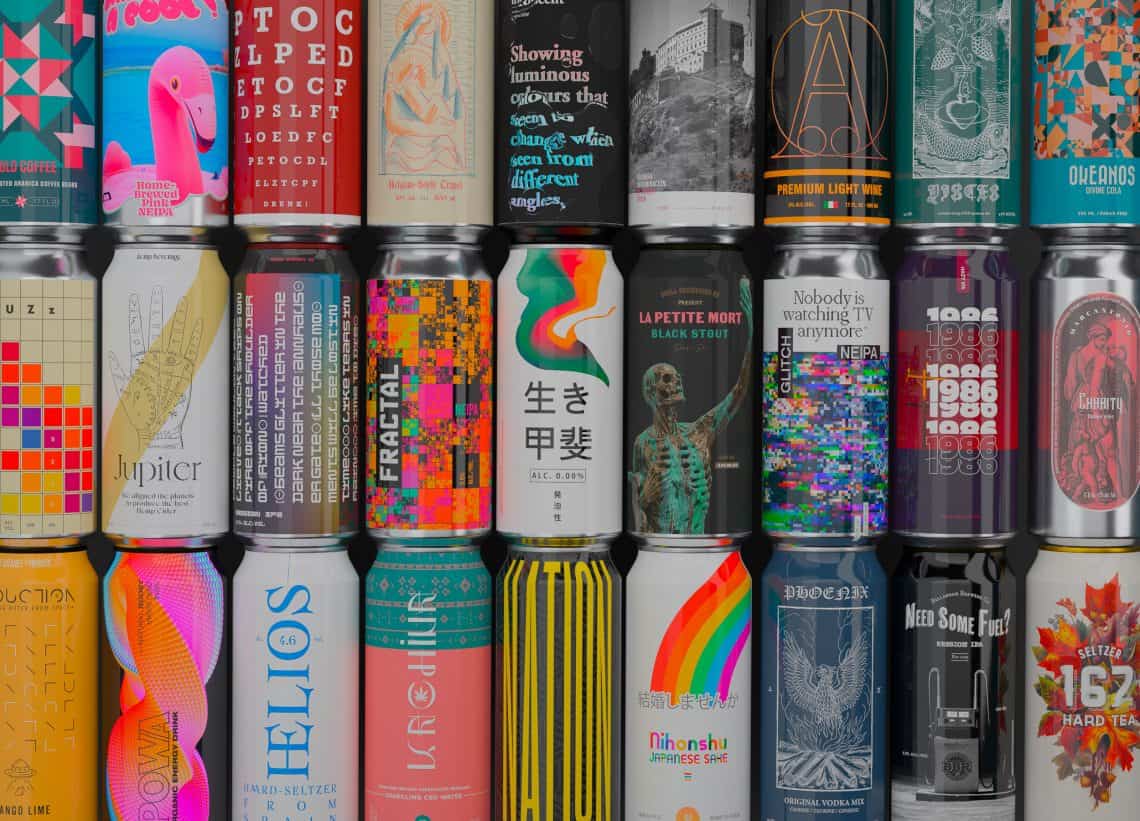
- Cans : direct print, sleeve or adhesive depending on your volumes and your MOQs, a field that we have documented to the point of obsession with 366 Cans Challenge (366 designs in 366 days, featured by The Dieline, Packaging Digest and Brand New) and Our can design guide
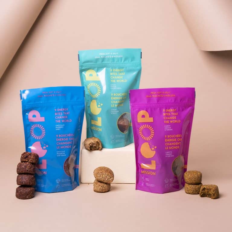
- Soft and alternative pouches and doypacks, premium bag-in-box, cartons, sachets
- Solid Drinks and Groceries : Coffee beans or ground, teas and infusions, powders and preparations for dilution, Condiments and gourmet grocery products
- Secondary and overwrapping : packs, clusters, cases
Yes, that’s quite a wide range! Each container dictates its own physical characteristics (a can is viewed on a cylinder, a pouch changes shape, a box is experienced as it’s unpacked) as well as its distribution channel. So designing for the ACTUAL container, on its ACTUAL shelf, is part of the basic brief at Studio Blackthorns.
Our most beautiful packaging projects
Our exorcisms speak louder than a sales pitch, so here's the best from the studio, all categories combined:
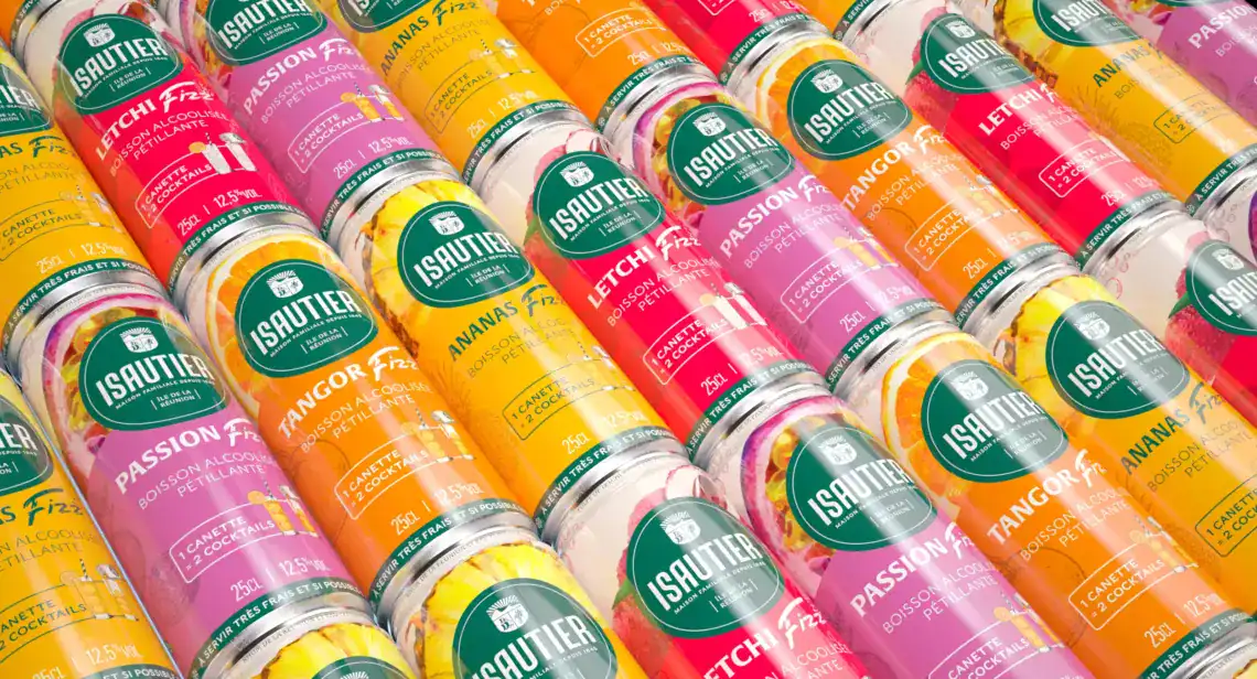
- Isautier FIZZ : RTD rum range in cans for a Réunionnais house founded in 1845, three-letter naming designed for a narrow cylinder, recognized by World Brand Design
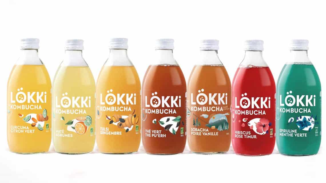
- Lökki Kombucha Repositioning the packaging of an organic kombucha leader, a textbook case documented on our blog
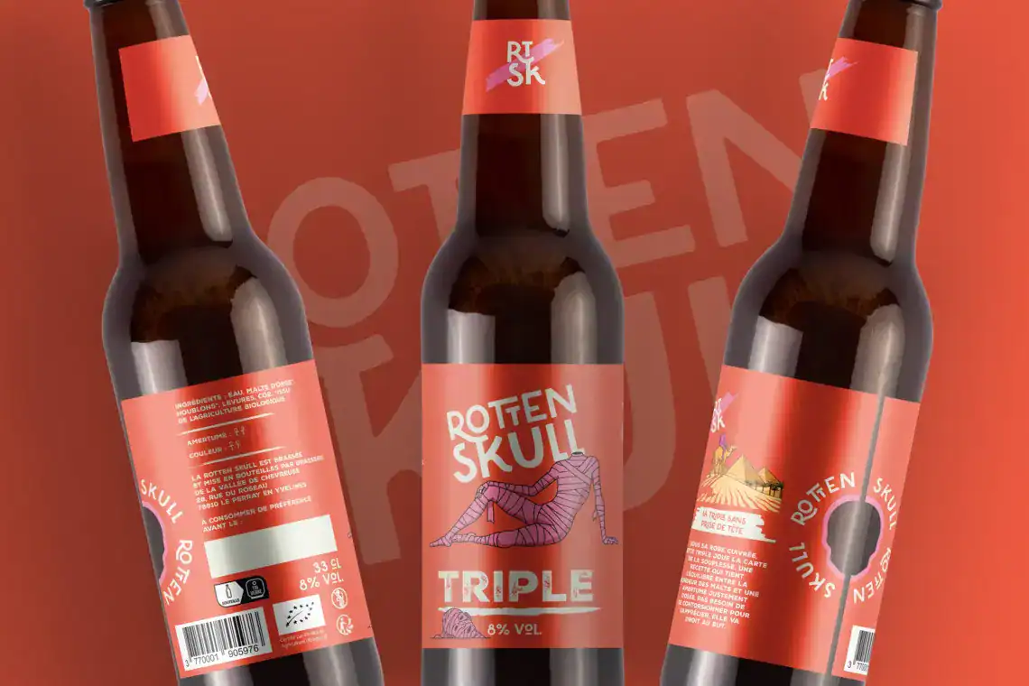
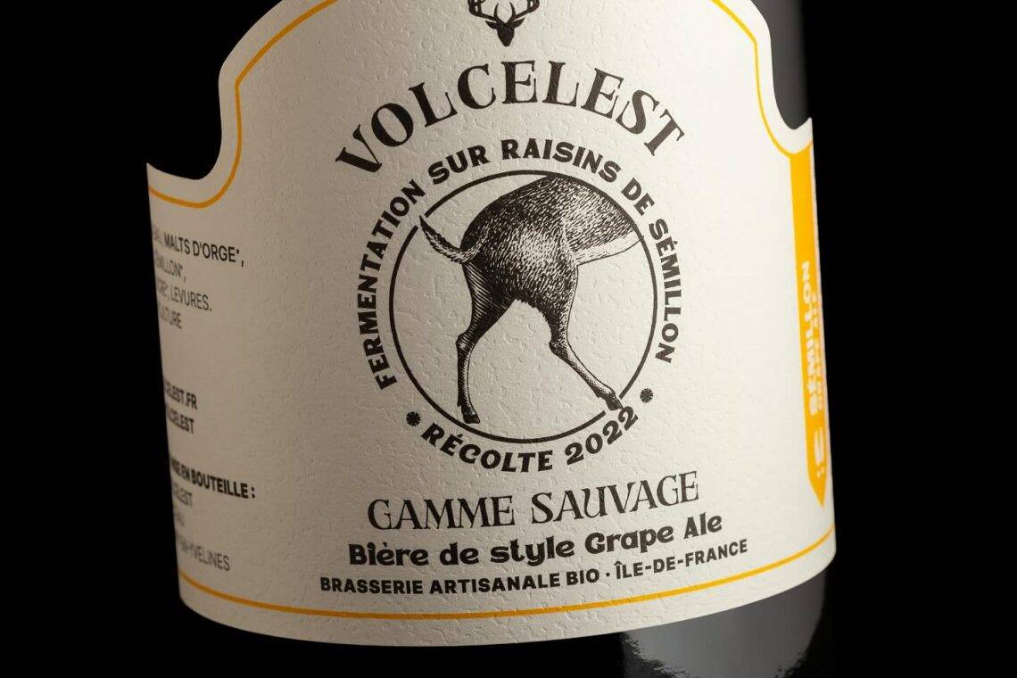
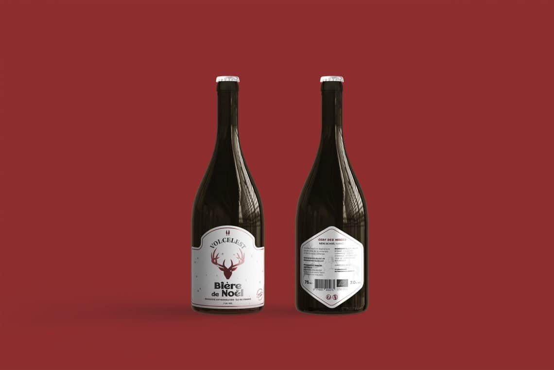
- Volcelest Brewery : complete design system for an artisanal brewery in Ile-de-France, from the returnable bottle to the supermarket multipack
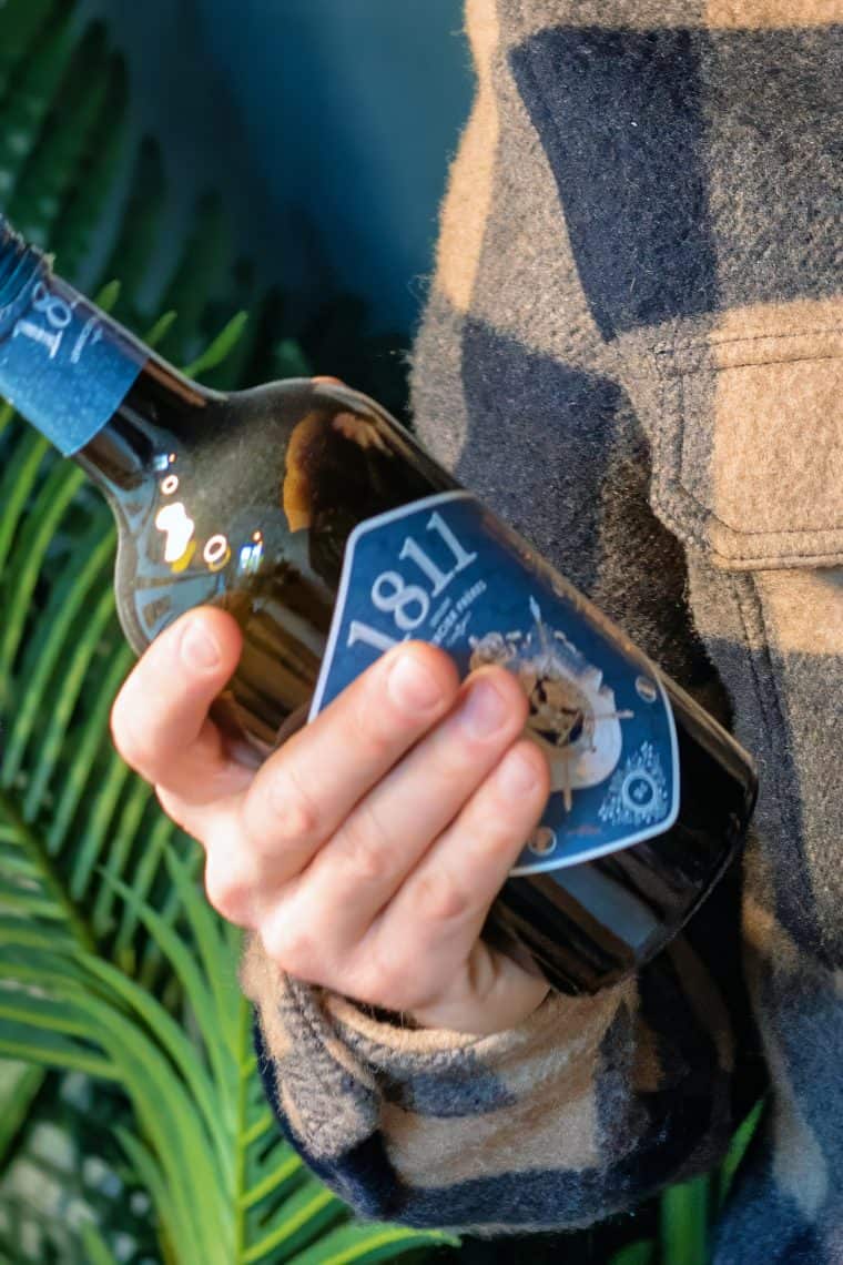
- Pastis 1811 Rebranding a pastis: between heritage and modernity
- Le Gang des Levures hard kombucha published by Packaging of the World
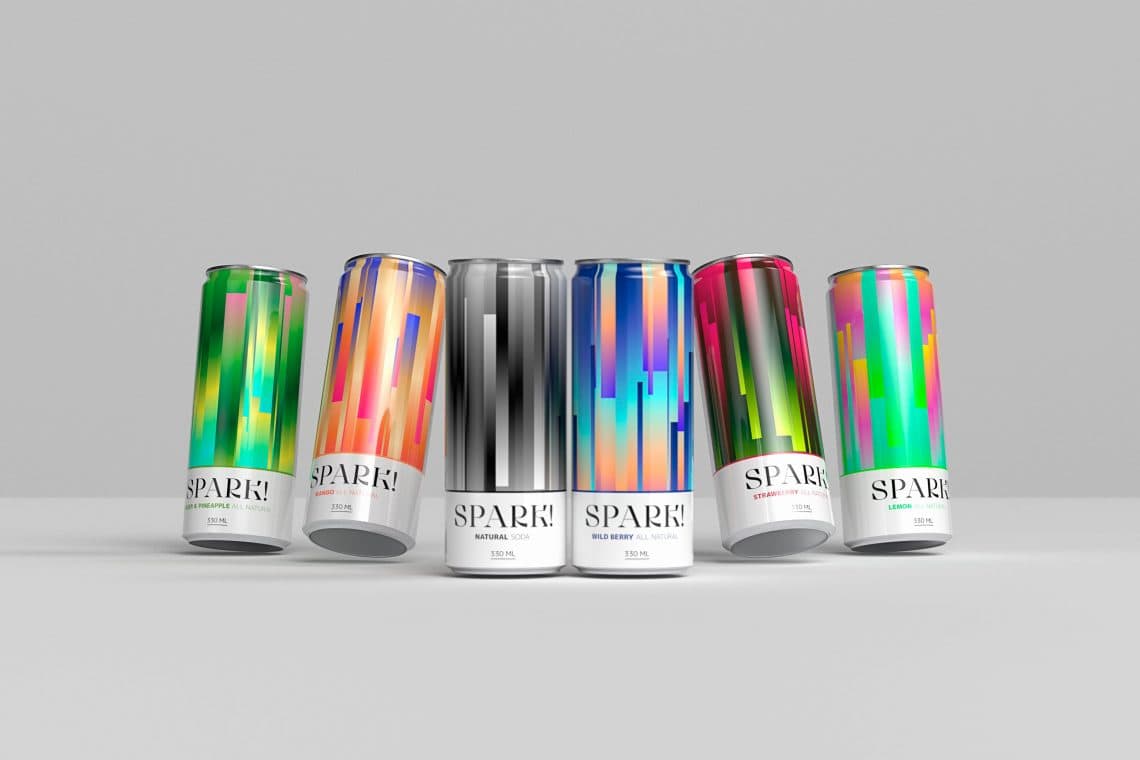
- Spark! prebiotic soda cans, cut for the shelf and drive-thru
- Gertrude Beers Belgian beer brand identity and range architecture redesign
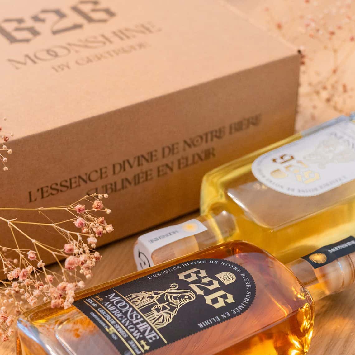
- Moonshine 626 Range of moonshines with a defined universe
- Ikigai Happoshu Japanese beer concept with and without alcohol
- Uchronic Wines A wine brand that breaks the mold of the wine aisle
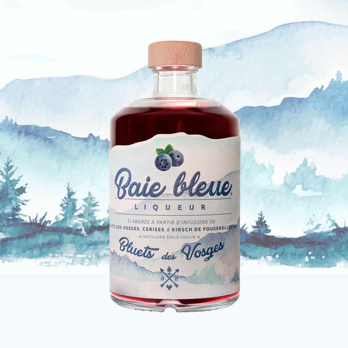
- Baie Bleue Liqueur Artisan liqueur
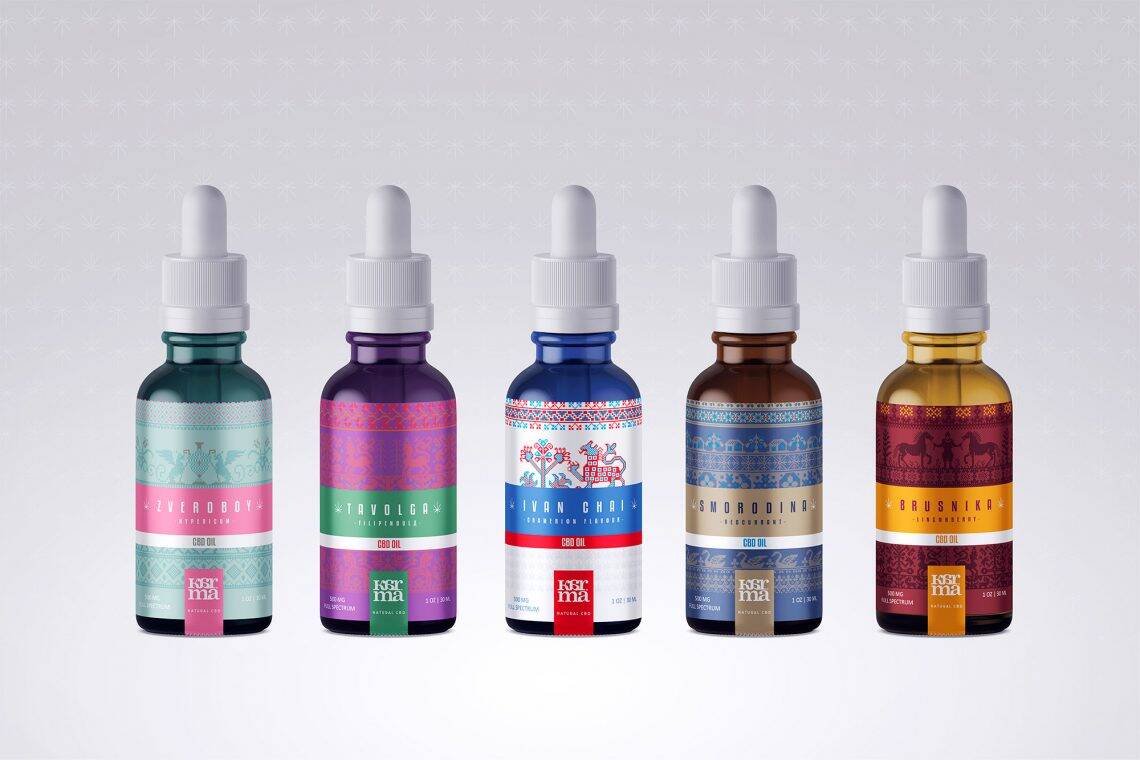
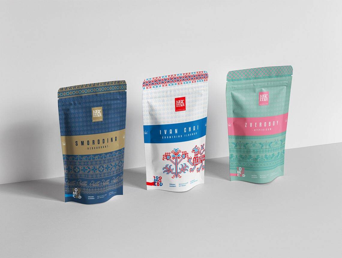
- Karma Award-winning CBD packaging concept
- 366 Cans Challenge 366 cans in one year, published by The Dieline, Packaging Digest, Brand New, and Trend Hunter.
These projects earned the studio publications in Strategies, Luxury Forms, Graphis, and GDUSA. To explore by sector, our dedicated pages detail our approach by category: beer, spirits, wine, soft and alcohol-free.
Deliverables & Investment
Packaging design based on an existing identity (design, variations, print-ready files, press proof monitoring) takes 4 to 6 weeks to complete. A complete creation, including strategy and brand identity, starts around €15,000; multi-reference product line architectures and multi-channel rollouts range from €25,000 to €50,000. Each delivery includes print-ready execution files for your printers, with variations for each format and channel.
Frequently asked questions about our agency
Do you have any other questions? Let's talk about your project