
Rotten Skull
From a second bar tap to a supermarket linear: anatomy of a brand created to break out of its mold.
Email Ludovic to discuss your Brand Excorsim today
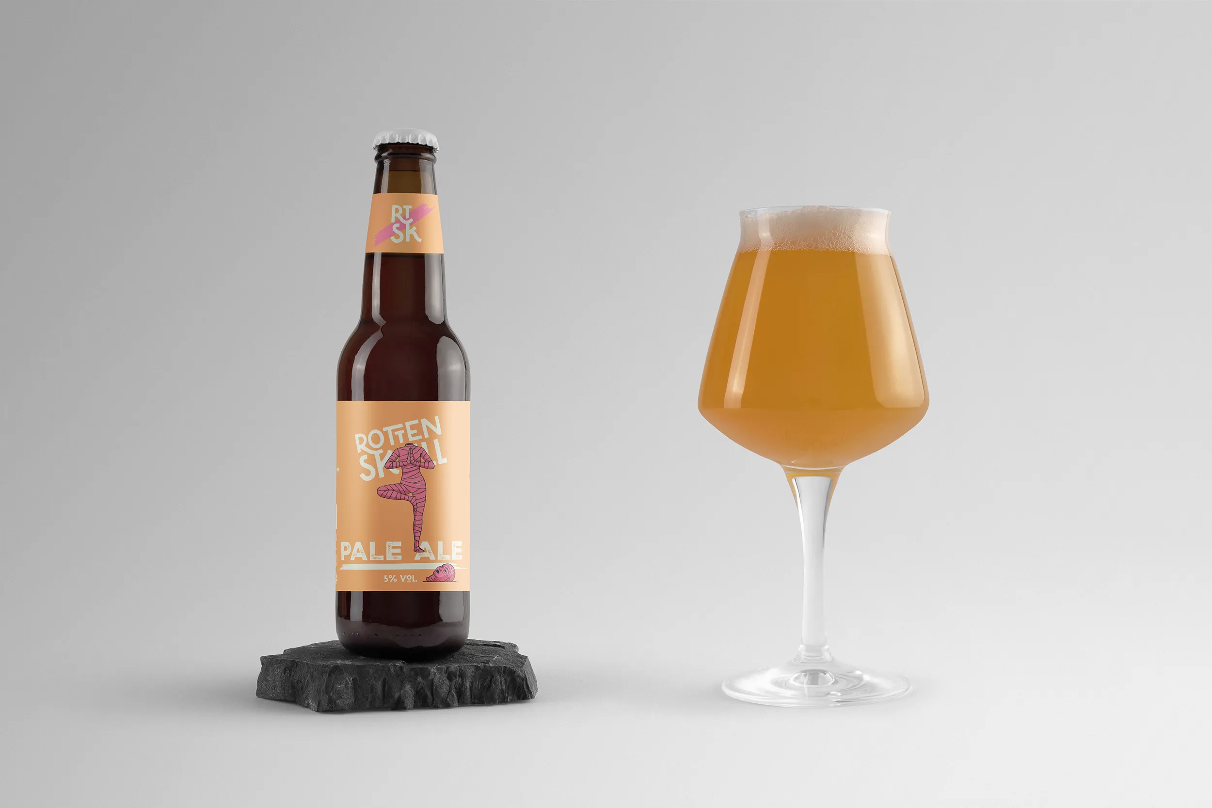
Challenge & Objectives
A well-established Parisian brasserie In the CHR (Café, Restaurant, Hotel) and organic store circuit, there was a recurring observation: when a bar already had one or more taps from a brewery, offering yet another variation of its main range tired the consumer. Drinkers want choice, diversity – not the impression that the same brewery is duplicated across five taps.
The request: create a self-sustaining brand, totally distinct, capable of living alone on a second brew without ever betraying its brewing origins. A brand that wouldn't be perceived as an extension, but as a discovery.
Carte blanche. Blank slate. Everything had to be invented!
What started as a CHR project – barrels, pump toppers, coasters – quickly became something else. Through reflection and market exposure, one thing became clear: This brand had the potential to go far beyond the bar. She could replace a range that was being delisted and establish herself in supermarkets, where the battle is won in a mere two seconds on the shelf.
Result: Rotten Skull will be available at Monoprix and Franprix starting March 2026.
Objectives:
- Create a self-sufficient beer brand, distinct from the parent company
- Design a universe strong enough to exist on its own in CHR (second bite)
- Architect a visual system capable of pivoting from barrel to GMS linear
- Generate immediate shelf impact in the face of saturated competition
- Extend the brand across two distribution formats (33 cl & 75 cl)
Expertise
Strategy & Brand Expression
- Visual Identity
- Mascot Creation
- Design system
- Packaging Design
What… A pink mummy???
The French beer market It's saturated. We all know it. Visually, many brands look alike: hops here, bearded guys there, ultra-complex illustrations, or vintage labels straight out of libraries like Adobe Stock, Pixabay, or Freepik. To exist, it wasn't enough to be «different.» It had to be memorable at first glance.
The strategic response was built around three pillars of linear impact:
1 — A proprietary mascot.
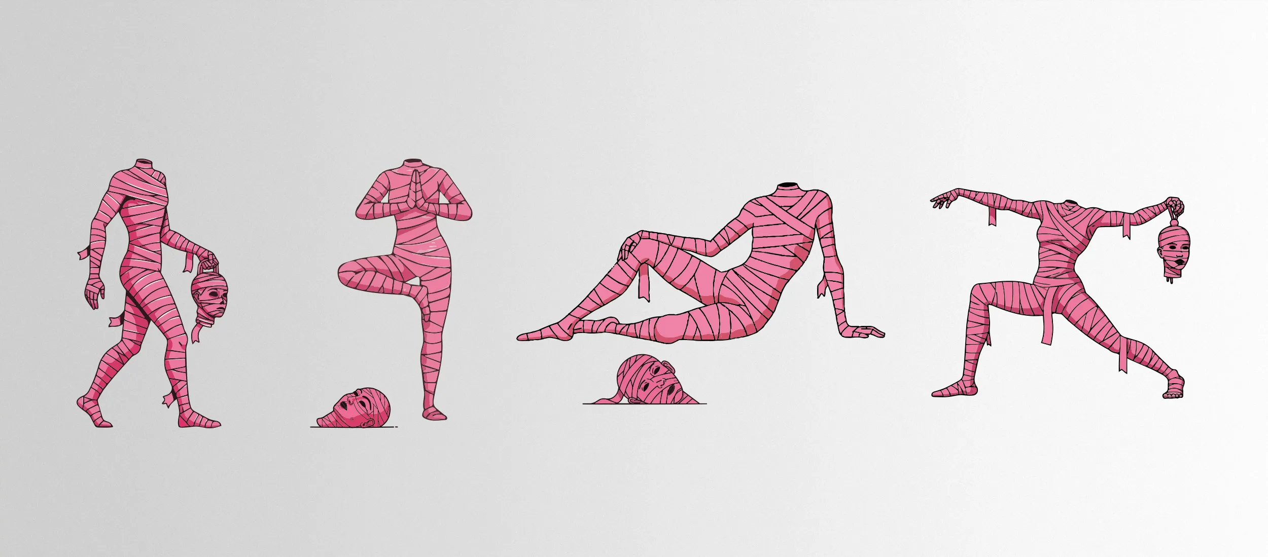
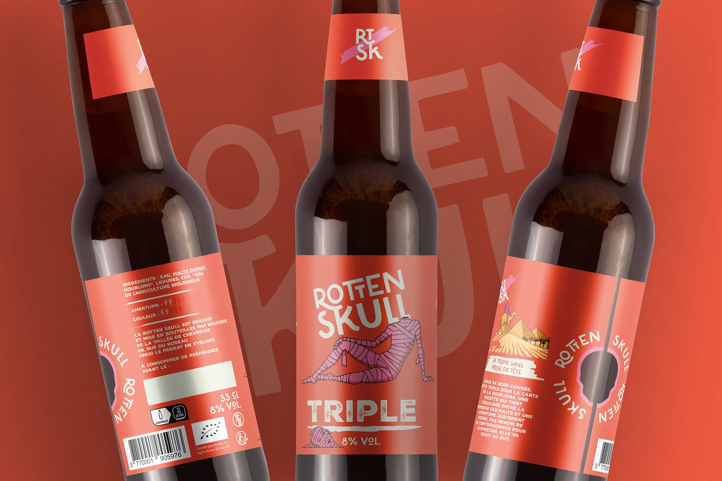
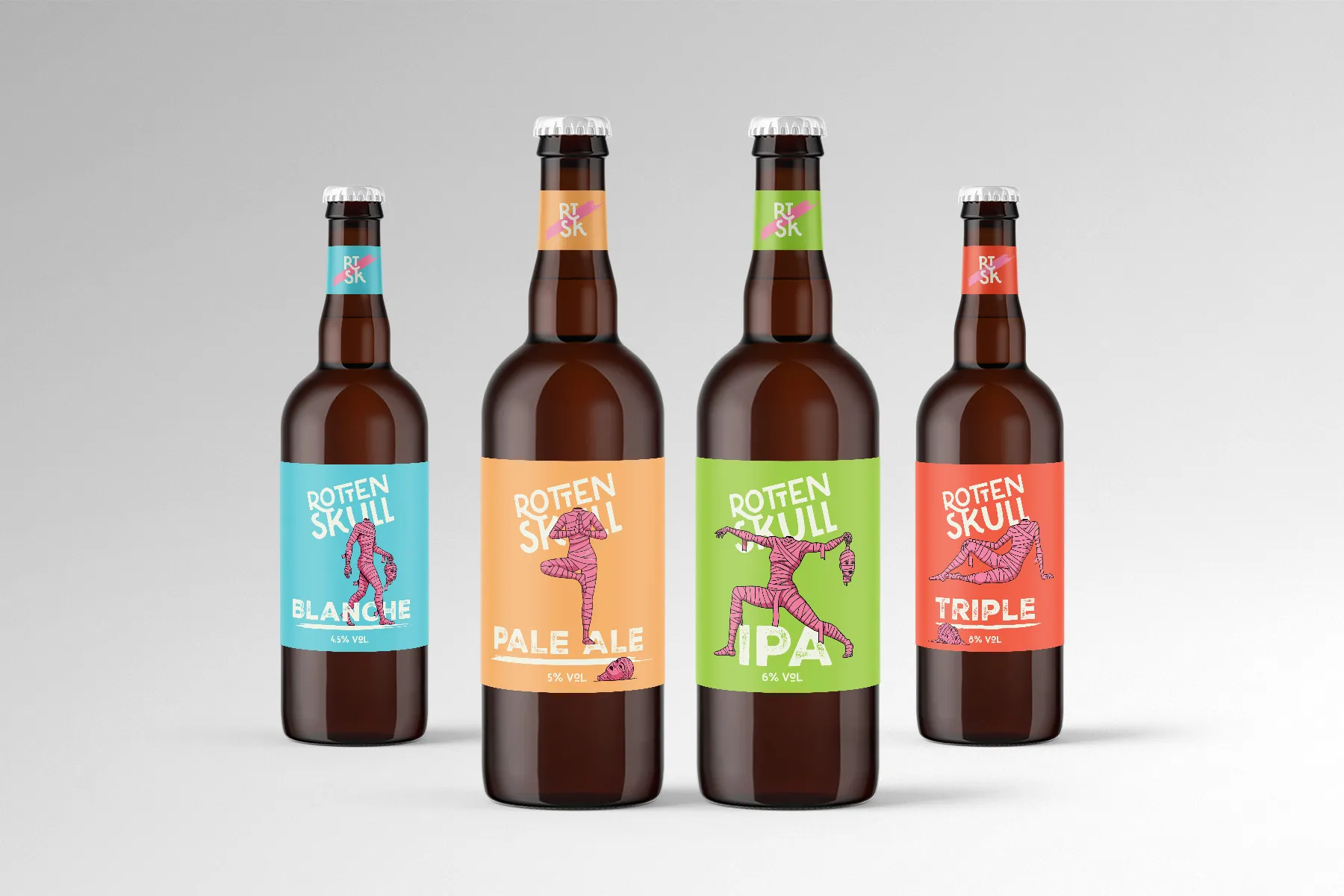
In addition to designing a logo with multiple variations, we wanted to create a (living) character. A pink, headless mummy doing yoga. Four distinct poses for the launch, one per reference — each bottle tells its own story while belonging to the same narrative universe. In HRI and GMS, The mascot creates what the logo alone cannot. of attachment, of conversation, of «Did you see the bottle?».
2 — A color code by reference, but a single system.
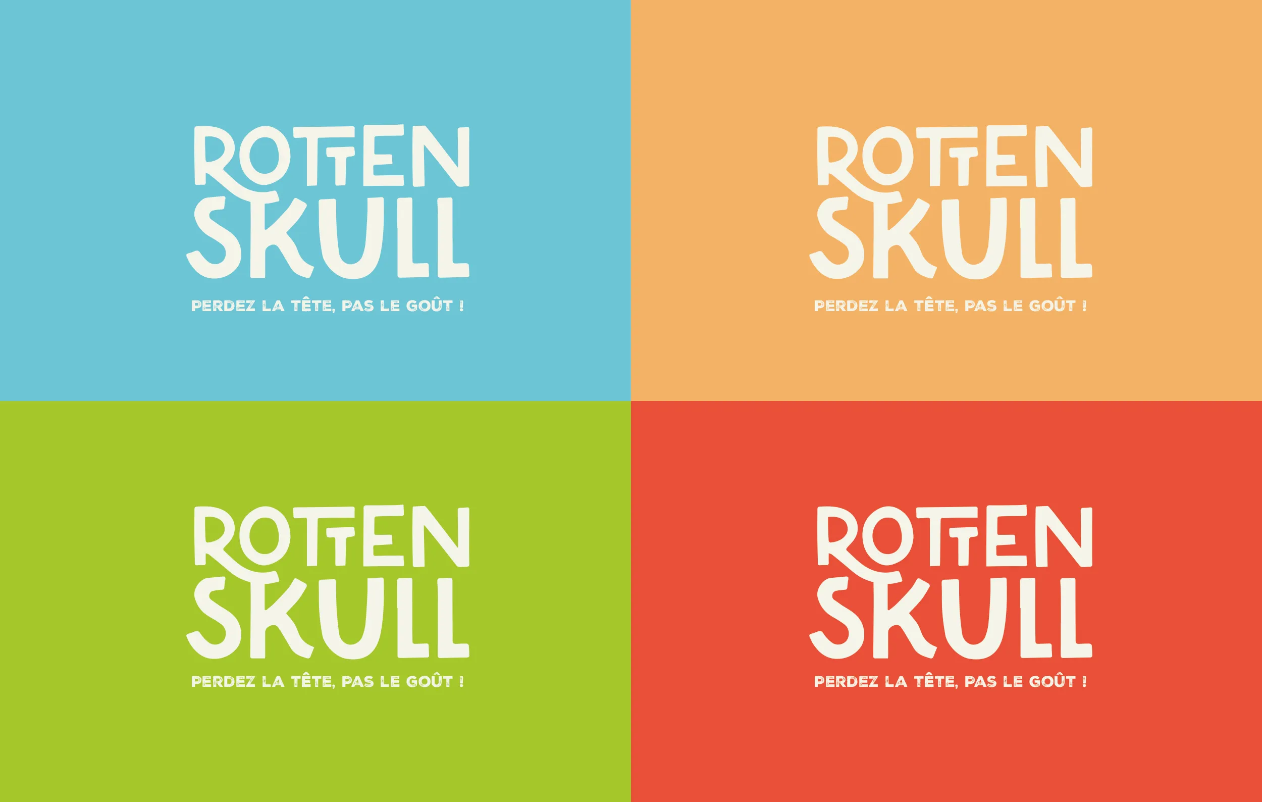
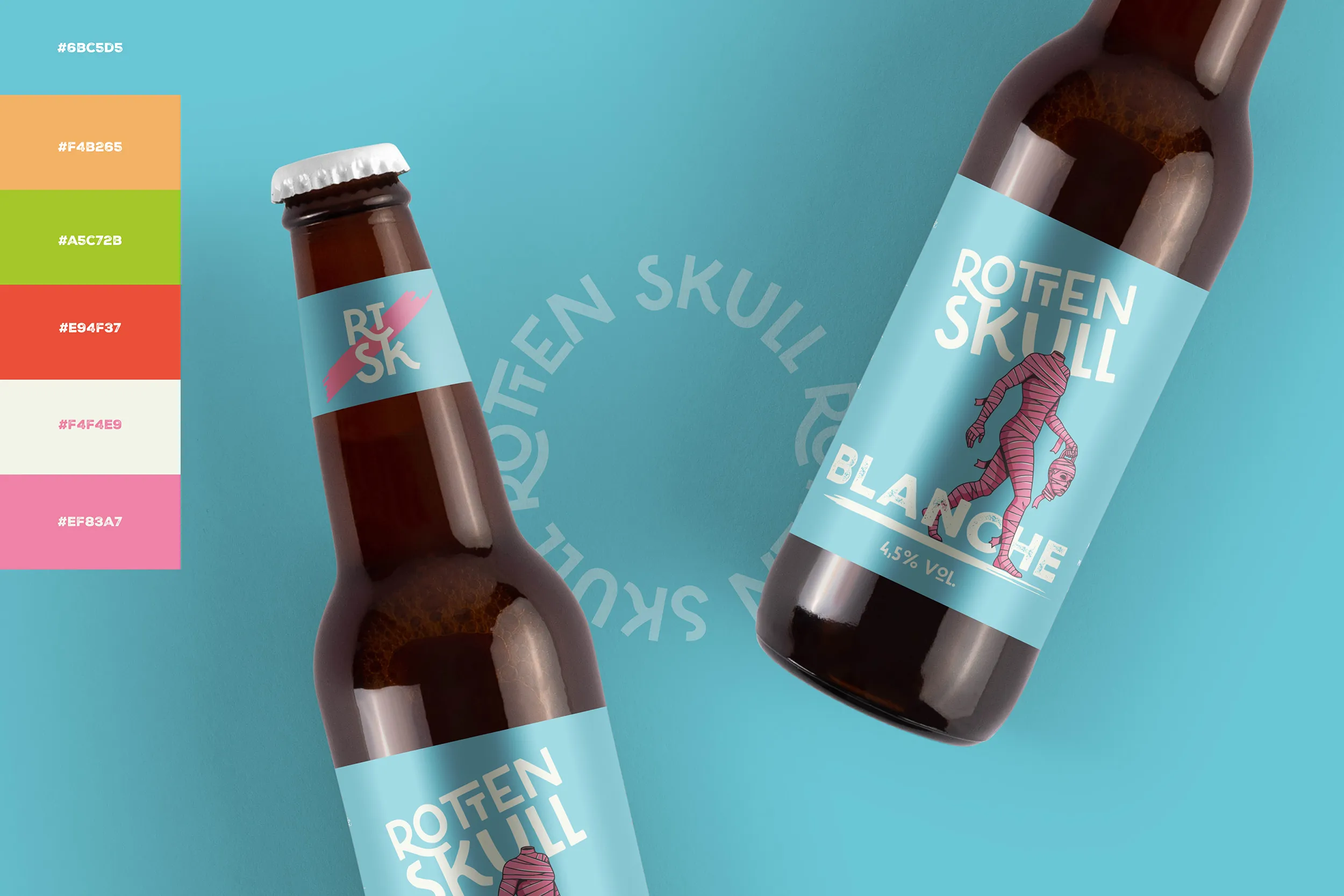
Four strong, saturated colors that contrast with the unapologetic pink of the mascot. On the shelf, Rotten Skull doesn't blend in; it stands out with two levels of reading: first, with the solid block of background color, and second, with the contrast of the mummy in the front.
3 — Typography with a strong personality.
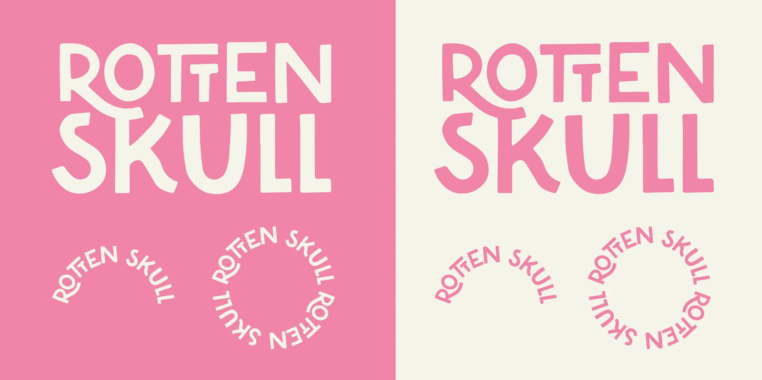
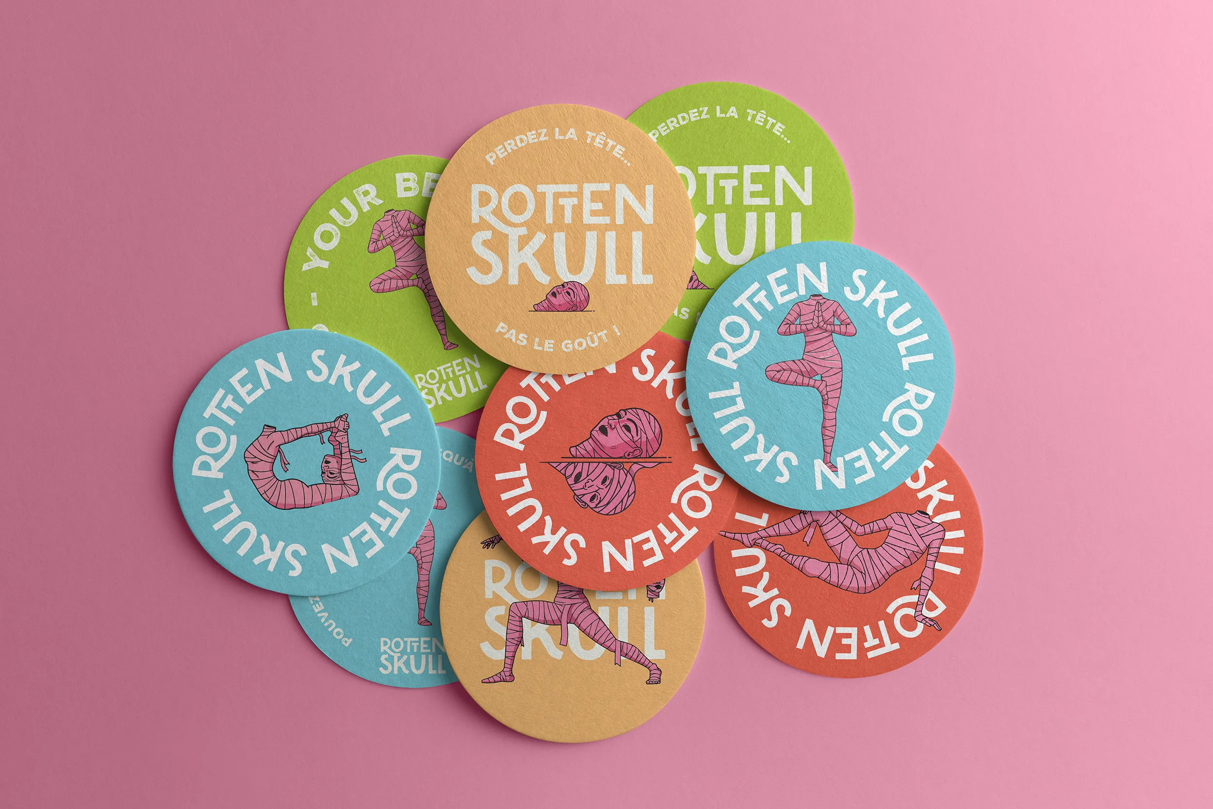
The letters dance, slightly irregular, intentionally imperfect. They carry the same DNA as the mascot: quirky, lively, never rigid. The wordmark functions stacked (ROTTEN / SKULL), in an arc, in a circle—a typographic system designed for application flexibility, from pump macarons to 75 cl packaging and social media avatars.
A brand conceived as a system
Rotten Skull's strength is that it was designed from the outset as a design system and not as a simple label.
Each element is modular:
- The monogram RT/SK works autonomously on bottle necks and small formats
- The mascot comes in a single pose per reference, creating a collectible effect.
- The typological circle ROTTEN SKULL brand stamp on coasters and HRI supports
- The color chart allows for instant identification of the reference, even from a distance in an aisle.
This system enabled the project's major strategic pivot: Transition from CHR to GMS without a redesign. The identity conceived for a beer tap handle was naturally transposed onto a 33 cl label, then a 75 cl label. No graphic compromise or loss of consistency.
That's precisely the definition of a good branding system: flexibility within consistency.
Key figures
Up 4 references on tap (Blanche 4.5%· Pale Ale 5% · IPA 6% · Triple 8% )
Up 2 formats of distribution — 33 cl & 75 cl
Up 2 circuits Commercialization — HRI & GMS
Up Entry confirmed at Monoprix & Franprix — March 2026
Rotten Skull is a textbook example of what a brand strategy well-built allows for: overflow the initial frame. What was intended to be a secondary bar project in Paris has proven solid enough to pivot towards large-scale distribution – without ever losing its identity.
Lose your head, yes... but not your taste!