
Beer Branding and Packaging Agency: Brewing Brands That Stand Out from the Shelf
Studio Blackthorns has been creating and repositioning beer brands for over 15 years: brewery identity, label and can design, and product line systems designed to expand your lineup without diluting your brand. From microbreweries to historic breweries, from brewpubs to supermarkets.
- The observation: 2,500 breweries, one single aisle
- Why does a specialized beer (and beverage) agency change everything?
- The BLACKTHORNS Approach: Impact Over Aesthetics
- The design system: the most profitable investment for a brewery
- Bottle, can, or both
- Our beer references
- What we deliver (and at what price)
- Let's talk about your brewery
- Our other beverage expertise
- Frequently asked questions about our agency
The observation: 2,500 breweries, one single aisle
France has over 2,500 breweries, and your beer is competing on a shelf where the buyer only considers about twenty references in 20 seconds. In this context, a nice label is no longer enough: you need a brand identifiable from 3 meters away, a range legible in 2 seconds, and a positioning that gives a reason to choose you, specifically you, among the dozens of IPAs in the aisle.
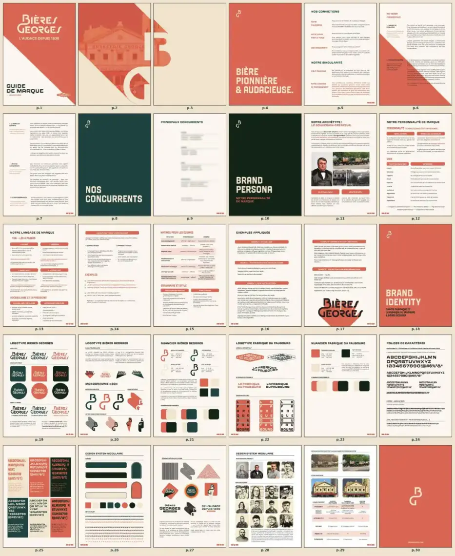
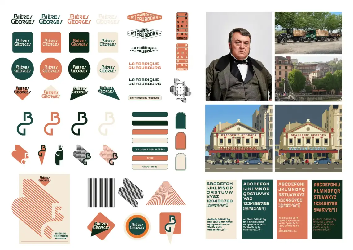
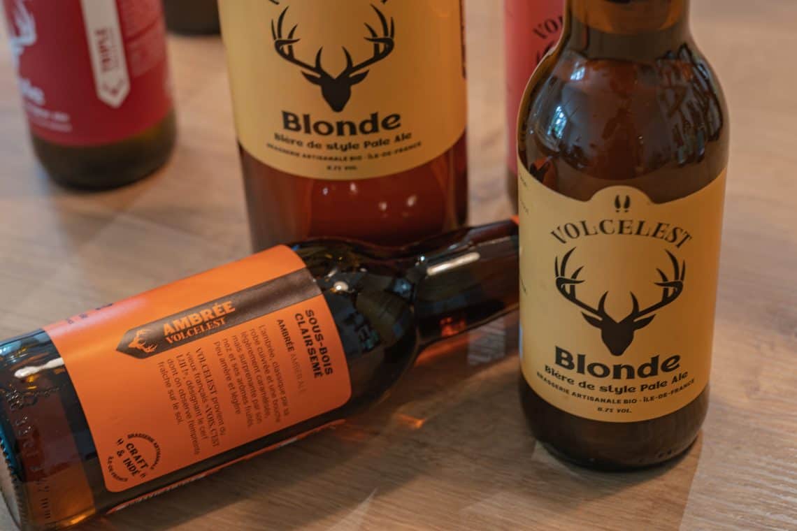
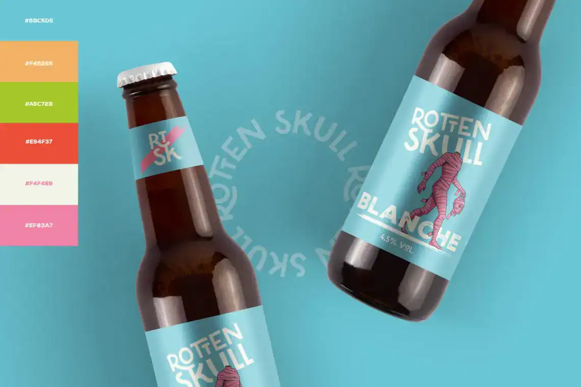
That’s exactly what we do. Studio Blackthorns is a 100 % strategic design firm dedicated to beverages, with beer as our traditional focus: we’ve worked with iconic breweries such as Bières Georges in Lyon, repositioned the Volcelest Brewery, working with Brasserie Lancelot, created craft brands like Gertrude or Rotten Skull, and drawn 366 cans in 366 days during the 366 Cans Challenge, highlighted by The Dieline and Packaging Digest.
Why does a specialized beer (and beverage) agency change everything?
A generalist agency learns brewing codes on your budget. We practice them daily: visual codes by style (what an IPA, a lager, or a sour «should» say to be identified, and how to deviate just enough), the constraints of the two distribution channels (returnable bottles for the HRI sector, high-impact cans for mass retailers), regulations (mandatory information, health warnings, Loi Évin integrated from the mock-ups) and industrial realities (MOQ of printed cans, sleeves and their distortion grids, adhesive labels that hold in an ice bucket).
This specialization has a direct consequence on your project: we start at the level of knowledge where a generalist finishes, and the budget goes into creation instead of learning.
The BLACKTHORNS Approach: Impact Before Aesthetics
Our conviction, forged from dozens of brewing projects: beautiful packaging Without a solid strategy, it often remains an empty shell. Tastes and colors may differ, but impact is measurable. Therefore, each creation undergoes our 5 impact tests before approval: the 3-meter test (readability from a distance), the thumb test (readability as a thumbnail for drive-by viewing), the silhouette test, the range test, and the perceived price test. The complete method is detailed in our Reference article on packaging that sells.
Upstream from the design, there is our signature method: the’Brand Exorcism. He diagnoses your positioning in relation to the breweries in your territory, your DNA, your Range architecture. And it is precisely this work that differentiates a profitable rebranding from a simple makeover.
The design system: A brewery's most profitable investment
A brewery lives at the pace of its releases: permanent, seasonal, and limited-edition beers, as well as collaborations. Without a graphic system, each new reference starts from scratch, is expensive, dilutes brand recognition, and… drives you crazy! We design brewing design systems: a fixed structure (logo, grid, hierarchy) and a variable expression per recipe (color, illustration, name), which allow for the addition of a new reference in a few days while strengthening the brand's presence on the shelf.
Take the test now and line up 4 of your beers side-by-side: if you don't immediately see a single family AND four distinct recipes, then Let's talk about it. !
Bottle, can, or both
We design for all containers: bottle labels (33 and 75 cl, special sizes — see our Comprehensive Guide to Beer Labeling), standard/slim/sleek cans (direct print, sleeve, or adhesive depending on your volume, see our Can design guide, barrels and taps for the HRI (Hotel, Restaurant, Institution), packs, clusters and pallet boxes for the GMS (Supermarkets). We also prepare the execution files up to the final artwork approval, liaising directly with your printers if necessary.
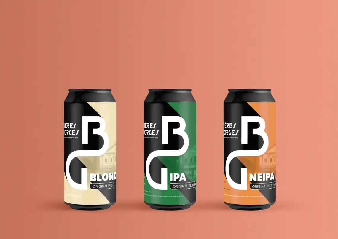
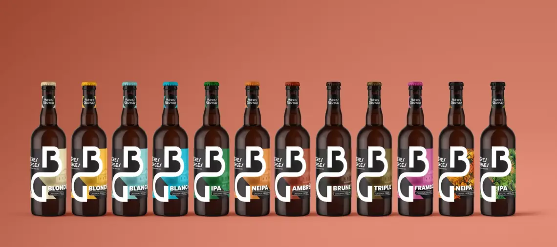
Our beer references
Among our brewery clients: supporting a Lyon institution with Bières Georges, the complete repositioning (strategy, identity, design system, packaging, brand architecture) of the Volcelest Brewery, a collaboration with one of the pioneers of Breton beer, Brasserie Lancelot, the rebranding of Belgian beer Gertrude Beers, the creation of a craft identity for Parisian mass retail with Rotten Skull, the concept of Japanese craft beer, with and without alcohol Ikigai Happoshu, the identity of a craft brewery internationally with Brewlander (Singapore), and the 366 Cans Challenge, 366 can designs in one year, published by The Dieline, Packaging Digest, Brand New, Trend Hunter, etc.
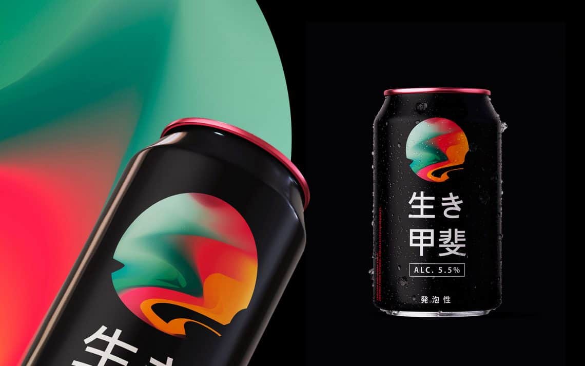
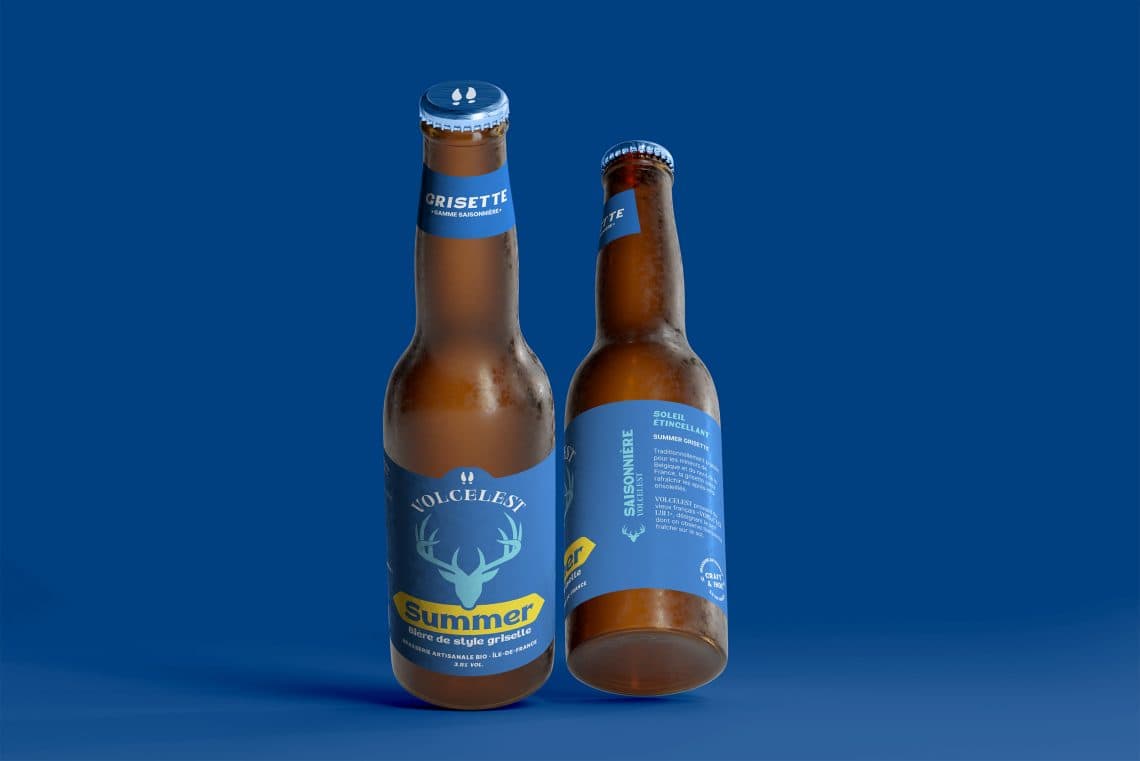
What we deliver (and at what price)
Based on your stage: diagnostic and strategic coaching for breweries in question, complete brand identity (strategy, naming, visual identity, packaging, execution files) starting at €15,000, and large-scale support (repositioning, multi-reference product line architecture, supermarket and hospitality deployment) between €25,000 and €50,000. A complete project takes 6 to 12 months; packaging alone with an existing identity takes 4 to 6 weeks. If you're starting from scratch, our Complete guide to beer brand creation detail each step: positioning, naming, visual identity, and product line architecture.
Let's talk about your brewery
Tell us about your project: setting up a brewery, revamping a stagnant product line, switching to cans, entering supermarkets. We'll respond within 48 hours, with an honest initial assessment of your situation. Let's talk!
Our other beverage expertise
The studio also designs identities for other beverage families: spirits, wine and Soft drinks & non-alcoholic beverages. Same positioning, naming, and packaging requirements, adapted to the codes of each category.
Frequently asked questions about our agency
Do you have any other questions? Let's talk about your project