Stella Artois: Rebranding an iconic brewery
Stella Artois, the world-famous beer brand, recently undertook a bold overhaul of its brand identity. In the podcast 1000 Hectos, In this article, we delve into the fascinating details of this transformation. This article explores the various aspects of the redesign to understand how Stella Artois managed to modernize its image while preserving its heritage.
- History of Stella Artois
- Redesigning the identity of an iconic brewery
- Redesign of packaging, bottles and labels
- DESIGN SYSTEM for the Stella Artois brand
- A brand refreshment based on conviviality
- Would you like to delve deeper and access a detailed analysis of the trends that will shape the beer world in 2025?
History of Stella Artois
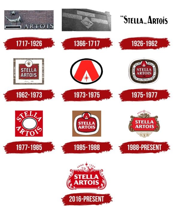
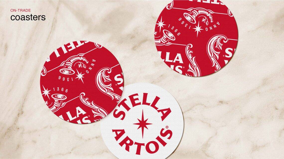
The Stella Artois brand was first launched as a seasonal Christmas beer in 1926 by the Brouweij Artois brewery in Leuven, Belgium. Since then, it has become one of the world's most popular beer brands. With roots dating back to 1366 - when the brewery was known as Den Hoorn before being bought by head brewer Sebastian Artois in 1717 - Stella Artois boasts “the world's oldest logo”.
Redesigning the identity of an iconic brewery
Logo redesign
A key step in this transformation was the redesign of the emblematic Stella Artois logotype. The old, ornate and somewhat busy cartouche had been introduced in the 1980s and gave the brand a traditional, high-end look. However, to reconnect with a younger, more modern audience, Stella Artois decided to modernize its logotype.
In collaboration with the designer Alec Tear, the brand has rethought the proportions and overall balance of the logo's elements. The new logotype places greater emphasis on the star, which now creates a play of light and shadow on the floral motifs surrounding the cartouche and horn. By eliminating the frame at the top and bottom, the logo appears more dynamic and lighter. What's more, the word “Belgium” is now more legible, clean and balanced with the other elements of the logo.
To remain relevant, Stella Artois needed to evolve its brand to reflect a modern audience.
JKR

Would you like to delve deeper and access a detailed analysis of the trends that will shape the beer world in 2025?
Discover our complete report "Consumer Trends in Beer – 2025 Season (French version)", a treasure trove of insights and advice to help you stay ahead.

Redesign of packaging, bottles and labels
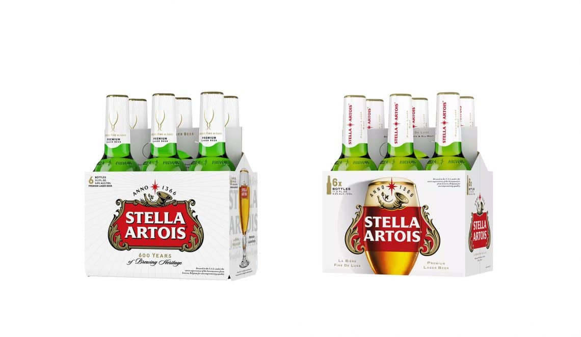
The overhaul of Stella Artois' visual identity extended to product packaging. Bottles and packaging have remained faithful to previous designs, while highlighting the updates made to the overall visual system. On our part, we have a minor quibble with the design of the cans, which is not the most successful (we mention in particular in the podcast the strange vertical placement of the logo). A mixed decision, which (perhaps?) brings a contemporary touch to the brand.
Reinforcing brand distinction is at the heart of what we believe in as a company, so we seized the opportunity to redefine the world of the Stella Artois brand with this objective in mind.
JKR
DESIGN SYSTEM for the Stella Artois brand
Lifestyle photography
To create a coherent brand experience, Stella Artois has developed a captivating visual universe. Lifestyle photography by Cait Oppermann transport viewers into a festive world of fun and casual elegance. These images invite us to share moments around the table with style and good humor.
Custom typography
Two new signed typefaces Pangram Pangram were also created especially for Stella Artois: Isabella Serif and Sebastian Sans. These fonts blend harmoniously to reflect the spirit of the brand. Inspired by fashion magazine layouts, they add a touch of elegance and modernity.
A brand refreshment based on conviviality
The new identity designed by JKR aims to redefine Stella Artois as a brand that's friendly and relaxed, but still imbued with elegance. Cait Oppermann's photographs depict moments of sharing around food and beer, inviting consumers to join in this ongoing celebration.
In the end, this bold redesign succeeds in modernizing and rejuvenating the Stella Artois identity without denying its centuries-old history. The emblematic logo is given a new lease of life, while typography, packaging and photography celebrate «moments of beauty around the table». Stella Artois seems ready to conquer new generations of consumers in search of authenticity.
If you'd like to take a deeper dive into this transformation, we invite you to listen to the episode of the 1000 Hectos podcast hosted by Ludovic Mornand and Dorothée Van Agt. You'll discover fascinating details about every step of the process.
Sources :
Did you enjoy this episode of 1000 Hectos? Give it a try...
- 5 steps to maximize the impact of beer competitions
- How to judge a beer at a competition: behind the scenes and the truth about medals

- Beer market trends in CHR 2024
- Brewing news: between fiscal challenges, alcohol-free and sustainable innovations
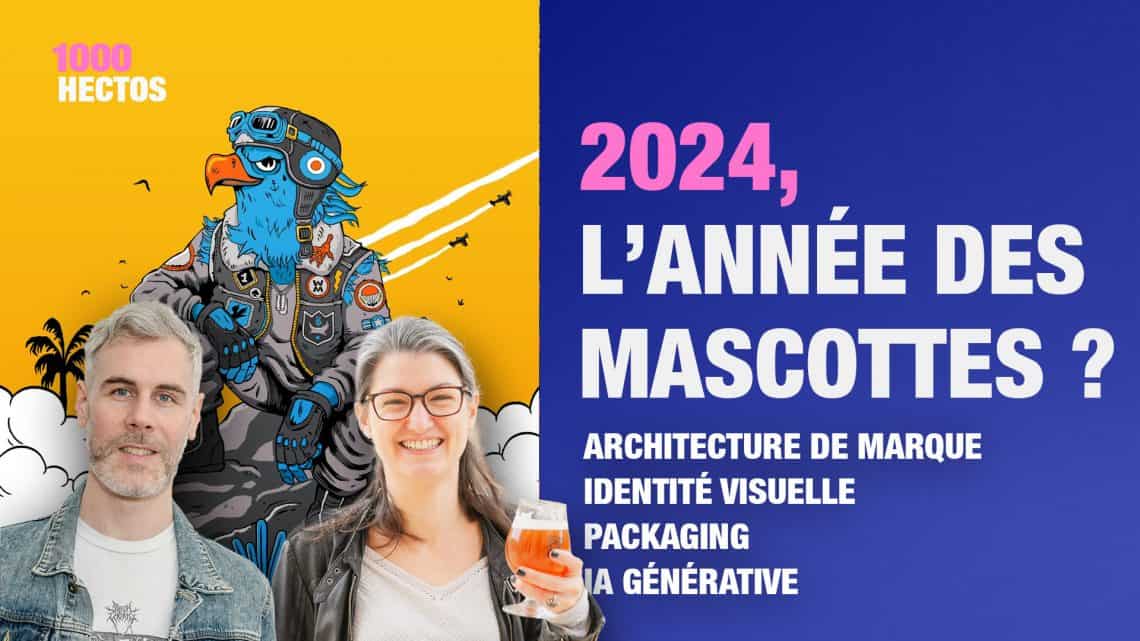
- The secrets of mascots to boost your brand identity
- New European regulations raise questions about pesticides in hops