
Beautiful packaging or packaging that sells? Why impact beats aesthetics on the shelf
Last updated: July 2026 · By Ludovic Mornand, founder of Studio Blackthorns
the essentials to remember
A beautiful packaging does not guarantee any sales. Within a 90-reference radius, a consumer only considers’About twenty products in about 20 seconds (Gidlöf et al., 2013). At this speed, what triggers the grasp is a matter of’impact Contrast, silhouette, naming, readable typography at 3 meters. The subtlety of gilding comes later.
Aesthetics are subjective, while impact can be measured. Tastes and preferences vary from one consumer to another. A pack's ability to be seen, understood, and remembered is tested, corrected, and proven.
At Studio Blackthorns, every beverage design (regardless of the channel) goes through 5 impact tests before internal validation: the 3-meter test, the thumb test, the silhouette test, the range test, and the perceived price test. This method applies to the craft beer, to spirits, soft drinks, and non-alcoholic beverages, in supermarkets and in the restaurant/hotel industry.
I spend part of my life in the beverage aisles. Occupational hazard: when I go grocery shopping, I sometimes photograph the shelves. And what I've observed there for the last 15 years contradicts a firmly held belief in our industry: the most attractive bottle on the shelf is rarely the one that sells the fastest.
This belief comes at a high cost. Brand founders invest tens of thousands of euros in packaging worthy of a design competition, only to see disappointing sales in supermarkets. The product looks great on Instagram but is invisible on the shelf. Out of more than 90 episodes SuperPotion™, This story comes up regularly among my guests, both brewers and distillers.
In this article, I'll explain why the commercial impact of beverage packaging takes precedence over its aesthetics, what eye-tracking studies reveal about actual shopper behavior, and I'll give you the 5-test method we use at the studio to validate a design before production.
Part 1: The Belief That «Beauty Sells» (and Why It's Not Necessarily True)
Where does this belief come from?
The beverage industry is fed by design competitions. Pentawards, Dieline Awards, Packaging Of The World, World Brand Design, Formes de Luxe: these awards celebrate magnificent objects, photographed in a studio, on a neutral background, with perfect lighting. Our projects are sometimes published there, and I am proud of that. However, a jury of designers examining a bottle for 3 minutes does not replicate the conditions of a purchase decision in any way.
Social networks amplify the phenomenon. «Instagrammable» packaging generates likes, reposts, and press coverage. These signals flatter the ego of the founder and the agency (these are called «vanity metrics» in jargon). None of them measure in-store rotation, distance recognition, or brand recall.
The result, I see it every week: brands briefing their agency with a Pinterest mood board full of award-winning bottles, thinking the beauty of the object will do the commercial work. It won't do it alone.
If aesthetics are a judgment, impact is a behavior.
Tastes and colors are a matter of personal preference. Your minimalist label, which might be considered sublime by a Parisian art director, will seem cold to a buyer from Carrefour Vénissieux. No design pleases everyone, and that's perfectly fine.
The impact, however, doesn't depend on any judgment of taste. Either your can is noticed on the shelf, or it isn't. Either your brand name can be read from 3 meters away, or it can't. Either a consumer who liked your beer finds it again the following week, or they leave with their neighbor's. These behaviors are observed, filmed, measured with eye-tracking, and translated into sales figures.
That's the whole difference between decorative design and strategic design. The former seeks approval, the latter seeks results. Beautiful packaging without a solid strategy is an empty shell: that's our studio's founding conviction.
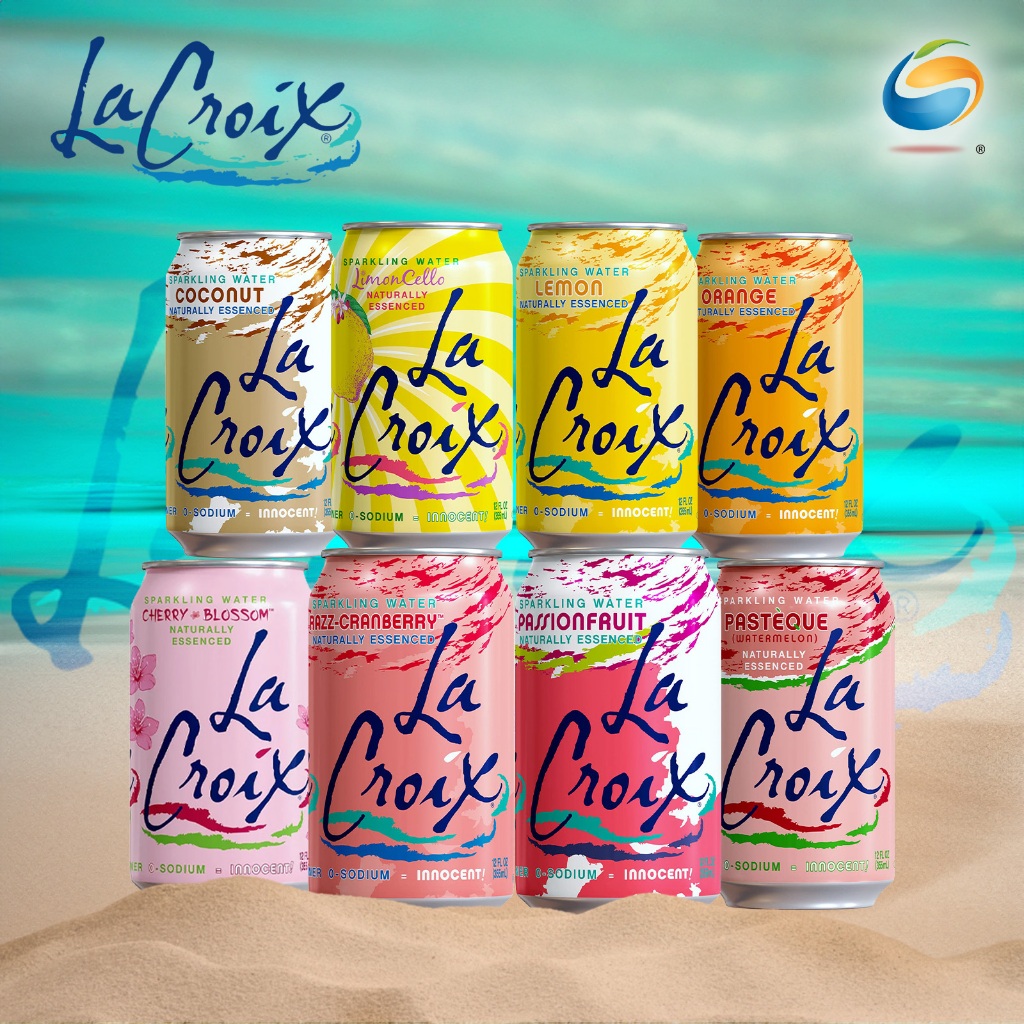
My most beautiful proof in image with the brand LaCroix, an American «water brand» from Wisconsin that I personally find very ugly BUT which is a hit in the US:
What the «very beautiful» sometimes sacrifices
Let's be honest: beauty and impact aren't mutually exclusive; far from it. The best brands combine both. The problem arises when aesthetics become the goal instead of a means. This is when you choose a thin, elegant font that's illegible from 6 feet away. A subtle spot varnish that's invisible under the LED lighting of a hypermarket. A range of 6 products with completely different labels, which... The consumer never connects with just one brand..
Every refinement costs something somewhere. The right question to ask your Beverage design agency is rarely «is it beautiful?» but rather «what makes it sell, and to whom?».
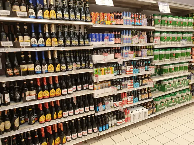
The most beautiful bottle on the shelf is rarely the one that sells the fastest.
Ludovic Mornand, Studio Blackthorns
Part 2: What (Really) Happens at a Register
20 seconds, 20 products, 90 references
Gidlöf's (2013) study, conducted under real-world conditions in a supermarket with a mobile eye-tracking system, is illuminating. Within a range of 90 products and 13 brands, participants on a shopping mission visually processed the shelf for an average of 21 seconds and actually considered only about 23 products. In other words, three-quarters of the radius simply doesn't exist in the buyer's brain.
Clement's (2007) work, published in the Journal of Marketing Management, describes a first stage of «pre-attention»: an ultra-fast visual sweep during which only the most salient stimuli (color, contrast, shape) catch the eye. Your storytelling, your origin mentions, your medal at the agricultural competition only intervene if you have survived this stage.
Chandon et al. (2009), in the Journal of Marketing, showed that the number and position of facings directly influence brand attention at the point of sale. The shelf battle is therefore fought on two fronts: the Negotiated visibility (facing) and the intrinsic visibility (your design). You only fully control the second one.
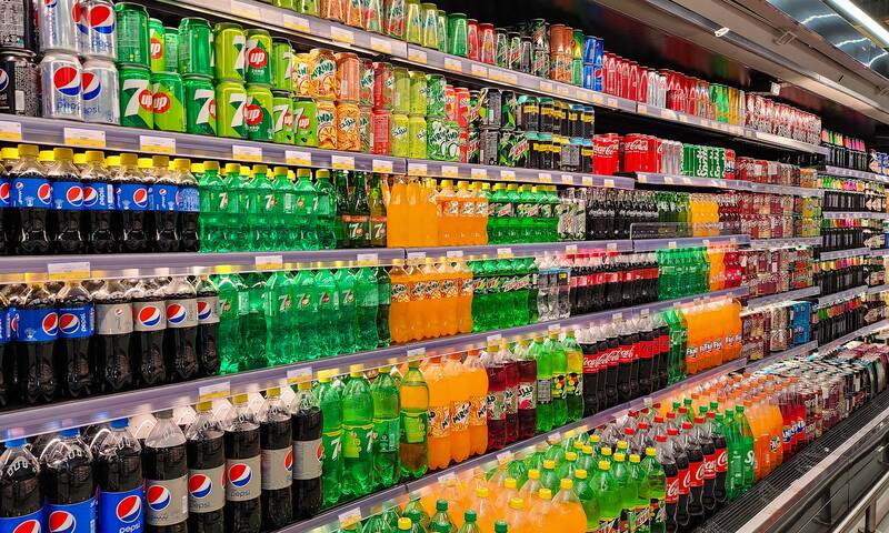
The 4 impact triggers of beverage packaging
Concretely, what makes a bottle or can stand out in these conditions? Based on our experience with dozens of beverage projects, four elements do the bulk of the work:
- The color block a bold and differentiating color compared to the segment's codes. If the entire IPA range is saturated in fluorescent, then matte kraft becomes the disruption (and vice versa).
- The silhouette and structure : the recognizable shape from afar, even before reading. That's what makes you identify an Orangina bottle or a slim energy drink can from 5 meters away.
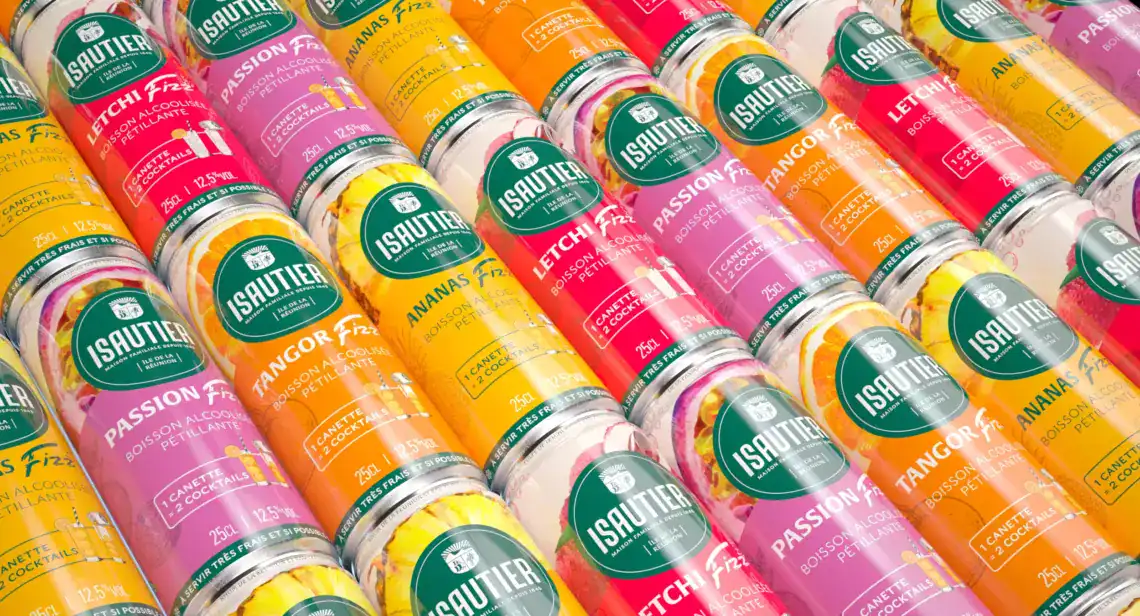
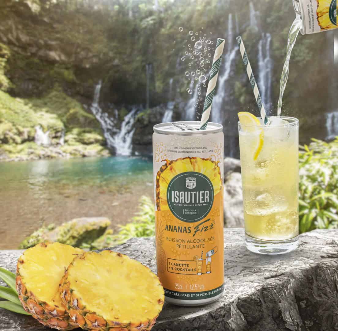
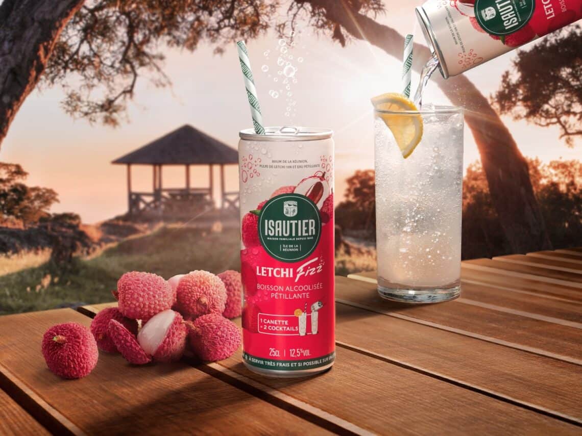
- Naming and its typography a short, impactful name, large enough to be read from a distance by passersby. For the range RTD FIZZ that we created with the Isautier House, the four-letter name functions as an onomatopoeia: it is instantly readable and tells the product's story on its own.
- The hierarchy of information At 3 meters, I understand the category; at 1 meter, the promise; in hand, the details. A package that wants to say everything on the shelf says nothing.
The impact doesn't stop at the first purchase
High-performing packaging also works after the purchase. Recall (will I find this brand again next week?) and scalability (will I recognize the range when the brand releases a new flavor?) drive repeat purchases, which is where a beverage brand's profitability is built.
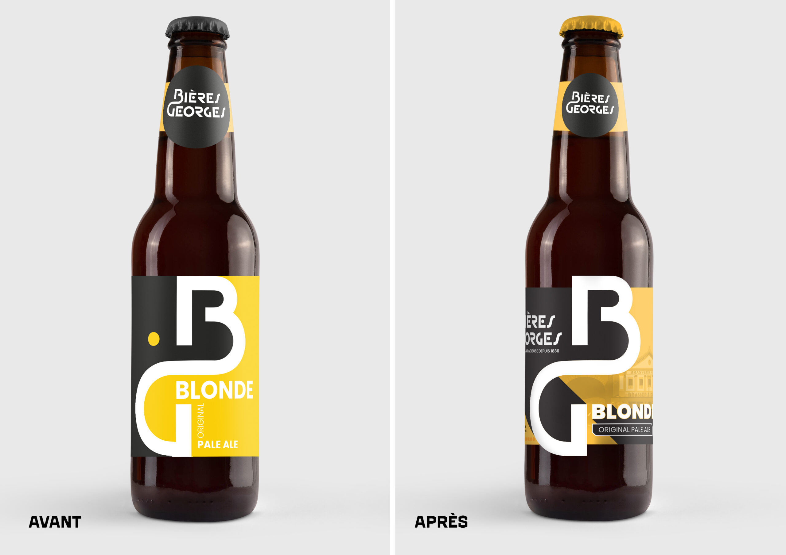
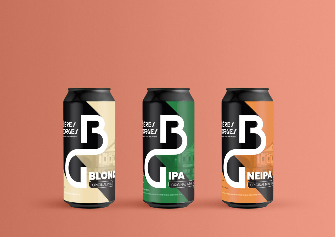
This is the role of the design system : a graphic system designed from the outset to absorb future references without diluting recognition. For a craft brewery releasing 10 recipes a year, this system is worth more than any award-winning single label. We dedicate a huge portion of our efforts to this, from repositioning the Volcelest brewery Georges Beer Range.
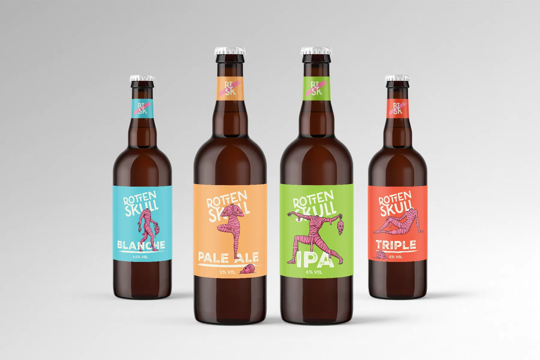
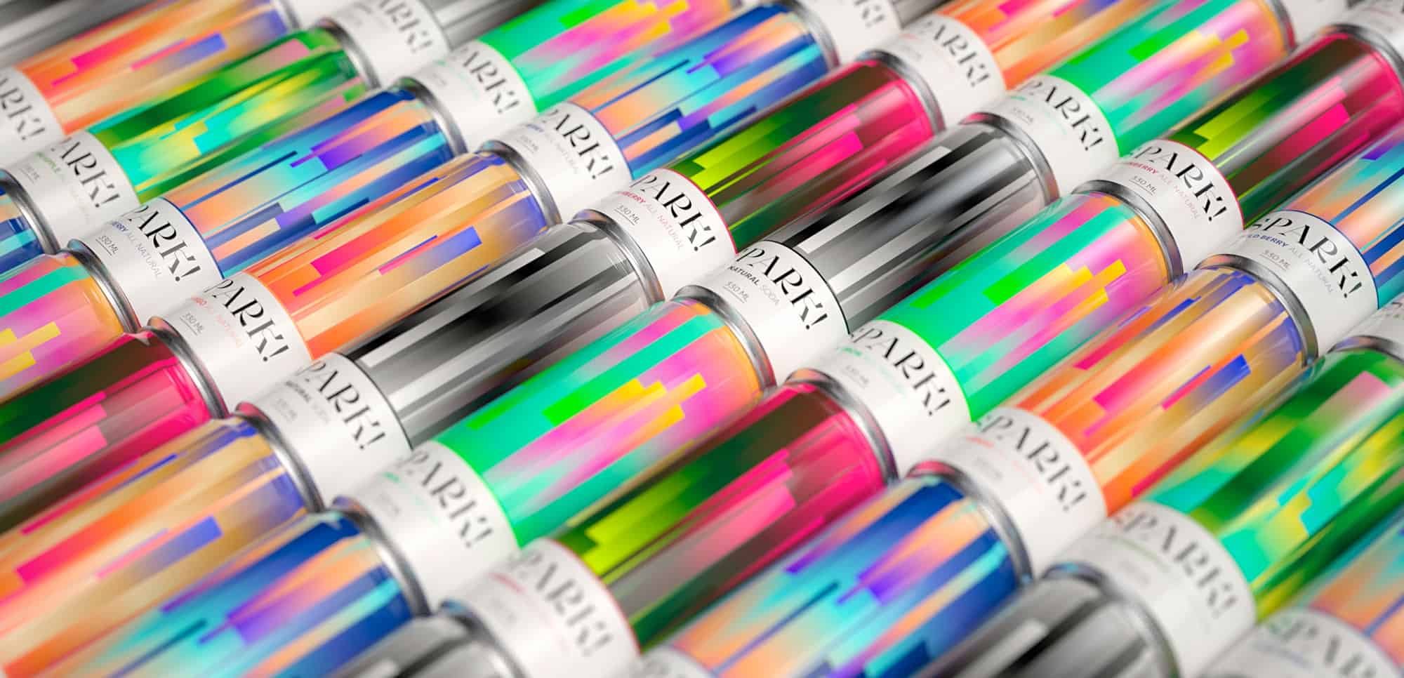
Effective packaging also works after the purchase. Memorability and adaptability drive repeat purchases, which is where the profitability of a beverage brand is built.
Ludovic Mornand, founder of Studio Blackthorns
Part 3: The 5 Blackthorns Impact Tests
Here is the method we apply in the studio before approving a beverage design. You can reproduce it on your own packaging starting today.
Test 1: The 3-meter test
Print your design at actual size, place it in a store aisle context (or at least on a shelf between real competitors), and step back 10 feet. What do you still see? If the answer is limited to «a bottle with a label,» the design has failed. At that distance, the brand, category, and primary promise must survive.
Test 2: The Thumb Test
Reduce your facing to the size of an e-commerce or drive-through thumbnail (approximately 2 cm high on a smartphone). More than half of supermarket purchases are now prepared or made online. Unreadable packaging in miniature loses drive-through, quick commerce, and marketplaces. This is a test that very beautiful «competition-style» packaging regularly fails.
Test 3: The Silhouette Test
Make your design black and white, then a simple silhouette. Does it remain recognizable? This test reveals whether your recognition relies on a true visual structure or only on decorative details. Iconic drink brands (think Coca-Cola, Ricard, Orangina) all pass this test.
Test 4: Range Test
Align your current and future references. Does an outside look identify within 2 seconds that they belong to the same brand, while distinguishing each recipe? This is the most difficult balance in beverage packaging: too much consistency and the recipes get confused, too much variety and the brand disappears.
Test 5: Perceived Price Test
Show your product to people outside the project and ask a single question: «How much does this product cost?». If the average answer is lower than your target selling price, your design is destroying margin. If it is largely higher, you risk product disappointment. The design calibrates the psychological price far more than most founders imagine.
A design that passes the five tests can then (and only then) receive all the aesthetic layering your positioning deserves. Beauty crowns impact, never replaces it.
A last word?
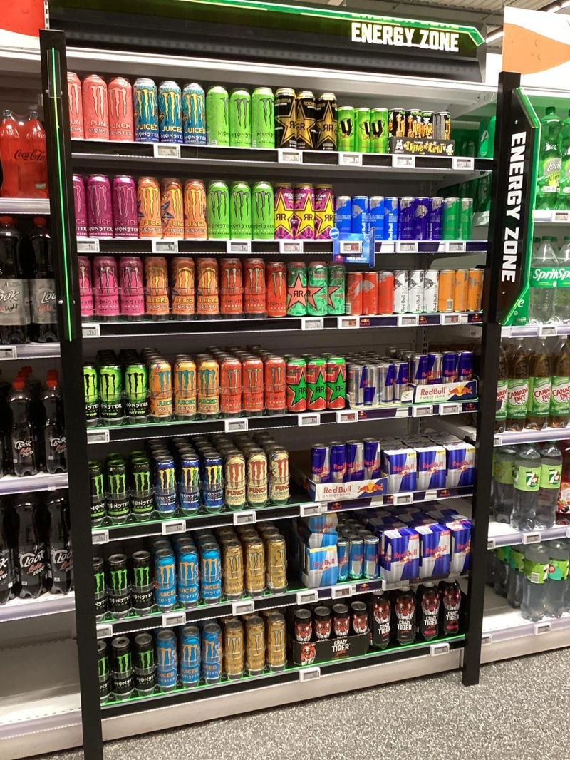
The beverage industry has never produced so many beautiful packagings, and rarely so many invisible brands! Faced with saturated shelves and consumers who only consider a quarter of the references, aesthetics alone is a losing bet. Impact (color, silhouette, naming, hierarchy, range system) is worked on, tested, and measured.
This is good news for independent brands: impact isn't bought by the pound of gilding. A well-designed craft can can outperform a six-figure silkscreened bottle on the shelf. Brand strategy is the challenger's weapon.
Are you launching a beverage brand or are your sales stagnating despite «beautiful» packaging? This is exactly the type of diagnosis we conduct during a Brand Exorcism. Tell us about your project, and we'll look at your shelving together.
FAQ
Packaging that sells is packaging designed to trigger a measurable purchasing behavior: to be spotted on a crowded shelf, to communicate its category and promise in under 2 seconds, to justify its price, and to be found during the next purchase. It is distinct from decorative packaging, which is judged on subjective aesthetic criteria. The two are not mutually exclusive, but commercial impact must be validated before aesthetic refinement.
Not on its own. In-store eye-tracking studies show that a consumer considers only about 23 out of 90 products on a shelf (Gidlöf et al., 2013). Beauty only works if the product first passes the pre-attention filter, which relies on contrast, color, and shape. A beautiful but inconspicuous design remains invisible, and therefore unsold.
Five simple tests provide a reliable initial evaluation: the 3-meter test (readability at a typical distance), the thumb test (readability in e-commerce thumbnails), the silhouette test (black and white recognition), the range test (consistency and distinction of references), and the perceived price test (match between design and target price). For significant stakes, eye-tracking studies or tests in a recreated aisle can usefully supplement these checks.
Decorative design aims to create a beautiful object, judged by aesthetic criteria. Strategic design starts with the brand’s positioning, its target audience, and its distribution channels to create an object that meets business objectives: visibility, brand recall, perceived price, and product line expansion. At Studio Blackthorns, the strategic phase always precedes the graphic design phase, because beautiful packaging without a solid strategy is nothing more than an empty shell.
Yes, radically. In mass retail, packaging fights alone against dozens of competitors, at a distance, under standardized lighting: contrast and legibility take precedence. In the HRI (hotel, restaurant, and catering) sector, the product is often recommended by staff and discovered in hand or on the menu: storytelling, manufacturing details, and a connection with the establishment carry more weight. A brand present in both channels must prioritize its elements to function in both contexts.
Yes. The Loi Évin frame the content of alcoholic beverage communications (prohibition of inciting consumption, mandatory information) but do not limit work on color, typography, structure, or range system in any way. Visual impact remains a completely free territory for expression, provided the legal mentions on the pack are respected. Our Complete guide of the Évin Law details these obligations.
Start with an honest audit: photograph your product in its actual shelf space, apply the 5 impact tests described in this article, and note the failures. Then, analyze the color and typography codes of your segment to identify available differentiation space. If the diagnosis reveals a fundamental problem (unclear positioning, illegible range, perceived price mismatch), strategic support will be more cost-effective than a simple graphic makeover.