
Beer Label Design: The Complete Guide (Codes, Formats, Regulations, Mistakes)
Last updated: August 2026 · By Ludovic Mornand, founder of Studio Blackthorns

In short (for the lazy or the robots)
A beer label performante often answers three questions: which brand (the recognizable block for hardcore fans), which style (IPA, NEIPA, lager, pils, stout, aka the beer lover's piece of information #1), and which promise (the reason for choosing this one). Aesthetics come next to serve this hierarchy.
Design is thought of in scale system starting with the very first recipe: a fixed structure (logo, grid, style positioning) and a variable of expression per beer (color, illustration, mascot, personalized name...). This is generally what makes it possible to release several recipes a year (including limited editions) without diluting the brand or having to pay for a complete redesign.
Regarding obligations, the label must bear the Legal notice (name, strength, volume, ingredients and allergens, Best Before Date (BBD), batch, contact details, pregnant woman pictogram, sorting markings, AB logo if applicable) and comply with the Loi Évin. On the production side, the material matters just as much as the visual: a beer label has to withstand cold rooms, display fridges, and sometimes an ice bucket.
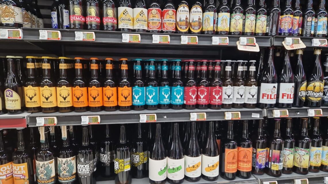
Beer labels are probably the most creative form of packaging in recent years: the craft beer movement has turned them into an art gallery (notably through The Cans Boom), and some shelves practically look like walls of vinyl records! Paradoxically, it’s also one of the most poorly utilized formats. At the studio, when a brewery shows us its struggling product line, the diagnosis is the same eight times out of ten: a label designed as a work of art, but never really as a sales tool.
I see the classic example every week on the shelves: a stunning illustration covering the entire front, a poetic beer name in handwritten typeface… and the beer style listed in 8-point font in a corner. But the beer lover standing in front of the shelf is first and foremost looking for an IPA, a lager, or a stout. If that information requires any effort to find, they’ll just grab the beer next to it. It’s also important to note that the alcohol content should be prominently displayed, so consumers can spot it right away.
Thus, this guide compiles our complete method: the information hierarchy that drives sales, visual codes by style and how to intelligently break away from them, the range system (we quite like the term «Design System»), mandatory notices, material and printing choices, and costly mistakes. Along with the lessons learned from our projects for Bières Georges, Volcelest, Gertrude or Rotten Skull.
Part 1: Hierarchy—The Secret to Selling
The three questions of the drinker, in order
In front of a beer store shelf or cooler, consumers process your label in a matter of seconds and in a specific order. First, the brand: a color block, a silhouette, a logo that says «it's us» from 3 meters away. Next, the style: IPA, lager, triple, stout, sour, non-alcoholic. This is the beer enthusiast's primary selection criterion, and it must be readable without picking up the bottle. Finally, the promise: what sets your IPA apart from the other ten (the assertive bitterness, the featured hops, the story, the ABV).
Test your current label: From 3 meters away, are these three pieces of information still legible? This is the first of our 5 impact tests, detailed in our article on packaging that sells, and the one that the label «art gallery» most often fails to capture.
Strong brand or strong recipe: the structuring choice
Any self-respecting beer lineup must make a a matter of architecture : Is it the brand that takes precedence (a brewery, with recipes developed under its umbrella) or the recipes themselves (beers with strong personalities, with the brewery serving as a discreet guarantor)? Both models work; disaster, however, tends to arise from a haphazard mix—one that’s neither chosen nor embraced—when each new batch invents its own rules and the lineup becomes a patchwork.
Our decision matrix: The more your distribution channel is mass-market and your inventory turnover is rapid, the more the brand must take precedence (the product line is your weapon on the shelf); the more your distribution channel is specialized (beer cellars, taprooms) and your new releases are frequent, the more the recipes can shine within a shared framework.
The back label, a silent salesperson
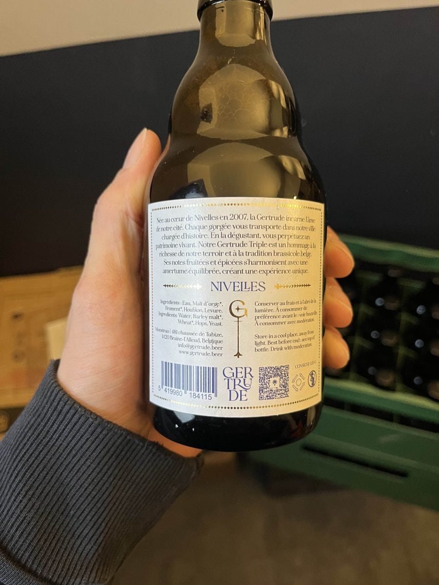
The front label grabs the customer’s attention; the back label seals the sale. This is where useful storytelling comes into play: a one-sentence description of the taste profile (bitterness, roundness, aromas), pairing suggestions or recommended occasions, a brief history of the brewery, and legal notices laid out neatly. Avoid long, literary passages if possible: stick to a maximum of three levels of readability, and use casual, conversational language rather than the jargon of a wine expert. Pay as much attention to the finishing touches—such as foil stamping and embossing—as you do on the front label to ensure a high-quality, cohesive overall package.
Part 2: Codes by Style, Color System, and Materials
Visual Cues by Style (and How to Deviate from Them)
Each beer style has developed its own shelf aesthetics: IPAs and NEIPAs go for bold, saturated looks (neon colors, maximalist illustrations, American or tropical themes), while lagers and pilsners emphasize simplicity and a vintage feel (classic typefaces, blues and golds), stouts and porters emphasize dark backgrounds and richness, sours and fruit beers use pop colors, and non-alcoholic beers are still finding their style between sports-inspired designs, sophistication, and light backgrounds. These conventions generally help consumers navigate the shelves: adhering to them makes the product easy to identify, while breaking them makes it stand out. It’s up to you to find the right formula!
A best practice is to photograph the actual shelf layout at your target retail locations, style by style. If all the local IPAs have fluorescent labels, an IPA with a cream-colored label will stand out the most in that segment. Disruption is assessed based on the actual shelf layout, never in absolute terms using a mockup.
The range system: your label (unfortunately) never exists alone
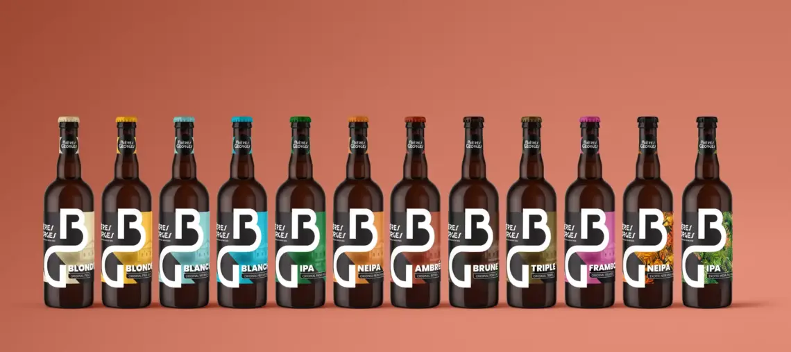
A brewery thrives on its releases: permanent, seasonal, limited-edition, and collaborations. The design of the first label must therefore be part of a system: a fixed structure (logo placement, typographic grid, stylistic elements, and template for required information) combined with variables that change per recipe (color, illustration, and name). When well-designed, this system allows a new product to be launched in just a few days, ensures brand consistency on the shelf, and turns each batch into an advertisement for the others.
It’s the most cost-effective investment in brewery branding, and the core of our consulting services, from repositioning Georges beers to the brand architecture of Volcelest. The test: line up your beers; you must instantly see a family AND four recipes.
Materials, Formats, and Printing: Design Put to the Test in the Real World
A beer label lives in conditions that are often hostile: a cold room, a foggy display fridge, an ice bucket on a restaurant terrace. The choice of material is therefore strategic: coated papers with varnish for standard durability, so-called «wet strength» papers (resistant to moisture) for ice bucket use, transparent polypropylene for a «no label look» effect, textured papers for a premium feel (checking their behavior in cold and condensation with your printer). Not to mention production defects (print registration, neck labels that aren't straight or symmetrical, wrinkled or torn labels...).
In terms of formats, the dimensions depend on your bottles (33cl steinie or longneck, 75cl): always start from the template provided by your printer or glassmaker before designing, otherwise you risk wasting unnecessary time having to readjust the elements (multiplied by the number of SKUs). Also plan for the can version if it is in your roadmap, even in the future: a system designed for both containers from the start avoids a redesign (Our can design guide detail this pendant). Finally, finishes (hot stamping, embossing, selective varnishing) are priced per thousand labels: ask for the costs BEFORE creating, so you can design with the budget in mind instead of degrading the design after receiving the quote.
Part 3: Regulations and Costly Mistakes
Required Information on a Beer Label
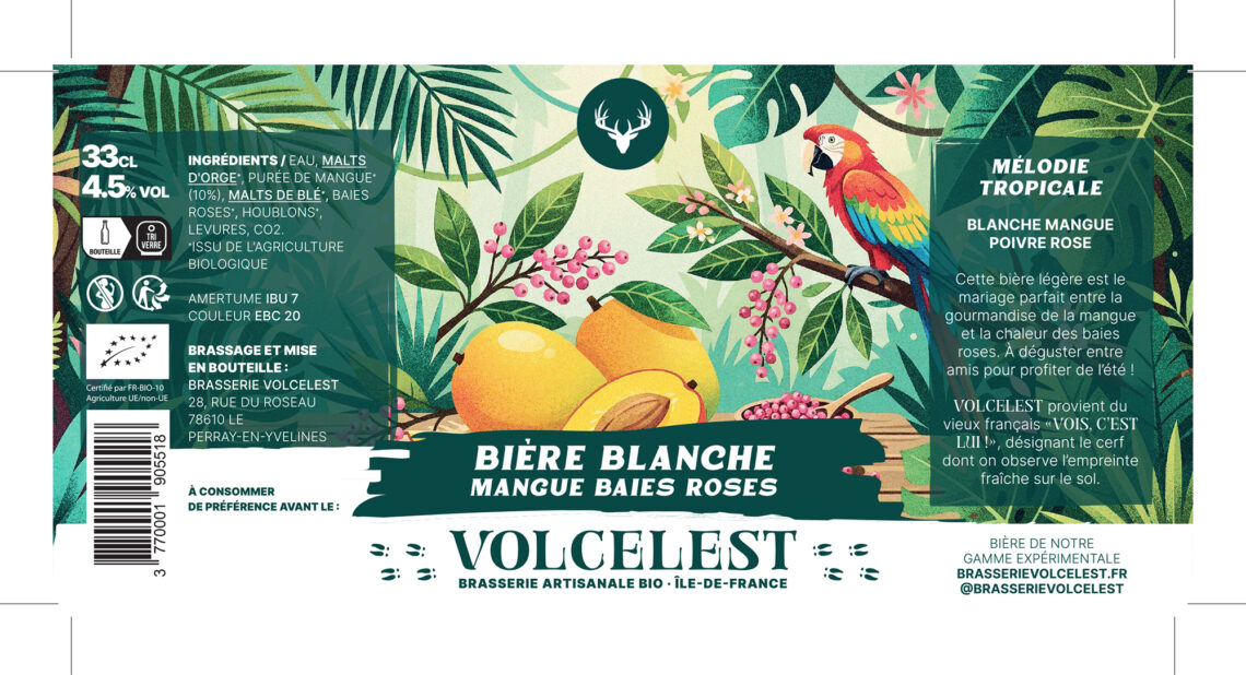
The French and European regulatory framework requires: the sales description («beer», with any necessary details), the alcohol by volume, the net volume, the list of ingredients and allergens (cereal gluten first, highlighted in bold and/or underlined), the date of minimum durability, the batch number, the operator's contact details, the pregnant woman pictogram, and sorting markings (Triman and instructions). Beer being an alcoholic beverage, the Loi Évin otherwise, frame the content of the design and all communication: the complete guide is on SuperPotion™.
Two recurring pitfalls: the additions at the end of the project that disfigure a composition not designed for them (integrate the legal template from the very first mock-ups), and the risky claims («detox», «recovery») that fall under the strict framework of health claims.
The 6 Mistakes We Correct Most Often
The illustration that eats the hierarchy. The cuvée name treated larger than the brand, preventing any range capitalization. The handwritten typography unreadable from a distance and in a drive-thru thumbnail. The typography unreadable due to color choices (white on yellow = bad!). The range patchwork, with each recipe reinventing the rules. The material not tested in real-life conditions (the label that wrinkles at the first ice bucket). And the design approved on screen rather than on a full-size print placed among competitors.
Each one is detected beforehand with our 5 impact tests: 3 meters, thumb, silhouette, range, perceived price.
Label redesign: when and how?
If your turnover has hit a ceiling, the «new label» reflex deserves a preliminary diagnosis: failing legibility tests calls for a graphic redesign; a positioning problem (no one understands why they should choose you) calls for brand work, which a makeover alone will not solve. Our article on the timing of the rebranding and our Proprietary Exorcism Method provide the context for this decision. In any case, preserve your established brand assets (color, symbol, logo): a successful redesign moves the brand forward without making it disappear.
A Beer Label That Sells
A beer label that sells is, above all, about hierarchy before it is about imagery: the brand visible from 3 meters away, the style at a glance, the promise in your hand. It’s conceived as a design system from the very first draft, printed on material tested under real-world conditions, incorporates legal disclosures right from the mockup stage, and is validated on the shelf rather than on a screen.
The good news for independent breweries: these rules don’t cost anything extra to implement. And I sincerely believe that, given the same budget, a well-structured label is better than a decorative one.
Does your product range deserve a fresh perspective? Send us a photo of your beers on their actual shelf via our contact page : We'll tell you frankly what our impact tests reveal, and whether a redesign is warranted.
Frequently asked questions about our agency
Do you have any other questions? Let's talk about your project