
Can Design: The Definitive Guide for Your Beverage (Beer, Soft Drink, RTD, Non-Alcoholic)
Last updated: July 2026 · By Ludovic Mornand, founder of Studio Blackthorns
The main takeaway, roughly
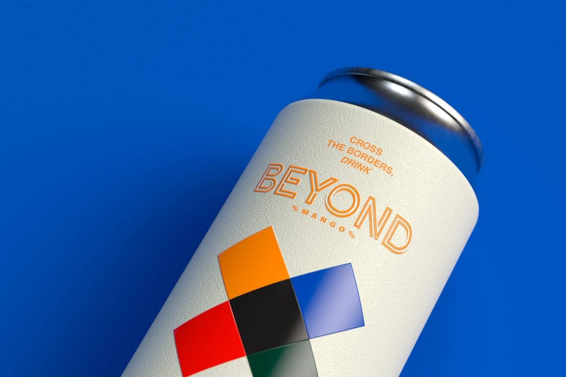
The can design follows its own rules, different from those of the bottle: a 360° surface for expression, which only About a third is visible on the shelf, a metal support that can alter color rendering (in direct printing), and three different wrapping techniques with dramatically different costs.
The three options for dressing a can: the’direct impression (the most economical per unit, but reserved for large volumes, generally several tens of thousands of units per visual), the retractable sleeve (available from a few thousand units, 360° rendering and various finishes) and the’adhesive label (starting from a few hundred units, ideal for microbreweries and market testing). It should be noted that there are still some companies like NOMOQ whose promise is to be able to print directly on cans with no minimum required.
In terms of formats, the French market standards are: 25 cl slim (energy, RTD, supply voltage), 33 cl sleek or standard (beer, soft drinks, hard seltzer), 44 and 50 cl (craft beer). The choice of format often communicates the category even before the graphic design.
A good can design is judged by its facing a useful, its scalability for a range and its legibility in e-commerce thumbnails, rather than its rendering in 3D mockups (alas!).
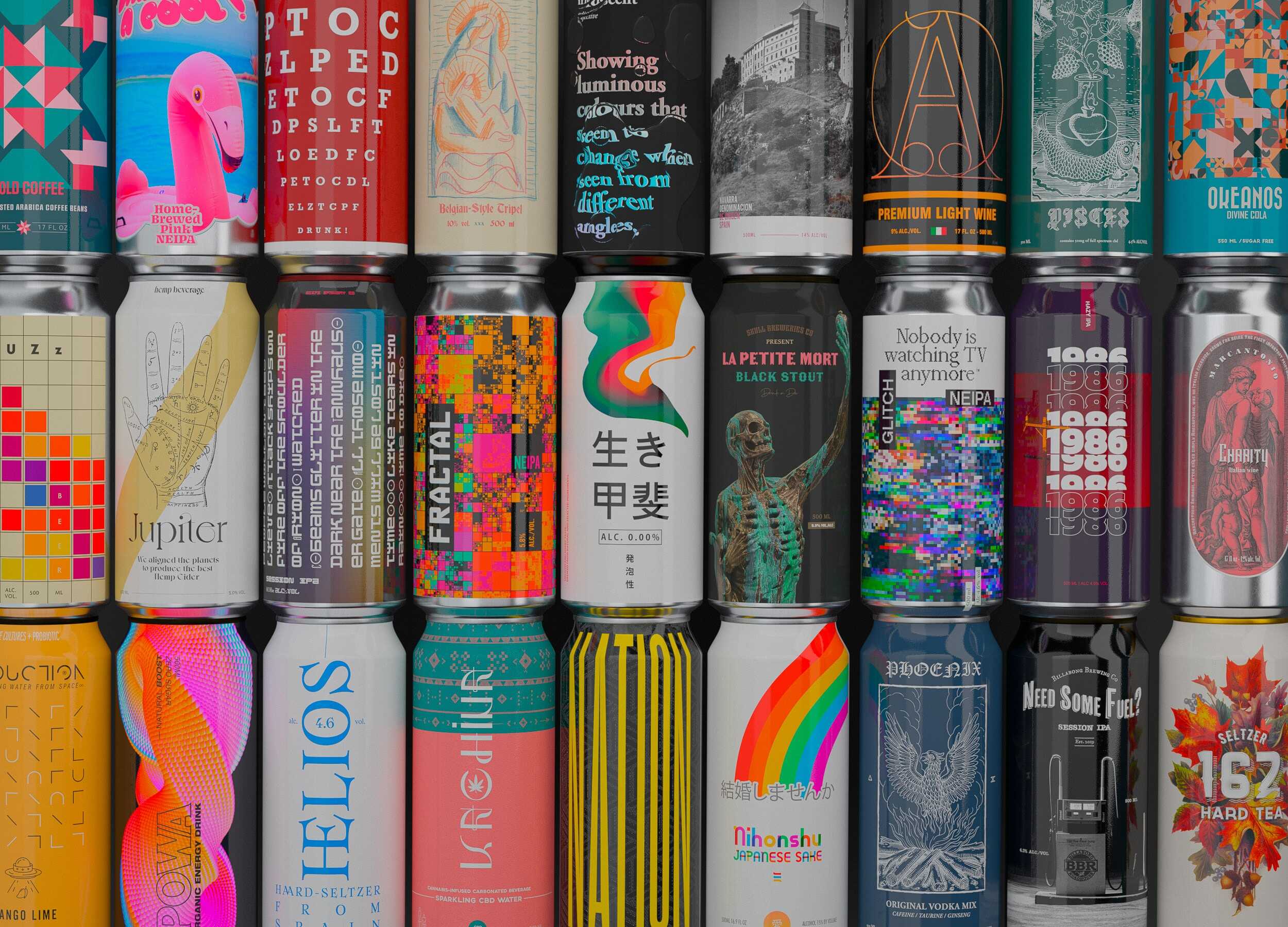
In 2020, to celebrate the studio's 10th anniversary, I set myself a slightly crazy challenge: Create a beverage can design a day for a year. 366 cans (it's a leap year ^^), covering beer, wine, spirits, hard seltzers, coffee/tea, sodas, and even CBD drinks. The 366 Cans Challenge has been featured by The Dieline, Packaging Digest, Brand New, and Trend Hunter, and it taught me one thing above all: the can is the most demanding AND most exciting format Beverage packaging.
Demanding, because everything shows. No back label to hide the flaws: a metal cylinder, a continuous surface, and very real printing constraints. Exciting, because the can is THE format that is on the rise: the craft beer It has been widely adopted, RTDs are booming (with projected annual growth of 13.9 % between 2024 and 2031 in this segment), and Gen Z associates it with values of modernity and practicality that bottled beverages struggle to claim. In any case, that’s what we’re seeing across the Atlantic and in Anglo-Saxon countries right now.
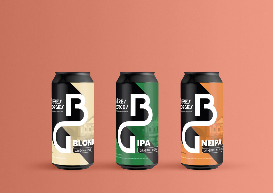
This small guide compiles everything that 366 conceptual designs and very real projects (Isautier, Bières Georges, Uchronic...) have taught me: formats, printing techniques and their minimum quantities, the rules of effective 360° design, and costly mistakes.
Why is the CAN gaining ground?
A super container designed for today's market
The arguments for the can are concrete. It fully protects the liquid from light and limits residual oxygen, two enemies of hopped beers as well as natural sodas. It cools faster than a bottle, weighs a fraction of its weight (lighter transport and carbon footprint), and aluminum can be recycled almost indefinitely. Add to that the prohibition of glass at festivals, beaches, and many events: the can opens up entire sales channels.
From an image perspective, the turnaround has been spectacular over the last 5 years. Long associated with First prize, the can has gradually become the signature format for craft, RTDs (ready-to-drinks), and low-alcohol beverages. For a brand targeting mass retail and a young audience, it is now an offensive choice.
The format that communicates before the design
First decision, before any graphic design: the format. In France, each container size has well-established category codes. The 25 cl slim evokes energy drinks and premium RTDs. The 33 cl sleek (thinner and taller than the standard) signals high-end soft drinks, hard seltzers, and kombucha. The standard 33 cl remains the domain of beer and classic soda. The 44 and 50 cl belong to craft beer, a legacy of American tallboys.
Choosing a counter-code format can be a disruptive strategy, provided it's done consciously. A 25 cl slim beer will send an «RTD cocktail» signal that can lose the buyer at the shelf. We've dedicated an entire article to these linear impact mechanisms The format is the first stage.
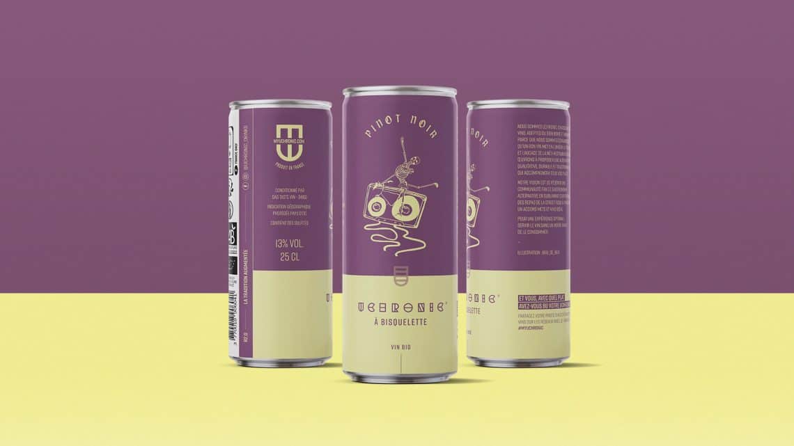
Direct print, sleeve, or label? This choice will shape your budget.
The three techniques compared
| Technique | Minimum quantity (order of magnitude) | Unit cost | Render | For whom |
|---|---|---|---|---|
| Direct-to-metal printing | Several tens of thousands of units per visual, except at Nomoq | The lowest | Inks on aluminum, natural metal effect, 6 to 8 colors depending on the lines | Established brands, large volumes, mass distribution |
| Heat shrink tubing | From a few thousand units | Intermediate | 360° total, quad + finishes (matte, soft touch), very flexible | Launches, wide ranges, limited series |
| Adhesive label | From a few hundred units | The highest | Printed zone on raw can (silver showing) | Microbreweries, market tests, ultra-limited editions, brand wishing to adopt a «craft effect» |
The exact minimum quantities vary by manufacturer and filler: always check the MOQs (minimum order quantity) with your partner before finalizing the design, as the chosen technique influences certain graphic options.
What Each Technique Changes for Design
In direct printing, aluminum becomes a color in its own right: the areas without ink reveal the metal, a superb effect that no sleeve could perfectly imitate. On the other hand, the turnover of visuals is heavy: changing a design involves large volumes, which freezes brands in their choices.
The sleeve offers maximum freedom: each reference can have its own visuals from just a few thousand units, making it the ally of breweries that release 10 recipes per year and brands testing their market. However, be mindful of color rendering on film and distortions: the sleeve shrinks with heat, and a poorly anticipated design can result in a twisted logo around the neck. Another drawback concerns the environmental standards of the sleeve (be sure it's biodegradable, for example).
The adhesive label, finally, embraces the raw can's visibility. When well-executed (kraft label on aluminum, textured papers), it offers an artisanal look consistent with a microbrewery positioning. Or, it can achieve a futuristic look for an energy drink. When poorly executed, it simply screams «low budget.».
A little anecdote that sums it up well
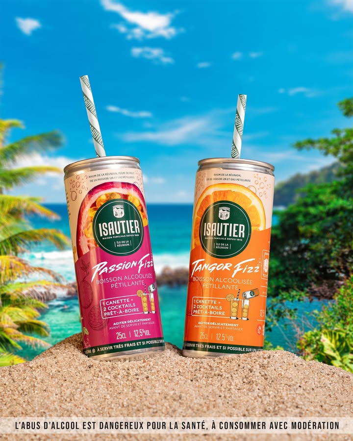
For the FIZZ range from Maison Isautier (ready-to-drink rum cocktails, produced in Reunion Island by a house founded in 1845), the choice of packaging and technique was an integral part of the strategy: a portable and responsible can format, breaking away from the glass universe of "Arrangés," to reach a new generation of consumers without cannibalizing the core product range. The project has since been recognized by World Brand Design and, most importantly, embraced by the people of Reunion Island from its launch!
Rules for a can design to work
Think 360°, design for a third party
A can offers a continuous surface area of about 20 cm wide for a 33 cl can. On the shelf, the buyer only sees about a third of it: the facing. The golden rule is to concentrate identification (brand, category, variety) on this usable facing, then use the rest of the cylinder for discovery in hand: storytelling, ingredients, legal notices, easter eggs.
The best can designs leverage this rotation as storytelling. The grip is part of the experience: it's an advantage over the labeled bottle, where the back remains an administrative space. Basically, think of volume like a tattoo artist tattooing an entire arm 😉
Build a system, never an isolated can
Of the 366 designs in the challenge, the most effective concepts were systematically ranges: a fixed structure (logo placement, typographic grid) and an expressive variable (color, illustration, pattern) per recipe. This is precisely the logic applied to our projects, from the Yeast Gang (hard kombucha) Spark! (Prebiotic Soda): The graphic system allows for adding a reference without starting from scratch and without diluting brand recognition.
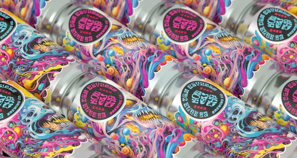
For a craft brewery with a steady release pace, this design system is the most profitable branding investment. The test is simple: place four cans from your range side-by-side. If you don't immediately see a family AND four distinct recipes, the system, most of the time, needs to be revised.
Anticipate technical constraints from the outset
Here are some classic pitfalls we incorporate from the mock-up stage: the crimping areas at the top and bottom of the can, where printing is distorted or impossible; the white undercoat to be included under light colors in direct printing (without it, the metal will grey all shades); dark solid colors that show micro-scratches from the filling line; and the readability of variations on the lid's top or edge, which is valuable when cans are stored in display refrigerators and viewed from above.
Not to mention regulatory requirements: mandatory information, alcoholic strength, health warning message, and pregnant woman logo for alcoholic beverages (presence + minimum size mandatory), all in compliance with Loi Évin. On such a compact surface, these mentions must be carefully composed from the start, otherwise they will mar the design at the end of the project.
Never validate solely on a 3D mockup, prototype in real life!
3D renders flatten everything: perfect lighting, photogenic condensation, a neutral background. Your can, however, will live in a saturated ray of light, behind a fridge door, or as a small thumbnail in an e-commerce app. Therefore, validate your designs on prints. life-size, wound around a true cans, placed between the competitors reels. And have them take the 5 impact tests we detailed in our article on Beautiful packaging vs. packaging that really sells 3-meter test, thumb test, silhouette test, range test, perceived price test.
One last word
The can is the most strategic playing field in beverage packaging right now: a growing format, adored by Gen Z, open to every channel, and one whose technical constraints (reduced facing, metal, MOQs) reward brands that think in terms of system and impact rather than decorative object.
The key decisions, in order: the format (which codes your category), the decoration technique (which structures your budget and your flexibility), the range system (which determines how you grow), and only then the graphic expression. It's the method we've been applying from the 366 Cans Challenge through to the ranges on shelf today.
Are you preparing a can launch or a bottle-to-can transition? Let's talk about your project . Chances are we've already designed, tested or produced a case very close to yours.
Frequently asked questions about our agency
Do you have any other questions? Let's talk about your project