Brewlander
The story
Brewlander est une des premières brasseries artisanales de Singapour. Faisant partie de la filière brassicole depuis 2016, la brasserie produisait auparavant en Thaïlande et se qualifiait de « gypsy brewery ». A présent, elle s’est équipée afin de brasser ses bières à domicile dans un gigantesque local fraichement rénové et une station de brassage à la pointe.
Malgré cette expansion et leur notoriété dans la scène craft locale, la brasserie a souhaité revoir son brand identity. Le problème principal auquel ils faisaient face était le manque de cohérence dans leur communication et le fait que leur image ne reflétait pas leurs valeurs ni leur origine. Leur désir : s’étendre au-delà de la scène craft en proposant leurs breuvages à une population plus diversifiée tout en restant indépendants et avant-gardistes. C’est ainsi que Studio Blackthorns à travailler courant 2020 sur leur rebranding stratégique.
Services provided
- Strategic design
- Brand Identity system
- Ressources marketing
The approach
In order to align their brand identity avec leurs valeurs fondamentales et donner naissance à une identité forte et emprunte d’histoire, Studio Blackthorns a engagé un travail d’analyse scrupuleuse de la concurrence dans le marché de la beer en Asie. Nous avons également passer en revu les marketing and communication trends in the global landscape in order to structure the strategic approach to their rebranding. We initially focused on the Perenakan culture, occupying a special place in the history of the region in relation to the immigration of the Chinese population from the 15th to the 17th century.
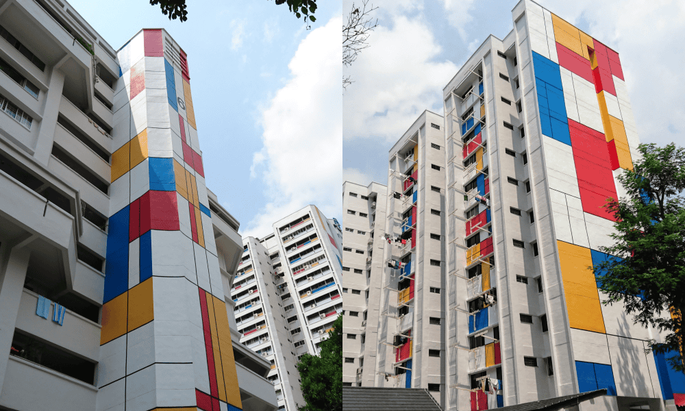
However, after consultation with the Brewlander team, this track seemed too traditional and perhaps less exportable internationally. So we focused on Brewlander's history and its DIY (do it yourself) beginnings, when John brewed his beer at home in a popular district of Singapore. We proposed various creative paths focused on Mondrian-inspired HDB flats. This way, Brewlander is growing without losing sight of its origins and inspires confidence among its consumers.
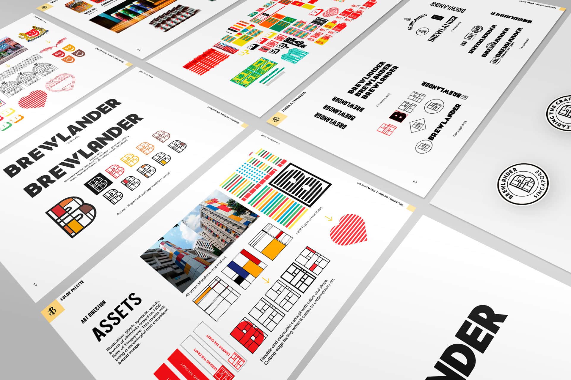
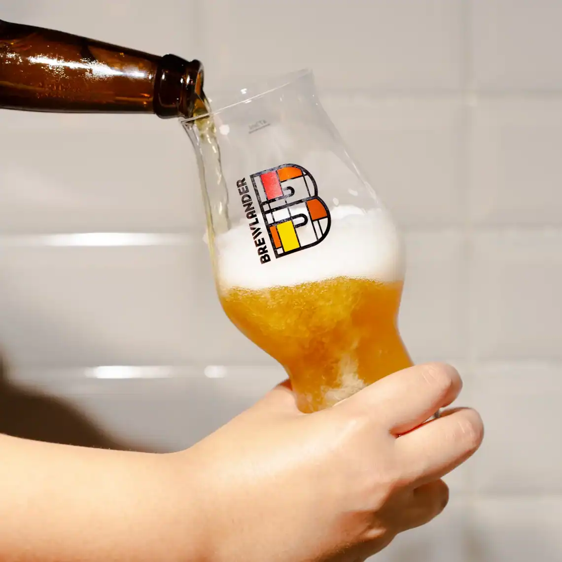
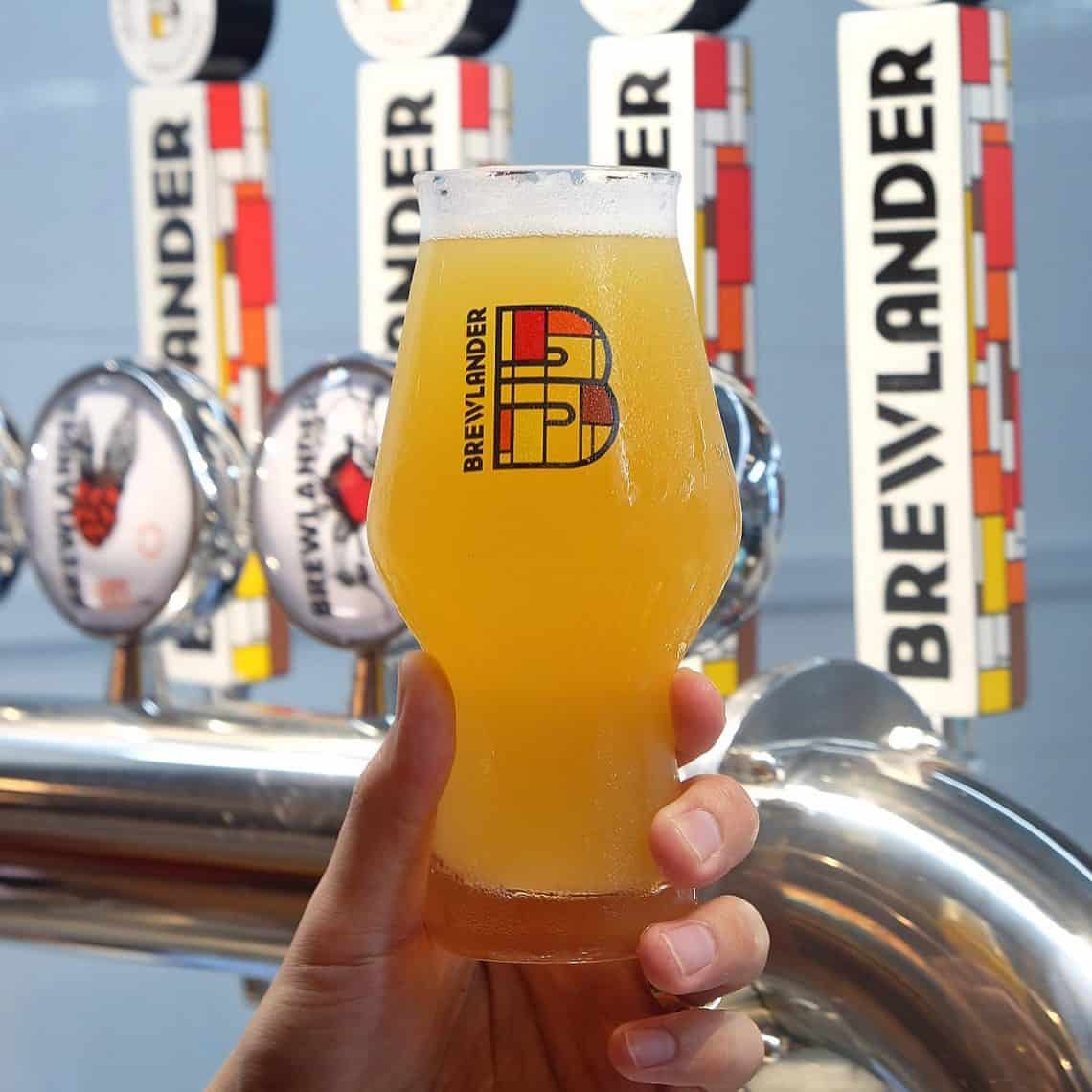
Our letter B perfectly encapsulates the backbone of our origins. From John's innocent brewing hobby in his little HDB flat, and our upward journey in the local craft beer scene, this emblem signifies determination, passion and pushing boundaries.
Brewlander
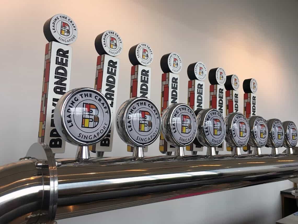
The Brewlander font was selected and redesigned to incorporate elements of their values and vision. We have a modern sans serif typeface, with a slightly cut 'W' to bring back the cutting-edge feel of the brewery. The letter 'A' has been rounded off in order to keep the arch shape of the traditional architecture but also to make it more recognizable.
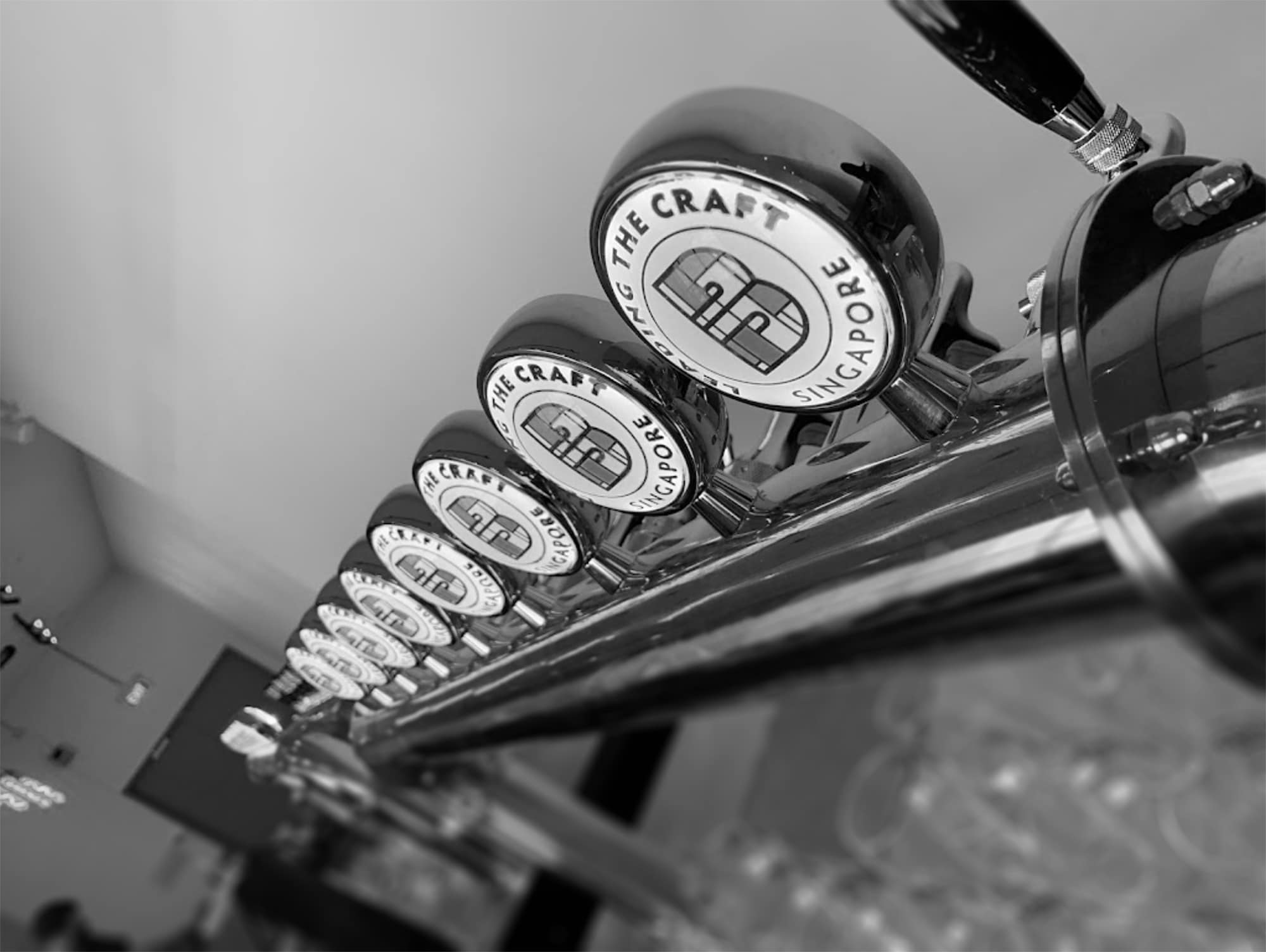
The avatar, a squared B, is inspired by the HDB Flats and Mondrian. We have thought about its use for social media platforms and the flexibility of possible animations. Thus, Brewlander is proud to have a disruptive MTV-like mark and can enjoy a wide range of designs and colours to develop its visual communication. We have created different badges in the colours of their core range (Love, Hope, Joy, Respect) and we have redefined a brighter colour scheme.
Alongside the launch of our new brewery, we are also proud to announce that we have a sexy, spanking new mark!
John Wei, founder of Brewlander
Scope of work
Brand essence
- Strategic design
Brand Expression
- Brand Identity system
- Branding design
- Label design

