The very principle of design is to create a better world. We're still a long way from a perfect world, but...
After scouring the majority of blogs and websites specializing in beverage and packaging design, Studio Blackthorns has compiled a summary of the best beverage packaging for the first 6 months of 2021. On the agenda: beer, hard seltzers, probiotic sodas, sake, cans galore and eco-friendly packaging. Enjoy tasting with your eyes! 😍
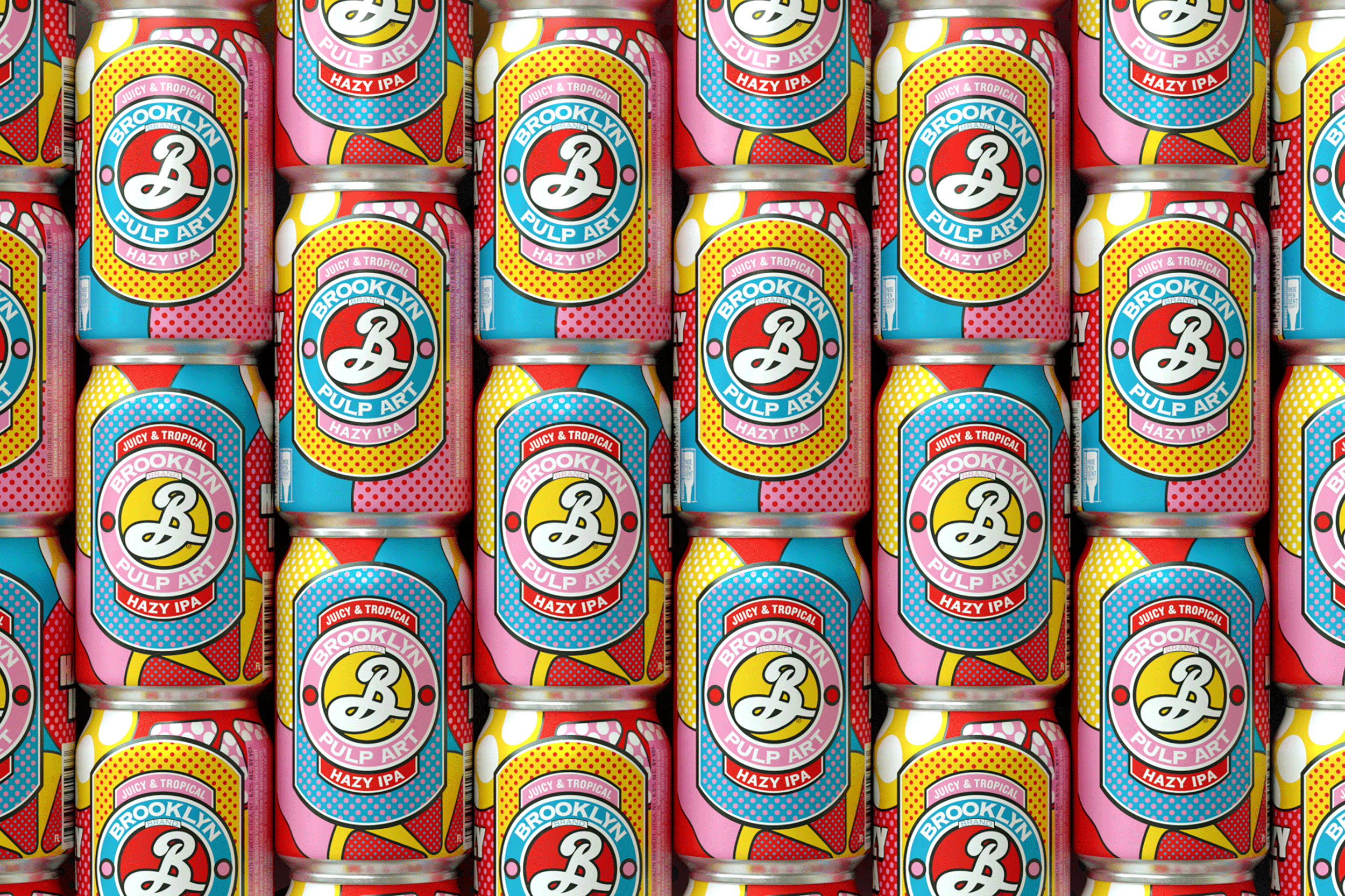
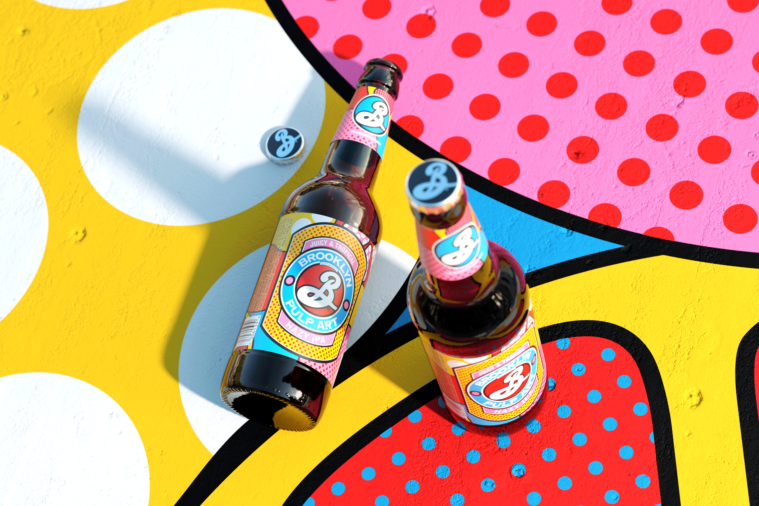
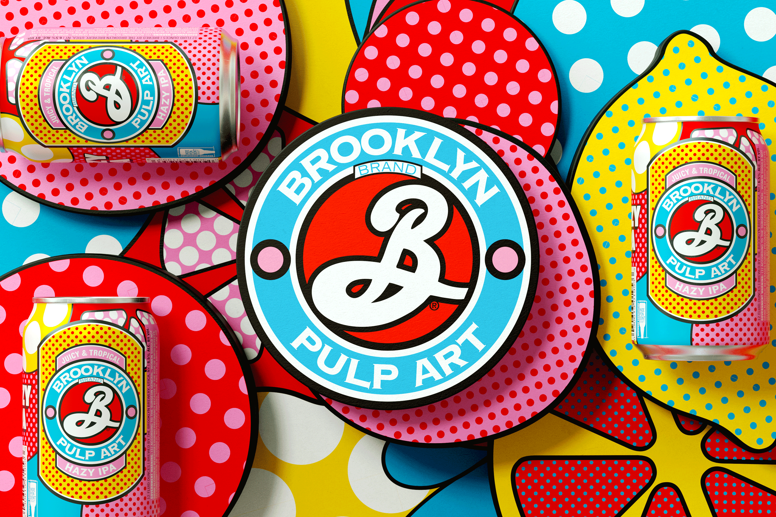
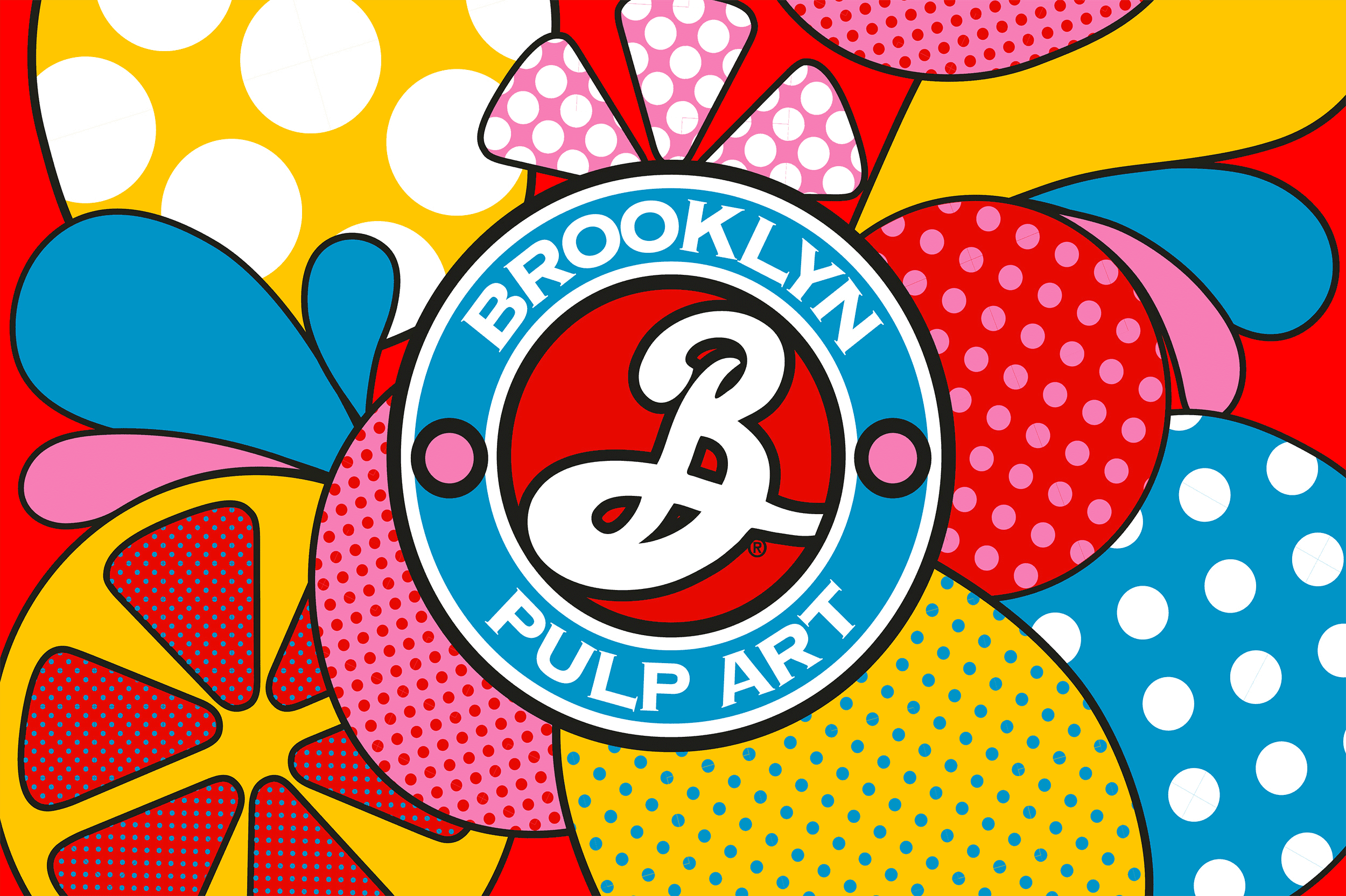
As already mentioned in our article Why have artisanal beer packages become so cool?, beers in cans have become a veritable form of artistic expression for brands, and numerous craft breweries bring the art gallery into the refrigerator. Such is the case with Brooklyn Brewery's Hazy IPA, with its new pop art look.
With obvious nods to Warhol and Lichtenstein, the new brew leans heavily on the pop art aesthetic, with lots of black lines and polka dots. Brooklyn Brewery's iconic insignia is transformed into a cartoon, with a background of crazy colors corresponding to the fruit segments inserted into the design. The visual identity of the off-pack range has also been tweaked to create a totally Instagrammable graphic environment.
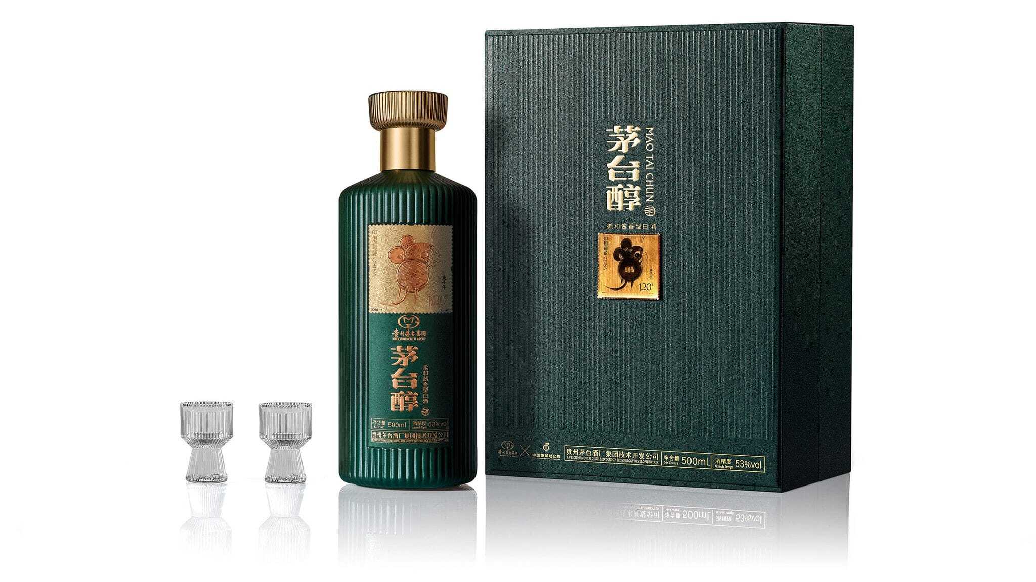
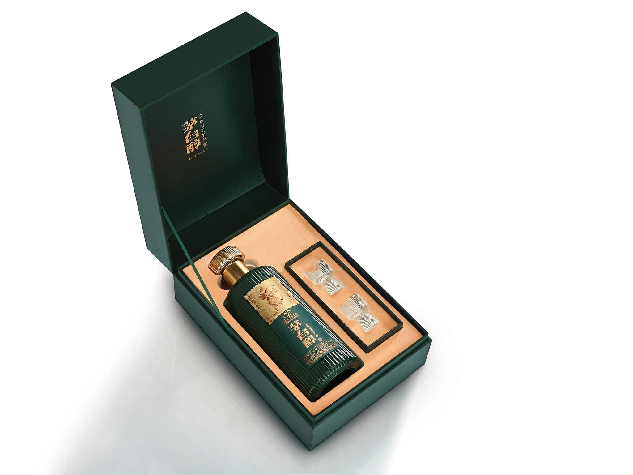
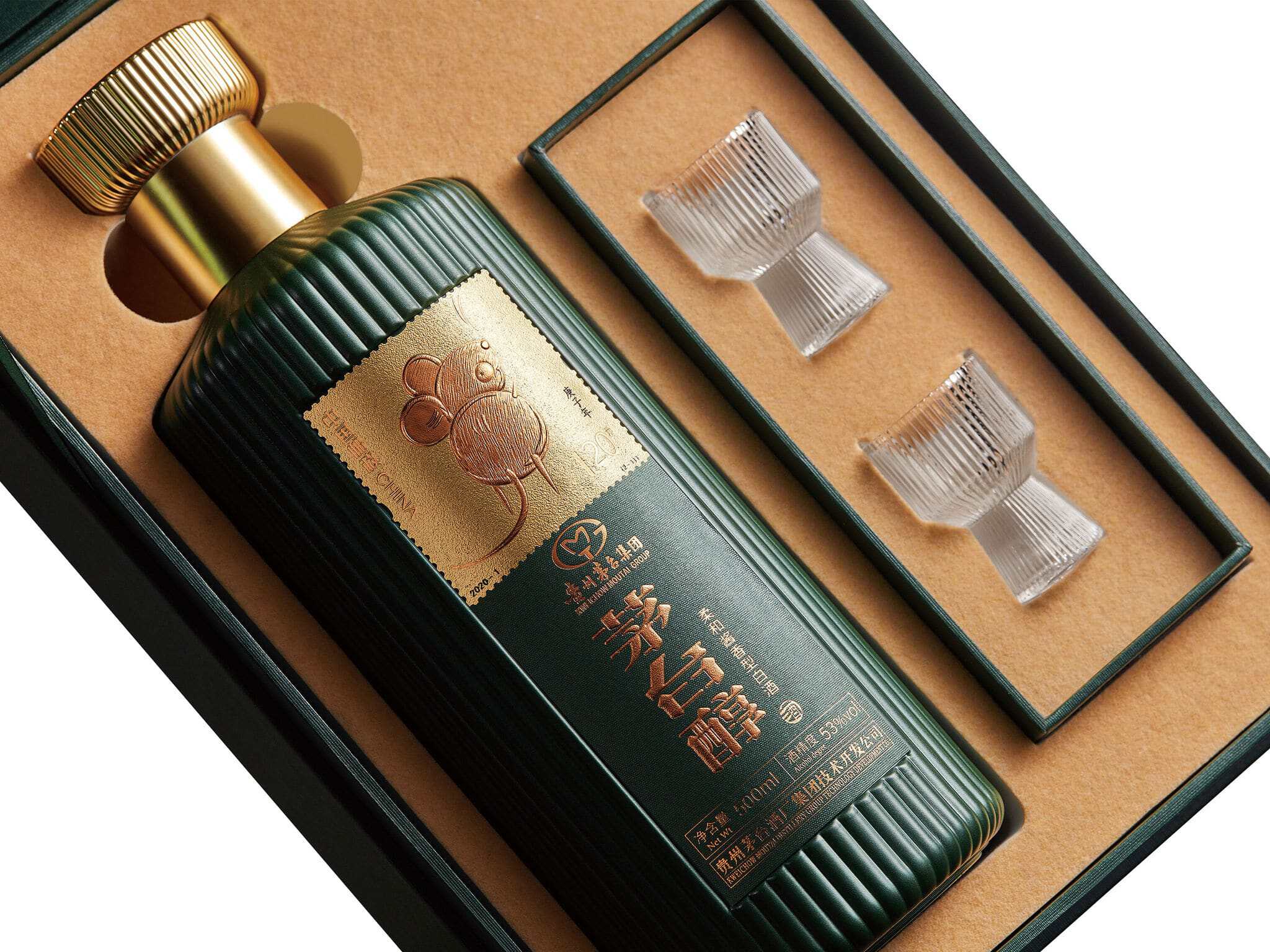
The designers of this packaging for Mao Tai Chun liqueur wanted to take up the traditional design elements used for the liqueur packaging and add a touch of modernity and creativity. The imagery is based on the stamps of a famous collector, also with the aim of highlighting the tradition of philately. The result is a high-end presentation that turns packaging and liqueur into collector's items in their own right.
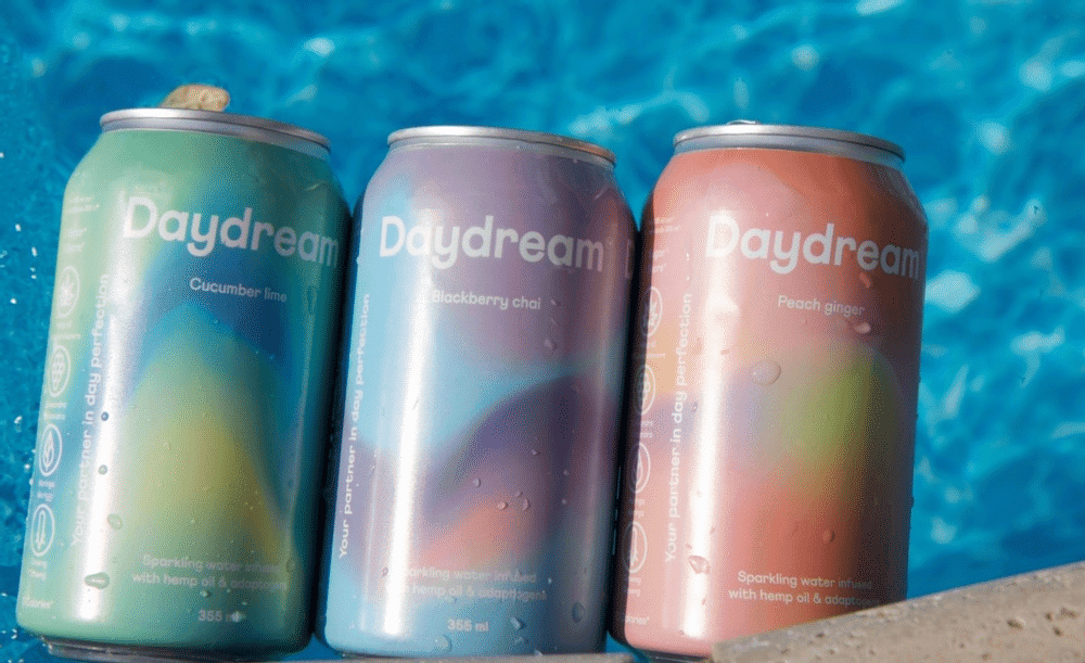
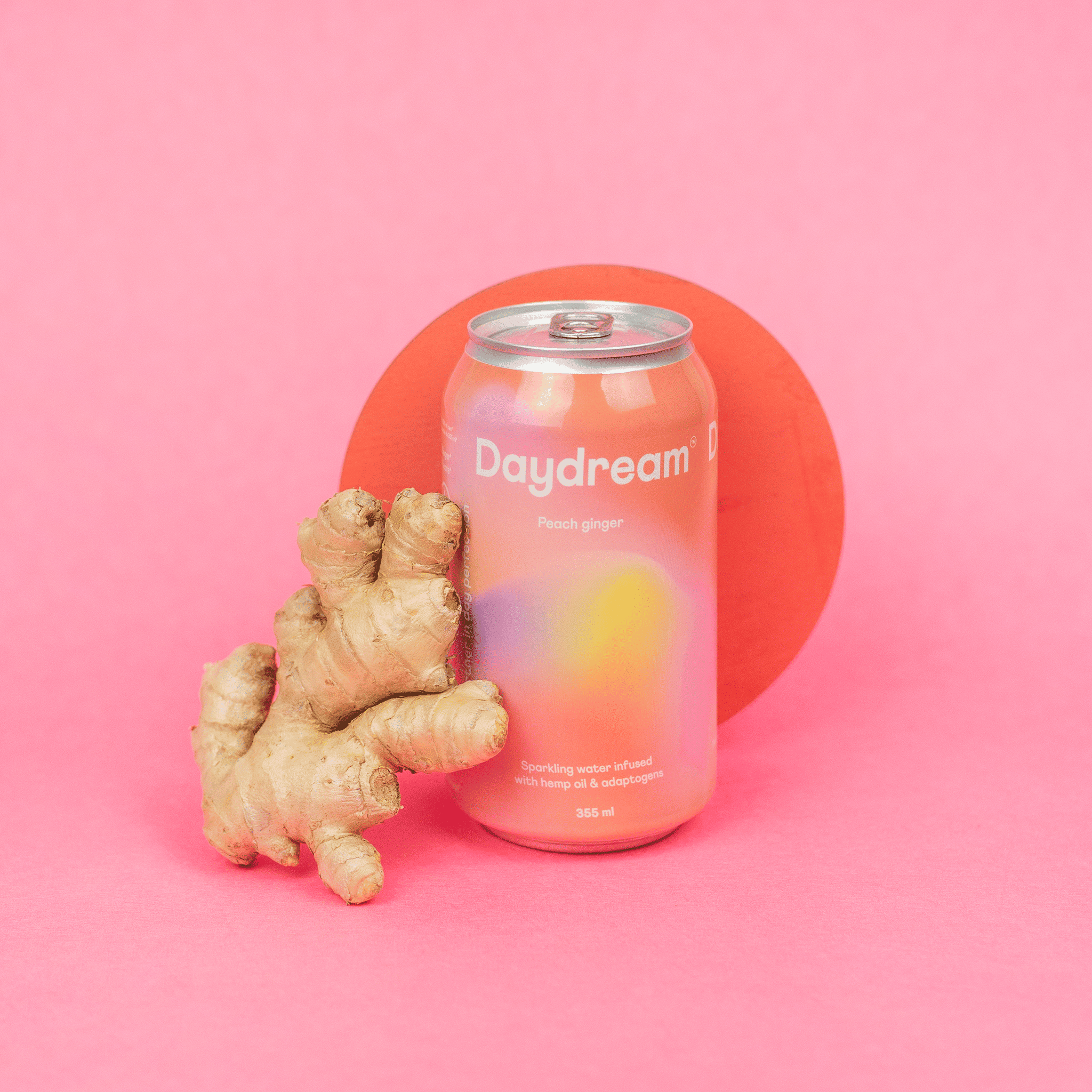
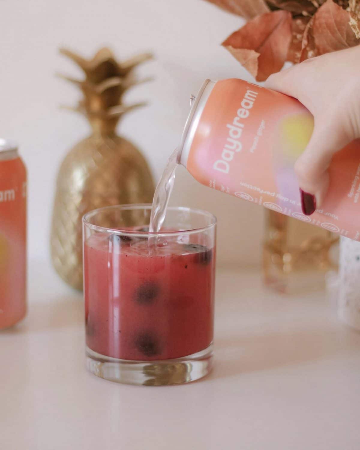
The Daydream sparkling water brand wanted to orient its visual identity around the concept of daydreaming. The idea was literally to take one's brain on vacation, so as to escape from dull everyday life and recharge both physically and mentally. Of course, reaching such a state can be difficult, especially when the world around you weighs heavily (Covid obliges!). Daydreams also take us back to a familiar, idyllic experience, when we were at our best.
Visit beverage brand Daydream sparkling water has sought to create this state of consciousness with a low-calorie sparkling water containing hemp extracts and other herbs and ingredients claimed to promote well-being, such as moringa, ginseng and schisandra. Daydream comes in three flavors: chai-blackberry, cucumber-lime and peach-ginger. The labels are bright and ethereal. Swirls of saturated, gradient colors are diffused across the can, and each flavor has its own palette. Placed next to each other, they create a harmonious landscape and form a "green", "green", "green", "green", "green", "green", "green", "green". brand identity soothing and whimsical.
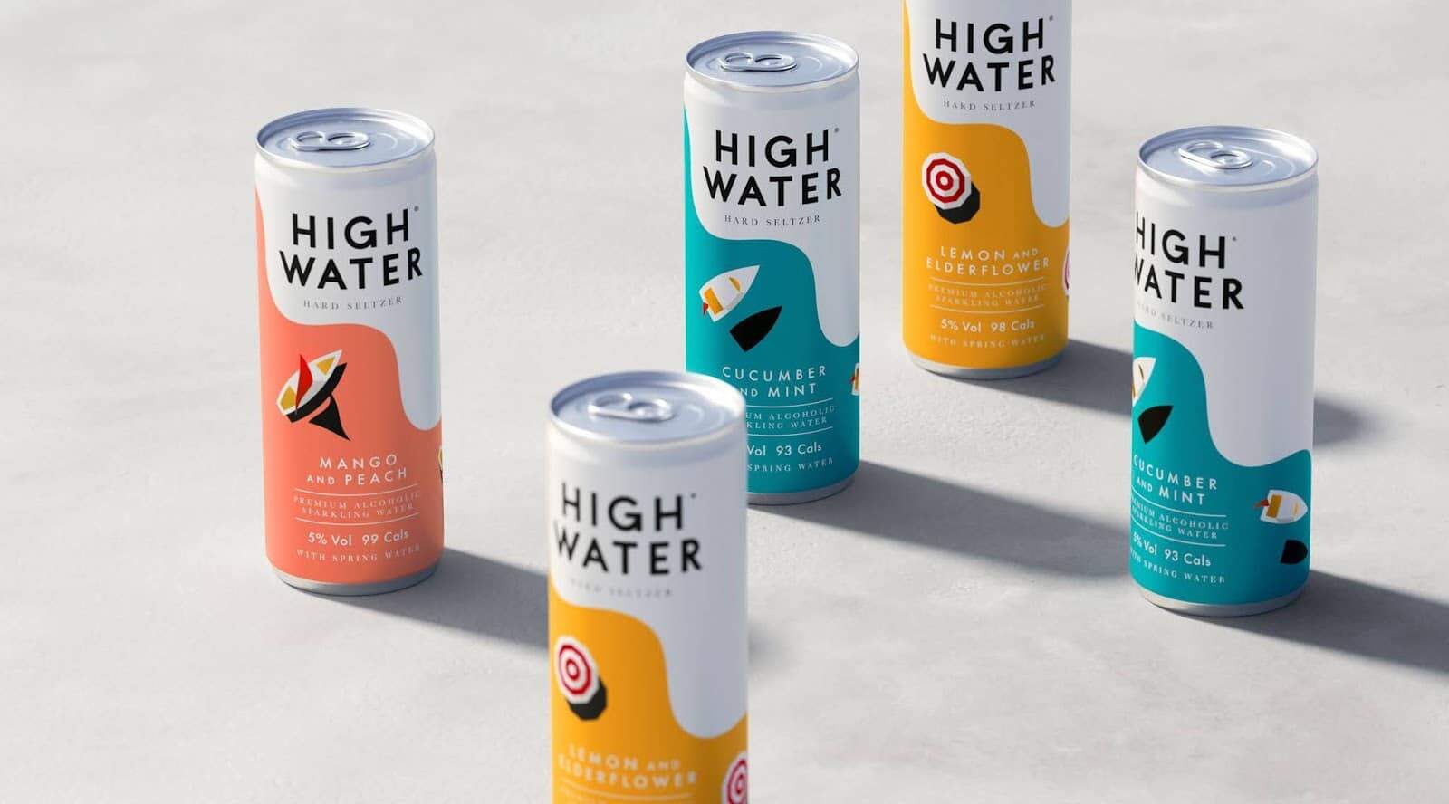
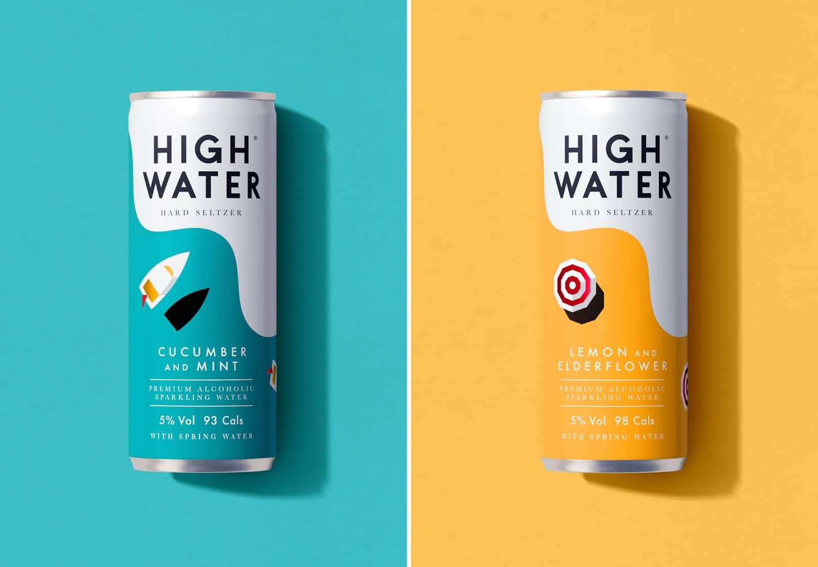
Made from sparkling Cotswold spring water, triple-distilled vodka and natural fruit essences, the High Water brand also aims to donate a percentage of profits to marine charities. In addition to its ambition to be the tastiest of the hard seltzer category, High Water is low-calorie, vegan and gluten-free, presented in fully recyclable cans and contains no artificial ingredients.
Hard seltzer is already very popular in the U.S. and growing in the UK. To catch and ride this wave, High Water needed to create a brand that would combine high-end aspirations with mainstream appeal, capture the magic of the waterside and promise lots of fun. Emotional connection was currently lacking in the market. The brand's first concern, therefore, was to create a strong brand story with a compelling manifesto and distinct brand values.
Elegant and tranquil, with a hint of opulent pleasure, the evocative designs set the scene. Waves of anticipation flow through a range of art-based cans, and you can imagine yourself strolling along the Cornish coast or relaxing on the sands of Sicily.

Sake, fermented rice drink from Japan, Sake has a long history, probably beginning some time after rice was first cultivated in the country. For centuries, sake has been the country's national alcohol and one of its most important culinary exports. Despite its ancient origins and worldwide popularity, sake does not share the same passion and consumer interest as other types of spirits in America.
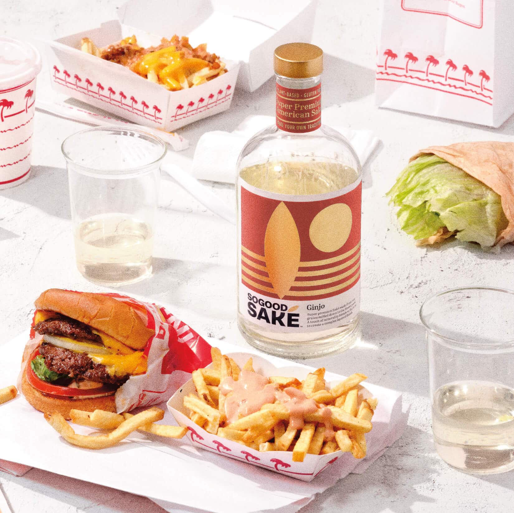
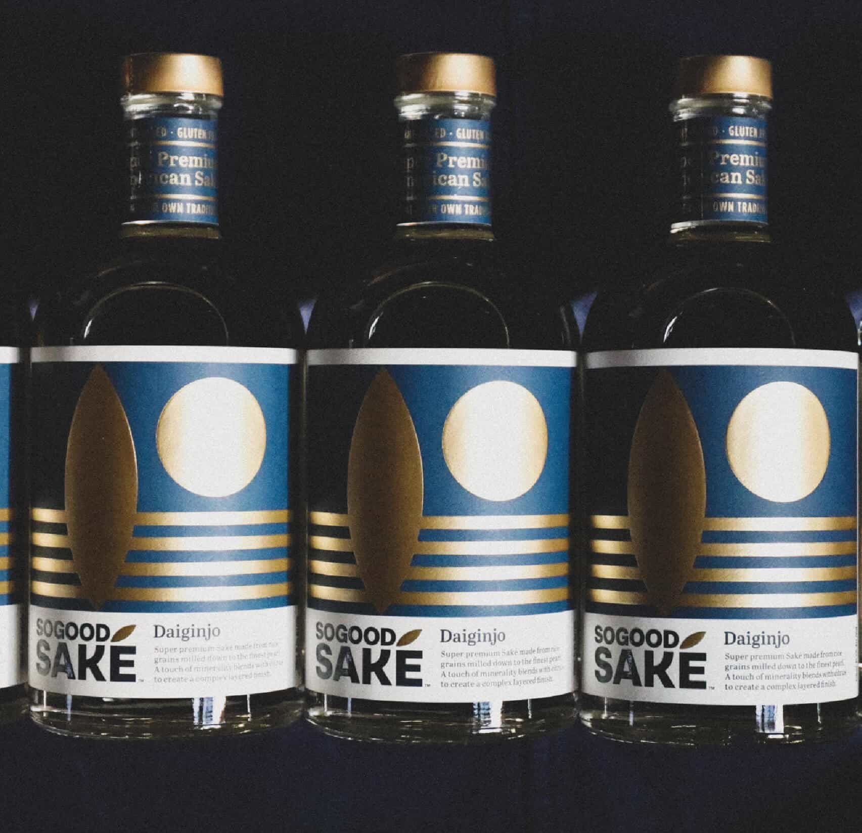
SoGood sake is a super-premium spirit made in the USA from rice grown in the Sacramento Valley. The SoGood brand image features the sophistication of modern craft spirit makers and the excitement of exploration while making rice the star. The K de saké features a sumptuous round arm, similar to a polished rice bead. The accent is also inspired by the grain, while bringing movement and dynamism to the brand. Rice paddies and rice stalks are also used in the design language, the bottles use the shapes arranged with art and elegance, and aluminum foil adds shine and sparkle. Finally, the textured bumps on the bottle add dimension to the packaging and are shaped like rice, because of course they are.
Rather than focusing on the long history of sake and its Japanese origins, SoGood creates a mood, positioning its spirits as a handcrafted, high-end alternative to more traditional liqueurs. The streamlined packaging imposes provenance on the bar shelf, as well as experimentation.
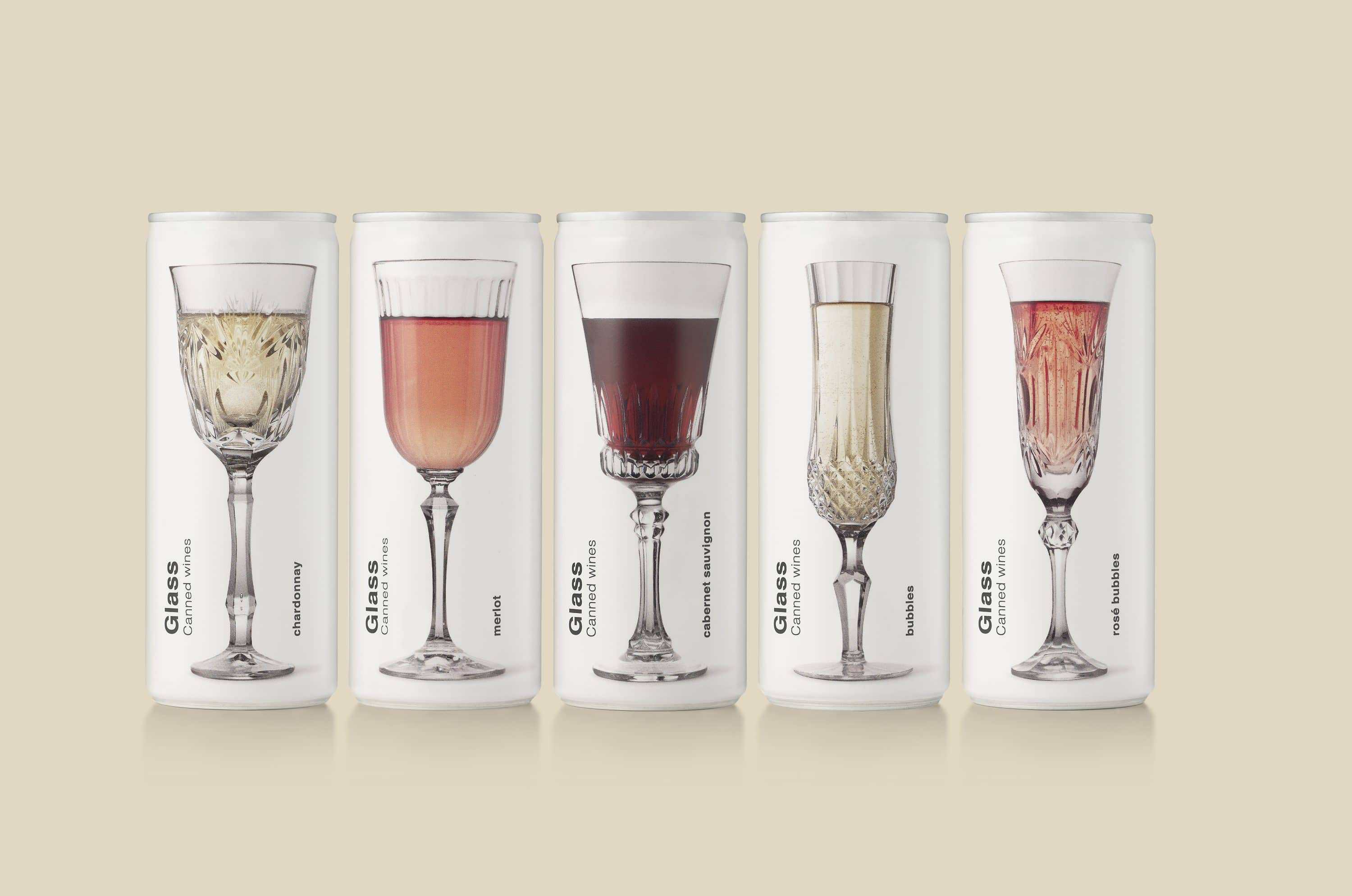
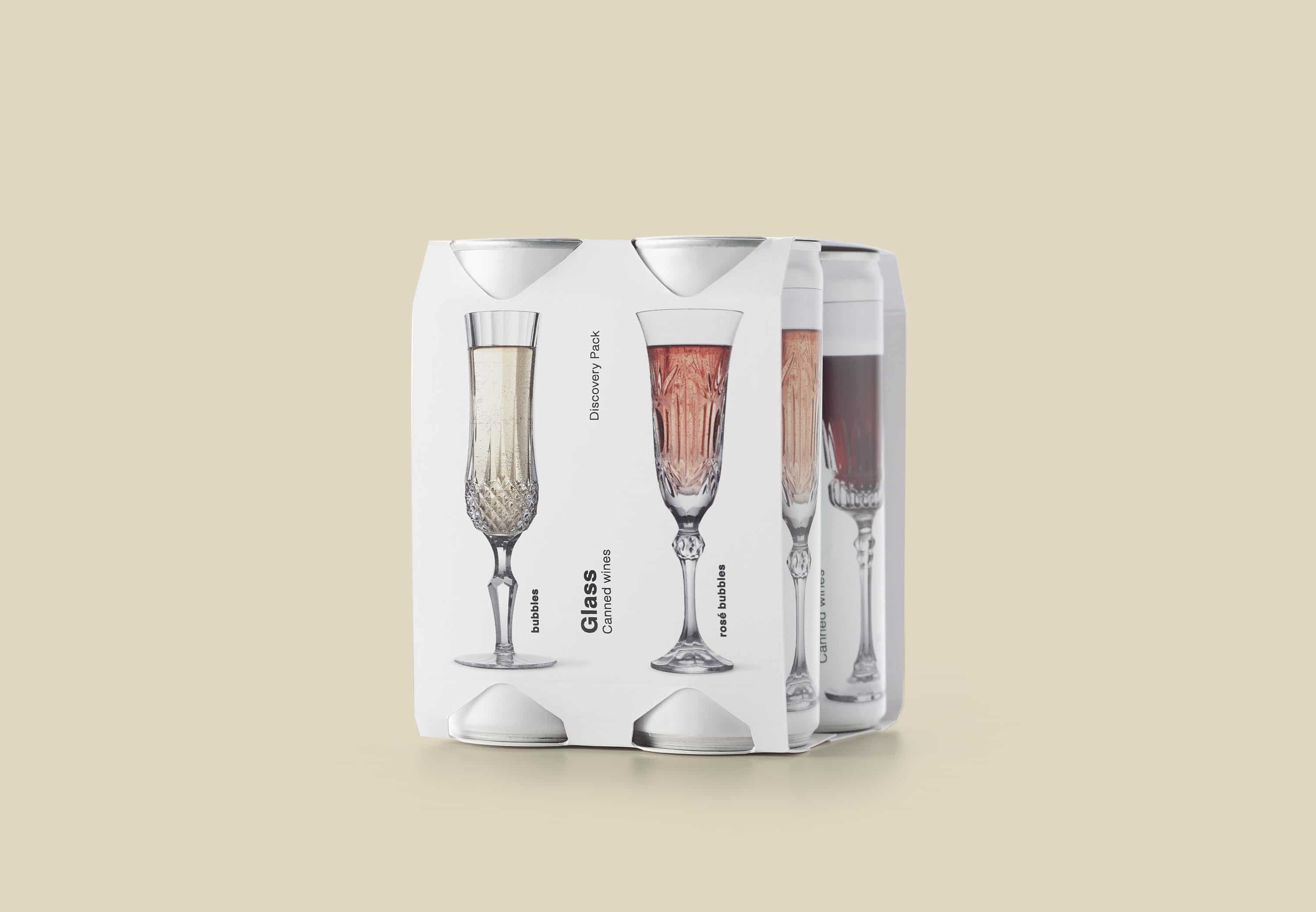
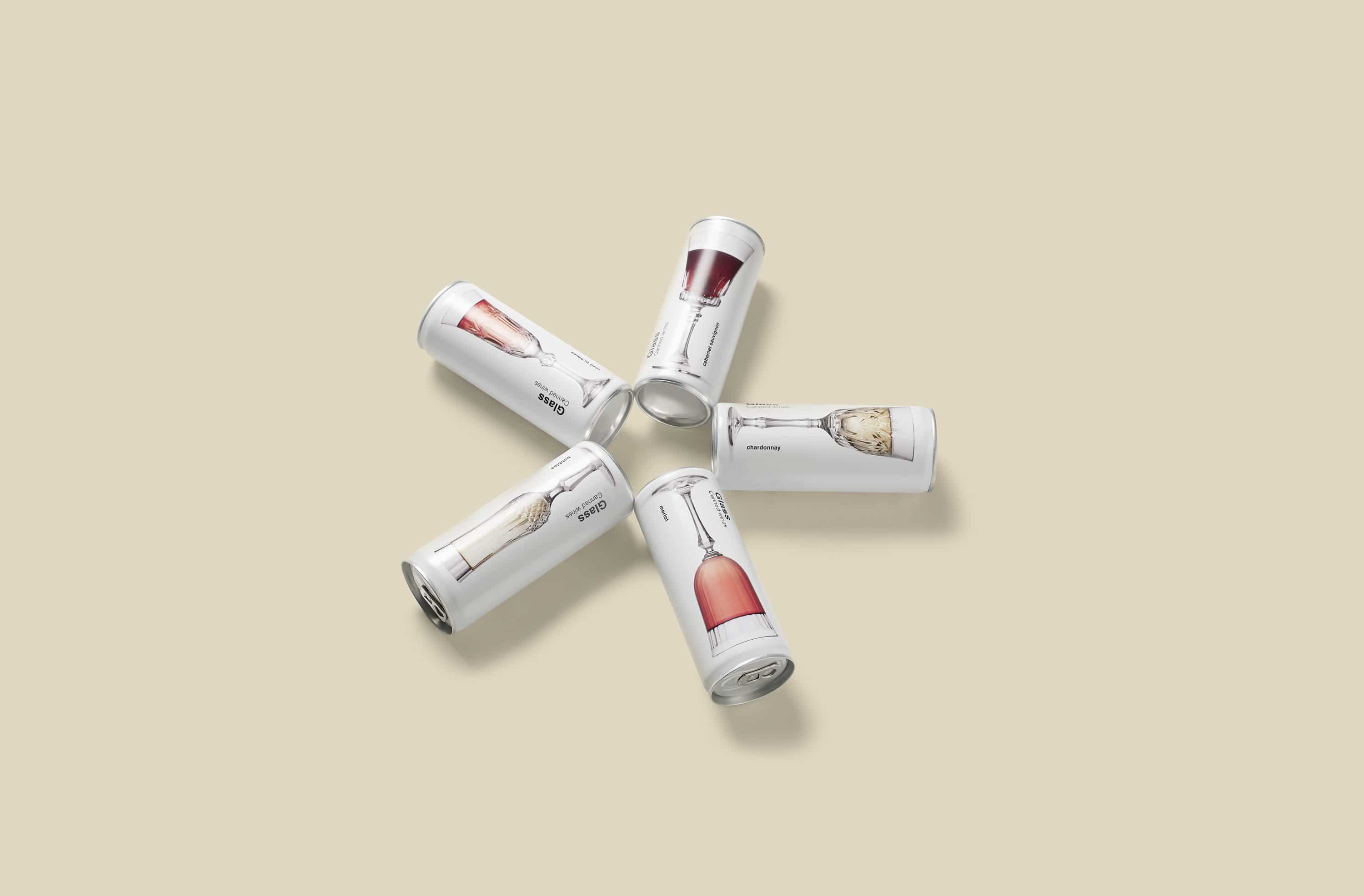
Perhaps you grew up in a family that blessed good wine and its traditions. Or perhaps you were accustomed to arranging beautiful cut crystal glasses at family meals and parties? Elegance aside, wine in cans offers a number of distinct advantages. A dropped can won't break into a million pieces, and they're much more practical to bring to a picnic in the park than fancy glasses and a bottle. Aluminum is also more durable, keeping wine cool and out of the sun.
Glass is inspired by the usefulness of wine in cans, and attempts to recreate the ambience of a buttery chardonnay or a full-bodied merlot in refined glasses. The labels are white, with sober text, and depict elegant glasses generously filled with wine. This original packaging design allows us to subtly and modernly retain much of the effect that fine crystal glass has on wine itself, so much so that we'd be tempted to give this range of cans to our grandparents!
Overall, the brand image emphasizes and celebrates the joy of wine and luxury tableware, even if the occasion calls for more casual packaging.
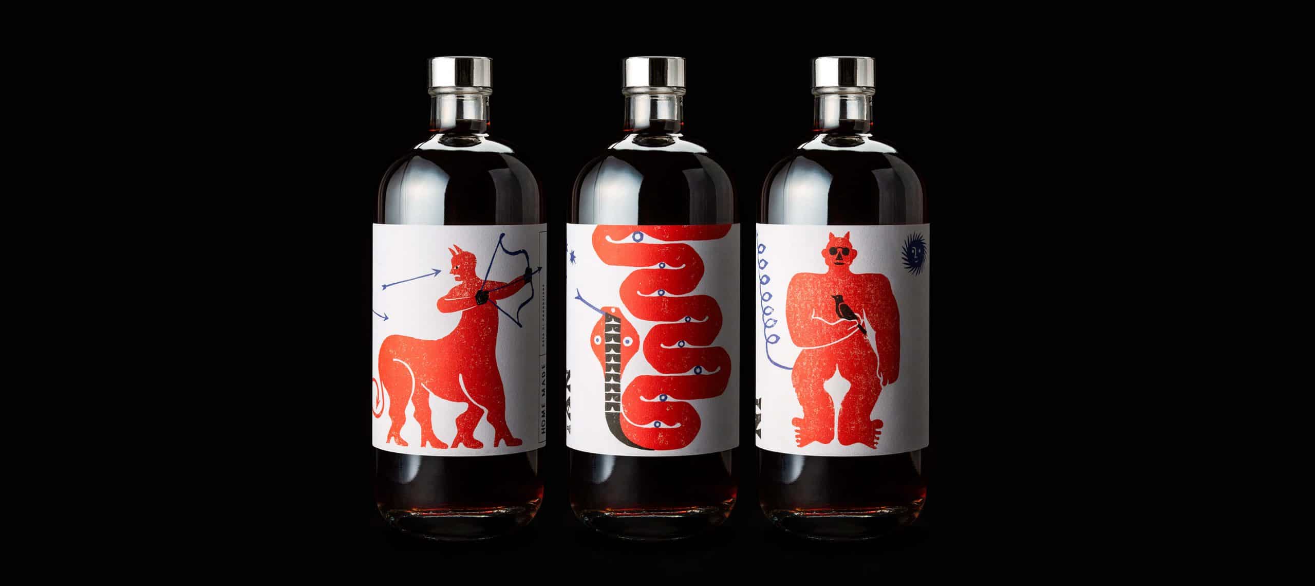
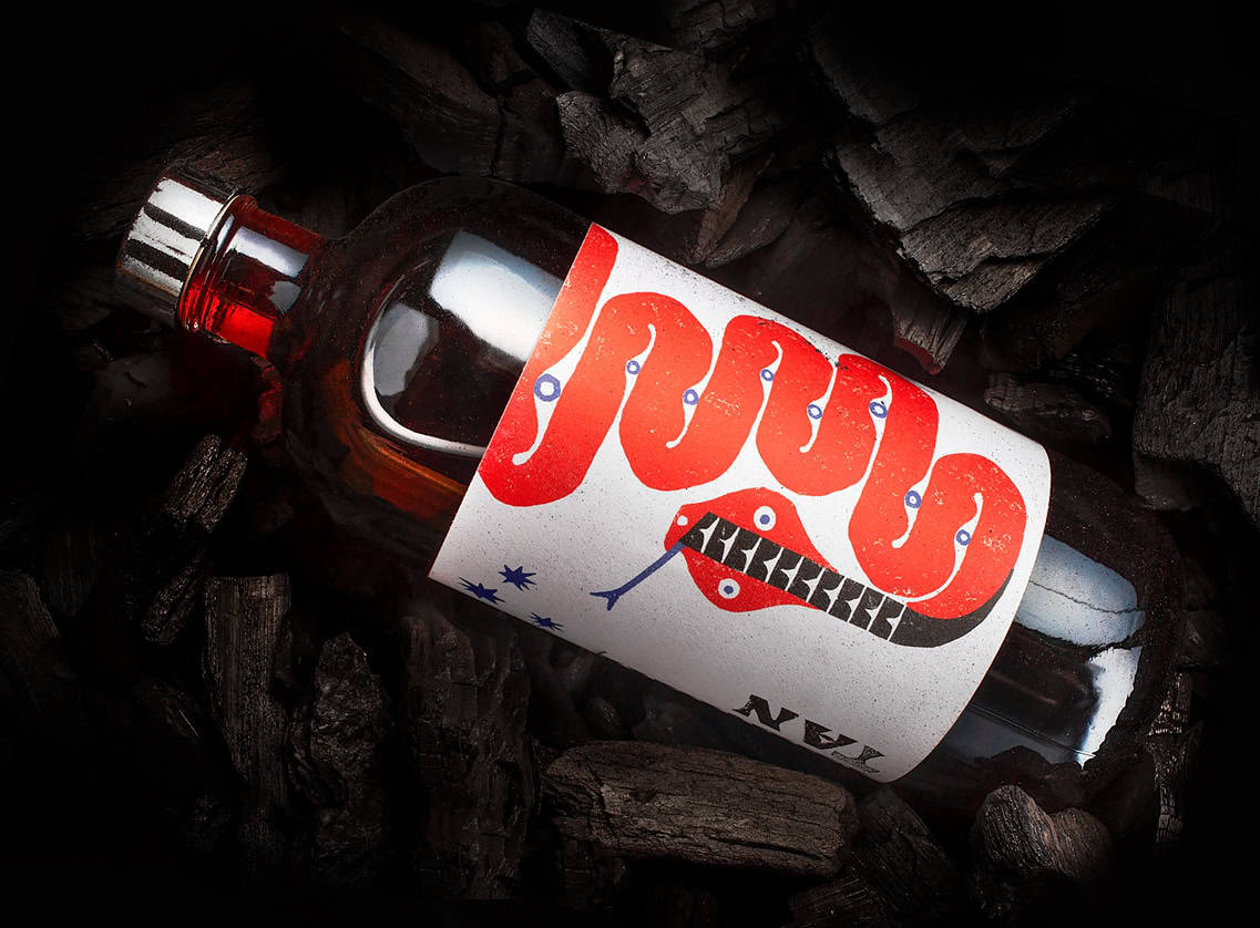
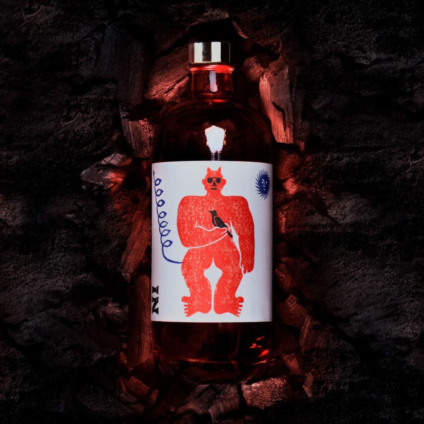
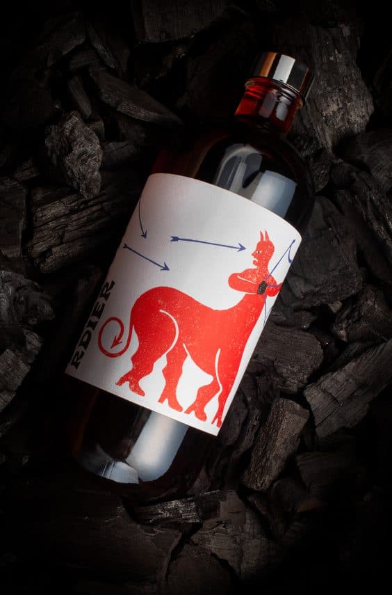
Emanuel Cafe's pre-assorted Negroni, Manhattan and Boulevardier cocktails can confidently stand on the shelf of every wine bar, thanks to the label design by Lettera7. The three mystical, eccentric red characters perfectly match the nuances of the spirits they contain and add an unexpected touch of personality, just as the fruity extension does for each drink. Each bottle is numbered, as production is limited.
Negroni, Manhattan and Boulevardier now rest in seductive bottles featuring three almost mystical labels, where information gives way to images. Each label represents a vision stimulated by tasting the cocktail. Each character tells a story inspired by fairy tales and fantasy worlds, where chimeras, demons and charming snakes live enchanted by the cocktail. potions prepared by wizards reminiscent of modern alchemist bartenders.
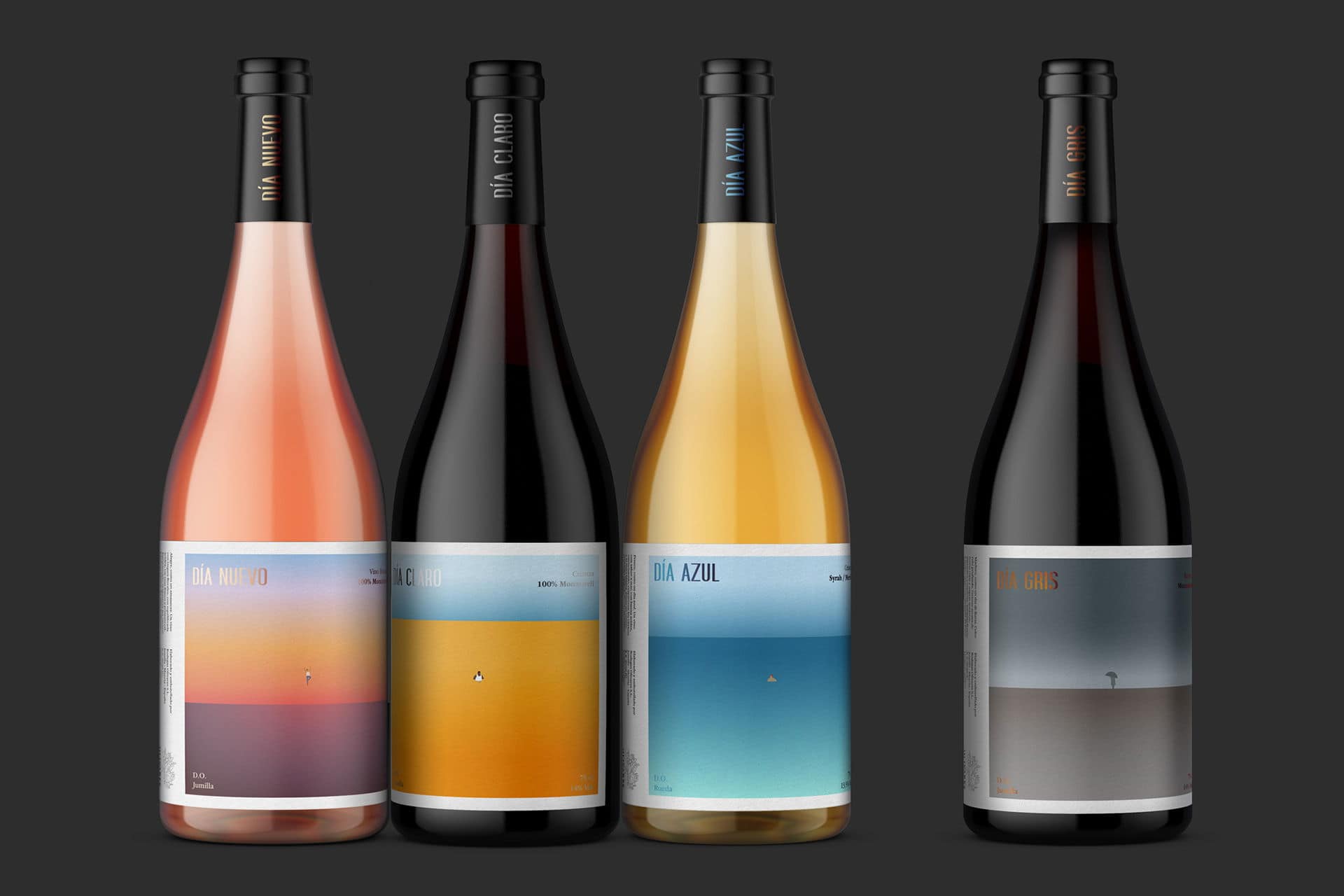
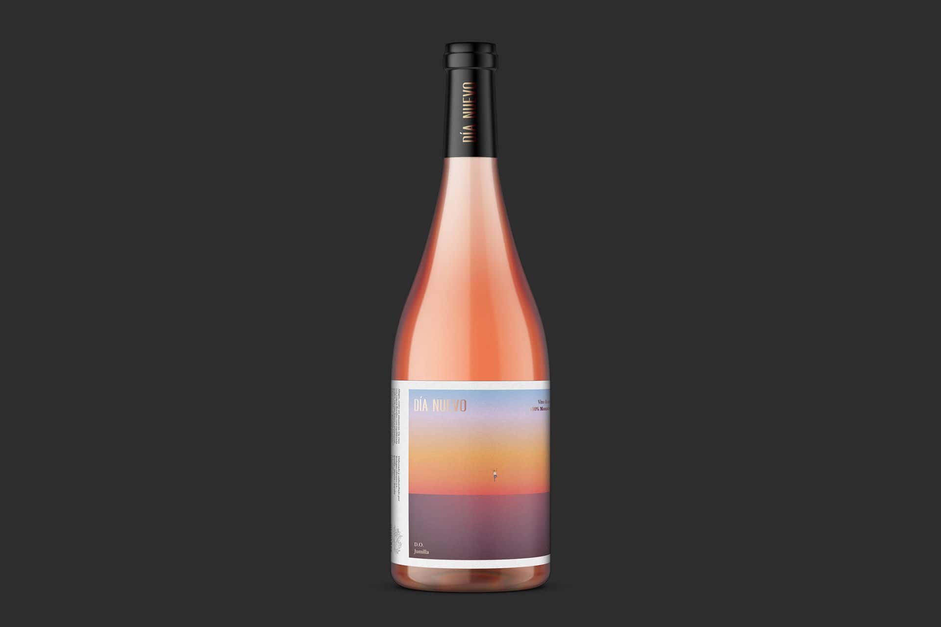
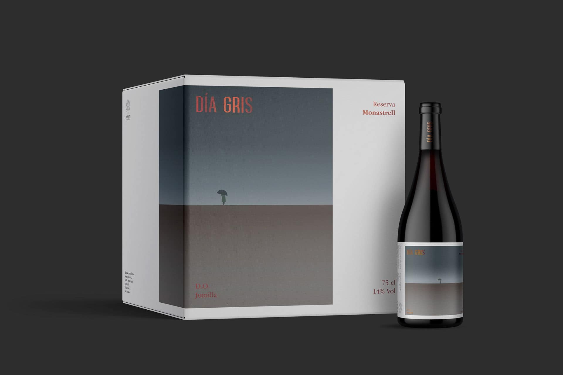
Día wines are there for you to sip on, whatever your mood. Rubio & del Amo worked on the label design with dense colors but simple illustrations, for Día Wines. The result is a collection of wines whose names speak to the feelings their flavors and labels evoke.
The individual labels for Día Azul, Día Gris, Día Nuevo and Día Claro use warm and cool colors respectively, and incorporate elegant gradations, bold lines and minimalist cartoon sketches. The design of each carton corresponds to the landscape design of the bottle, formatted off-center to enhance the already linear nature of the graphic paintings.
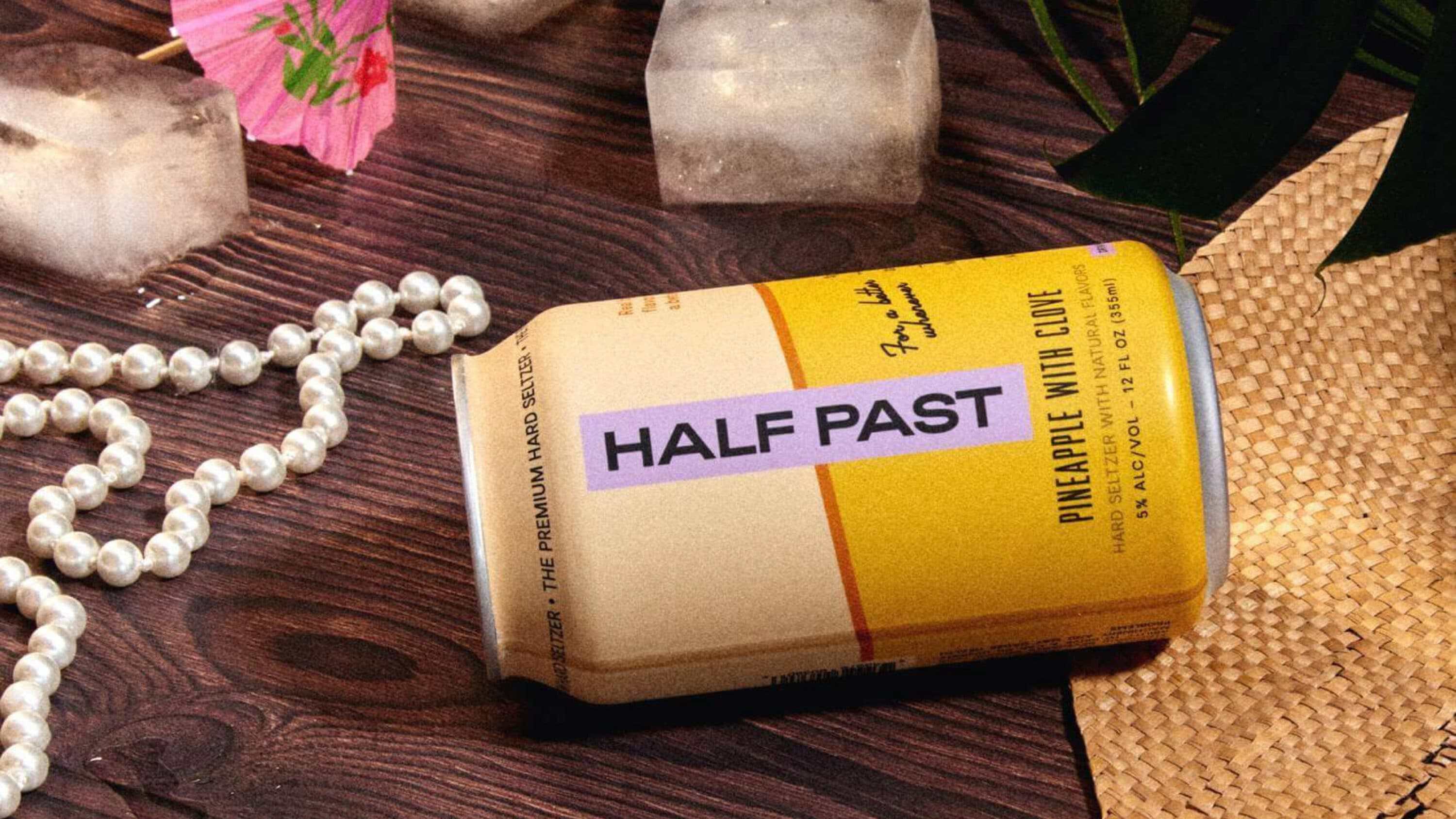
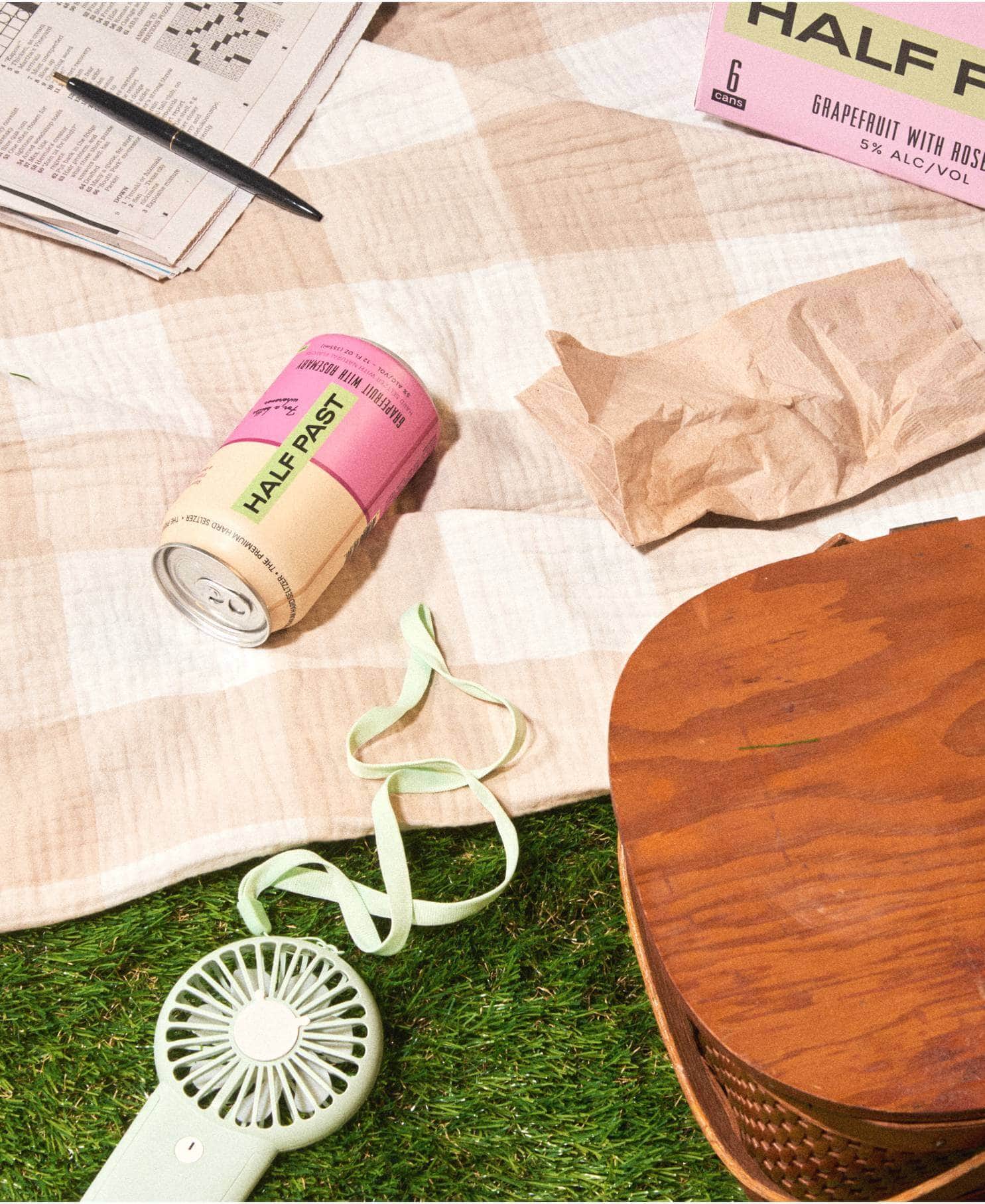
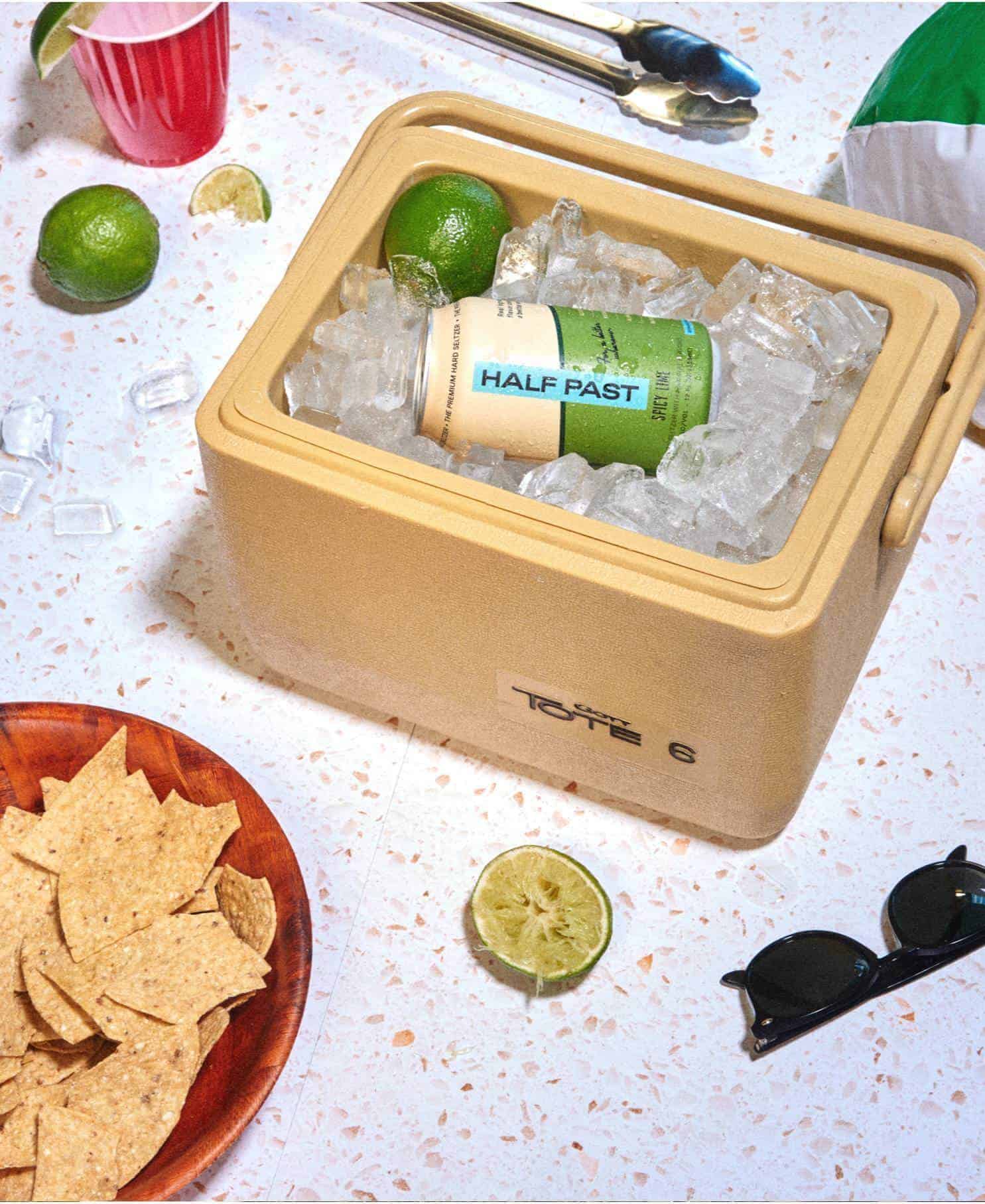
Love it or hate it, but let's face it, the’hard seltzer brand identity Half Past has character! Compared to any other package in its category, Half Past goes the extra mile. Indeed, there's something special about the way these cans look effortlessly at home in the hands of a Generation Z's TikToker or your father ironically wearing Birkenstocks with socks. Stunning color combinations and unexpected typographic elements add an element of surprise with that nostalgic yet timeless edge.
The brand has thus developed a can that is at once unexpected, comfortable and familiar. Its ambition was to create something that would stand out from the mass of sodas and demonstrate a certain level of quality, without being considered a niche or high-end product. Given that hard seltzer is generally bought in cans, Half Past also had to ensure that the can was shapeless, but still stood out on the shelf and reflected the spirit of the brand.
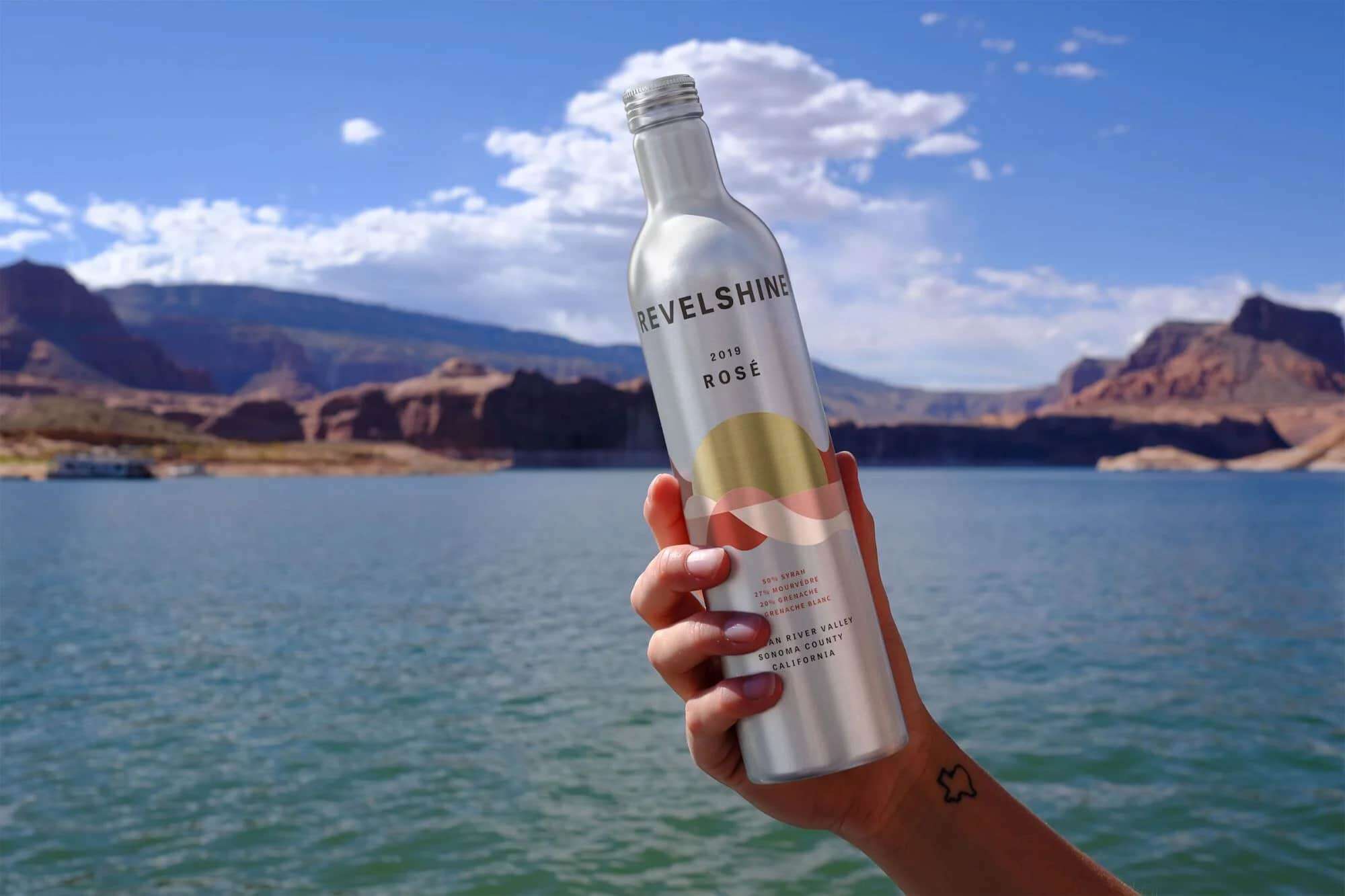
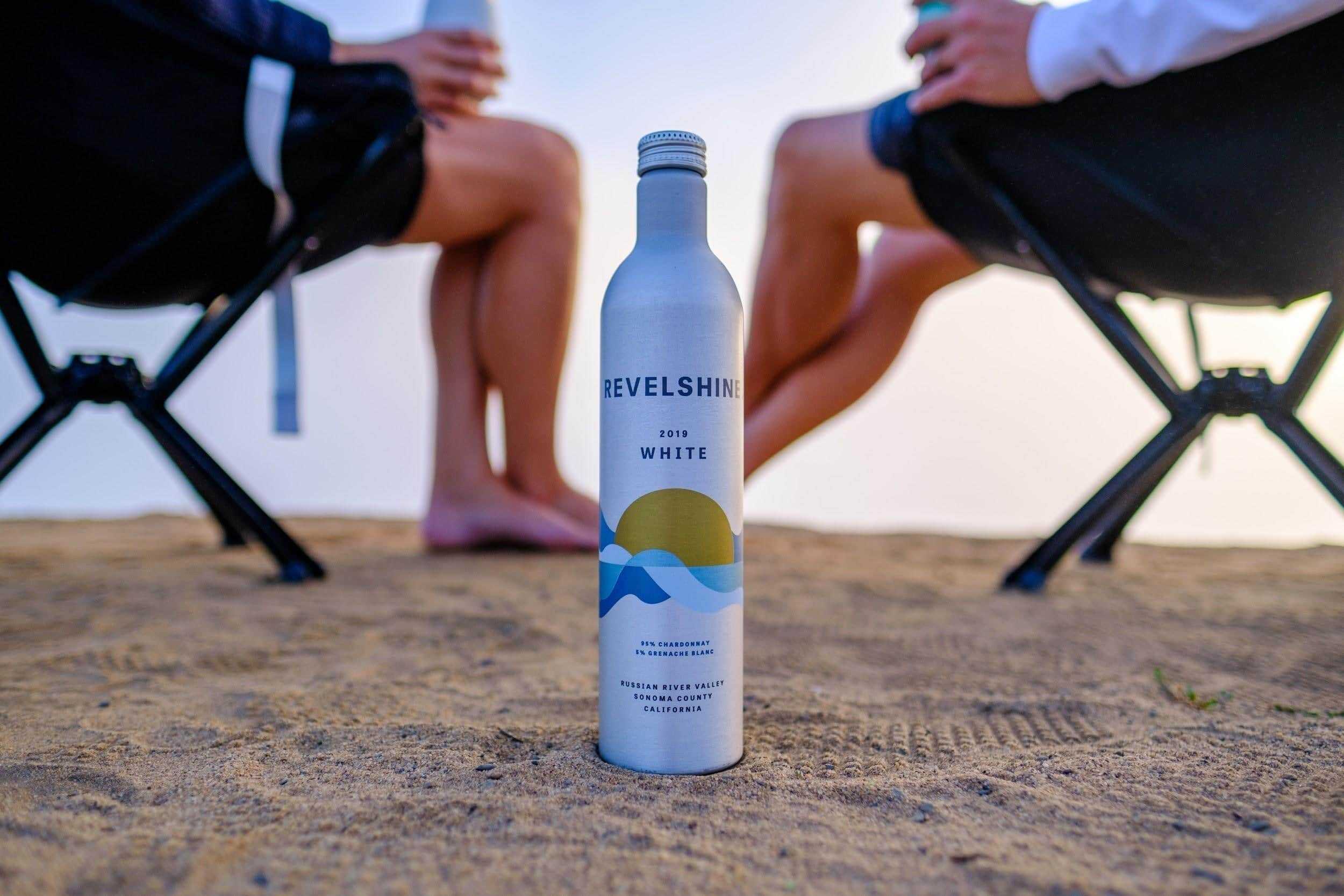
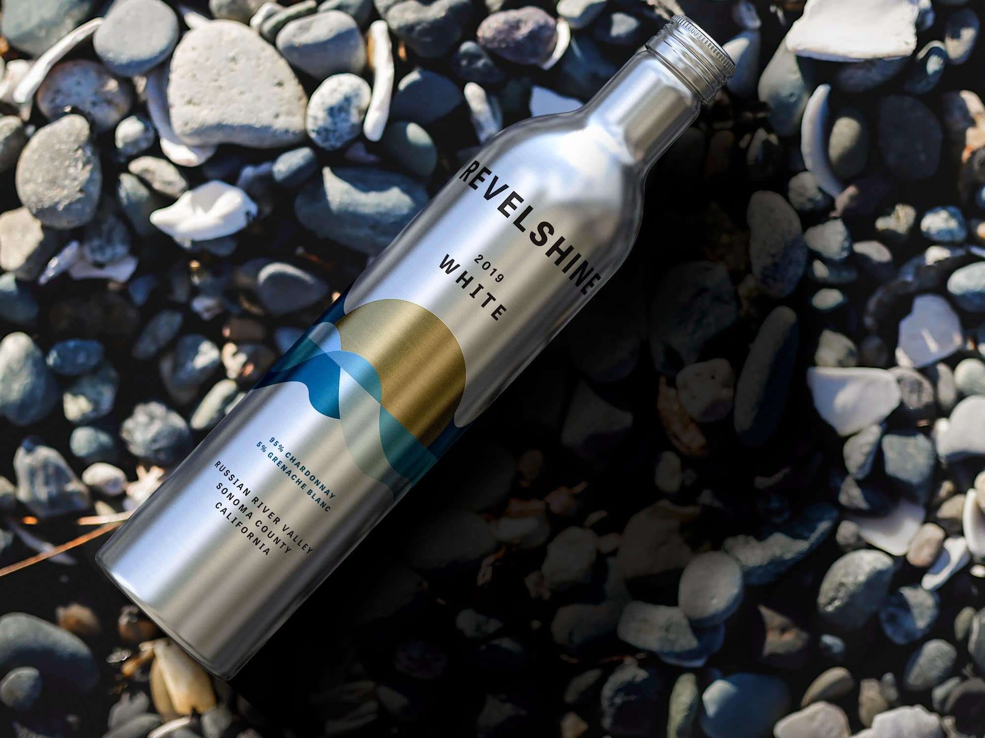
Although pressurized beverages such as carbonated soft drinks and beer come in cans, the emphasis is on individual portions. Of course, there are individual bottles of wine, but carrying a bottle with a few glasses in it is less cumbersome, and more in keeping with the spirit of the brand. the wine-drinking experience, Especially when enjoying the outdoors, where glass is often not an option, and bottled wine is too bulky.
This is where Revelshine wine comes in, in aluminum bottles suitable for outdoor use. Indeed, the 500 ml bottle is large enough to share, and the resealable screw cap keeps the wine safe. The raw aluminum and size of the bottle give it a gourd look, reinforced by the beautiful abstract landscape on the front. Its shape also allows it to fit into the same pockets as water bottles.
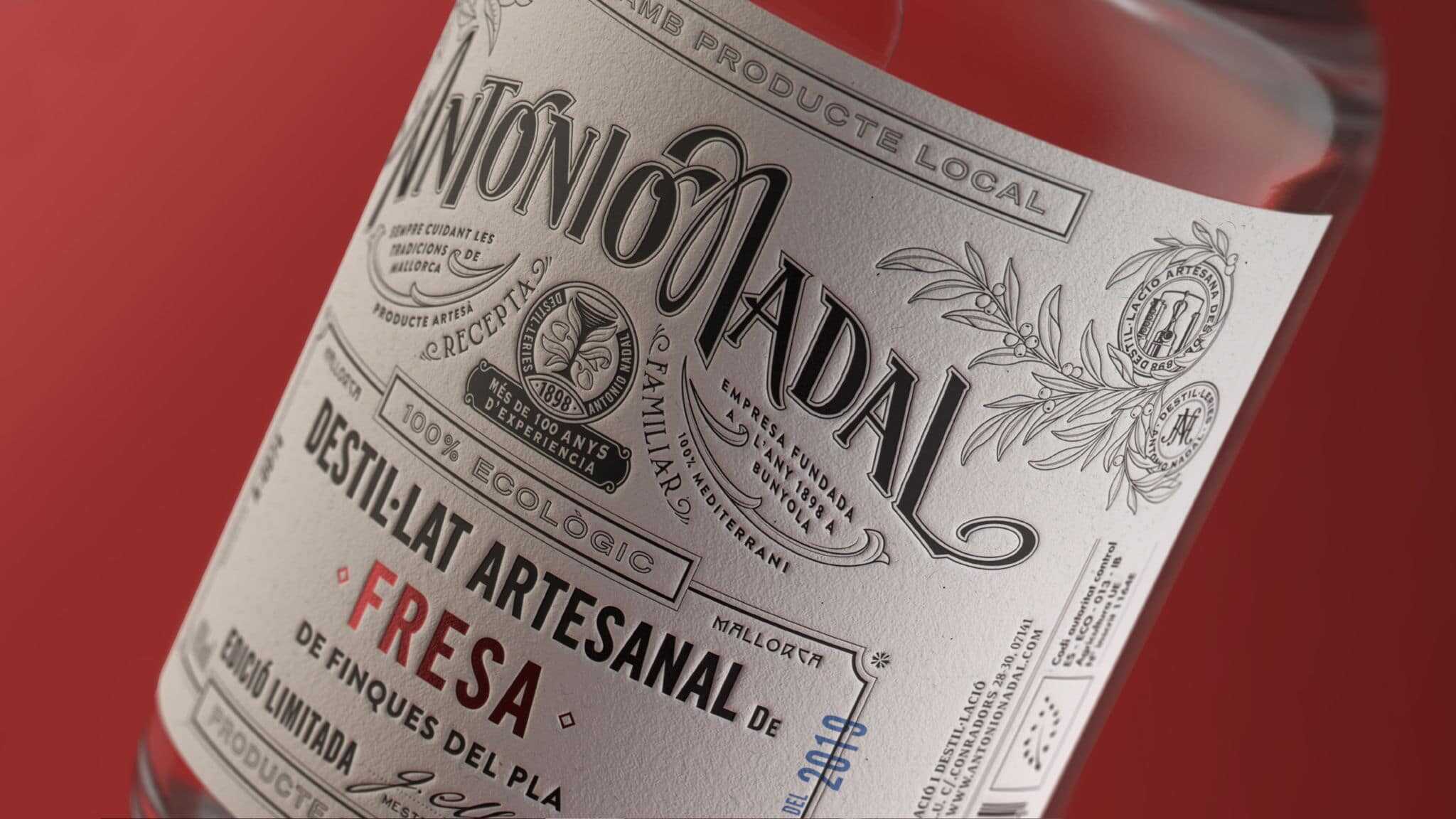
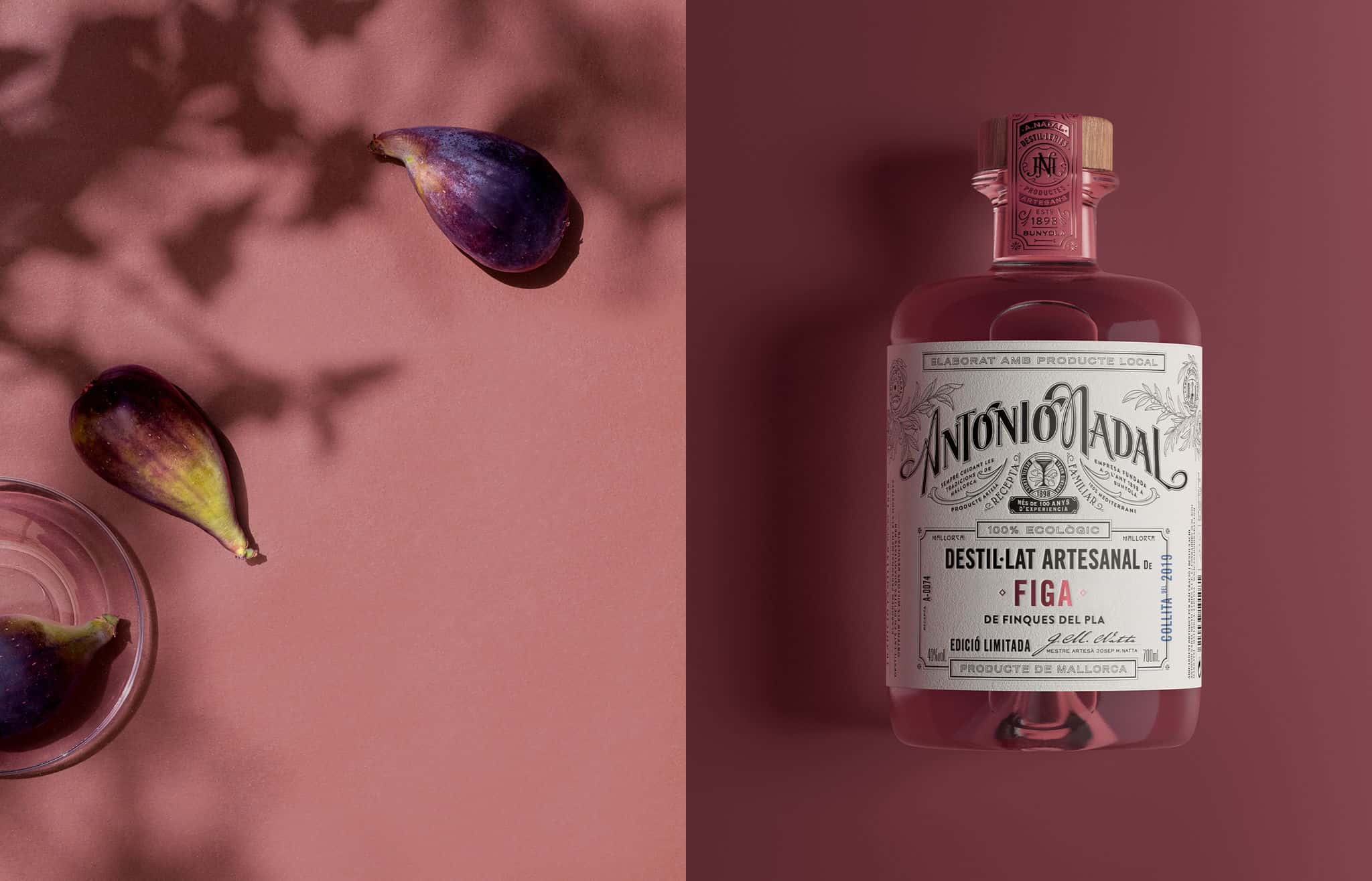
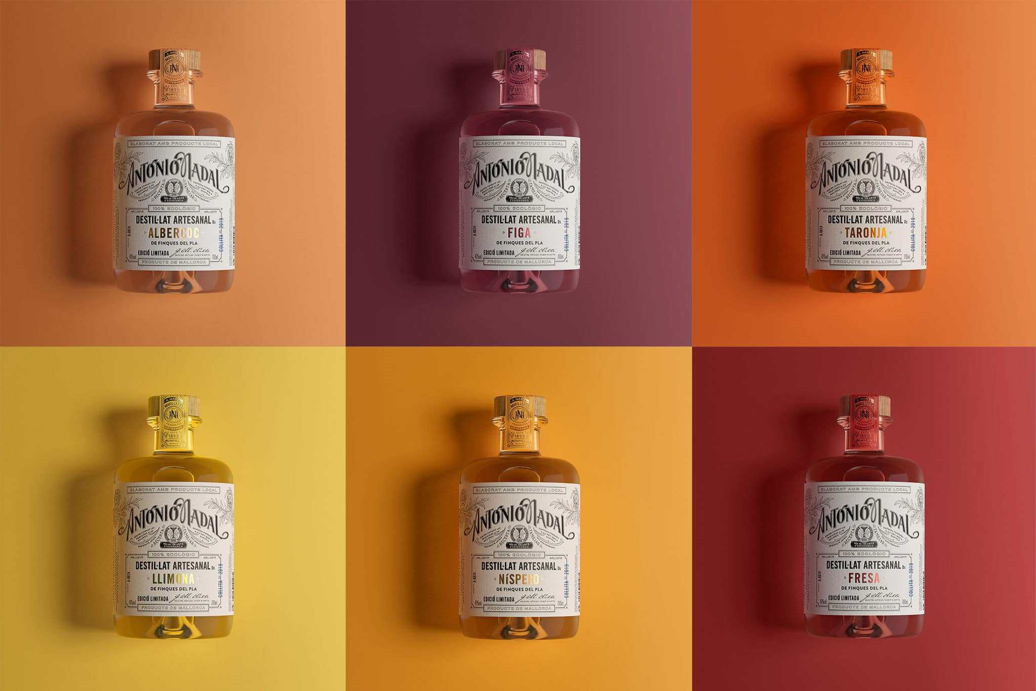
Antonio Nadal is over 100 years old, a fine heritage. However, they wanted to re-establish this link with consumers to regain some credibility. Indeed, part of the problem is that Antonio Nadal products are everywhere and have a reputation for being mass-produced, whereas they make spirits by hand using an old copper still. The design of this liqueur range This limited-edition collection focuses on that artisanal feel, while striking a balance between vintage and modern.
To bring out the in-house quality notes on the label, they used a typographic effect on the black ink, giving it a more tactile presence. The color foil, used minimally, reflects the flavor variant without relying on illustrations of the ingredients. Overall, the packaging had to exude a certain authenticity, almost like an antique label you'd see on a bottle from an old-fashioned bar. However, due to its luxurious and limited nature, it had to be subtle without exaggerating shine and sparkle.
Skilful use of the paper's unique shade gives rise to a palette of warm, vivid colors. The paper's texture is then enhanced by a clever use of debossing and hot foil stamping, resulting in a series of delicate yet powerful labels, where spaces and hierarchies of information are perfectly managed by interesting and never banal lettering.


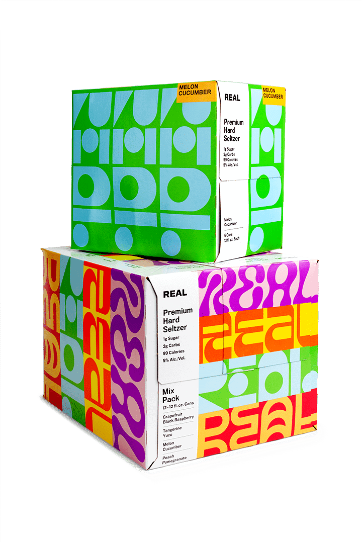
Real is a premium Texas hard seltzer made from carefully selected ingredients. The outside of the can reflects what's inside: a bold, unique liquid. Indeed, with just 1g of real cane sugar per can, Real offers consumers what they've come to expect from a hard seltzer. The packaging is inspired by the eclectic nature of the brand, thanks to funky typography and a palette of bright colors. Each fragrance is presented in a different colored box, and the geometric design also changes each time.
The brand image is both attractive and thoughtful, and if it says REAL in big letters on the box, it's got to be true! This is evidenced by the fact that they make their sugar in-house, because they believe that's what consumers really want.
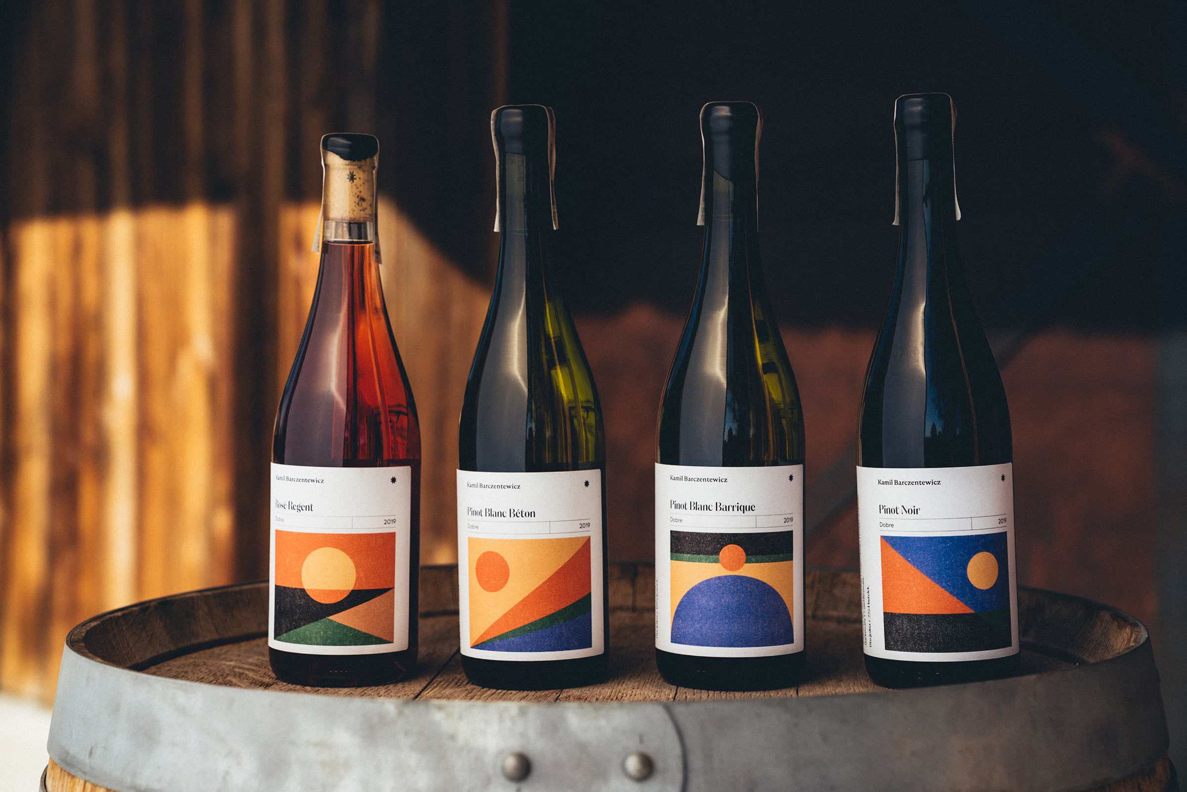
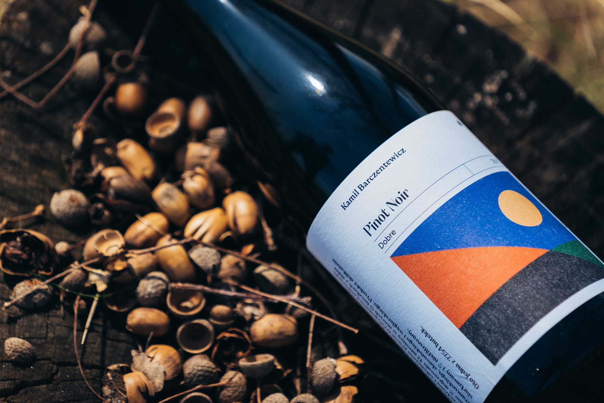
Wines from the Kamil Barczentewicz winery in Dobre, near Kazimierz Dolny, tell the story of the picturesque landscapes from which they originate. That's right, wine labels illustrate their place of production with geometric shapes. Each label takes into account the landscape and the way in which the wine is produced. The packaging of this wine is thoughtful, simple, and adds an often overlooked element of storytelling.
The elaborate designs allude to the idea that wine is the fruit of terroir. Strong, contrasting colors recall the vineyard environment, which changes with the seasons. To show the climate of the habitat and the taste of the wine, they used a simple yet powerful means of expression. For example, the Pinot Blanc Barrique label refers to the aging process and yeast sediment, and the Pinot Noir label to the time lapse motif, illustrating the maceration process.
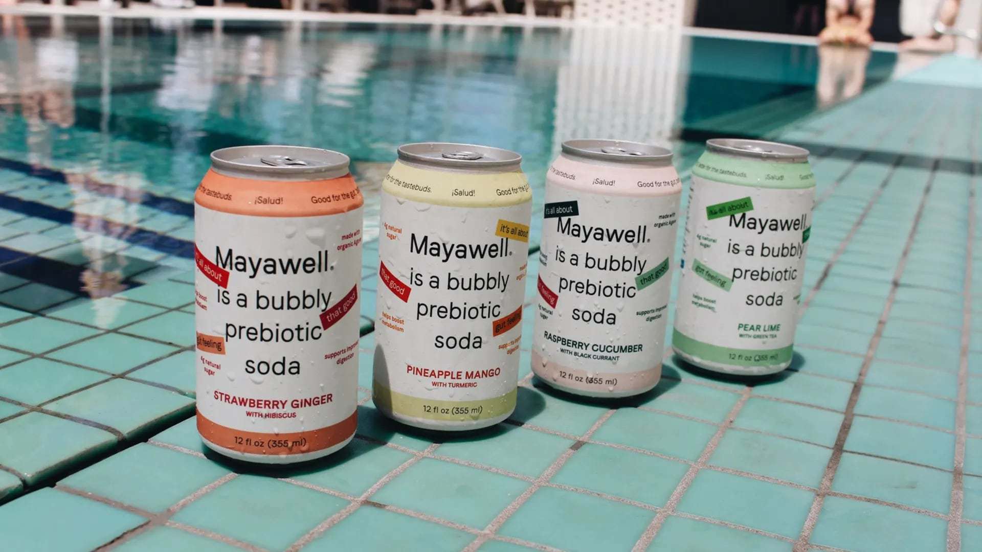
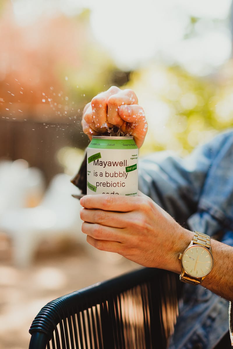
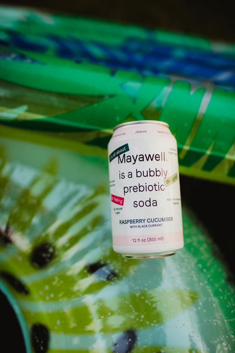
Mayawell is a modern beverage brand that harnesses the prebiotic benefits of Mexican agave into a tasty wellness drink. Their range of prebiotic sodas features organic, hand-harvested Active Agave™, which has been shown to improve digestion, boost the immune system and stimulate metabolism. Each purchase also supports indigenous Mexican communities by providing resources to help them grow, market and reforest agave crops. The identity features an avant-garde design based on the use of typography, with graphic shelf appeal and a clear message strategy.
The design on the front of the label explicitly states that «Mayawell is all about a good mood», proving the effects of this tasty drink. Their graphic system contrasts bold typography with playful stickers to maximize the message, and alludes to Mexico's color palette. The language highlights the Agave plant, responsible sourcing and health benefits.
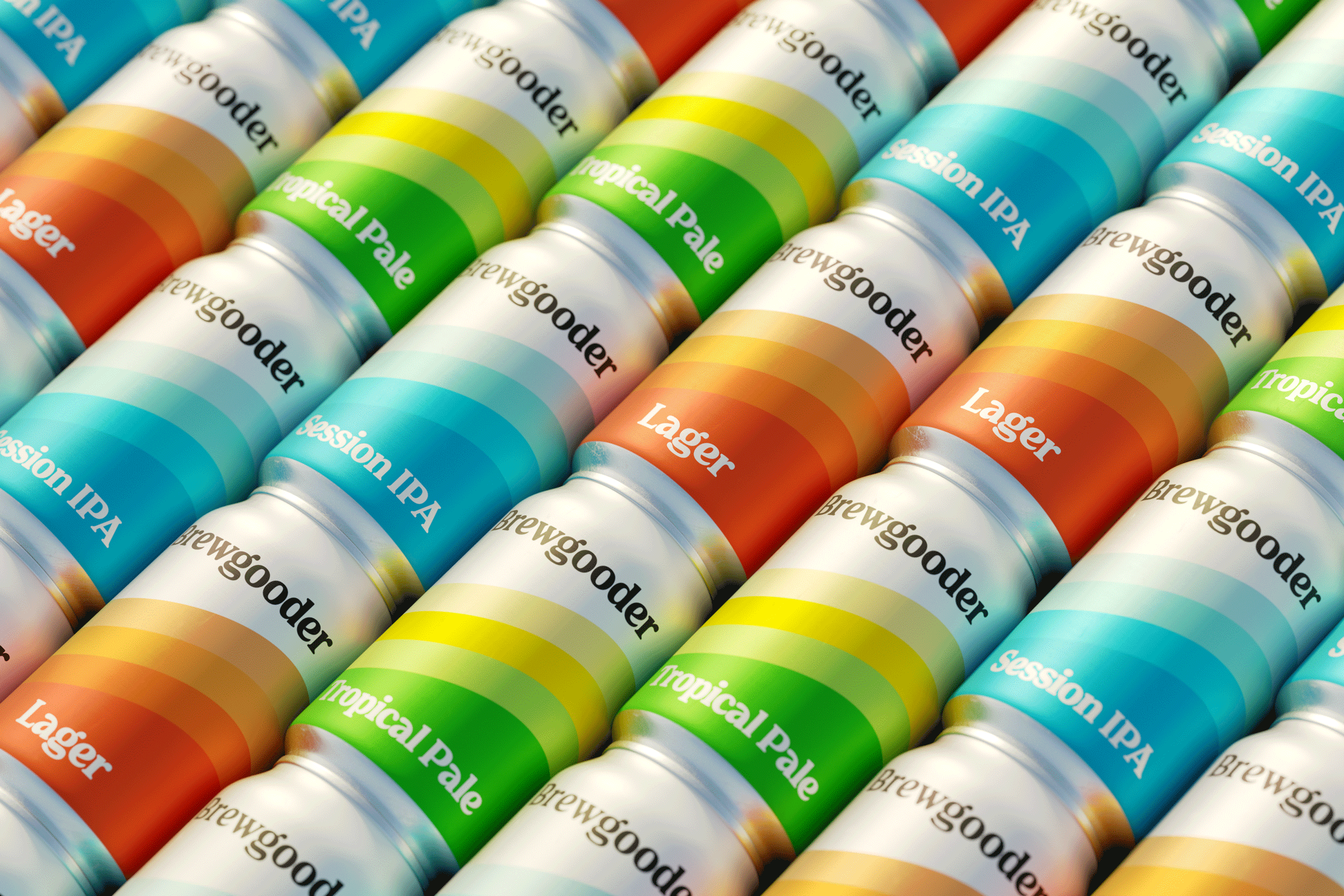
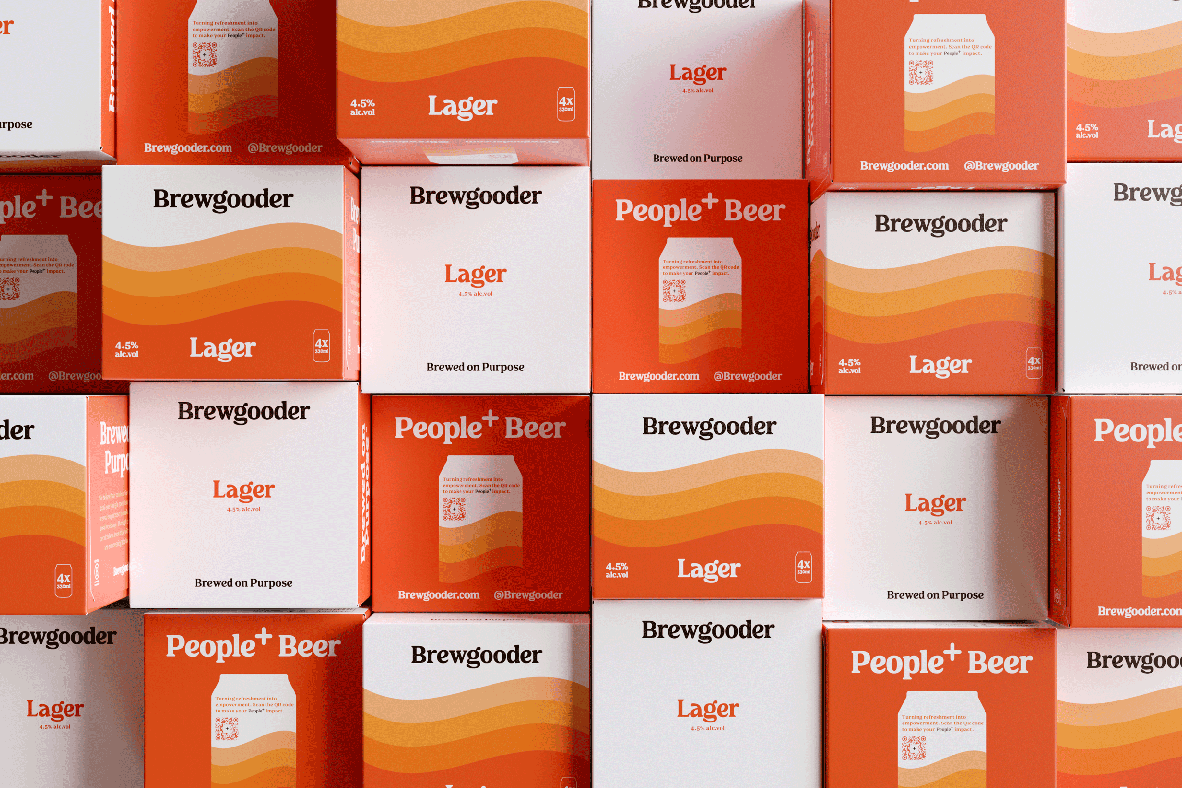
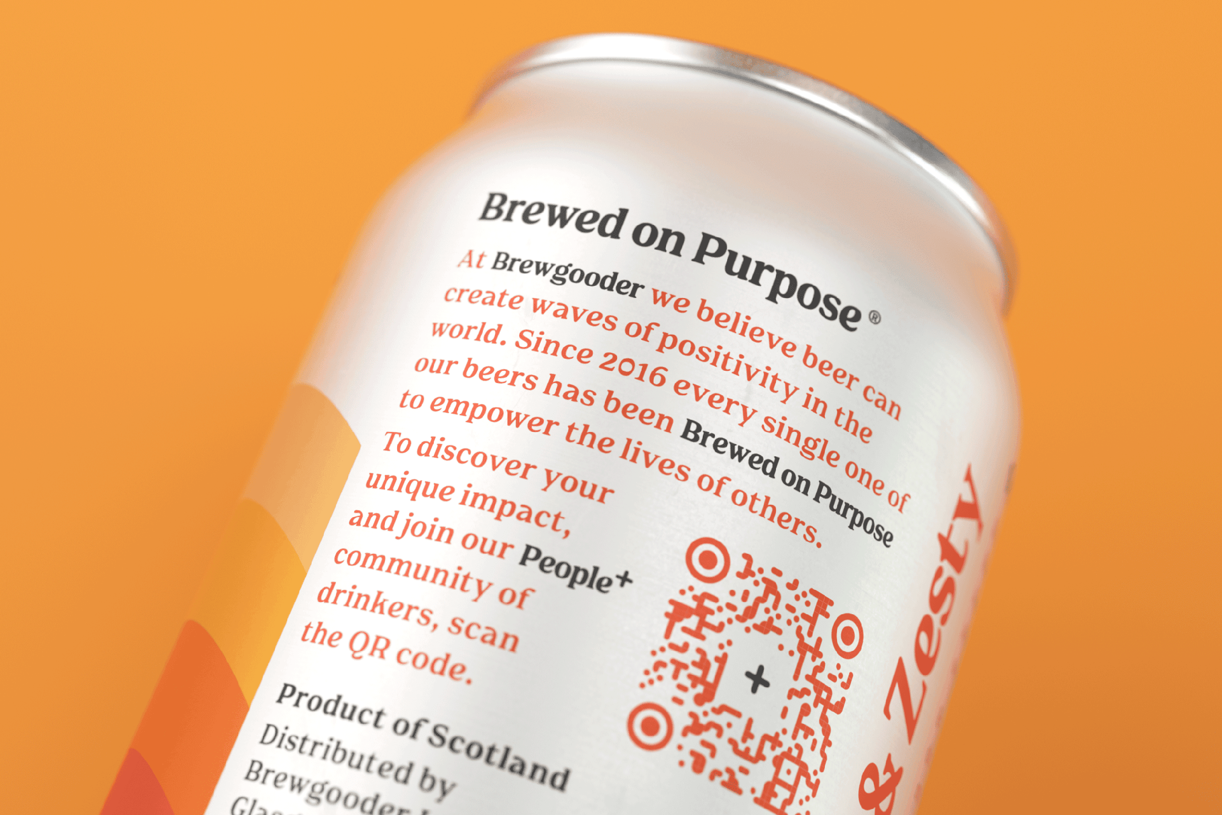
Inspired by a bad experience with contaminated water during a trip to Nepal, Brewgooder was founded to generate social good as a key driver, with every can of beer sold funding 100 times the volume in clean water projects.
Inspired by the brewery's deeply rooted ethos rooted in positive change and improving lives, Brewgood gets warmth and hope with the brand's orange, which lends impetus and vitality when paired with white. The brand's more ornate script lettering is replaced by a cleaner font that retains its affable, but dressier character. Similarly, the illustrations are replaced by solid-colored stripes accented by waving ribbons evoking Brewgooder's clean water mission. Successful rebranding adds a new dimension to their brand identity system. It remains easy to use with the permanent range, in addition to seasonal and collaboration beers.
In the end, Brewgooder's new brand identity exudes confidence and personality, while making it clear that the brand is purpose-driven. If the brewer's objective has remained the same in spirit, the brewery's new brand image is simpler and less complicated to implement.
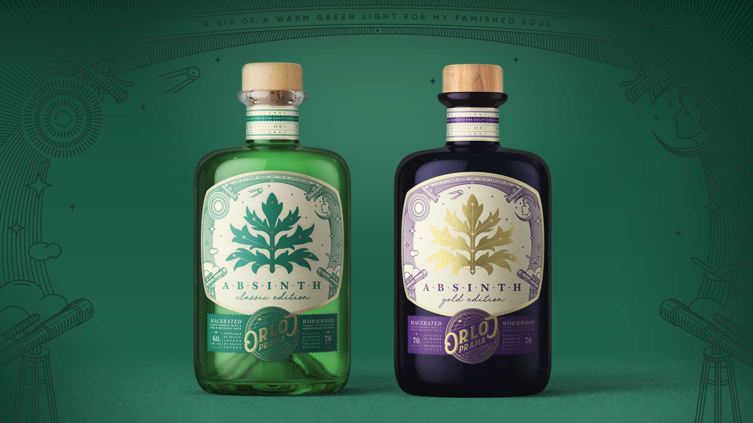
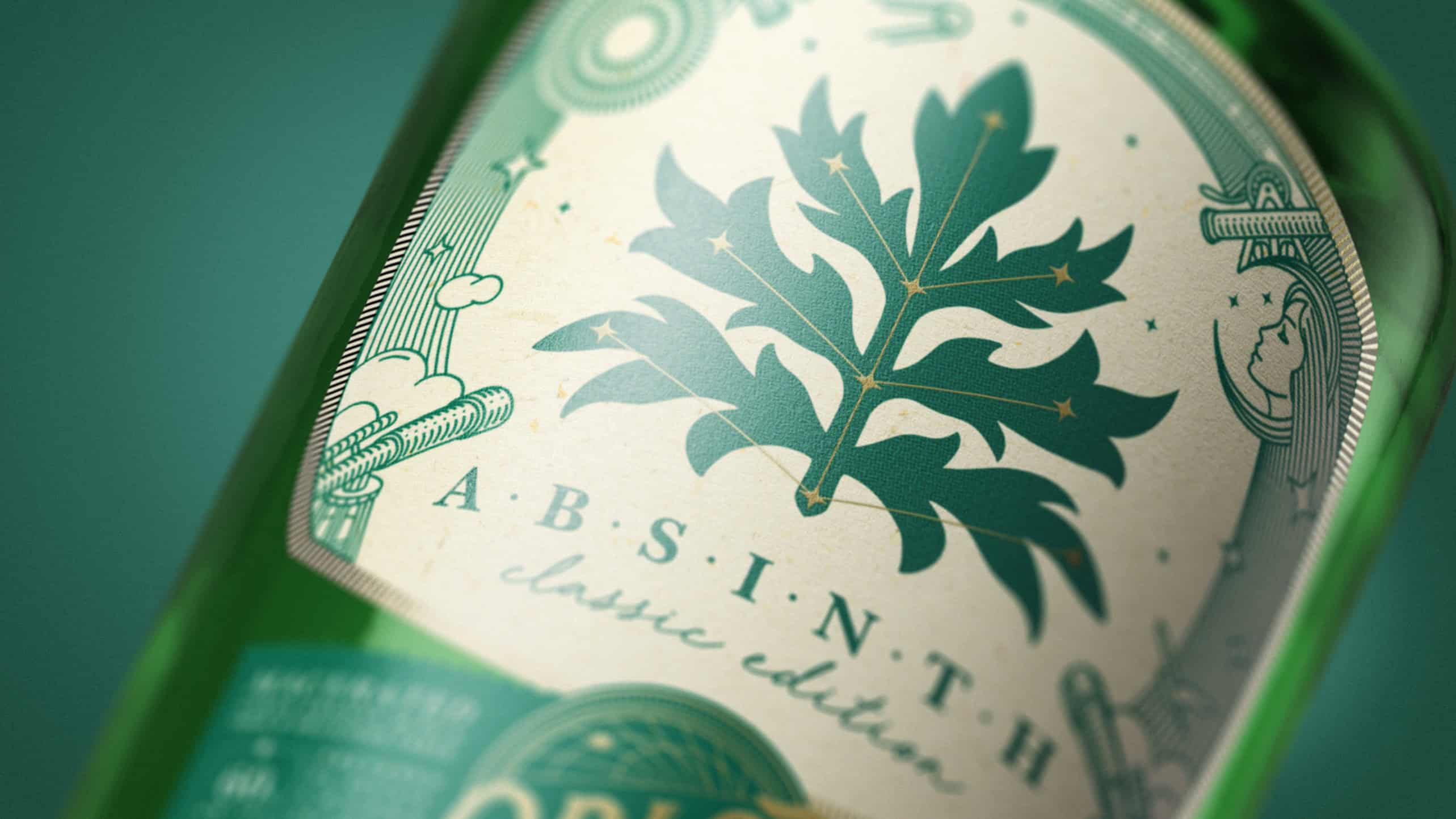
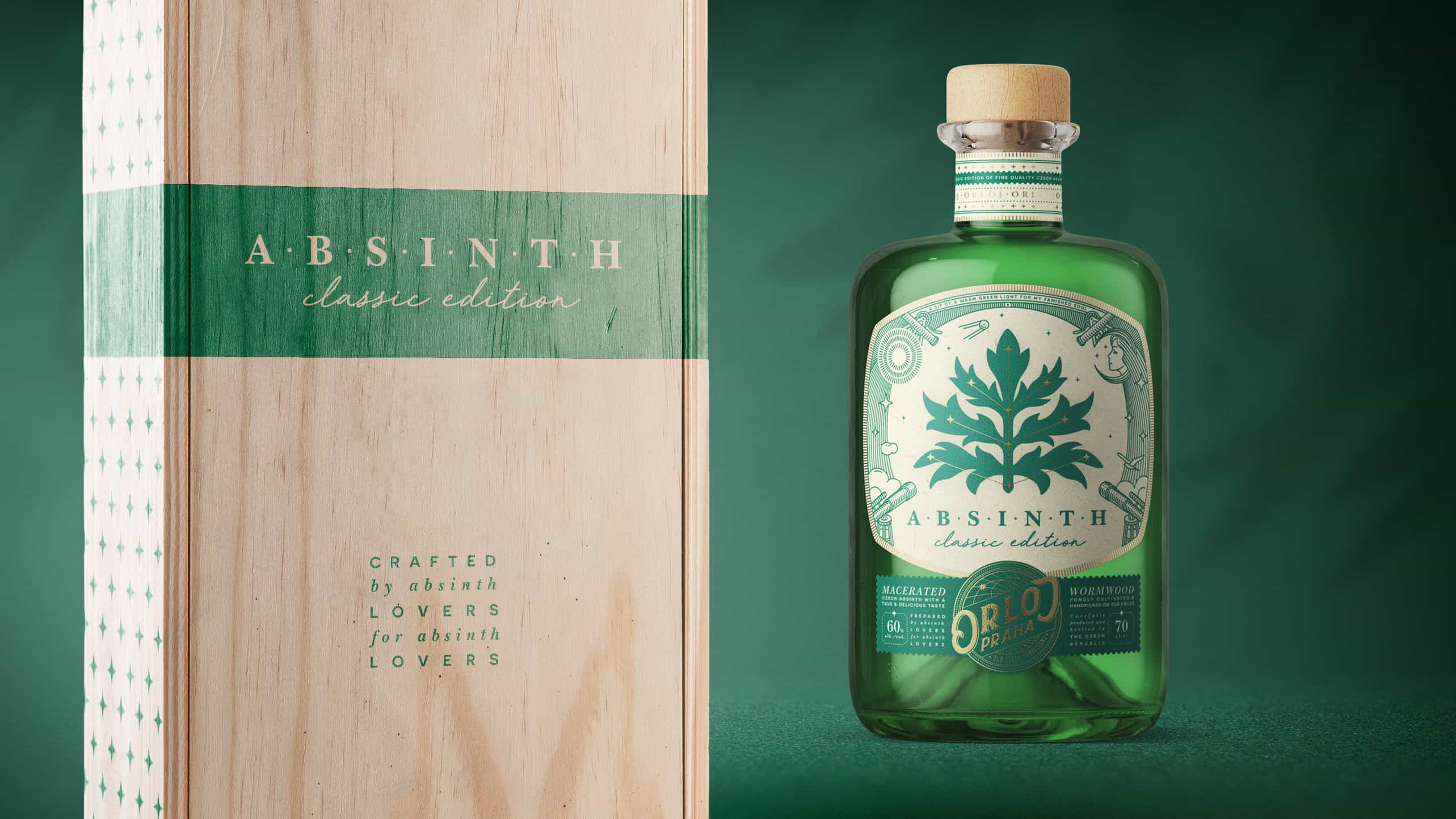
It's no secret that the Czech Republic is famous for its absinthe. Many tourists come every year to sample this mystical beverage. Prague is famous for its astronomical clock, Orloj. It was installed in 1410, making it the third oldest astronomical clock in the world.
The Prague clock, Orloj, features very specific details in its construction. These details became the elements of the logo block, linking the upper and lower parts of the label. The visual identity of the brand is based on the elements of the label. Three main colors (forest green, midnight violet and sand cream) create a deep yet gentle atmosphere of mysticism. The choice of natural, handcrafted materials underlines the product's high-end category.
The central part of the label is devoted to the main theme of the product: astronomical absinthe. It is represented by an absinthe leaf surrounded by the constellations of the starry sky. This composition serves as a metaphor for the discovery of a new product in the world of absinthe producers. The linear style of the illustration was chosen to support the feeling of an astronomical study of the product.
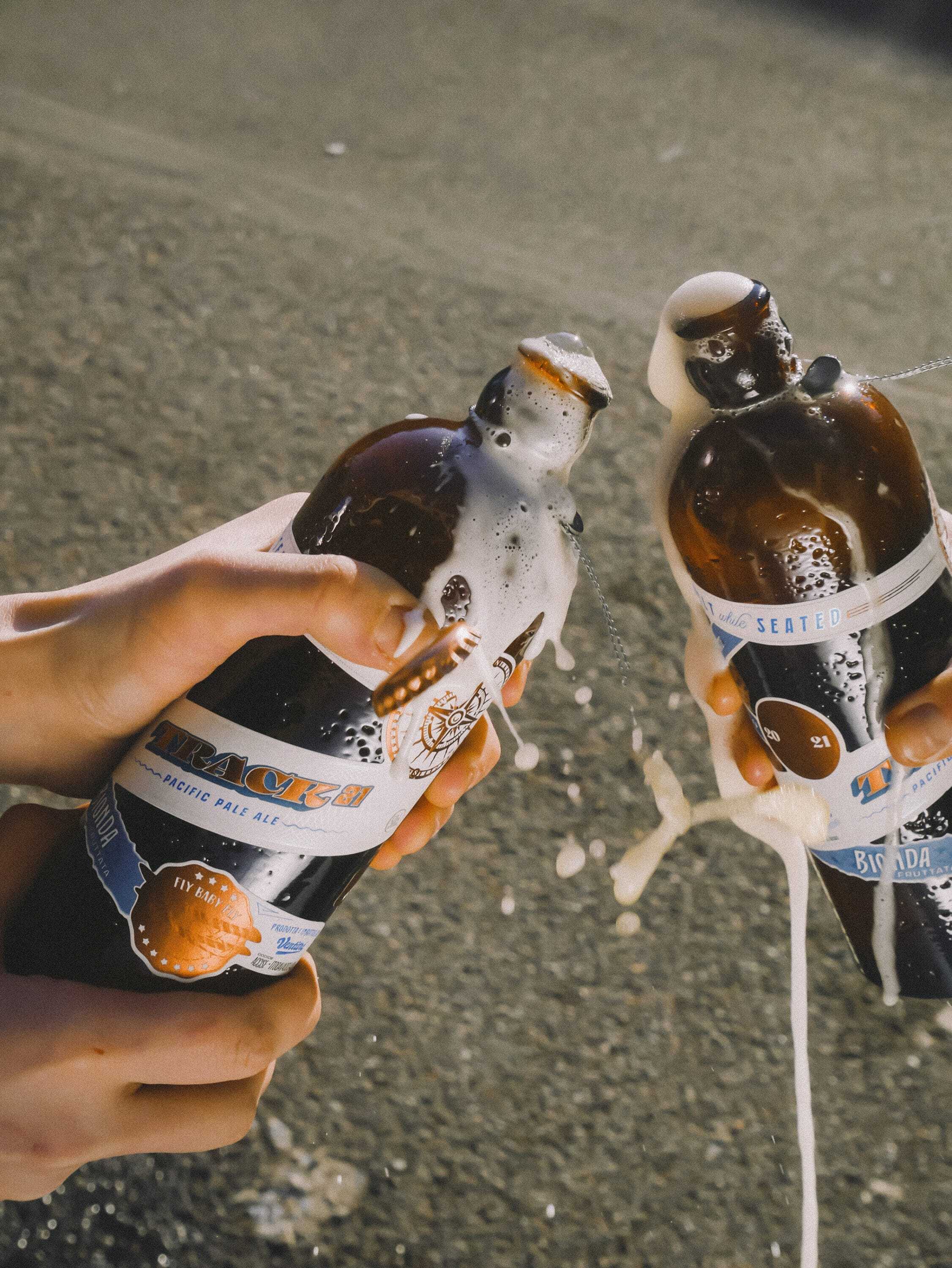
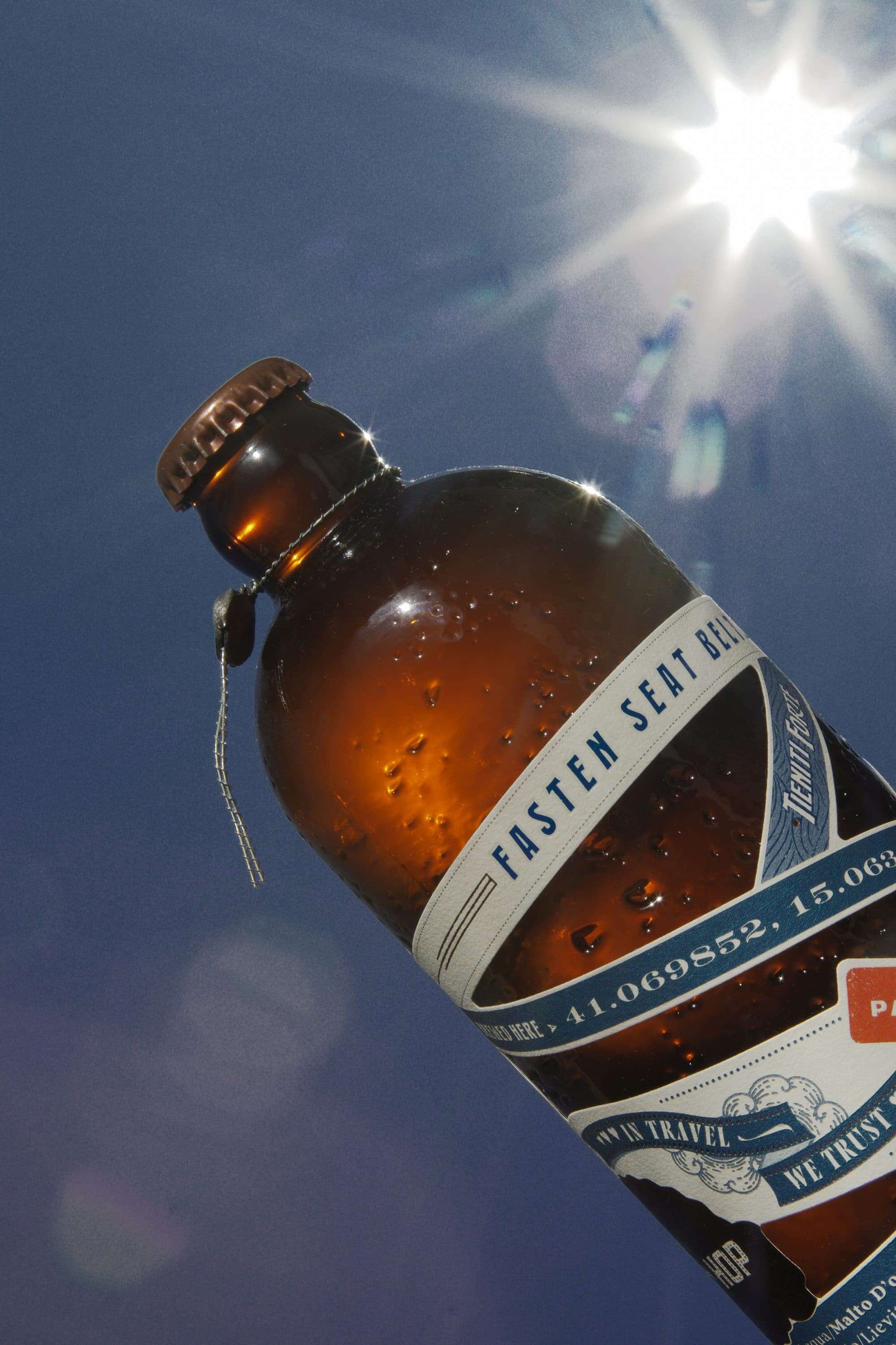
Track21 is a beer with unique design whose aim is to encourage a love of travel and curiosity about the world around us. From the deliberately distorted bottle to the transparent information provided on the beer brewing process, Track21 is both rebellious and insightful. By opting for copper foil and blue accents juxtaposed with angled text and zigzag labels, the bottle stands out in every way.
This dented bottle shows us that it has traveled and been battered along the way. The label is full of messages, from the type of beer to the brewery's contact details. It conveys thoughts of hope and a description of the ingredients. The text is accompanied by other graphic elements, such as the postage stamp, the compass rose and the phrase «Bon voyage». Every element of the lettering has been designed specifically for this product, from the «Track21» logo to the other texts. The packaging acts as a small travel case that you can take with you, with encouraging text about why we humans love to travel. Inside, you'll find a singular brochure, reminiscent of an old-fashioned ticket book, printed on cotton paper with copper foil.
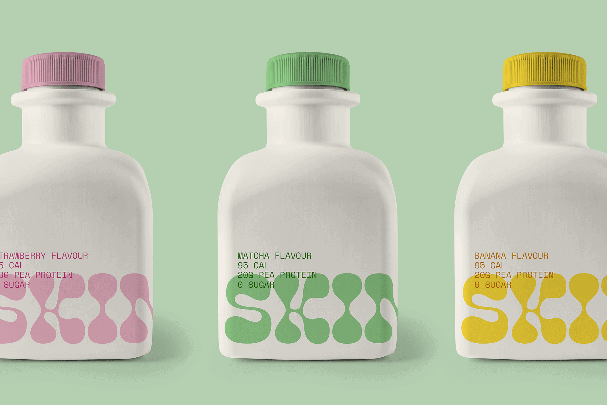
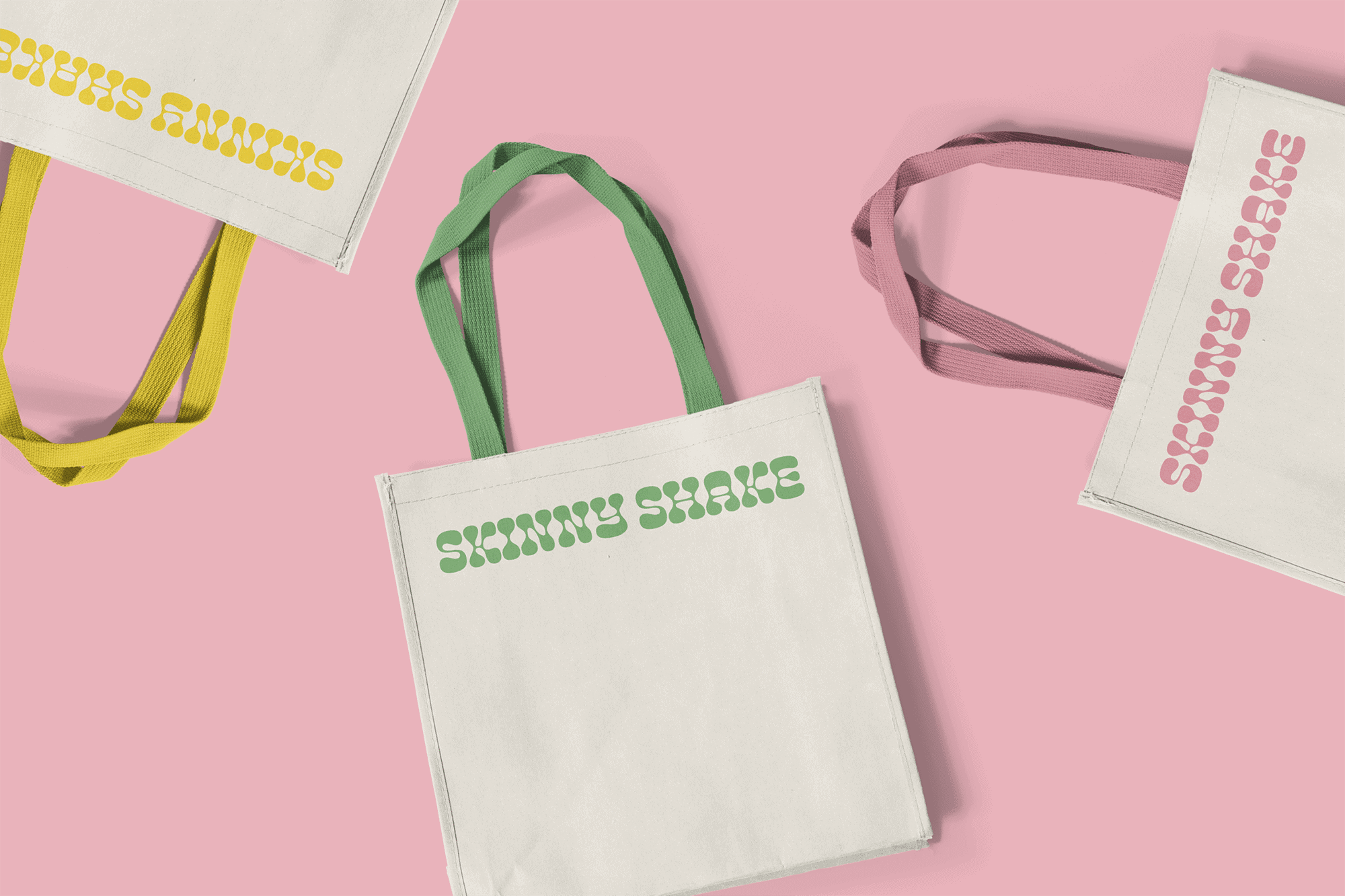
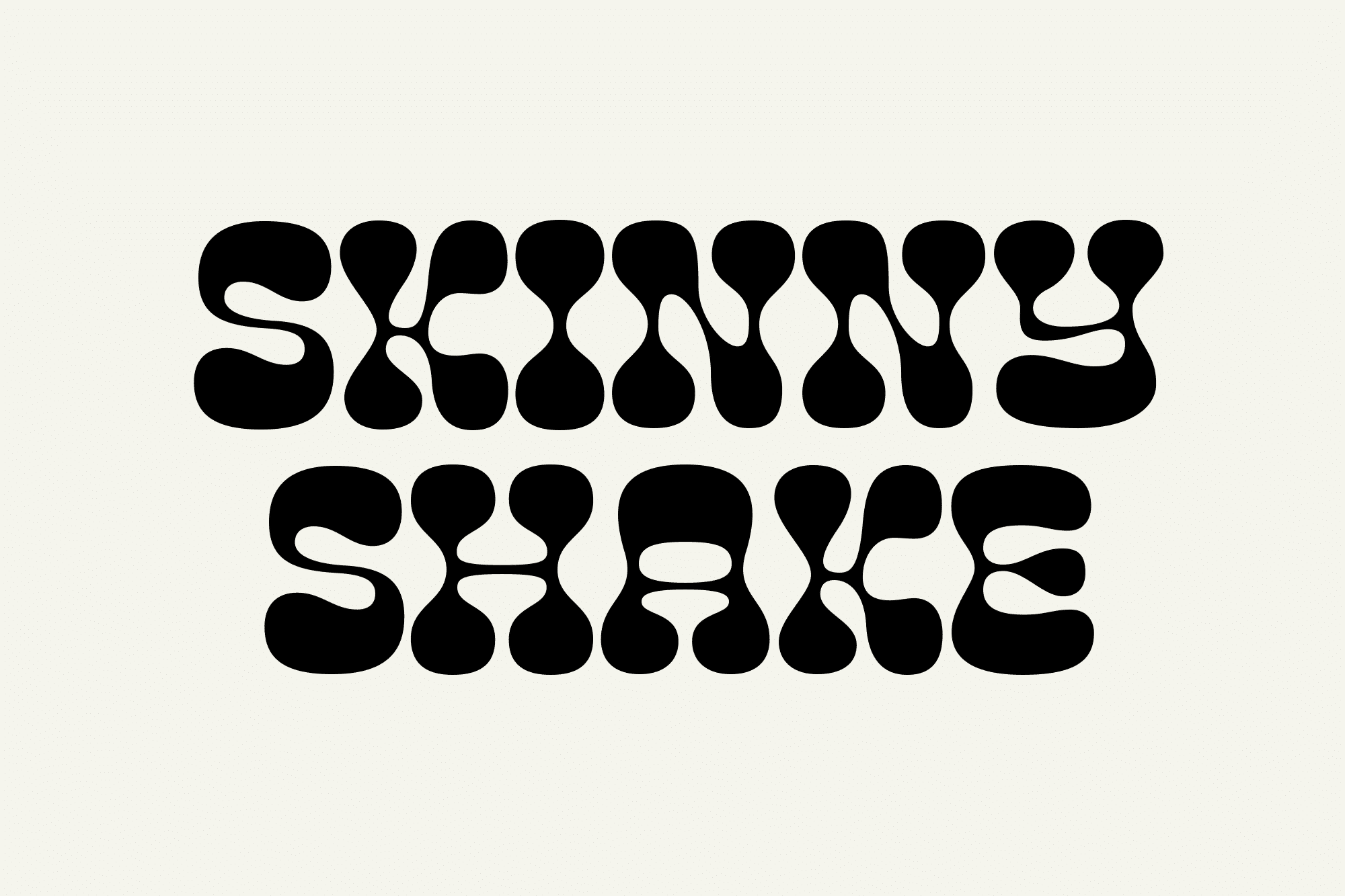
Light, natural and authentic - that's what you're looking for when you buy smoothies, and that's exactly what Skinny Shake wanted to symbolize with their brand identity. A company that guarantees only the purest, cleanest ingredients, free from harmful substances, had to keep things simple.
Skinny Shake needed a brand identity that would stand out in the noisy world of beverage retailing. The choice of a hip, groovy typeface, with notable pastel tones, set the smoothie and shake bottles apart from other brand labels. In this way, the brand was able to create a minimalist design that set itself apart from the competition, with charismatic typography and colors inspired by the product itself.
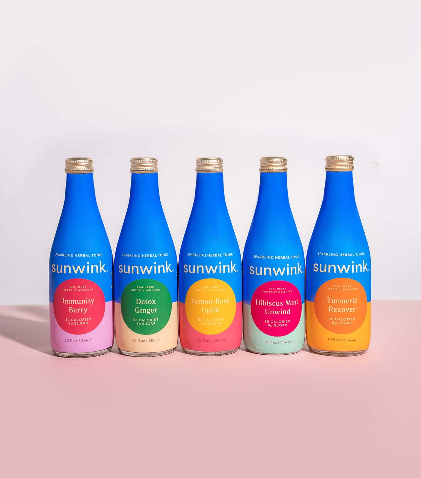
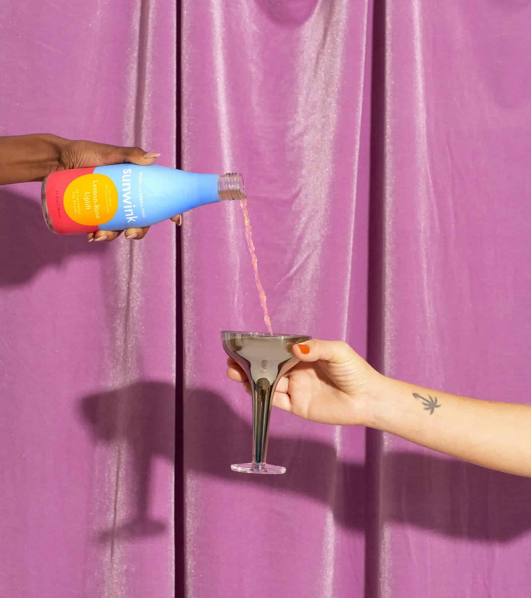
The new design of Sunwink's sparkling herbal products brings joy and optimism. Sunwink's color identity is centered on a distinctive shade of blue. Inspired by nature, this blue is dreamy and atmospheric, yet energetic and powerful. Sunwink's color palette is magnetic, vibrant and inviting, with a spectrum of colors that revolves around Sunwink's signature blue. A generous range of hues includes rich, sun-kissed citrus colors, balanced by several neutral tones.
Packaging design revolves around a prominent logotype combined with dynamic typography for product names and ingredient lists. The use of symbolic colors and an iconic sphere motif play a central role in brand perception. The Sunwink logotype features clean lines, strong geometric shapes and crisp sans-serif lettering, giving it an iconic, accessible and eye-catching quality. Within this colorful, saturated graphic, however, small, subtle typographic details stand out, notably in the branching of the «n» and «u» shapes, movements that imbue a sense of warmth and accessibility.
The Xianjin Group, established in 1985 and located in Dongguan, China focuses on research and development, manufacturing, marketing and brand development of various beverages and health foods. These include vegetable protein drinks, soft drinks, fruit drinks and alcoholic beverages.
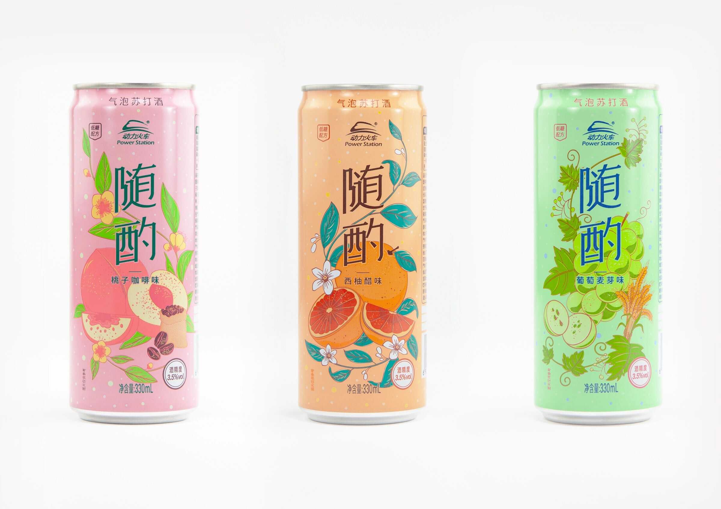
Power Station is a subsidiary brand of the group, which has experience in the RTD sector and used to sell mainly in nightclubs. Although a growing number of young people are interested in alcoholic beverages, the Low-alcohol RTD is a niche market.
Compared to traditional alcohol consumption, the new generation's attitude to alcohol is one of pleasure rather than indulgence. PowerStation's target audience is therefore young people born in the 90s and 95s, and the design theme is comfortable and enjoyable. The aim of this positioning was to broaden consumer demands on alcohol consumption in different contexts, as well as reshaping the perception and consumption habits of alcoholic beverages.
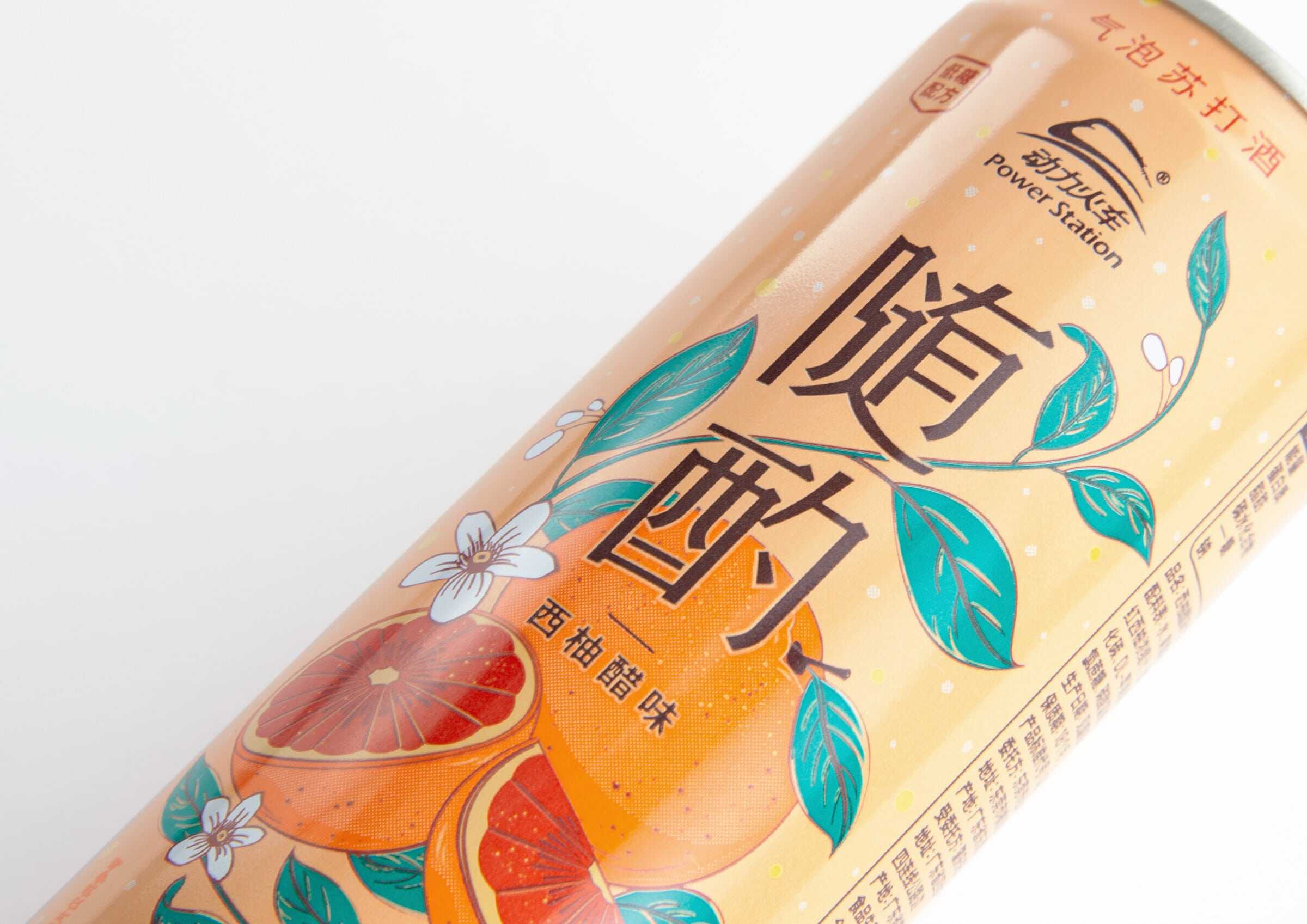
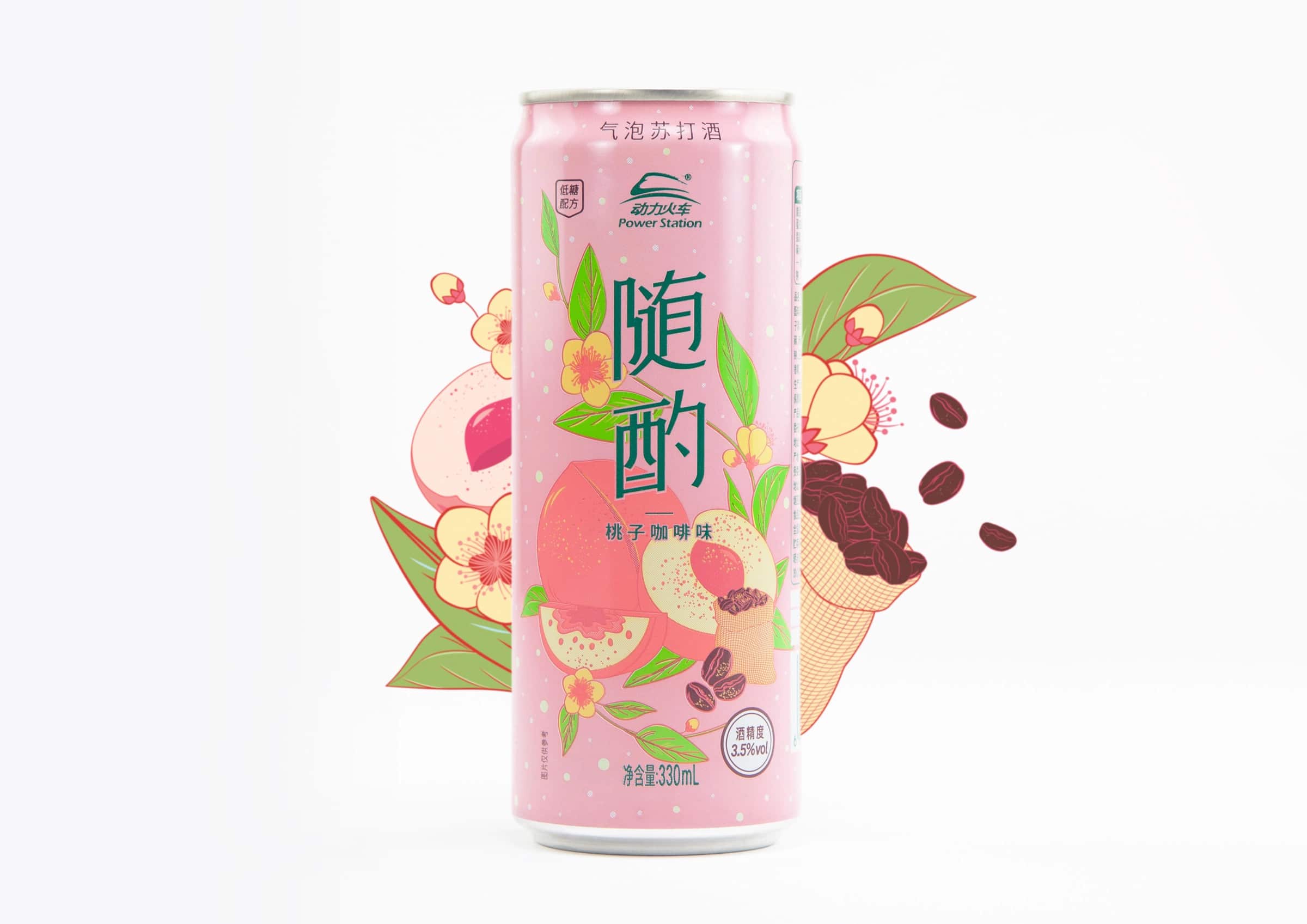
To establish a distinct brand identity with a pleasant, comfortable image, hand-painted illustrations of fresh fruit add a unique style to the product, highlighting the characteristics of the fruit, blurring the boundary between the alcoholic beverage and other common fruit soft drinks. The fresh, bright color palette adds a touch of comfort and relaxation. The clear, uncluttered typography also reinforces the brand's impression with consumers. After analyzing packaging in the Asian market, illustrated packaging design in this sector was relatively little used. Their can design could therefore stand out from the competition while easily appealing to younger consumers.
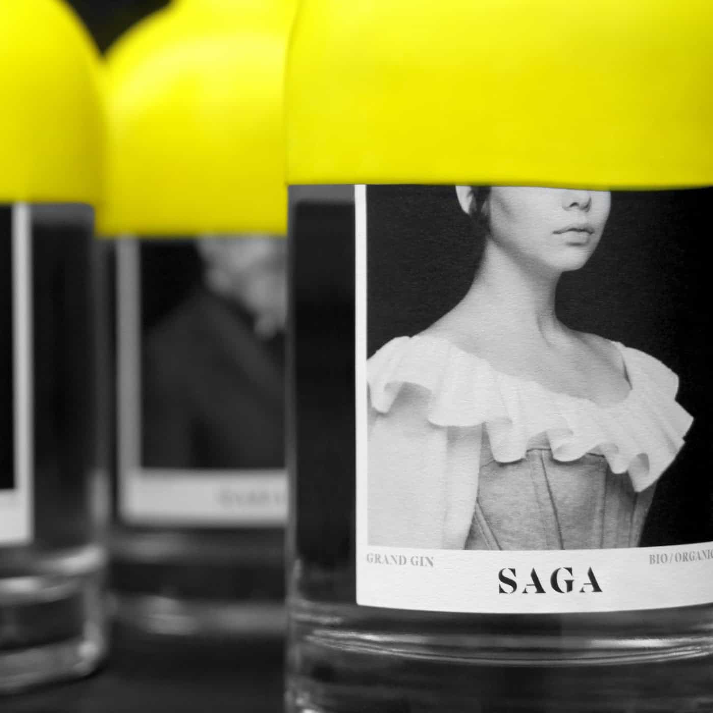
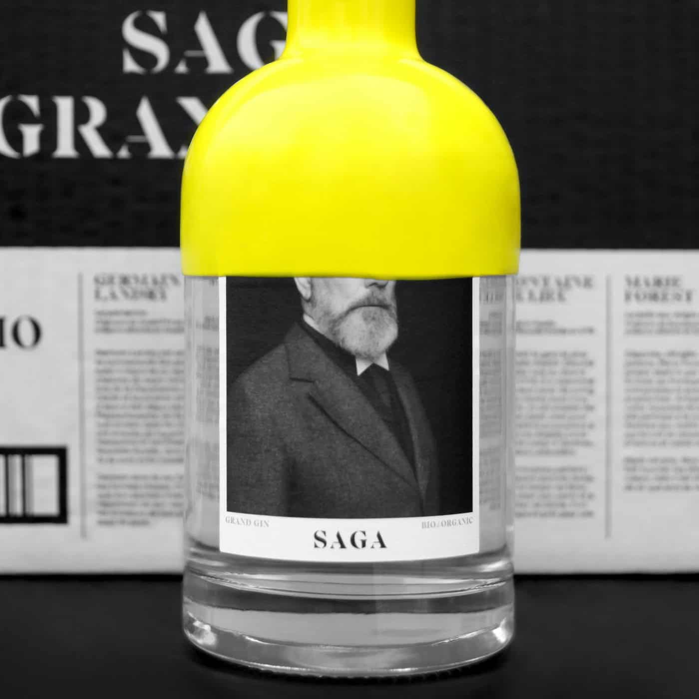
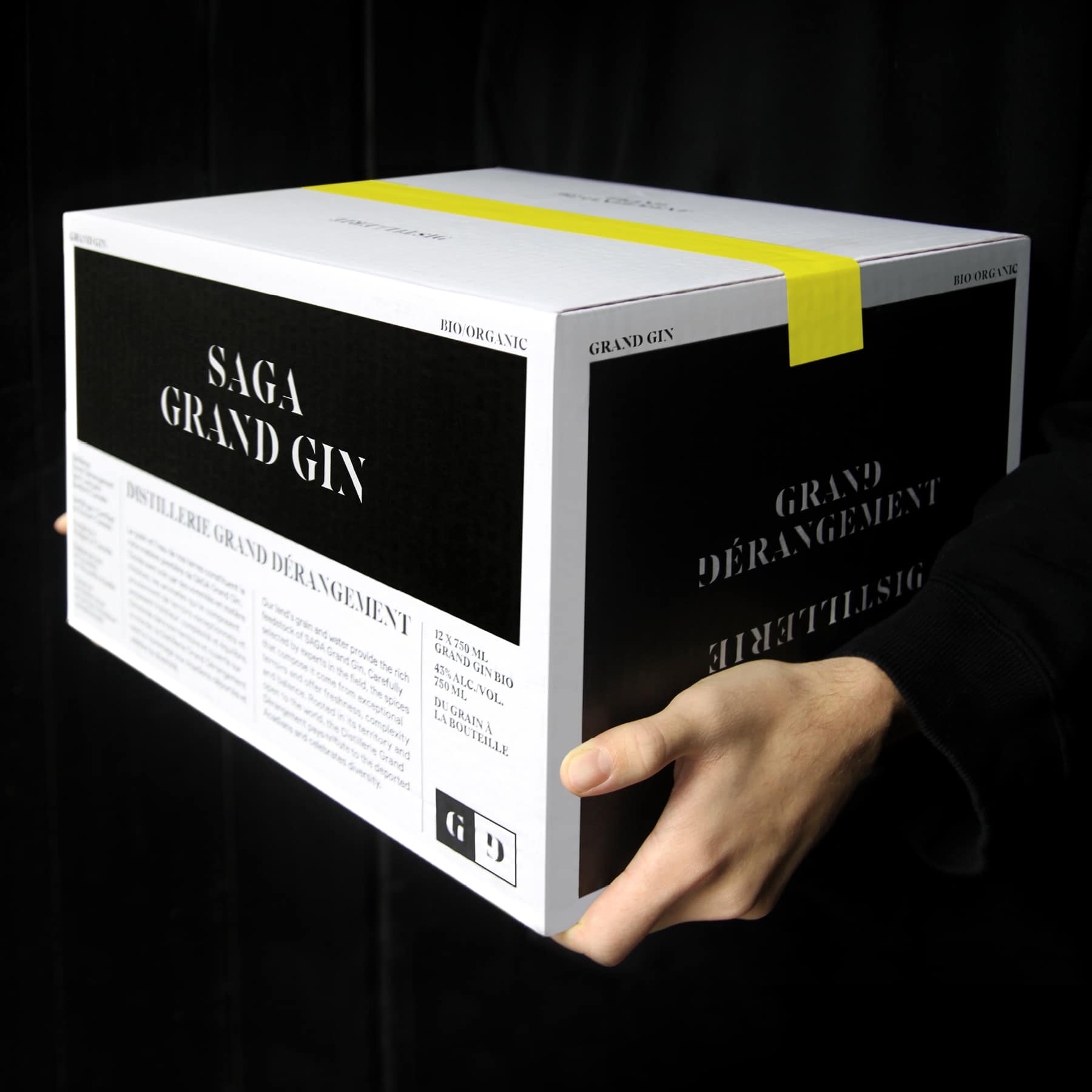
Saga Grand Gin showcases the history of Acadia with a stunning packaging. In the 17th century, a group of French settlers who would come to be known as Acadians moved to an area in what is now northeastern Canada. Although already occupied by First Nations peoples, the Acadians coexisted on the land in relative peace, creating a community in what was then New France, relatively untouched by European powers.
Until French and British imperial interests placed the Acadians at the center of a geopolitical conflict that would see them ethnically cleansed by the British and displaced in what became known as the Great Upheaval. Many displaced Acadians died of starvation and disease, but those who survived showed exceptional resilience, the same robustness that enabled them to thrive in Acadia and endure massive displacement.
By telling the story of the strong Acadian men and women who settled in Lanaudière, home of the Le Grand Dérangement distillery, gin makers pay tribute to the region's heritage and spirit. The beer, wine and spirits market is a competitive one, and packaging plays a crucial role in winning over consumers. In addition to serving as containers for alcoholic beverages, bottles need to stand out on shelves and attract the curious. Saga Grand Gin's packaging design does just that, using contrasting colors, textures and materials to spark intrigue while highlighting the Acadian story.
The portraits of each of the characters are printed on high-quality, highly textured paper, which reinforces the historical aspect of the packaging. The bottles themselves are also dipped in a bright yellow wax, which not only provides a striking contrast with the label but reinforces the packaging's themes. Yellow is an important color for Acadians, as a five-pointed yellow star features prominently on their flag.
Related articles